
Statistics Made Easy

What is Univariate Analysis? (Definition & Example)
The term univariate analysis refers to the analysis of one variable. You can remember this because the prefix “uni” means “one.”
The purpose of univariate analysis is to understand the distribution of values for a single variable. You can contrast this type of analysis with the following:
- Bivariate Analysis : The analysis of two variables.
- Multivariate Analysis: The analysis of two or more variables.
For example, suppose we have the following dataset:

We could choose to perform univariate analysis on any of the individual variables in the dataset to gain a better understanding of its distribution of values.
For example, we may choose to perform univariate analysis on the variable Household Size :

There are three common ways to perform univariate analysis:
1. Summary Statistics
The most common way to perform univariate analysis is to describe a variable using summary statistics .
There are two popular types of summary statistics:
- Measures of central tendency : these numbers describe where the center of a dataset is located. Examples include the mean and the median .
- Measures of dispersion : these numbers describe how spread out the values are in the dataset. Examples include the range , interquartile range , standard deviation , and variance .
2. Frequency Distributions
Another way to perform univariate analysis is to create a frequency distribution , which describes how often different values occur in a dataset.
Yet another way to perform univariate analysis is to create charts to visualize the distribution of values for a certain variable.
Common examples include:
- Density Curves
The following examples show how to perform each type of univariate analysis using the Household Size variable from our dataset mentioned earlier:
Summary Statistics
We can calculate the following measures of central tendency for Household Size:
- Mean (the average value): 3.8
- Median (the middle value): 4
These values give us an idea of where the “center” value is located.
We can also calculate the following measures of dispersion:
- Range (the difference between the max and min): 6
- Interquartile Range (the spread of the middle 50% of values): 2.5
- Standard Deviation (an average measure of spread): 1.87
These values give us an idea of how spread out the values are for this variable.
Frequency Distributions
We can also create the following frequency distribution table to summarize how often different values occur:

This allows us to quickly see that the most frequent household size is 4 .
Resource: You can use this Frequency Calculator to automatically produce a frequency distribution for any variable.
We can create the following charts to help us visualize the distribution of values for Household Size:
A boxplot is a plot that shows the five-number summary of a dataset.
The five-number summary includes:
- The minimum value
- The first quartile
- The median value
- The third quartile
- The maximum value
Here’s what a boxplot would look like for the variable Household Size:

Resource: You can use this Boxplot Generator to automatically produce a boxplot for any variable.
2. Histogram
A histogram is a type of chart that uses vertical bars to display frequencies. This type of chart is a useful way to visualize the distribution of values in a dataset.
Here’s what a histogram would look like for the variable Household Size:

3. Density Curve
A density curve is a curve on a graph that represents the distribution of values in a dataset.
It’s particularly useful for visualizing the “shape” of a distribution, including whether or not a distribution has one or more “peaks” of frequently occurring values and whether or not the distribution is skewed to the left or the right .
Here’s what a density curve would look like for the variable Household Size:

4. Pie Chart
A pie chart is a type of chart that is shaped like a circle and uses slices to represent proportions of a whole.
Here’s what a pie chart would look like for the variable Household Size:

Depending on the type of data, one of these charts may be more useful for visualizing the distribution of values than the others.
Hey there. My name is Zach Bobbitt. I have a Master of Science degree in Applied Statistics and I’ve worked on machine learning algorithms for professional businesses in both healthcare and retail. I’m passionate about statistics, machine learning, and data visualization and I created Statology to be a resource for both students and teachers alike. My goal with this site is to help you learn statistics through using simple terms, plenty of real-world examples, and helpful illustrations.
Leave a Reply Cancel reply
Your email address will not be published. Required fields are marked *
- Memberships
Univariate Analysis: basic theory and example

Univariate analysis: this article explains univariate analysis in a practical way. The article begins with a general explanation and an explanation of the reasons for applying this method in research, followed by the definition of the term and a graphical representation of the different ways of representing univariate statistics. Enjoy the read!
Introduction
Research is a dynamic process that carefully uses different techniques and methods to gain insights, validate hypotheses and make informed decisions.
Using a variety of analytical methods, researchers can gain a thorough understanding of their data, revealing patterns, trends, and relationships.

One of the main approaches or methods for research is the univariate analysis, which provides valuable insights into individual variables and their characteristics.
In this article, we dive into the world of univariate analysis, its definition, importance and applications in research.
Techniques and methods in research
Research methodologies encompass a wide variety of techniques and methods that help researchers extract meaningful information from their data. Some common approaches are:
Descriptive statistics
Summarizing data using measures such as mean, median, mode, variance, and standard deviation.
Inferential statistics
Drawing conclusions about a broader population based on a sample. Methods such as hypothesis testing and confidence intervals are used for this.
Multivariate analysis
Exploring relationships between multiple variables simultaneously, allowing researchers to explore complex interactions and dependencies. A bivariate analysis is when the relationship between two variables is explored.
Qualitative analysis
Discovering insights and trying to understand subjective type of data, such as interviews, observations and case studies.
Quantitative analysis
Analyzing numerical data using statistical methods to reveal patterns and trends.
What is univariate analysis?
Univariate analysis focuses on the study and interpretation of only one variable on its own, without considering possible relationships with other variables.
The method aims to understand the characteristics and behavior of that specific variable. Univariate analysis is the simplest form of analyzing data.
Definition of univariate
The term univariate consists of two elements: uni, which means one, and variate, which refers to a statistical variable. Therefore, univariate analysis focuses on exploring and summarizing the properties of one variable independently.
Importance of univariate analysis
Univariate analysis serves as an important first step in many research projects, as it provides essential insights and lays a foundation for further research. It offers researchers the following benefits:
Data exploration
Univariate analysis allows researchers to understand the distribution, central tendency, and variability of a variable.
Identification of outliers
By detecting anomalous values, univariate analysis helps identify outliers that require further investigation or treatment during the data analysis phase.
Data cleaning
Univariate analysis helps identify missing data, inconsistencies or errors within a variable, allowing researchers to refine and optimize their data set before moving on to more complex analyses.
Variable selection
Researchers can use the univariate analysis to determine which variables are most promising for further research. This enables efficient allocation of resources and hypothesis testing.
Reporting and visualization
Summarizing and visualizing univariate statistics facilitates clear and concise reporting of research results. This makes complex data more accessible to a wider audience.
Research Methods For Business Students Course A-Z guide to writing a rockstar Research Paper with a bulletproof Research Methodology! More information
Applications of univariate analysis
Univariate analysis is used in various research areas and disciplines. It is often used in:
- Epidemiological studies to analyze risk factors
- Social science research to investigate attitudes, behaviors or socio-economic variables
- Market research to understand consumer preferences, buying patterns or market trends
- Environmental studies to investigate pollution, climate data or species distributions
By using univariate analysis, researchers can uncover valuable insights, detect trends, and lay the groundwork for more comprehensive statistical analysis.
Types of univariate analyses
The most common method of performing univariate analysis is summary statistics. The correct statistics are determined by the level of measurement or the nature of the information in the variabels. The following are the most common types of summary statistics:
- Measures of dispersion: these numbers describe how evenly the values are distributed in a dataset. The range, standard deviation, interquartile range, and variance are some examples.
- Range: the difference between the highest and lowest value in a data set.
- Standard deviation: an average measure of the spread.
- Interquartile range: the spread of the middle 50% of the values.
- Measures of central tendency: these numbers describe the location of the center point of a data set or the middle value of the data set. The mean, median and mode are the three main measures of central tendency.

Figure 1. Univariate Analysis – Types
Frequency table
Frequency indicates how often something occurs. The frequency of observation thus indicates the number of times an event occurs.
The frequency distribution table can display qualitative and numerical or quantitative variables. The distribution provides an overview of the data and allows you to spot patterns.
The bar chart is displayed in the form of rectangular bars. The chart compares different categories. The chart can be plotted vertically or horizontally.
In most cases, the bar is plotted vertically.
The horizontal or x-axis represents the category and the vertical y-axis represents the value of the category.
This diagram can be used, for example, to see which part of a budget is the largest.
A histogram is a graph that shows how often certain values occur in a data set. It consists of bars whose height indicates how often a certain value occurs.
Frequency polygon
The frequency polygon is very similar to the histogram. It is used to compare data sets or to display the cumulative frequency distribution.
The frequency polygon is displayed as a line graph.
The pie chart displays the data in a circular format. The diagram is divided into pieces where each piece is proportional to its part of the complete category. So each “pie slice” in the pie chart is a portion of the total. The total of the pieces should always be 100.
Example situation of an Univariate Analysis
An example of univariate analysis might be examining the age of employees in a company.
Data is collected on the age of all employees and then a univariate analysis is performed to understand the characteristics and distribution of this single variable.
We can calculate summary statistics, such as the mean, median, and standard deviation, to get an idea of the central tendency and range of ages.
Histograms can also be used to visualize the frequency of different age groups and to identify any patterns or outliers.

Now it’s your turn
What do you think? Do you recognize the explanation about the univariate analysis? Have you ever heard of univariate analysis? Have you applied it yourself during any of the studies you have conducted? Do you know of any other methods or techniques used in conjunction with univariate analysis? Are you familiar with the visual graphs used in univariate analysis?
Share your experience and knowledge in the comments box below.
More information about the Univariate Analysis
- Barick, R. (2021). Research Methods For Business Students . Retrieved 02/16/2024 from Udemy.
- Dowdy, S., Wearden, S., & Chilko, D. (2011). Statistics for research . John Wiley & Sons.
- Garfield, J., & Ben‐Zvi, D. (2007). How students learn statistics revisited: A current review of research on teaching and learning statistics . International statistical review, 75(3), 372-396.
- Ostle, B. (1963). Statistics in research . Statistics in research., (2nd Ed).
- Wagner III, W. E. (2019). Using IBM® SPSS® statistics for research methods and social science statistics . Sage Publications .
How to cite this article: Janse, B. (2024). Univariate Analysis . Retrieved [insert date] from Toolshero: https://www.toolshero.com/research/univariate-analysis/
Original publication date: 03/22/2024 | Last update: 03/22/2024
Add a link to this page on your website: <a href=”https://www.toolshero.com/research/univariate-analysis/”>Toolshero: Univariate Analysis</a>
Did you find this article interesting?
Your rating is more than welcome or share this article via Social media!
Average rating 4.2 / 5. Vote count: 5
No votes so far! Be the first to rate this post.
We are sorry that this post was not useful for you!
Let us improve this post!
Tell us how we can improve this post?

Ben Janse is a young professional working at ToolsHero as Content Manager. He is also an International Business student at Rotterdam Business School where he focusses on analyzing and developing management models. Thanks to his theoretical and practical knowledge, he knows how to distinguish main- and side issues and to make the essence of each article clearly visible.
Related ARTICLES

Respondents: the definition, meaning and the recruitment

Market Research: the Basics and Tools

Gartner Magic Quadrant report and basics explained

Bivariate Analysis in Research explained

Contingency Table: the Theory and an Example

Content Analysis explained plus example
Also interesting.

Field Research explained

Observational Research Method explained

Research Ethics explained
Leave a reply cancel reply.
You must be logged in to post a comment.
BOOST YOUR SKILLS
Toolshero supports people worldwide ( 10+ million visitors from 100+ countries ) to empower themselves through an easily accessible and high-quality learning platform for personal and professional development.
By making access to scientific knowledge simple and affordable, self-development becomes attainable for everyone, including you! Join our learning platform and boost your skills with Toolshero.
POPULAR TOPICS
- Change Management
- Marketing Theories
- Problem Solving Theories
- Psychology Theories
ABOUT TOOLSHERO
- Free Toolshero e-book
- Memberships & Pricing

Want to create or adapt books like this? Learn more about how Pressbooks supports open publishing practices.
23 14. Univariate analysis
Chapter outline.
- Where do I start with quantitative data analysis? (12 minute read time)
- Measures of central tendency (17 minute read time, including 5-minute video)
- Frequencies and variability (13 minute read time)
People often dread quantitative data analysis because – oh no – it’s math. And true, you’re going to have to work with numbers. For years, I thought I was terrible at math, and then I started working with data and statistics, and it turned out I had a real knack for it. (I have a statistician friend who claims statistics is not math, which is a math joke that’s way over my head, but there you go.) This chapter, and the subsequent quantitative analysis chapters, are going to focus on helping you understand descriptive statistics and a few statistical tests, NOT calculate them (with a couple of exceptions). Future research classes will focus on teaching you to calculate these tests for yourself. So take a deep breath and clear your mind of any doubts about your ability to understand and work with numerical data.

In this chapter, we’re going to discuss the first step in analyzing your quantitative data: univariate data analysis. Univariate data analysis is a quantitative method in which a variable is examined individually to determine its distribution , or “the way the scores are distributed across the levels of that variable” (Price et. al, Chapter 12.1, para. 2). When we talk about levels , what we are talking about are the possible values of the variable – like a participant’s age, income or gender. (Note that this is different than our earlier discussion in Chaper 10 of levels of measurement , but the level of measurement of your variables absolutely affects what kinds of analyses you can do with it.) Univariate analysis is n on-relational , which just means that we’re not looking into how our variables relate to each other. Instead, we’re looking at variables in isolation to try to understand them better. For this reason, univariate analysis is best for descriptive research questions.
So when do you use univariate data analysis? Always! It should be the first thing you do with your quantitative data, whether you are planning to move on to more sophisticated statistical analyses or are conducting a study to describe a new phenomenon. You need to understand what the values of each variable look like – what if one of your variables has a lot of missing data because participants didn’t answer that question on your survey? What if there isn’t much variation in the gender of your sample? These are things you’ll learn through univariate analysis.
14.1 Where do I start with quantitative data analysis?
Learning objectives.
Learners will be able to…
- Define and construct a data analysis plan
- Define key data management terms – variable name, data dictionary, primary and secondary data, observations/cases
No matter how large or small your data set is, quantitative data can be intimidating. There are a few ways to make things manageable for yourself, including creating a data analysis plan and organizing your data in a useful way. We’ll discuss some of the keys to these tactics below.
The data analysis plan
As part of planning for your research, and to help keep you on track and make things more manageable, you should come up with a data analysis plan. You’ve basically been working on doing this in writing your research proposal so far. A data analysis plan is an ordered outline that includes your research question, a description of the data you are going to use to answer it, and the exact step-by-step analyses, that you plan to run to answer your research question. This last part – which includes choosing your quantitative analyses – is the focus of this and the next two chapters of this book.
A basic data analysis plan might look something like what you see in Table 14.1. Don’t panic if you don’t yet understand some of the statistical terms in the plan; we’re going to delve into them throughout the next few chapters. Note here also that this is what operationalizing your variables and moving through your research with them looks like on a basic level.
An important point to remember is that you should never get stuck on using a particular statistical method because you or one of your co-researchers thinks it’s cool or it’s the hot thing in your field right now. You should certainly go into your data analysis plan with ideas, but in the end, you need to let your research question and the actual content of your data guide what statistical tests you use. Be prepared to be flexible if your plan doesn’t pan out because the data is behaving in unexpected ways.
Managing your data
Whether you’ve collected your own data or are using someone else’s data, you need to make sure it is well-organized in a database in a way that’s actually usable. “Database” can be kind of a scary word, but really, I just mean an Excel spreadsheet or a data file in whatever program you’re using to analyze your data (like SPSS, SAS, or r). (I would avoid Excel if you’ve got a very large data set – one with millions of records or hundreds of variables – because it gets very slow and can only handle a certain number of cases and variables, depending on your version. But if your data set is smaller and you plan to keep your analyses simple, you can definitely get away with Excel.) Your database or data set should be organized with variables as your columns and observations/cases as your rows. For example, let’s say we did a survey on ice cream preferences and collected the following information in Table 14.2:
There are a few key data management terms to understand:
- Variable name : Just what it sounds like – the name of your variable. Make sure this is something useful, short and, if you’re using something other than Excel, all one word. Most statistical programs will automatically rename variables for you if they aren’t one word, but the names are usually a little ridiculous and long.
- Observations/cases : The rows in your data set. In social work, these are often your study participants (people), but can be anything from census tracts to black bears to trains. When we talk about sample size, we’re talking about the number of observations/cases. In our mini data set, each person is an observation/case.
- Primary data : Data you have collected yourself.
- Secondary data : Data someone else has collected that you have permission to use in your research. For example, for my student research project in my MSW program, I used data from a local probation program to determine if a shoplifting prevention group was reducing the rate at which people were re-offending. I had data on who participated in the program and then received their criminal history six months after the end of their probation period. This was secondary data I used to determine whether the shoplifting prevention group had any effect on an individual’s likelihood of re-offending.
- Data dictionary (sometimes called a code book) : This is the document where you list your variable names, what the variables actually measure or represent, what each of the values of the variable mean if the meaning isn’t obvious (i.e., if there are numbers assigned to gender), the level of measurement and anything special to know about the variables (for instance, the source if you mashed two data sets together). If you’re using secondary data, the data dictionary should be available to you.
When considering what data you might want to collect as part of your project, there are two important considerations that can create dilemmas for researchers. You might only get one chance to interact with your participants, so you must think comprehensively in your planning phase about what information you need and collect as much relevant data as possible. At the same time, though, especially when collecting sensitive information, you need to consider how onerous the data collection is for participants and whether you really need them to share that information. Just because something is interesting to us doesn’t mean it’s related enough to our research question to chase it down. Work with your research team and/or faculty early in your project to talk through these issues before you get to this point. And if you’re using secondary data , make sure you have access to all the information you need in that data before you use it.
Let’s take that mini data set we’ve got up above and I’ll show you what your data dictionary might look like in Table 14.3.
Key Takeaways
- Getting organized at the beginning of your project with a data analysis plan will help keep you on track. Data analysis plans should include your research question, a description of your data, and a step-by-step outline of what you’re going to do with it.
- Be flexible with your data analysis plan – sometimes data surprises us and we have to adjust the statistical tests we are using.
- Always make a data dictionary or, if using secondary data, get a copy of the data dictionary so you (or someone else) can understand the basics of your data.
- Make a data analysis plan for your project. Remember this should include your research question, a description of the data you will use, and a step-by-step outline of what you’re going to do with your data once you have it, including statistical tests (non-relational and relational) that you plan to use. You can do this exercise whether you’re using quantitative or qualitative data! The same principles apply.
- Make a data dictionary for the data you are proposing to collect as part of your study. You can use the example above as a template.
14.2 Measures of central tendency
- Explain measures of central tendency – mean, median and mode – and when to use them to describe your data
- Explain the importance of examining the range of your data
- Apply the appropriate measure of central tendency to a research problem or question
A measure of central tendency is one number that can give you an idea about the distribution of your data. The video below gives a more detailed introduction to central tendency. Then we’ll talk more specifically about our three measures of central tendency – mean, median and mode.
One quick note: the narrator in the video mentions skewness and kurtosis . Basically, these refer to a particular shape for a distribution when you graph it out.e.That gets into some more advanced multivariate analysis that we aren’t tackling in this book, so just file them away for a more advanced class, if you ever take on.
There are three key measures of central tendency, which we’ll go into now.
The mean , also called the average, is calculated by adding all your cases and dividing the sum by the number of cases. You’ve undoubtedly calculated a mean at some point in your life. The mean is the most widely used measure of central tendency because it’s easy to understand and calculate. It can only be used with interval/ratio variables, like age, test scores or years of post-high school education. (If you think about it, using it with a nominal or ordinal variable doesn’t make much sense – why do we care about the average of our numerical values we assigned to certain races?)
The biggest drawback of using the mean is that it’s extremely sensitive to outliers , or extreme values in your data. And the smaller your data set is, the more sensitive your mean is to these outliers. One thing to remember about outliers – they are not inherently bad, and can sometimes contain really important information. Don’t automatically discard them because they skew your data.
Let’s take a minute to talk about how to locate outliers in your data. If your data set is very small, you can just take a look at it and see outliers. But in general, you’re probably going to be working with data sets that have at least a couple dozen cases, which makes just looking at your values to find outliers difficult. The best way to quickly look for outliers is probably to make a scatter plot with excel or whatever database management program you’re using.
Let’s take a very small data set as an example. Oh hey, we had one before! I’ve re-created it in Table 14.5. We’re going to add some more cases to it so it’s a little easier to illustrate what we’re doing.
Let’s say we’re interested in knowing more about the distribution of participant age. Let’s see a scatterplot of age (Figure 14.1). On our y-axis (the vertical one) is the value of age, and on our x-axis (the horizontal one) is the frequency of each age, or the number of times it appears in our data set.

Do you see any outliers in the scatter plot? There is one participant who is significantly older than the rest at age 54. Let’s think about what happens when we calculate our mean with and without that outlier. Complete the two exercises below by using the ages listed in our mini-data set in this section.
Next, let’s try it without the outlier.
With our outlier, the average age of our participants is 28, and without it, the average age is 25. That might not seem enormous, but it illustrates the effects of outliers on the mean.
Just because Tom is an outlier at age 54 doesn’t mean you should exclude him. The most important thing about outliers is to think critically about them and how they could affect your analysis. Finding outliers should prompt a couple of questions. First, could the data have been entered incorrectly? Is Tom actually 24, and someone just hit the “5” instead of the “2” on the number pad? What might be special about Tom that he ended up in our group, given how that he is different? Are there other relevant ways in which Tom differs from our group (is he an outlier in other ways)? Does it really matter than Tom is much older than our other participants? If we don’t think age is a relevant factor in ice cream preferences, then it probably doesn’t. If we do, then we probably should have made an effort to get a wider range of ages in our participants.
The median (also called the 50th percentile) is the middle value when all our values are placed in numerical order. If you have five values and you put them in numerical order, the third value will be the median. When you have an even number of values, you’ll have to take the average of the middle two values to get the median. So, if you have 6 values, the average of values 3 and 4 will be the median. Keep in mind that for large data sets, you’re going to want to use either Excel or a statistical program to calculate the median – otherwise, it’s nearly impossible logistically.
Like the mean, you can only calculate the median with interval/ratio variables, like age, test scores or years of post-high school education. The median is also a lot less sensitive to outliers than the mean. While it can be more time intensive to calculate, the median is preferable in most cases to the mean for this reason. It gives us a more accurate picture of where the middle of our distribution sits in most cases. In my work as a policy analyst and researcher, I rarely, if ever, use the mean as a measure of central tendency. Its main value for me is to compare it to the median for statistical purposes. So get used to the median, unless you’re specifically asked for the mean. (When we talk about t- tests in the next chapter, we’ll talk about when the mean can be useful.)
Let’s go back to our little data set and calculate the median age of our participants (Table 14.6).
Remember, to calculate the median, you put all the values in numerical order and take the number in the middle. When there’s an even number of values, take the average of the two middle values.
What happens if we remove Tom, the outlier?
With Tom in our group, the median age is 27.5, and without him, it’s 27. You can see that the median was far less sensitive to him being included in our data than the mean was.
The mode of a variable is the most commonly occurring value. While you can calculate the mode for interval/ratio variables, it’s mostly useful when examining and describing nominal or ordinal variables. Think of it this way – do we really care that there are two people with an income of $38,000 per year, or do we care that these people fall into a certain category related to that value, like above or below the federal poverty level?
Let’s go back to our ice cream survey (Table 14.7).
We can use the mode for a few different variables here: gender, hometown and fav_ice_cream. The cool thing about the mode is that you can use it for numeric/quantitative and text/quantitative variables.
So let’s find some modes. For hometown – or whether the participant’s hometown is the one in which the survey was administered or not – the mode is 0, or “no” because that’s the most common answer. For gender, the mode is 0, or “female.” And for fav_ice_cream, the mode is Chocolate, although there’s a lot of variation there. Sometimes, you may have more than one mode, which is still useful information.
One final thing I want to note about these three measures of central tendency: if you’re using something like a ranking question or a Likert scale, depending on what you’re measuring, you might use a mean or median, even though these look like they will only spit out ordinal variables. For example, say you’re a car designer and want to understand what people are looking for in new cars. You conduct a survey asking participants to rank the characteristics of a new car in order of importance (an ordinal question). The most commonly occurring answer – the mode – really tells you the information you need to design a car that people will want to buy. On the flip side, if you have a scale of 1 through 5 measuring a person’s satisfaction with their most recent oil change, you may want to know the mean score because it will tell you, relative to most or least satisfied, where most people fall in your survey. To know what’s most helpful, think critically about the question you want to answer and about what the actual values of your variable can tell you.
- The mean is the average value for a variable, calculated by adding all values and dividing the total by the number of cases. While the mean contains useful information about a variable’s distribution, it’s also susceptible to outliers, especially with small data sets.
- In general, the mean is most useful with interval/ratio variables.
- The median , or 50th percentile, is the exact middle of our distribution when the values of our variable are placed in numerical order. The median is usually a more accurate measurement of the middle of our distribution because outliers have a much smaller effect on it.
- In general, the median is only useful with interval/ratio variables.
- The mode is the most commonly occurring value of our variable. In general, it is only useful with nominal or ordinal variables.
- Say you want to know the income of the typical participant in your study. Which measure of central tendency would you use? Why?
- Find an interval/ratio variable and calculate the mean and median. Make a scatter plot and look for outliers.
- Find a nominal variable and calculate the mode.
14.3 Frequencies and variability
- Define descriptive statistics and understand when to use these methods.
- Produce and describe visualizations to report quantitative data.
Descriptive statistics refer to a set of techniques for summarizing and displaying data. We’ve already been through the measures of central tendency, (which are considered descriptive statistics) which got their own chapter because they’re such a big topic. Now, we’re going to talk about other descriptive statistics and ways to visually represent data.
Frequency tables
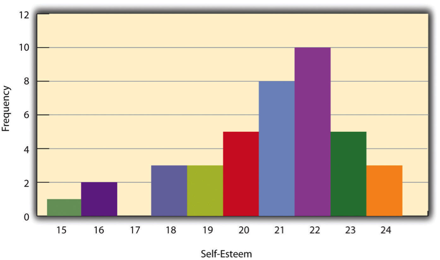
One way to display the distribution of a variable is in a frequency table . Table 14.2, for example, is a frequency table showing a hypothetical distribution of scores on the Rosenberg Self-Esteem Scale for a sample of 40 college students. The first column lists the values of the variable—the possible scores on the Rosenberg scale—and the second column lists the frequency of each score. This table shows that there were three students who had self-esteem scores of 24, five who had self-esteem scores of 23, and so on. From a frequency table like this, one can quickly see several important aspects of a distribution, including the range of scores (from 15 to 24), the most and least common scores (22 and 17, respectively), and any extreme scores that stand out from the rest.
There are a few other points worth noting about frequency tables. First, the levels listed in the first column usually go from the highest at the top to the lowest at the bottom, and they usually do not extend beyond the highest and lowest scores in the data. For example, although scores on the Rosenberg scale can vary from a high of 30 to a low of 0, Table 14.8 only includes levels from 24 to 15 because that range includes all the scores in this particular data set. Second, when there are many different scores across a wide range of values, it is often better to create a grouped frequency table, in which the first column lists ranges of values and the second column lists the frequency of scores in each range. Table 14.9, for example, is a grouped frequency table showing a hypothetical distribution of simple reaction times for a sample of 20 participants. In a grouped frequency table, the ranges must all be of equal width, and there are usually between five and 15 of them. Finally, frequency tables can also be used for nominal or ordinal variables, in which case the levels are category labels. The order of the category labels is somewhat arbitrary, but they are often listed from the most frequent at the top to the least frequent at the bottom.
A histogram is a graphical display of a distribution. It presents the same information as a frequency table but in a way that is grasped more quickly and easily. The histogram in Figure 14.2 presents the distribution of self-esteem scores in Table 14.8. The x- axis (the horizontal one) of the histogram represents the variable and the y- axis (the vertical one) represents frequency. Above each level of the variable on the x- axis is a vertical bar that represents the number of individuals with that score. When the variable is quantitative, as it is in this example, there is usually no gap between the bars. When the variable is nominal or ordinal, however, there is usually a small gap between them. (The gap at 17 in this histogram reflects the fact that there were no scores of 17 in this data set.)
Distribution shapes
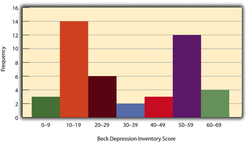
When the distribution of a quantitative variable is displayed in a histogram, it has a shape. The shape of the distribution of self-esteem scores in Figure 14.2 is typical. There is a peak somewhere near the middle of the distribution and “tails” that taper in either direction from the peak. The distribution of Figure 14.2 is unimodal , meaning it has one distinct peak, but distributions can also be bimodal , as in Figure 14.3, meaning they have two distinct peaks. Figure 14.3, for example, shows a hypothetical bimodal distribution of scores on the Beck Depression Inventory. I know we talked about the mode mostly for nominal or ordinal variables, but you can actually use histograms to look at the distribution of interval/ratio variables, too, and still have a unimodal or bimodal distribution even if you aren’t calculating a mode. Distributions can also have more than two distinct peaks, but these are relatively rare in social work research.
Another characteristic of the shape of a distribution is whether it is symmetrical or skewed. The distribution in the center of Figure 14.4 is symmetrical . Its left and right halves are mirror images of each other. The distribution on the left is negatively skewed , with its peak shifted toward the upper end of its range and a relatively long negative tail. The distribution on the right is positively skewed, with its peak toward the lower end of its range and a relatively long positive tail.

Range: A simple measure of variability
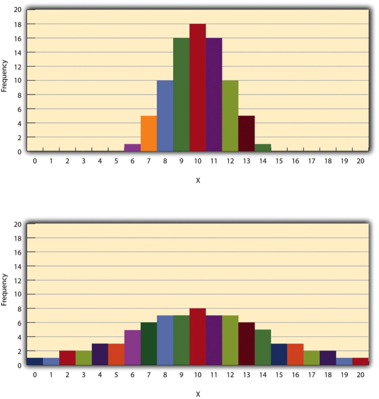
The variability of a distribution is the extent to which the scores vary around their central tendency. Consider the two distributions in Figure 14.5, both of which have the same central tendency. The mean, median, and mode of each distribution are 10. Notice, however, that the two distributions differ in terms of their variability. The top one has relatively low variability, with all the scores relatively close to the center. The bottom one has relatively high variability, with the scores are spread across a much greater range.
One simple measure of variability is the range , which is simply the difference between the highest and lowest scores in the distribution. The range of the self-esteem scores in Table 12.1, for example, is the difference between the highest score (24) and the lowest score (15). That is, the range is 24 − 15 = 9. Although the range is easy to compute and understand, it can be misleading when there are outliers. Imagine, for example, an exam on which all the students scored between 90 and 100. It has a range of 10. But if there was a single student who scored 20, the range would increase to 80—giving the impression that the scores were quite variable when in fact only one student differed substantially from the rest.
- Descriptive statistics are a way to summarize and display data, and are essential to understand and report your data.
- A frequency table is useful for nominal and ordinal variables and is needed to produce a histogram
- A histogram is a graphic representation of your data that shows how many cases fall into each level of your variable.
- Variability is important to understand in analyzing your data because studying a phenomenon that does not vary for your population does not provide a lot of information.
- Think about the dependent variable in your project. What would you do if you analyzed its variability for people of different genders, and there was very little variability?
- What do you think it would mean if the distribution of the variable were bimodal?
Univariate data analysis is a quantitative method in which a variable is examined individually to determine its distribution.
the way the scores are distributed across the levels of that variable.
The possible values of the variable - like a participant's age, income or gender.
Referring to data analysis that doesn't examine how variables relate to each other.
An ordered outline that includes your research question, a description of the data you are going to use to answer it, and the exact analyses, step-by-step, that you plan to run to answer your research question.
The process of determining how to measure a construct that cannot be directly observed
A group of statistical techniques that examines the relationship between at least three variables
The name of your variable.
The rows in your data set. In social work, these are often your study participants (people), but can be anything from census tracts to black bears to trains.
Data someone else has collected that you have permission to use in your research.
This is the document where you list your variable names, what the variables actually measure or represent, what each of the values of the variable mean if the meaning isn't obvious.
One number that can give you an idea about the distribution of your data.
Also called the average, the mean is calculated by adding all your cases and dividing the total by the number of cases.
Extreme values in your data.
A graphical representation of data where the y-axis (the vertical one along the side) is your variable's value and the x-axis (the horizontal one along the bottom) represents the individual instance in your data.
The value in the middle when all our values are placed in numerical order. Also called the 50th percentile.
The most commonly occurring value of a variable.
A technique for summarizing and presenting data.
A table that lays out how many cases fall into each level of a varible.
a graphical display of a distribution.
A distribution with one distinct peak when represented on a histogram.
A distribution with two distinct peaks when represented on a histogram.
A distribution with a roughly equal number of cases on either side of the median.
A distribution where cases are clustered on one or the other side of the median.
The extent to which the levels of a variable vary around their central tendency (the mean, median, or mode).
The difference between the highest and lowest scores in the distribution.
Graduate research methods in social work Copyright © 2020 by Matthew DeCarlo, Cory Cummings, Kate Agnelli is licensed under a Creative Commons Attribution-NonCommercial-ShareAlike 4.0 International License , except where otherwise noted.
Share This Book
User Preferences
Content preview.
Arcu felis bibendum ut tristique et egestas quis:
- Ut enim ad minim veniam, quis nostrud exercitation ullamco laboris
- Duis aute irure dolor in reprehenderit in voluptate
- Excepteur sint occaecat cupidatat non proident
Keyboard Shortcuts
8.1 - the univariate approach: analysis of variance (anova).
In the univariate case, the data can often be arranged in a table as shown in the table below:
The columns correspond to the responses to g different treatments or from g different populations. And, the rows correspond to the subjects in each of these treatments or populations.
- \(Y_{ij}\) = Observation from subject j in group i
- \(n_{i}\) = Number of subjects in group i
- \(N = n_{1} + n_{2} + \dots + n_{g}\) = Total sample size.
Assumptions for the Analysis of Variance are the same as for a two-sample t -test except that there are more than two groups:
- The data from group i has common mean = \(\mu_{i}\); i.e., \(E\left(Y_{ij}\right) = \mu_{i}\) . This means that there are no sub-populations with different means.
- Homoskedasticity : The data from all groups have common variance \(\sigma^2\); i.e., \(var(Y_{ij}) = \sigma^{2}\). That is, the variability in the data does not depend on group membership.
- Independence: The subjects are independently sampled.
- Normality : The data are normally distributed.
The hypothesis of interest is that all of the means are equal. Mathematically we write this as:
\(H_0\colon \mu_1 = \mu_2 = \dots = \mu_g\)
The alternative is expressed as:
\(H_a\colon \mu_i \ne \mu_j \) for at least one \(i \ne j\).
i.e., there is a difference between at least one pair of group population means. The following notation should be considered:
This involves taking an average of all the observations for j = 1 to \(n_{i}\) belonging to the i th group. The dot in the second subscript means that the average involves summing over the second subscript of y .
This involves taking the average of all the observations within each group and over the groups and dividing by the total sample size. The double dots indicate that we are summing over both subscripts of y .
- \(\bar{y}_{i.} = \frac{1}{n_i}\sum_{j=1}^{n_i}Y_{ij}\) = Sample mean for group i .
- \(\bar{y}_{..} = \frac{1}{N}\sum_{i=1}^{g}\sum_{j=1}^{n_i}Y_{ij}\) = Grand mean.
Here we are looking at the average squared difference between each observation and the grand mean. Note that if the observations tend to be far away from the Grand Mean then this will take a large value. Conversely, if all of the observations tend to be close to the Grand mean, this will take a small value. Thus, the total sum of squares measures the variation of the data about the Grand mean.
An Analysis of Variance (ANOVA) is a partitioning of the total sum of squares. In the second line of the expression below, we are adding and subtracting the sample mean for the i th group. In the third line, we can divide this out into two terms, the first term involves the differences between the observations and the group means, \(\bar{y}_i\), while the second term involves the differences between the group means and the grand mean.
\(\begin{array}{lll} SS_{total} & = & \sum_{i=1}^{g}\sum_{j=1}^{n_i}\left(Y_{ij}-\bar{y}_{..}\right)^2 \\ & = & \sum_{i=1}^{g}\sum_{j=1}^{n_i}\left((Y_{ij}-\bar{y}_{i.})+(\bar{y}_{i.}-\bar{y}_{..})\right)^2 \\ & = &\underset{SS_{error}}{\underbrace{\sum_{i=1}^{g}\sum_{j=1}^{n_i}(Y_{ij}-\bar{y}_{i.})^2}}+\underset{SS_{treat}}{\underbrace{\sum_{i=1}^{g}n_i(\bar{y}_{i.}-\bar{y}_{..})^2}} \end{array}\)
The first term is called the error sum of squares and measures the variation in the data about their group means.
Note that if the observations tend to be close to their group means, then this value will tend to be small. On the other hand, if the observations tend to be far away from their group means, then the value will be larger. The second term is called the treatment sum of squares and involves the differences between the group means and the Grand mean. Here, if group means are close to the Grand mean, then this value will be small. While, if the group means tend to be far away from the Grand mean, this will take a large value. This second term is called the Treatment Sum of Squares and measures the variation of the group means about the Grand mean.
The Analysis of Variance results is summarized in an analysis of variance table below:
Hover over the light bulb to get more information on that item.
The ANOVA table contains columns for Source, Degrees of Freedom, Sum of Squares, Mean Square and F . Sources include Treatment and Error which together add up to the Total.
The degrees of freedom for treatment in the first row of the table are calculated by taking the number of groups or treatments minus 1. The total degree of freedom is the total sample size minus 1. The Error degrees of freedom are obtained by subtracting the treatment degrees of freedom from the total degrees of freedom to obtain N - g .
The formulae for the Sum of Squares are given in the SS column. The Mean Square terms are obtained by taking the Sums of Squares terms and dividing them by the corresponding degrees of freedom.
The final column contains the F statistic which is obtained by taking the MS for treatment and dividing it by the MS for Error.
Under the null hypothesis that the treatment effect is equal across group means, that is \(H_{0} \colon \mu_{1} = \mu_{2} = \dots = \mu_{g} \), this F statistic is F -distributed with g - 1 and N - g degrees of freedom:
\(F \sim F_{g-1, N-g}\)
The numerator degrees of freedom g - 1 comes from the degrees of freedom for treatments in the ANOVA table. This is referred to as the numerator degrees of freedom since the formula for the F -statistic involves the Mean Square for Treatment in the numerator. The denominator degrees of freedom N - g is equal to the degrees of freedom for error in the ANOVA table. This is referred to as the denominator degrees of freedom because the formula for the F -statistic involves the Mean Square Error in the denominator.
We reject \(H_{0}\) at level \(\alpha\) if the F statistic is greater than the critical value of the F -table, with g - 1 and N - g degrees of freedom, and evaluated at level \(\alpha\).
\(F > F_{g-1, N-g, \alpha}\)
- How It Works
Univariate Analysis of Variance in SPSS
Discover Univariate Analysis of Variance in SPSS ! Learn how to perform, understand SPSS output , and report results in APA style. Check out this simple, easy-to-follow guide below for a quick read!
Struggling with the ANOVA Test in SPSS? We’re here to help . We offer comprehensive assistance to students , covering assignments , dissertations , research, and more. Request Quote Now !
Introduction
Welcome to our exploration of the U nivariate Analysis of Variance Analysis , a statistical method that unlocks valuable insights when comparing means across multiple groups. Whether you’re a student engaged in a research project or a seasoned researcher investigating diverse populations, the One-Way ANOVA Test proves indispensable in discerning if there are significant differences among group means. In this blog post, we’ll traverse the fundamentals of the Univariate Analysis , from its definition to the practical application using SPSS . By the end, you’ll possess not only a solid theoretical understanding but also the practical skills to conduct and interpret this powerful statistical analysis.
What is the Univariate Analysis?
ANOVA stands for Analysis of Variance, and the “ One-Way ” denotes a scenario where there is a single independent variable with more than two levels or groups . Essentially, this test assesses whether the means of these groups are significantly different from each other. It’s a robust method for scenarios like comparing the performance of students in multiple teaching methods or examining the impact of different treatments on a medical condition. The One-Way ANOVA Test yields valuable insights into group variations, providing researchers with a statistical lens to discern patterns and make informed decisions. Now, let’s delve deeper into the assumptions, hypotheses, and the step-by-step process of conducting the One-Way ANOVA Test in SPSS .
Assumption of the One-Way ANOVA Test
Before delving into the intricacies of the One-Way ANOVA Test, let’s outline its critical assumptions:
- Normality : The dependent variable should be approximately normally distributed within each group.
- Homogeneity of Variances : The variances of the groups being compared should be approximately equal. This assumption is crucial for the validity of the test.
- Independence : Observations within each group must be independent of each other.
Adhering to these assumptions ensures the reliability of the One-Way ANOVA Test results, providing a strong foundation for accurate statistical analysis.
Hypothesis of the Univariate Analysis of Variance (ANOVA) Test
Moving on to the formulation of hypotheses in the One-Way ANOVA Test,
- The null hypothesis ( H 0): There is no significant difference in the means of the groups.
- The alternative hypothesis ( H 1): there is a significant difference in the means of the groups.
Clear and specific hypotheses are crucial for the subsequent statistical analysis and interpretation.
Post-Hoc Tests for ANOVA
While the One-Way ANOVA is powerful in detecting overall group differences, it doesn’t provide specific information on which pairs of groups differ significantly. Post-hoc tests become essential in this context to conduct pairwise comparisons and identify the specific groups responsible for the observed overall difference. Without post-hoc tests, researchers might miss crucial nuances in the data, leading to incomplete or inaccurate interpretations.
Here are commonly used Post-hoc Tests for One-Way ANOVA:
- Tukey’s Honestly Significant Difference (HSD): Ideal when there are equal sample sizes and variances across groups. It controls the familywise error rate, making it suitable for multiple comparisons.
- Bonferroni Correction : Helpful when conducting numerous comparisons. It’s more conservative, adjusting the significance level to counteract the increased risk of Type I errors.
- Scheffe Test : Useful for unequal sample sizes and variances. It’s more robust but might be conservative in some situations.
- Dunnett’s Test : Designed for comparing each treatment group with a control group. It’s suitable for situations where there is a control group and multiple treatment groups.
- Games-Howell Test: Useful when sample sizes and variances are unequal across groups. It’s a robust option for situations where assumptions of homogeneity are not met.
Choosing the appropriate post-hoc test depends on the characteristics of your data and the specific research context. Consider factors such as sample sizes, homogeneity of variances, and the number of planned comparisons when deciding on the most suitable post-hoc test for your One-Way ANOVA results.
Example of Univariate Analysis of Variance Analysis
To illustrate the practical application of the One-Way ANOVA Test, let’s consider a hypothetical scenario. Imagine you’re studying the effectiveness of different fertilizers on the growth of plants. You have three groups, each treated with a different fertilizer.
- The null hypothesis: there’s no significant difference in the mean plant growth across the three fertilizers.
- The alternative hypothesis: there is a significant difference in the mean plant growth across the three fertilizers.
By conducting the One-Way ANOVA Test, you can statistically evaluate whether the observed differences in plant growth are likely due to the different fertilizers’ effectiveness or if they could occur by random chance alone. This example demonstrates how the One-Way ANOVA Test can be a valuable tool in diverse fields, providing insights into the impact of various factors on the dependent variable.
How to Perform Univariate Analysis of Variance in SPSS
Step by Step: Running ANOVA Test in SPSS Statistics
Let’s delve into the step-by-step process of conducting the univariate analysis using SPSS. Here’s a step-by-step guide on how to perform Univariate Analysis of Variance in SPSS :
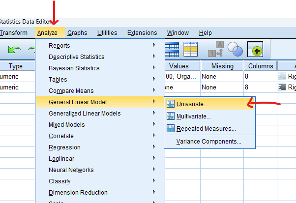
- STEP: Load Data into SPSS
Commence by launching SPSS and loading your dataset, which should encompass the variables of interest – a categorical independent variable. If your data is not already in SPSS format, you can import it by navigating to File > Open > Data and selecting your data file.
- STEP: Access the Analyze Menu
In the top menu, locate and click on “ Analyze .” Within the “Analyze” menu, navigate to “ General Linear Model ” and choose ” Univariate .” Analyze > General Linear Model> Univariate
- STEP: Specify Variables
In the dialogue box, move the dependent variable to the “ Dependent Variable ” field. Move the variable representing the group or factor to the “ Fixed Factor (s) ” field. This is the independent variable with different levels or groups.
- STEP: Plots Post-Hoc Test
Click on the “ Plot ” button, Move to Facto into the Horizontal Axis, and then click the “ Add ” button.
Go on the “ Post Hoc ” button, Check “ Tukey ” and Adjust as per your analysis requirements.
- STEP: Options
Snap on the “ Options ” button Check “ Descriptive ”, “ Homogeneity Test ” and “ Estimates of effect size ”
- STEP: Generate SPSS Output
Once you have specified your variables and chosen options, click the “ OK ” button to perform the analysis. SPSS will generate a comprehensive output, including the requested frequency table and chart for your dataset.
Conducting a One-Way ANOVA test in SPSS provides a robust foundation for understanding the key features of your data. Always ensure that you consult the documentation corresponding to your SPSS version, as steps might slightly differ based on the software version in use. This guide is tailored for SPSS version 25 , and for any variations, it’s recommended to refer to the software’s documentation for accurate and updated instructions.
SPSS Output for One Way ANOVA
How to Interpret SPSS Output of Univariate Analysis
SPSS will generate output, including descriptive statistics, the f value, degrees of freedom, and the p-value and post-hoc
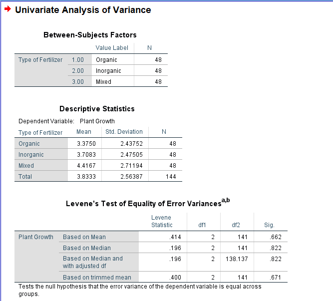
Descriptives Table
- Mean and Standard Deviation : Evaluate the means and standard deviations of each group. This provides an initial overview of the central tendency and variability within each group.
- Sample Size (N): Confirm the number of observations in each group. Discrepancies in sample sizes could impact the interpretation.
- 95% Confidence Interval (CI): Review the confidence interval for the mean difference.
Test of Homogeneity of Variances Table
- Levene’s Test: In the Test of Homogeneity of Variances table, look at Levene’s Test statistic and associated p-value. This test assesses whether the variances across groups are roughly equal. A non-significant p-value suggests that the assumption of homogeneity of variances is met.
ANOVA Table
- Between-Groups and Within-Groups Variability: Move on to the ANOVA table, which displays the Between-Groups and Within-Groups sums of squares, degrees of freedom, mean squares, the F-ratio, and the p-value.
- F-Ratio : Focus on the F-ratio. A higher F-ratio indicates larger differences among group means relative to within-group variability.
- Degrees of Freedom : Note the degrees of freedom for Between-Groups and Within-Groups. These values are essential for calculating the critical F-value.
- P-Value: Examine the p-value associated with the F-ratio. If the p-value is below your chosen significance level (commonly 0.05), it suggests that at least one group’s mean is significantly different.
Post Hoc Tests Table
- Specific Group Differences: If you conducted post-hoc tests, examine the results. Look for significant differences between specific pairs of groups. Pay attention to p-values and confidence intervals to identify which groups are significantly different from each other.
Effect Size Measures
- Eta-squared : If available, consider effect size measures in the ANOVA table. Eta-squared indicates the proportion of variance in the dependent variable explained by the group differences.
How to Report Results of One-Way ANOVA Test in APA
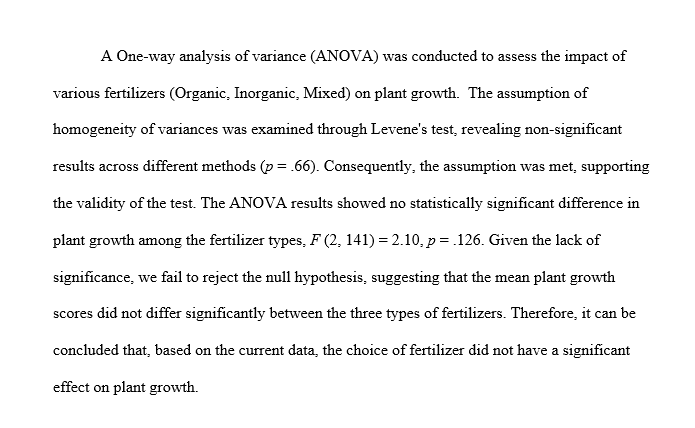
Reporting the results of a One-Way ANOVA Test in APA style ensures clarity and adherence to established guidelines. Begin with a concise description of the analysis conducted, including the test name, the dependent variable, and the independent variable representing the groups.
For instance, “A One-Way Analysis of Variance (ANOVA) was conducted to examine the differences in plant growth across different fertilizers.”
Present the key statistical findings from the ANOVA table, including the F-ratio, degrees of freedom, and p-value. For example, “The results revealed a significant difference in plant growth among the fertilizers, F(df_between, df_within) = [F-ratio], p = [p-value].”
If the p-value is significant, proceed with post-hoc tests (e.g., Tukey’s HSD) to pinpoint specific group differences. Additionally, report effect size measures to provide a comprehensive overview of the results.
Conclude the report by summarising the implications of the findings in relation to your research question or hypothesis. This structured approach to reporting One-Way ANOVA results in APA format ensures transparency and facilitates the understanding of your research outcomes.
Get Help For Your SPSS Analysis
Embark on a seamless research journey with SPSSAnalysis.com , where our dedicated team provides expert data analysis assistance for students, academicians, and individuals. We ensure your research is elevated with precision. Explore our pages;
- SPSS Data Analysis Help – SPSS Helper ,
- Quantitative Analysis Help ,
- Qualitative Analysis Help ,
- SPSS Dissertation Analysis Help ,
- Dissertation Statistics Help ,
- Statistical Analysis Help ,
- Medical Data Analysis Help .
Connect with us at SPSSAnalysis.com to empower your research endeavors and achieve impactful results. Get a Free Quote Today !
Expert SPSS data analysis assistance available.
Struggling with Statistical Analysis in SPSS? - Hire a SPSS Helper Now!
Want to create or adapt books like this? Learn more about how Pressbooks supports open publishing practices.
Quantitative Data Analysis With SPSS
11 Quantitative Analysis with SPSS: Univariate Analysis
Mikaila Mariel Lemonik Arthur
The first step in any quantitative analysis project is univariate analysis, also known as descriptive statistics . Producing these measures is an important part of understanding the data as well as important for preparing for subsequent bivariate and multivariate analysis. This chapter will detail how to produce frequency distributions (also called frequency tables), measures of central tendency , measures of dispersion , and graphs in SPSS. The chapter on Univariate Analysis provides details on understanding and interpreting these measures. To select the correct measures for your variables, first determine the level of measurement of each variable for which you want to produce appropriate descriptive statistics. The distinction between binary and other nominal variables is important here, so you need to determine whether each variable is binary, nominal, ordinal , or continuous . Then, use Table 1 to determine which descriptive statistics you should produce.
Producing Descriptive Statistics
Other than graphs, all of the univariate analyses discussed in this chapter are produced by going to Analyze → Descriptive Statistics → Frequencies, as shown in Figure 1. Note that SPSS also offers a tool called Descriptives; avoid this unless you are specifically seeking to produce Z scores , a topic beyond the scope of this text, as the Descriptives tool provides far fewer options than the Frequencies tool.

Selecting this tool brings up a window called “Frequencies” from which the various descriptive statistics can be selected, as shown in Figure 2. In this window, users select which variables to perform univariate analysis upon. Note that while univariate analyses can be performed upon multiple variables as a group, those variables need to all have the same level of measurement as only one set of options can be selected at a time.
To use the Frequencies tool, scroll through the list of variables on the left side of the screen, or click in the list and begin typing the variable name if you remember it and the list will jump to it. Use the blue arrow to move the variable into the Variables box or grab and drag it over. If you are performing analysis on a binary, nominal, or ordinal variable, be sure the checkbox next to “Display frequency tables” is checked; if you are performing analysis on a continuous variable, leave that box unchecked. The checkbox for “Create APA style tables” slightly alters the format and display of tables. If you are working in the field of psychology specifically, you should select this checkbox, otherwise it is not needed. The options under “Format” specify elements about the display of the tables; in most cases those should be left as the default. The options under “Style” and “Bootstrap” are beyond the scope of this text.

It is under “Statistics” that the specific descriptive statistics to be produced are selected, as shown in Figure 3. First, users can select several different options for producing percentiles, which are usually produced only for continuous variables but occasionally are used for ordinal variables. Quartiles produces the 25th, 50th (median), and 75th percentile in the data. Cut points allows the user to select a specified number of equal groups and see at which values the groups break. Percentiles allows the user to specify specific percentiles to produce—for instance, a user might want to specify 33 and 66 to see where the upper, middle, and lower third of data fall.
Second, users can select measures of central tendency, specifically the mean (used for binary and continuous variables), the median (used for ordinal and continuous variables), and the mode (used for binary, nominal, and ordinal variables). Sum adds up all the values of the variable, and is not typically used. There is also an option to select if values are group midpoints, which is beyond the scope of this text.
Next, users can select measures of dispersion and distribution, including the standard deviation (abbreviated here Std. deviation, and used for continuous variables), the variance (used for continuous variables), the range (used for ordinal and continuous variables), the minimum value (used for ordinal and continuous variables), the maximum value (used for ordinal and continuous variables), and the standard error of the mean (abbreviated here as S.E. mean, this is a measure of sampling error and beyond the scope of this text), as well as skewness and kurtosis (used for continuous variables).

Once all desired tests are selected, click “Continue” to go back to the main frequencies dialog. There, you can also select the Chart button to produce graphs (as shown in Figure 4), though only one graph can be produced at a time (other options for producing graphs will be discussed later in this chapter). Bar charts are appropriate for binary, nominal, and ordinal variables. Pie charts are typically used only for binary variables and nominal variables with just a few categories, though they may at times make sense for ordinal variables with just a few categories. Histograms are used for continuous variables; there is an option to show the normal curve on the histogram, which can help users visualize the distribution more clearly. Users can also choose whether their graphs will be displayed in terms of frequencies (the raw count of values) or percentages.
Examples at Each Level of Measurement
Here, we will produce appropriate descriptive statistics for one variable from the 2021 GSS file at each level of measurement, showing what it looks like to produce them, what the resulting output looks like, and how to interpret that output.
A Binary Variable
To produce descriptive statistics for a binary variable, be sure to leave Display frequency tables checked. Under statistics, select Mean and Mode and then click continue, and under graphs select your choice of bar graph or pie chart and then click continue. Using the variable GUNLAW, then, the selected option would look as shown in Figure 5. Then click OK, and the results will appear in the Output window.

The output for GUNLAW will look approximately like what is shown in Figure 6. GUNLAW is a variable measuring whether the respondent favors or opposes requiring individuals to obtain police permits before buying a gun.

The output shows that 3,992 people gave a valid answer to this question, while responses for 40 people are missing. Of those who provided answers, the mode, or most frequent response, is 1. If we look at the value labels, we will find that 1 here means “favor;” in other words, the largest number of respondents favors requiring permits for gun owners. The mean is 1.33. In the case of a binary variable, what the mean tells us is the approximate proportion of people who have provided the higher-numbered value label—so in this case, about ⅓ of respondents said they are opposed to requiring permits.
The frequency table, then, shows the number and proportion of people who provided each answer. The most important column to pay attention to is Valid Percent. This column tells us what percentage of the people who answered the question gave each answer. So, in this case, we would say that 67.3% of respondents favor requiring permits for gun ownership, while 32.7% are opposed—and 1% are missing.
Finally, we have produced a pie chart, which provides the same information in a visual format. Users who like playing with their graphs can double-click on the graph and then right-click or cmd/ctrl click to change options such as displaying value labels or amounts or changing the color of the graph.
A Nominal Variable
To produce descriptive statistics for a nominal variable, be sure to leave Display frequency tables checked. Under statistics, select Mode and then click continue, and under graphs select your choice of bar graph or pie chart (avoid pie chart if your variable has many categories) and then click continue. Using the variable MOBILE16, then, the selected option would look as shown in Figure 7. Then click OK, and the results will appear in the Output window.

The output will then look approximately like the output shown in Figure 8. MOBILE16 is a variable measuring respondents’ degree of geographical mobility since age 16, asking them if they live in the same city they lived in at age 16; stayed in the same state they lived in at age 16 but now live in a different city; or live in a different state than they lived in at age 16.

The output shows that 3608 respondents answered this survey question, while 424 did not. The mode is 2; looking at the value labels, we conclude that 2 refers to “same state, different city,” or in other words that the largest group of respondents lives in the same state they lived in at age 16 but not in the same city they lived in at age 16. The frequency table shows us the percentage breakdown of respondents into the three categories. Valid percent is most useful here, as it tells us the percentage of respondents in each category after those who have not responded to the question are removed. In this case, 35.9% of people live in the same state but a different city, the largest category of respondents. Thirty-four percent live in a different state, while 30.1% live in the same city in which they lived at age 16. Below the frequency table is a bar graph which provides a visual for the information in the frequency table. As noted above, users can change options such as displaying value labels or amounts or changing the color of the graph.
An Ordinal Variable
To produce descriptive statistics for an ordinal variable, be sure to leave Display frequency tables checked. Under statistics, select Median, Mode, Range, Minimum, and Maximum, and then click continue, and under graphs select your choice of bar graph and then click continue. Then click OK, and the results will appear in the Output window. Using the variable CARSGEN, then, the selected option would look as shown in Figure 7.

The output will then look approximately like the output shown in Figure 10. CARSGEN is an ordinal variable measuring the degree to which respondents agree or disagree that car pollution is a danger to the environment.

First, we see that 1778 respondents answered this question, while 2254 did not (remember that the GSS has a lot of questions; some are asked of all respondents while others are only asked of a subset, so the fact that a lot of people did not answer may indicate that many were not asked rather than that there is a high degree of nonresponse). The median and mode are both 3. Looking at the value labels tells us that 3 represents “somewhat dangerous.” The range is 4, representing the maximum (5) minus the minimum (1)—in other words, there are five ordinal categories.
Looking at the valid percents, we can see that 13% of respondents consider car pollution extremely dangerous, 31.4% very dangerous, and 45.8%—the biggest category (and both the mode and median)—somewhat dangerous. In contrast only 8.5% think car pollution is not very dangerous and 1.2% think it is not dangerous at all. Thus, it is reasonable to conclude that the vast majority—over 90%—of respondents think that car pollution presents at least some degree of danger. The bar graph at the bottom of the output represents this information visually.
A Continuous Variable
To produce descriptive statistics for a continuous variable, be sure to uncheck Display frequency tables. Under statistics, go to percentile values and select Quartiles (or other percentile options appropriate to your project). Then select Mean, Median, Std. deviation, Variance, Range, Minimum, Maximum, Skewness, and Kurtosis and then click continue, and under graphs select Histograms and turn on Show normal curve on histogram and then click continue. Using the variable EATMEAT, then, the selected option would look as shown in Figure 11. Then click OK, and the results will appear in the Output window.

The output will then look approximately like the output shown in Figure 12. EATMEAT is a continuous variable measuring the number of days per week that the respondent eats beef, lamb, or products containing beef or lamb.

Because this variable is continuous, we have not produced frequency tables, and therefore we jump right into the statistics. 1795 respondents answered this question. On average, they eat beef or lamb 2.77 days per week (that is what the mean tells us). The median respondent eats beef or lamb three days per week. The standard deviation of 1.959 tells us that about 68% of respondents will be found within ±1.959 of the mean of 2.77, or between 0.811 days and 4.729 days. The skewness of 0.541 tells us that the data is mildly skewed to the right, with a longer tail at the higher end of the distribution. The kurtosis of -0.462 tells us that the data is mildly platykurtic, or has little data in the outlying tails. (Note that we have ignored several statistics in the table, which are used to compute or further interpret the figures we are discussing and which are otherwise beyond the scope of this text). The range is 7, with a minimum of 0 and a maximum of 7—sensible, given that this variable is measuring the number of days of the week that something happens. The 25th percentile is at 1, the 50th at 3 (this is the same as the median) and the 75th at 4. This tells us that one quarter of respondents eat beef or lamb one day a week or fewer; a quarter eat it between one and three days a week; a quarter eat it between three and four days a week; and a quarter eat it more than four days per week. The histogram shows the shape of the distribution; note that while the distribution is otherwise fairly normally distributed, more respondents eat beef or lamb seven days a week than eat it six days a week.
There are several other ways to produce graphs in SPSS. The simplest is to go to Graphs → Legacy Dialogs, where a variety of specific graph types can be selected and produced, including both univariate and bivariate charts. The Legacy Dialogs menu, as shown in Figure 13, permits users to choose bar graphs, 3-D bar graphs, line graphs, area charts, pie charts, high-low plots, boxplots, error bars, population pyramids, scatterplots/dot graphs, and histograms. Users are then presented with a series of options for what data to include in their chart and how to format the chart.

Here, we will review how to produce univariate bar graphs, pie charts, and histograms using the legacy dialogs. Other graphs important to the topics discussed in this text will be reviewed in other chapters.
To produce a bar graph, go to Graphs → Legacy Dialogs → Bar. For a univariate graph, then select Simple, and click Define. Then, select the relevant binary, nominal, or ordinal variable and use the blue arrow (or drag and drop it) to place it in the “Category Axis” box. You can change the options under “Bars represent” to be the number of cases, the percent of cases, or other statistics, if you choose. Once you have set up your graph, click OK, and the graph will appear in the Output Viewer window. Figure 14 shows the dialog boxes for creating a bar graph, with the appropriate options selected, as well as a graph of the variable NEWS, which measures how often the respondent reads a newspaper.

To produce a pie chart, go to Graphs → Legacy Dialogs → Pie. In most cases, users will want to select the default option, “Summaries for groups of cases,” and click define. Then, select the relevant binary, nominal, or ordinal variable (remember not to use pie charts for variables with too many categories) and use the blue arrow (or drag and drop it) to place it in the “Define Slices By” box. You can change the options under “Slices represent” to be the number of cases or the percent of cases. Once you have set up your graph, click OK, and the graph will appear in the Output Viewer window. Figure 15 shows the dialog boxes for creating a pie chart, with the appropriate options selected, as well as a graph of the variable BORN, which measures whether or not the respondent was born in the United States.

To produce a histogram, go to Graphs → Legacy Dialogs → Histogram. Then, select the relevant continuous variable and use the blue arrow (or drag and drop it) to place it in the “Variable” box. Most users will want to check the “Display normal curve” box. Once you have set up your graph, click OK, and the graph will appear in the Output Viewer window. Figure 16 shows the dialog boxes for creating a histogram, with the appropriate options selected, as well as a graph of the variable AGE, which measures the respondent’s age at the time of the survey. Note that when histograms are produced, SPSS also provides the mean, standard deviation, and total number of cases along with the graph.

Other Ways of Producing Graphs
Other options include the Chart Builder and the Graphboard Template Chooser. In the Graphboard Template Chooser, users select one or more variables and SPSS indicates a selection of graphs that may be suitable for that combination of variables (note that SPSS simply provides options, it cannot determine if those options would in fact be appropriate for the analysis in question, so analysts must take care to evaluate the options and choose which one(s) are actually useful for a given analysis). Then, users are able to select from among a set of detailed options and provide titles for their graph. In chart builder, users first select from among a multitude of univariate and bivariate graph formats and drag and drop variables into the graph, then setting options and properties and changing colors as desired. While both of these tools provide more flexibility than the graphs accessed via Legacy Dialogs, advanced users designing visuals often move outside of the SPSS ecosystem and create graphs in software more directly suited to this purpose, such as Excel or Tableau.
To complete these exercises, load the 2021 GSS data prepared for this text into SPSS. For each of the following variables, answer the questions below.
- Any other variable of your choice
- What is the variable measuring? Use the GSS codebook to be sure you understand.
- At what level of measurement is the variable?
- What measures of central tendency, measures of dispersion, and graphs can you produce for this variable, given its level of measurement?
- Produce each of the measures and graphs you have listed and copy and paste the output into a document.
- Write a paragraph explaining the results of the descriptive statistics you’ve obtained. The goal is to put into words what you now know about the variable—interpreting what each statistic means, not just restating the statistic.
Media Attributions
- descriptives frequencies © IBM SPSS is licensed under a All Rights Reserved license
- frequencies window © IBM SPSS is licensed under a All Rights Reserved license
- frequencies-statistics © IBM SPSS is licensed under a All Rights Reserved license
- frequencies charts © IBM SPSS is licensed under a All Rights Reserved license
- binary descriptives © IBM SPSS is licensed under a All Rights Reserved license
- gunlaws output © IBM SPSS is licensed under a All Rights Reserved license
- nominal descriptives © IBM SPSS is licensed under a All Rights Reserved license
- mobile16 output © IBM SPSS is licensed under a All Rights Reserved license
- ordinal descriptives © IBM SPSS is licensed under a All Rights Reserved license
- carsgen output © IBM SPSS is licensed under a All Rights Reserved license
- continuous descriptives © IBM SPSS is licensed under a All Rights Reserved license
- eatmeat output © IBM SPSS is licensed under a All Rights Reserved license
- graphs legacy dialogs © IBM SPSS is licensed under a All Rights Reserved license
- bar graphs © IBM SPSS is licensed under a All Rights Reserved license
- pie charts © IBM SPSS is licensed under a All Rights Reserved license
- histogram © IBM SPSS is licensed under a All Rights Reserved license
Using one variable.
Statistics used to describe a sample.
An analysis that shows the number of cases that fall into each category of a variable.
A measure of the value most representative of an entire distribution of data.
Statistical tests that show the degree to which data is scattered or spread.
Classification of variables in terms of the precision or sensitivity in how they are recorded.
A characteristic that can vary from one subject or case to another or for one case over time within a particular research study.
Consisting of only two options. Also known as dichotomous.
A variable whose categories have names that do not imply any order.
A variable with categories that can be ordered in a sensible way.
A variable measured using numbers, not categories, including both interval and ratio variables. Also called a scale variable.
A way of standardizing data based on how many standard deviations away each value is from the mean.
The sum of all the values in a list divided by the number of such values.
The middle value when all values in a list are arranged in order.
The category in a list that occurs most frequently.
A measure of variation that takes into account every value’s distance from the sample mean.
A basic statistical measure of dispersion, the calculation of which is necessary for computing the standard deviation.
The highest category in a list minus the lowest category.
An asymmetry in a distribution in which a curve is distorted either to the left or the right, with positive values indicating right skewness and negative values indicating left skewness.
How sharp the peak of a frequency distribution is. If the peak is too pointed to be a normal curve, it is said to have positive kurtosis (or “leptokurtosis”). If the peak of a distribution is too flat to be normally distributed, it is said to have negative kurtosis (or platykurtosis).
Also called bar graphs, these graphs display data using bars of varying heights.
Circular graphs that show the proportion of the total that is in each category in the shape of a slice of pie.
A graph that looks like a bar chart but with no spaces between the bars, it is designed to display the distribution of continuous data by creating rectangles to represent equally-sized groups of values.
A distribution of values that is symmetrical and bell-shaped.
Social Data Analysis Copyright © 2021 by Mikaila Mariel Lemonik Arthur is licensed under a Creative Commons Attribution-NonCommercial-ShareAlike 4.0 International License , except where otherwise noted.
- Skip to main content
- Skip to primary sidebar
- Skip to footer
- QuestionPro

- Solutions Industries Gaming Automotive Sports and events Education Government Travel & Hospitality Financial Services Healthcare Cannabis Technology Use Case NPS+ Communities Audience Contactless surveys Mobile LivePolls Member Experience GDPR Positive People Science 360 Feedback Surveys
- Resources Blog eBooks Survey Templates Case Studies Training Help center
Home Market Research
Data Analysis in Research: Types & Methods

Content Index
Why analyze data in research?
Types of data in research, finding patterns in the qualitative data, methods used for data analysis in qualitative research, preparing data for analysis, methods used for data analysis in quantitative research, considerations in research data analysis, what is data analysis in research.
Definition of research in data analysis: According to LeCompte and Schensul, research data analysis is a process used by researchers to reduce data to a story and interpret it to derive insights. The data analysis process helps reduce a large chunk of data into smaller fragments, which makes sense.
Three essential things occur during the data analysis process — the first is data organization . Summarization and categorization together contribute to becoming the second known method used for data reduction. It helps find patterns and themes in the data for easy identification and linking. The third and last way is data analysis – researchers do it in both top-down and bottom-up fashion.
LEARN ABOUT: Research Process Steps
On the other hand, Marshall and Rossman describe data analysis as a messy, ambiguous, and time-consuming but creative and fascinating process through which a mass of collected data is brought to order, structure and meaning.
We can say that “the data analysis and data interpretation is a process representing the application of deductive and inductive logic to the research and data analysis.”
Researchers rely heavily on data as they have a story to tell or research problems to solve. It starts with a question, and data is nothing but an answer to that question. But, what if there is no question to ask? Well! It is possible to explore data even without a problem – we call it ‘Data Mining’, which often reveals some interesting patterns within the data that are worth exploring.
Irrelevant to the type of data researchers explore, their mission and audiences’ vision guide them to find the patterns to shape the story they want to tell. One of the essential things expected from researchers while analyzing data is to stay open and remain unbiased toward unexpected patterns, expressions, and results. Remember, sometimes, data analysis tells the most unforeseen yet exciting stories that were not expected when initiating data analysis. Therefore, rely on the data you have at hand and enjoy the journey of exploratory research.
Create a Free Account
Every kind of data has a rare quality of describing things after assigning a specific value to it. For analysis, you need to organize these values, processed and presented in a given context, to make it useful. Data can be in different forms; here are the primary data types.
- Qualitative data: When the data presented has words and descriptions, then we call it qualitative data . Although you can observe this data, it is subjective and harder to analyze data in research, especially for comparison. Example: Quality data represents everything describing taste, experience, texture, or an opinion that is considered quality data. This type of data is usually collected through focus groups, personal qualitative interviews , qualitative observation or using open-ended questions in surveys.
- Quantitative data: Any data expressed in numbers of numerical figures are called quantitative data . This type of data can be distinguished into categories, grouped, measured, calculated, or ranked. Example: questions such as age, rank, cost, length, weight, scores, etc. everything comes under this type of data. You can present such data in graphical format, charts, or apply statistical analysis methods to this data. The (Outcomes Measurement Systems) OMS questionnaires in surveys are a significant source of collecting numeric data.
- Categorical data: It is data presented in groups. However, an item included in the categorical data cannot belong to more than one group. Example: A person responding to a survey by telling his living style, marital status, smoking habit, or drinking habit comes under the categorical data. A chi-square test is a standard method used to analyze this data.
Learn More : Examples of Qualitative Data in Education
Data analysis in qualitative research
Data analysis and qualitative data research work a little differently from the numerical data as the quality data is made up of words, descriptions, images, objects, and sometimes symbols. Getting insight from such complicated information is a complicated process. Hence it is typically used for exploratory research and data analysis .
Although there are several ways to find patterns in the textual information, a word-based method is the most relied and widely used global technique for research and data analysis. Notably, the data analysis process in qualitative research is manual. Here the researchers usually read the available data and find repetitive or commonly used words.
For example, while studying data collected from African countries to understand the most pressing issues people face, researchers might find “food” and “hunger” are the most commonly used words and will highlight them for further analysis.
LEARN ABOUT: Level of Analysis
The keyword context is another widely used word-based technique. In this method, the researcher tries to understand the concept by analyzing the context in which the participants use a particular keyword.
For example , researchers conducting research and data analysis for studying the concept of ‘diabetes’ amongst respondents might analyze the context of when and how the respondent has used or referred to the word ‘diabetes.’
The scrutiny-based technique is also one of the highly recommended text analysis methods used to identify a quality data pattern. Compare and contrast is the widely used method under this technique to differentiate how a specific text is similar or different from each other.
For example: To find out the “importance of resident doctor in a company,” the collected data is divided into people who think it is necessary to hire a resident doctor and those who think it is unnecessary. Compare and contrast is the best method that can be used to analyze the polls having single-answer questions types .
Metaphors can be used to reduce the data pile and find patterns in it so that it becomes easier to connect data with theory.
Variable Partitioning is another technique used to split variables so that researchers can find more coherent descriptions and explanations from the enormous data.
LEARN ABOUT: Qualitative Research Questions and Questionnaires
There are several techniques to analyze the data in qualitative research, but here are some commonly used methods,
- Content Analysis: It is widely accepted and the most frequently employed technique for data analysis in research methodology. It can be used to analyze the documented information from text, images, and sometimes from the physical items. It depends on the research questions to predict when and where to use this method.
- Narrative Analysis: This method is used to analyze content gathered from various sources such as personal interviews, field observation, and surveys . The majority of times, stories, or opinions shared by people are focused on finding answers to the research questions.
- Discourse Analysis: Similar to narrative analysis, discourse analysis is used to analyze the interactions with people. Nevertheless, this particular method considers the social context under which or within which the communication between the researcher and respondent takes place. In addition to that, discourse analysis also focuses on the lifestyle and day-to-day environment while deriving any conclusion.
- Grounded Theory: When you want to explain why a particular phenomenon happened, then using grounded theory for analyzing quality data is the best resort. Grounded theory is applied to study data about the host of similar cases occurring in different settings. When researchers are using this method, they might alter explanations or produce new ones until they arrive at some conclusion.
LEARN ABOUT: 12 Best Tools for Researchers
Data analysis in quantitative research
The first stage in research and data analysis is to make it for the analysis so that the nominal data can be converted into something meaningful. Data preparation consists of the below phases.
Phase I: Data Validation
Data validation is done to understand if the collected data sample is per the pre-set standards, or it is a biased data sample again divided into four different stages
- Fraud: To ensure an actual human being records each response to the survey or the questionnaire
- Screening: To make sure each participant or respondent is selected or chosen in compliance with the research criteria
- Procedure: To ensure ethical standards were maintained while collecting the data sample
- Completeness: To ensure that the respondent has answered all the questions in an online survey. Else, the interviewer had asked all the questions devised in the questionnaire.
Phase II: Data Editing
More often, an extensive research data sample comes loaded with errors. Respondents sometimes fill in some fields incorrectly or sometimes skip them accidentally. Data editing is a process wherein the researchers have to confirm that the provided data is free of such errors. They need to conduct necessary checks and outlier checks to edit the raw edit and make it ready for analysis.
Phase III: Data Coding
Out of all three, this is the most critical phase of data preparation associated with grouping and assigning values to the survey responses . If a survey is completed with a 1000 sample size, the researcher will create an age bracket to distinguish the respondents based on their age. Thus, it becomes easier to analyze small data buckets rather than deal with the massive data pile.
LEARN ABOUT: Steps in Qualitative Research
After the data is prepared for analysis, researchers are open to using different research and data analysis methods to derive meaningful insights. For sure, statistical analysis plans are the most favored to analyze numerical data. In statistical analysis, distinguishing between categorical data and numerical data is essential, as categorical data involves distinct categories or labels, while numerical data consists of measurable quantities. The method is again classified into two groups. First, ‘Descriptive Statistics’ used to describe data. Second, ‘Inferential statistics’ that helps in comparing the data .
Descriptive statistics
This method is used to describe the basic features of versatile types of data in research. It presents the data in such a meaningful way that pattern in the data starts making sense. Nevertheless, the descriptive analysis does not go beyond making conclusions. The conclusions are again based on the hypothesis researchers have formulated so far. Here are a few major types of descriptive analysis methods.
Measures of Frequency
- Count, Percent, Frequency
- It is used to denote home often a particular event occurs.
- Researchers use it when they want to showcase how often a response is given.
Measures of Central Tendency
- Mean, Median, Mode
- The method is widely used to demonstrate distribution by various points.
- Researchers use this method when they want to showcase the most commonly or averagely indicated response.
Measures of Dispersion or Variation
- Range, Variance, Standard deviation
- Here the field equals high/low points.
- Variance standard deviation = difference between the observed score and mean
- It is used to identify the spread of scores by stating intervals.
- Researchers use this method to showcase data spread out. It helps them identify the depth until which the data is spread out that it directly affects the mean.
Measures of Position
- Percentile ranks, Quartile ranks
- It relies on standardized scores helping researchers to identify the relationship between different scores.
- It is often used when researchers want to compare scores with the average count.
For quantitative research use of descriptive analysis often give absolute numbers, but the in-depth analysis is never sufficient to demonstrate the rationale behind those numbers. Nevertheless, it is necessary to think of the best method for research and data analysis suiting your survey questionnaire and what story researchers want to tell. For example, the mean is the best way to demonstrate the students’ average scores in schools. It is better to rely on the descriptive statistics when the researchers intend to keep the research or outcome limited to the provided sample without generalizing it. For example, when you want to compare average voting done in two different cities, differential statistics are enough.
Descriptive analysis is also called a ‘univariate analysis’ since it is commonly used to analyze a single variable.
Inferential statistics
Inferential statistics are used to make predictions about a larger population after research and data analysis of the representing population’s collected sample. For example, you can ask some odd 100 audiences at a movie theater if they like the movie they are watching. Researchers then use inferential statistics on the collected sample to reason that about 80-90% of people like the movie.
Here are two significant areas of inferential statistics.
- Estimating parameters: It takes statistics from the sample research data and demonstrates something about the population parameter.
- Hypothesis test: I t’s about sampling research data to answer the survey research questions. For example, researchers might be interested to understand if the new shade of lipstick recently launched is good or not, or if the multivitamin capsules help children to perform better at games.
These are sophisticated analysis methods used to showcase the relationship between different variables instead of describing a single variable. It is often used when researchers want something beyond absolute numbers to understand the relationship between variables.
Here are some of the commonly used methods for data analysis in research.
- Correlation: When researchers are not conducting experimental research or quasi-experimental research wherein the researchers are interested to understand the relationship between two or more variables, they opt for correlational research methods.
- Cross-tabulation: Also called contingency tables, cross-tabulation is used to analyze the relationship between multiple variables. Suppose provided data has age and gender categories presented in rows and columns. A two-dimensional cross-tabulation helps for seamless data analysis and research by showing the number of males and females in each age category.
- Regression analysis: For understanding the strong relationship between two variables, researchers do not look beyond the primary and commonly used regression analysis method, which is also a type of predictive analysis used. In this method, you have an essential factor called the dependent variable. You also have multiple independent variables in regression analysis. You undertake efforts to find out the impact of independent variables on the dependent variable. The values of both independent and dependent variables are assumed as being ascertained in an error-free random manner.
- Frequency tables: The statistical procedure is used for testing the degree to which two or more vary or differ in an experiment. A considerable degree of variation means research findings were significant. In many contexts, ANOVA testing and variance analysis are similar.
- Analysis of variance: The statistical procedure is used for testing the degree to which two or more vary or differ in an experiment. A considerable degree of variation means research findings were significant. In many contexts, ANOVA testing and variance analysis are similar.
- Researchers must have the necessary research skills to analyze and manipulation the data , Getting trained to demonstrate a high standard of research practice. Ideally, researchers must possess more than a basic understanding of the rationale of selecting one statistical method over the other to obtain better data insights.
- Usually, research and data analytics projects differ by scientific discipline; therefore, getting statistical advice at the beginning of analysis helps design a survey questionnaire, select data collection methods , and choose samples.
LEARN ABOUT: Best Data Collection Tools
- The primary aim of data research and analysis is to derive ultimate insights that are unbiased. Any mistake in or keeping a biased mind to collect data, selecting an analysis method, or choosing audience sample il to draw a biased inference.
- Irrelevant to the sophistication used in research data and analysis is enough to rectify the poorly defined objective outcome measurements. It does not matter if the design is at fault or intentions are not clear, but lack of clarity might mislead readers, so avoid the practice.
- The motive behind data analysis in research is to present accurate and reliable data. As far as possible, avoid statistical errors, and find a way to deal with everyday challenges like outliers, missing data, data altering, data mining , or developing graphical representation.
LEARN MORE: Descriptive Research vs Correlational Research The sheer amount of data generated daily is frightening. Especially when data analysis has taken center stage. in 2018. In last year, the total data supply amounted to 2.8 trillion gigabytes. Hence, it is clear that the enterprises willing to survive in the hypercompetitive world must possess an excellent capability to analyze complex research data, derive actionable insights, and adapt to the new market needs.
LEARN ABOUT: Average Order Value
QuestionPro is an online survey platform that empowers organizations in data analysis and research and provides them a medium to collect data by creating appealing surveys.
MORE LIKE THIS

QuestionPro BI: From Research Data to Actionable Dashboards
Apr 22, 2024

21 Best Customer Advocacy Software for Customers in 2024
Apr 19, 2024

10 Quantitative Data Analysis Software for Every Data Scientist
Apr 18, 2024

11 Best Enterprise Feedback Management Software in 2024
Other categories.
- Academic Research
- Artificial Intelligence
- Assessments
- Brand Awareness
- Case Studies
- Communities
- Consumer Insights
- Customer effort score
- Customer Engagement
- Customer Experience
- Customer Loyalty
- Customer Research
- Customer Satisfaction
- Employee Benefits
- Employee Engagement
- Employee Retention
- Friday Five
- General Data Protection Regulation
- Insights Hub
- Life@QuestionPro
- Market Research
- Mobile diaries
- Mobile Surveys
- New Features
- Online Communities
- Question Types
- Questionnaire
- QuestionPro Products
- Release Notes
- Research Tools and Apps
- Revenue at Risk
- Survey Templates
- Training Tips
- Uncategorized
- Video Learning Series
- What’s Coming Up
- Workforce Intelligence
- En español – ExME
- Em português – EME
Multivariate analysis: an overview
Posted on 9th September 2021 by Vighnesh D

Data analysis is one of the most useful tools when one tries to understand the vast amount of information presented to them and synthesise evidence from it. There are usually multiple factors influencing a phenomenon.
Of these, some can be observed, documented and interpreted thoroughly while others cannot. For example, in order to estimate the burden of a disease in society there may be a lot of factors which can be readily recorded, and a whole lot of others which are unreliable and, therefore, require proper scrutiny. Factors like incidence, age distribution, sex distribution and financial loss owing to the disease can be accounted for more easily when compared to contact tracing, prevalence and institutional support for the same. Therefore, it is of paramount importance that the data which is collected and interpreted must be done thoroughly in order to avoid common pitfalls.

Image from: https://imgs.xkcd.com/comics/useful_geometry_formulas.png under Creative Commons License 2.5 Randall Munroe. xkcd.com.
Why does it sound so important?
Data collection and analysis is emphasised upon in academia because the very same findings determine the policy of a governing body and, therefore, the implications that follow it are the direct product of the information that is fed into the system.
Introduction
In this blog, we will discuss types of data analysis in general and multivariate analysis in particular. It aims to introduce the concept to investigators inclined towards this discipline by attempting to reduce the complexity around the subject.
Analysis of data based on the types of variables in consideration is broadly divided into three categories:
- Univariate analysis: The simplest of all data analysis models, univariate analysis considers only one variable in calculation. Thus, although it is quite simple in application, it has limited use in analysing big data. E.g. incidence of a disease.
- Bivariate analysis: As the name suggests, bivariate analysis takes two variables into consideration. It has a slightly expanded area of application but is nevertheless limited when it comes to large sets of data. E.g. incidence of a disease and the season of the year.
- Multivariate analysis: Multivariate analysis takes a whole host of variables into consideration. This makes it a complicated as well as essential tool. The greatest virtue of such a model is that it considers as many factors into consideration as possible. This results in tremendous reduction of bias and gives a result closest to reality. For example, kindly refer to the factors discussed in the “overview” section of this article.
Multivariate analysis is defined as:
The statistical study of data where multiple measurements are made on each experimental unit and where the relationships among multivariate measurements and their structure are important
Multivariate statistical methods incorporate several techniques depending on the situation and the question in focus. Some of these methods are listed below:
- Regression analysis: Used to determine the relationship between a dependent variable and one or more independent variable.
- Analysis of Variance (ANOVA) : Used to determine the relationship between collections of data by analyzing the difference in the means.
- Interdependent analysis: Used to determine the relationship between a set of variables among themselves.
- Discriminant analysis: Used to classify observations in two or more distinct set of categories.
- Classification and cluster analysis: Used to find similarity in a group of observations.
- Principal component analysis: Used to interpret data in its simplest form by introducing new uncorrelated variables.
- Factor analysis: Similar to principal component analysis, this too is used to crunch big data into small, interpretable forms.
- Canonical correlation analysis: Perhaps one of the most complex models among all of the above, canonical correlation attempts to interpret data by analysing relationships between cross-covariance matrices.
ANOVA remains one of the most widely used statistical models in academia. Of the several types of ANOVA models, there is one subtype that is frequently used because of the factors involved in the studies. Traditionally, it has found its application in behavioural research, i.e. Psychology, Psychiatry and allied disciplines. This model is called the Multivariate Analysis of Variance (MANOVA). It is widely described as the multivariate analogue of ANOVA, used in interpreting univariate data.

Image from: https://imgs.xkcd.com/comics/t_distribution.png under Creative Commons License 2.5 Randall Munroe. xkcd.com.
Interpretation of results
Interpretation of results is probably the most difficult part in the technique. The relevant results are generally summarized in a table with an associated text. Appropriate information must be highlighted regarding:
- Multivariate test statistics used
- Degrees of freedom
- Appropriate test statistics used
- Calculated p-value (p < x)
Reliability and validity of the test are the most important determining factors in such techniques.
Applications
Multivariate analysis is used in several disciplines. One of its most distinguishing features is that it can be used in parametric as well as non-parametric tests.
Quick question: What are parametric and non-parametric tests?
- Parametric tests: Tests which make certain assumptions regarding the distribution of data, i.e. within a fixed parameter.
- Non-parametric tests: Tests which do not make assumptions with respect to distribution. On the contrary, the distribution of data is assumed to be free of distribution.

Uses of Multivariate analysis: Multivariate analyses are used principally for four reasons, i.e. to see patterns of data, to make clear comparisons, to discard unwanted information and to study multiple factors at once. Applications of multivariate analysis are found in almost all the disciplines which make up the bulk of policy-making, e.g. economics, healthcare, pharmaceutical industries, applied sciences, sociology, and so on. Multivariate analysis has particularly enjoyed a traditional stronghold in the field of behavioural sciences like psychology, psychiatry and allied fields because of the complex nature of the discipline.
Multivariate analysis is one of the most useful methods to determine relationships and analyse patterns among large sets of data. It is particularly effective in minimizing bias if a structured study design is employed. However, the complexity of the technique makes it a less sought-out model for novice research enthusiasts. Therefore, although the process of designing the study and interpretation of results is a tedious one, the techniques stand out in finding the relationships in complex situations.
References (pdf)

Leave a Reply Cancel reply
Your email address will not be published. Required fields are marked *
Save my name, email, and website in this browser for the next time I comment.
No Comments on Multivariate analysis: an overview

I got good information on multivariate data analysis and using mult variat analysis advantages and patterns.

Great summary. I found this very useful for starters

Thank you so much for the dscussion on multivariate design in research. However, i want to know more about multiple regression analysis. Hope for more learnings to gain from you.

Thank you for letting the author know this was useful, and I will see if there are any students wanting to blog about multiple regression analysis next!

When you want to know what contributed to an outcome what study is done?

Dear Philip, Thank you for bringing this to our notice. Your input regarding the discussion is highly appreciated. However, since this particular blog was meant to be an overview, I consciously avoided the nuances to prevent complicated explanations at an early stage. I am planning to expand on the matter in subsequent blogs and will keep your suggestion in mind while drafting for the same. Many thanks, Vighnesh.

Sorry, I don’t want to be pedantic, but shouldn’t we differentiate between ‘multivariate’ and ‘multivariable’ regression? https://stats.stackexchange.com/questions/447455/multivariable-vs-multivariate-regression https://www.ajgponline.org/article/S1064-7481(18)30579-7/fulltext
Subscribe to our newsletter
You will receive our monthly newsletter and free access to Trip Premium.
Related Articles

Data mining or data dredging?
Advances in technology now allow huge amounts of data to be handled simultaneously. Katherine takes a look at how this can be used in healthcare and how it can be exploited.

Nominal, ordinal, or numerical variables?
How can you tell if a variable is nominal, ordinal, or numerical? Why does it even matter? Determining the appropriate variable type used in a study is essential to determining the correct statistical method to use when obtaining your results. It is important not to take the variables out of context because more often than not, the same variable that can be ordinal can also be numerical, depending on how the data was recorded and analyzed. This post will give you a specific example that may help you better grasp this concept.

Data analysis methods
A description of the two types of data analysis – “As Treated” and “Intention to Treat” – using a hypothetical trial as an example

Practical Statistics for Pharmaceutical Analysis pp 19–36 Cite as
Descriptive Statistics and Univariate Analysis
- James E. De Muth 3
- First Online: 11 December 2019
4350 Accesses
Part of the book series: AAPS Advances in the Pharmaceutical Sciences Series ((AAPS,volume 40))
Results from an experiment will create numerous data points. The organization and summary of these data are termed descriptive statistics. This chapter presents the various ways to report descriptive statistics as numerical text and/or graphics. For qualitative (categorical) data, the use of tables, pie charts, and bar charts are the most appropriate ways to summarize the information. With quantitative (measurable) data, the researcher is interested in reporting both the center of the samples and the dispersion of data points around that center. Histograms, dot plots, and box-and-whisker plots are appropriate graphics for quantitative data. These descriptive statistics provide the information to be used for the inferential statistics discussed in later chapters. A univariate statistics involves the analysis of a single variable, whereas a multivariate statistic evaluates the differences, relationships, or equivalence for a dependent variable based on levels of an associated independent variable in the study design.
This is a preview of subscription content, log in via an institution .
Buying options
- Available as PDF
- Read on any device
- Instant download
- Own it forever
- Available as EPUB and PDF
- Compact, lightweight edition
- Dispatched in 3 to 5 business days
- Free shipping worldwide - see info
- Durable hardcover edition
Tax calculation will be finalised at checkout
Purchases are for personal use only
De Muth JE (2014) Basic statistics and pharmaceutical statistical applications, 3rd edn. CRC Press, Boca Raton, pp 114–116
Google Scholar
Janson L, Fithian W, Hastie TJ (2015) Effective degrees of freedom: a flawed metaphor. Biometrika 102(2):479–485
Article Google Scholar
Sturges HA (1926) The choice of a class interval. J Am Stat Assoc 21:65–66
USP 42-NF 37 (2019a) General chapter <698> deliverable volume. US Pharmacopeial Convention, Rockville
USP 42-NF 37 (2019b) General chapter <911> viscosity – capillary viscometer methods. US Pharmacopeial Convention, Rockville
Walker HM (1940) Degrees of freedom. J Educ Psychol 31(4):253–269
Download references
Author information
Authors and affiliations.
School of Pharmacy, University of Wisconsin-Madison, Madison, WI, USA
James E. De Muth
You can also search for this author in PubMed Google Scholar
Rights and permissions
Reprints and permissions
Copyright information
© 2019 American Association of Pharmaceutical Scientists
About this chapter
Cite this chapter.
De Muth, J.E. (2019). Descriptive Statistics and Univariate Analysis. In: Practical Statistics for Pharmaceutical Analysis. AAPS Advances in the Pharmaceutical Sciences Series, vol 40. Springer, Cham. https://doi.org/10.1007/978-3-030-33989-0_2
Download citation
DOI : https://doi.org/10.1007/978-3-030-33989-0_2
Published : 11 December 2019
Publisher Name : Springer, Cham
Print ISBN : 978-3-030-33988-3
Online ISBN : 978-3-030-33989-0
eBook Packages : Biomedical and Life Sciences Biomedical and Life Sciences (R0)
Share this chapter
Anyone you share the following link with will be able to read this content:
Sorry, a shareable link is not currently available for this article.
Provided by the Springer Nature SharedIt content-sharing initiative
- Publish with us
Policies and ethics
- Find a journal
- Track your research
Click through the PLOS taxonomy to find articles in your field.
For more information about PLOS Subject Areas, click here .
Loading metrics
Open Access
Peer-reviewed
Research Article
Applying univariate vs. multivariate statistics to investigate therapeutic efficacy in (pre)clinical trials: A Monte Carlo simulation study on the example of a controlled preclinical neurotrauma trial
Roles Data curation, Formal analysis, Investigation, Methodology, Visualization, Writing – original draft
Affiliations Faculty of Biology, Institute for Developmental Biology and Neurobiology, Johannes Gutenberg-University Mainz, Mainz, Germany, Fresenius Kabi Deutschland GmbH, Oberursel, Germany
Roles Validation, Writing – review & editing
Affiliation Institute of Mathematics, Johannes Gutenberg-University Mainz, Mainz, Germany
Roles Conceptualization, Supervision, Writing – review & editing
* E-mail: [email protected]
Affiliation Faculty of Biology, Institute for Developmental Biology and Neurobiology, Johannes Gutenberg-University Mainz, Mainz, Germany
- Hristo Todorov,
- Emily Searle-White,
- Susanne Gerber
- Published: March 26, 2020
- https://doi.org/10.1371/journal.pone.0230798
- Peer Review
- Reader Comments
Small sample sizes combined with multiple correlated endpoints pose a major challenge in the statistical analysis of preclinical neurotrauma studies. The standard approach of applying univariate tests on individual response variables has the advantage of simplicity of interpretation, but it fails to account for the covariance/correlation in the data. In contrast, multivariate statistical techniques might more adequately capture the multi-dimensional pathophysiological pattern of neurotrauma and therefore provide increased sensitivity to detect treatment effects.
We systematically evaluated the performance of univariate ANOVA, Welch’s ANOVA and linear mixed effects models versus the multivariate techniques, ANOVA on principal component scores and MANOVA tests by manipulating factors such as sample and effect size, normality and homogeneity of variance in computer simulations. Linear mixed effects models demonstrated the highest power when variance between groups was equal or variance ratio was 1:2. In contrast, Welch’s ANOVA outperformed the remaining methods with extreme variance heterogeneity. However, power only reached acceptable levels of 80% in the case of large simulated effect sizes and at least 20 measurements per group or moderate effects with at least 40 replicates per group. In addition, we evaluated the capacity of the ordination techniques, principal component analysis (PCA), redundancy analysis (RDA), linear discriminant analysis (LDA), and partial least squares discriminant analysis (PLS-DA) to capture patterns of treatment effects without formal hypothesis testing. While LDA suffered from a high false positive rate due to multicollinearity, PCA, RDA, and PLS-DA were robust and PLS-DA outperformed PCA and RDA in capturing a true treatment effect pattern.
Conclusions
Multivariate tests do not provide an appreciable increase in power compared to univariate techniques to detect group differences in preclinical studies. However, PLS-DA seems to be a useful ordination technique to explore treatment effect patterns without formal hypothesis testing.
Citation: Todorov H, Searle-White E, Gerber S (2020) Applying univariate vs. multivariate statistics to investigate therapeutic efficacy in (pre)clinical trials: A Monte Carlo simulation study on the example of a controlled preclinical neurotrauma trial. PLoS ONE 15(3): e0230798. https://doi.org/10.1371/journal.pone.0230798
Editor: Marco Bonizzoni, The University of Alabama, UNITED STATES
Received: June 6, 2019; Accepted: March 9, 2020; Published: March 26, 2020
Copyright: © 2020 Todorov et al. This is an open access article distributed under the terms of the Creative Commons Attribution License , which permits unrestricted use, distribution, and reproduction in any medium, provided the original author and source are credited.
Data Availability: All relevant data are within the manuscript and its Supporting Information files.
Funding: The work of HT was funded by Fresenius Kabi Deutschland GmbH. This does not alter our adherence to PLOS ONE policies on sharing data and materials. The work of SG was partly supported by the CRC 1193. ESW was supported by Center for Computational Sciences in Mainz (CSM). The funder provided support in the form of salaries for author HT, but did not have any additional role in the study design, data collection and analysis, decision to publish, or preparation of the manuscript. This does not alter our adherence to PLOS ONE policies on sharing data and materials. The specific roles of all authors are articulated in the ‘author contributions’ section.
Competing interests: The work of HT was funded by Fresenius Kabi Deutschland GmbH. This does not alter our adherence to PLOS ONE policies on sharing data and materials. The work of SG was partly supported by the CRC 1193.
Introduction
The aim of controlled preclinical studies is usually to investigate the therapeutic potential of a chemical or biological agent, or a certain type of intervention. For this purpose, animals are randomized to a control group and a number of treatment groups in a manner similar to clinical trials. For quantitative endpoints, treatment effects are evaluated by assessing mean differences between control and intervention groups. In an effort to obtain as much information as possible with minimal cost of life, usually multiple endpoints are included in the trial [ 1 ], which is further motivated by the fact that the optimal efficacy endpoint for a specific disease might not be known. In this context, the null hypothesis of no treatment effect (H 0 ) can be rejected in two ways. The standard approach consists of performing independent univariate tests on each variable separately. However, this strategy might lead to an inflated family-wise error rate. In addition, different endpoints are usually correlated, implying that preclinical trials are multi-dimensional in nature. Consequently, the second approach is to use a multivariate technique, which accounts for the covariance/correlation structure of the data. H 0 is usually tested on some kind of linear combination of the original variables. Due to the increased complexity of analysis and interpretation of results in this case, such an approach has found limited use in preclinical research so far.
A number of studies have highlighted the potential benefits of multivariate techniques in the context of preclinical trials [ 2 ] and more specifically animal neurotrauma models [ 3 – 7 ]. Traumatic or ischemic events to the central nervous system such as stroke, spinal cord or traumatic brain injury are followed by a multi-faceted pathophysiology which manifests on molecular, histological and functional levels [ 8 – 11 ]. Individual biological mechanisms that are disrupted by or result from the neurotrauma such as apoptosis [ 12 , 13 ], neuroinflammation [ 14 – 18 ], oxidative stress [ 18 – 20 ] and plasticity alterations [ 21 , 22 ] have provided therapeutic targets in animal models. However, translation of candidate therapies to humans continues to be mostly unsuccessful [ 23 – 26 ]. Many studies indicate that individual biological processes interact together in determining functional outcome, which is why multivariate measures might capture the complex disease pattern more successfully and therefore detect therapeutic intervention efficacy with increased sensitivity [ 3 , 4 ]. However, no solid proof of the superiority of multivariate methods beyond these theoretical considerations has been ascertained so far.
The aim of our current study was to obtain empirical evidence as to whether univariate or multivariate statistical techniques are better suited for detecting treatment effects in preclinical neurotrauma studies. For this purpose, we performed simulations under a broad range of conditions while simultaneously trying to mimic realistic experimental conditions as closely as possible. We investigated the empirical type I error rate as well as empirical power of several competing techniques and evaluated factors which impact their performance.
Simulation procedure
We performed a Monte Carlo study using the statistical software R [ 27 ] and following recommendations of Burton et al. for the design of simulation studies [ 28 ]. Artificial data were based on a real study in a rat model of traumatic brain injury. In the preclinical trial, twenty animals per group received either vehicle control or a therapeutic agent. Functional outcome was evaluated based on 6 different endpoints including 20-point neuro-score, limb placing score, lesion and edema volume, and T2 lesion in the ipsilateral and contralateral hemisphere. All variables were measured repeatedly on three time points, therefore resulting in a data matrix with 18 columns. In order to obtain more general estimates of the mean vector and covariance matrix for subsequent simulations, a non-parametric bootstrap procedure was applied using the data from the saline control group from the in vivo study. Since two animals from this group were excluded from the study, the resampling procedure was conducted with the available 18 animals. 10,000 samples were drawn from the original data with replacement and the average mean vector and covariance matrix were then calculated. In order to retain the covariance structure of the data, complete rows of the data matrix (corresponding to all measurements from a single animal) were always sampled as a 18x1-dimensional vector. The nearPD R function was then employed to force the calculated dispersion matrix to be positive definite. The resulting mean vector and covariance matrix were used as parameters for multivariate distributions, from which data for subsequent simulations were sampled (see S1 Appendix of Tables 1 and 2). We generated one control group and three treatment groups under each scenario, which corresponds to a typical preclinical trial design where increasing doses of a therapeutic agent are tested against a control treatment.
Simulation factors
Sample size..
We performed simulations with 5, 10, 15 and 20 measurements per treatment group to investigate the impact of sample size. These values were selected to represent realistic group sizes commonly encountered in preclinical trials. Additionally, we performed simulations with 30, 40 and 50 replicates per group to investigate the effect of a larger sample size beyond those typical for animal studies. In the course of this study we use the terms measurements, subjects and replicates per group interchangeably.
Effect size.
Treatment effects were based on Cohen’s d with values set to 0, 0.2, 0.5 and 0.8 corresponding to no effects, small, moderate and large statistical effect sizes relative to the control group, respectively [ 29 ]. We chose Cohen’s d because this standardized statistical measure of effect size is independent of the scale of the original variables. The population mean values for the treatment groups were then calculated using the formula μ 1 = μ 0 ± s * d , where μ 0 corresponds to the population mean of the respective variable in the control group and s signifies the standard deviation of both groups in case of equal variance or the average standard deviation in case of unequal variance. We performed simulations with no treatment effects in all groups to investigate empirical type I error rate. Additionally, we investigated empirical power by simulating either large, moderate or small effects in the treatment groups relative to the control group.
Distribution of dependent variables.
The dependent variables were simulated to follow a multivariate normal distribution to comply with the assumptions of the investigated methods. Additionally, we employed the multivariate lognormal distribution and the multivariate gamma distribution in order to investigate the impact of departures from normality. The multivariate gamma distribution was modelled using its shape parameter α and its rate parameter β. These parameters were derived from the target mean and variance values using the following relationships: μ = α/β and σ 2 = α/β 2 , where μ and σ 2 correspond to the mean and variance of the gamma distribution, respectively. Since we wanted to simulate specific values for the mean and variance, we used the following equations to obtain the shape and rate parameter of the gamma distribution: α = μ 2 / σ 2 and β = μ/ σ 2 . The correlation matrix used for the simulation of multivariate data sets is shown in S1 Appendix of Table 2.
Parametric univariate methods to detect mean differences assume that variance in all groups is equal, which in the multivariate case extends to the assumption of homogeneity of covariance matrices [ 30 ]. Therefore we first performed simulations with all groups having equal variance. Then we simulated treatment groups having variance twice or 5 times higher than the variance in the control group. This allowed us to investigate the impact of increasing variance heterogeneity.
Factors were crossed to produce 252 different simulation scenarios with 1000 replicate data sets generated under each combination of simulation conditions.
Methods to detect treatment effects
Univariate statistics..
The univariate approach of investigating treatment differences between groups consisted of a series of independent analysis of variance (ANOVA) tests on each outcome variable separately. Furthermore, we applied Welch’s ANOVA as implemented in the oneway . test R function, which does not assume equal variance between groups [ 31 ]. In order to take the repeated measures nature of the input data into account, we also performed linear mixed effects tests for each endpoint. Since we did not simulate an interaction between treatment effect and time, we only included the main effects in the mixed effects model without an interaction term. We rejected H 0 of no treatment effect if the main effect for the treatment factor was significant.
Multivariate statistics.
The first multivariate strategy we investigated was performing ANOVA tests on principal component (PC) scores obtained from the original variables. We used eigen decomposition of the population correlation matrix in order to calculate the PCs, which is the preferred approach when variables are measured on different scales [ 30 , 32 ]. Based on the Kaiser criterion, we only retained components whose corresponding eigenvalue was greater than one [ 33 ]. Component scores were obtained by multiplying the standardized data matrix of original variables with the eigenvectors of the population correlation matrix [ 32 ].
The second multivariate technique consisted of a series of multivariate analysis of variance (MANOVA) tests on each study variable with repeated measures. Each repeated measure was considered a separate dependent variable for the respective MANOVA. Thus, we performed 6 MANOVA tests, each of which included the three repeated measures of one endpoint as the dependent variables. The significance of the MANOVA tests was evaluated using four different statistics which are commonly provided by statistical software such as R, SAS or SPSS: Wilks’ lambda [ 34 ], Lawley-Hotelling trace [ 35 ], Pillai’s trace [ 36 ] and Roy’s largest root [ 37 ].
In all cases, H 0 was rejected when the p-value from the omnibus test was less than 0.05; no specific contrasts or post hoc analyses were considered. Different techniques were evaluated based on the empirical type I error rate or on empirical power. Empirical type I error rate was defined as the number of significant statistical tests divided by the total number of tests when no treatment effects were simulated. Empirical power was defined as the number of significant tests divided by the total number of tests in the cases when treatment effects were simulated.
Multivariate dimensionality reduction techniques for pattern analysis
In addition to formally comparing the type I error rate and power of univariate and multivariate statistics, we also investigated if ordination techniques might be useful to detect patterns of treatment effects in multi-dimensional preclinical data sets. We focused on methods that perform ordination and dimensionality reduction based on Euclidean distances and are therefore suitable for quantitative and semi-quantitative data. First, we applied PCA, linear discriminant analysis (LDA), redundancy analysis (RDA), and partial least squares discriminant analysis (PLS-DA) on 1000 simulated data sets with 5 measurements per group and no treatment effects. We plotted the first versus the second multivariate dimension and visually inspected the plots. If the 95% confidence ellipse around the control group did not overlap with the confidence ellipses around the data points for the treatment groups, we considered that the ordination method falsely captured a treatment effect pattern in the data. Next, we examined the sensitivity of the ordination methods to detect true treatment effect patterns by simulating 1000 data sets with 5 measurements per group and huge treatment effects (Cohen’s d = 2.0). We used this effect size as we did not observe a difference between groups when smaller effect sizes were simulated. We considered that the respective method correctly accounted for a treatment effect pattern in the data if the 95% confidence ellipse around the control group did not overlap with the confidence ellipses around the simulated treatment groups.
Finally, we provide an applied example of combining dimensionality reduction techniques with formal hypothesis testing using one simulated data set with 5 measurements per group and treatment effects on only half of all the variables.
Competing multivariate statistics
Prior to investigating the performance of univariate and multivariate techniques, we examined the four MANOVA test statistics in order to identify the most appropriate for subsequent comparisons. Fig 1 shows representative results for the type I error and power of the MANOVA test (see S1 Appendix of Figs 1–4 for complete results) using the four different statistical criteria. We observed the same trend under all simulation scenarios with Roy’s largest root having a considerably high false positives rate over 30%. In contrast, the remaining statistics exhibited very similar type I error rates. Pillai’s trace was the most robust measure followed by Wilks’ lambda and Lawley-Hotelling trace. Roy’s largest root was not considered with regards to power analysis due to the unacceptably high type I error rate. Pillai’s trace consistently demonstrated the lowest power. In contrast, Wilks’ lambda was associated with a slightly higher probability of correctly rejecting the null hypothesis in the presence of treatment effects than Pillai’s trace but it was outperformed by Lawley-Hotelling trace. However, we chose Wilks’ lambda for further analysis because it provided a good compromise between type I error rate and power in comparison to the other multivariate test statistics.
- PPT PowerPoint slide
- PNG larger image
- TIFF original image
Example plots show empirical type I error and power of the MANOVA test using four common multivariate test statistics. Type I error rate is shown for the simulation scenario with no treatment effects, equal variance in all groups and data drawn from a multivariate normal distribution. An example of power analysis is shown for a simulation with large treatment effects (Cohen’s d equal to 0.8), equal variance in all groups and data sampled from a multivariate normal distribution. Hotelling: Lawley-Hotelling trace; Pillai: Pillai’s trace; Roy: Roy’s largest characteristic root; Wilks: Wilks’ lambda.
https://doi.org/10.1371/journal.pone.0230798.g001
The title of each plot reports the multivariate distribution from which the data were sampled as well as the variance ratio between the simulated control and treatment groups. ANOVA: Analysis of variance; MANOVA: Multivariate analysis of variance; Mixed: Linear mixed effects model; MV: Multivariate; PCA: Principal component analysis.
https://doi.org/10.1371/journal.pone.0230798.g002
The multivariate distribution from which the data were drawn as well as the variance ratio between simulated control and treatment groups are summarized in the title of each respective plot. ANOVA: Analysis of variance; MANOVA: Multivariate analysis of variance; Mixed: Linear mixed effects model; MV: Multivariate; PCA: Principal component analysis.
https://doi.org/10.1371/journal.pone.0230798.g003
https://doi.org/10.1371/journal.pone.0230798.g004
False positive rate
Empirical type I error rates of the methods we evaluated under different simulation scenarios are summarized in Fig 2 . Differences between univariate and multivariate methods were negligible under all simulation conditions. Furthermore, all methods managed to remain close to the nominal level of type I error rate around 5% even in the case of extreme variance heterogeneity (variance ratio between control and treatment group equal to 1:5). Interestingly, Welch’s ANOVA was associated with a slightly higher false positive rate compared to other methods when data were sampled from a multivariate lognormal distribution combined with extreme variance heterogeneity. Furthermore, linear mixed effects models had a slightly higher type I error rate in the case of 5 subjects per group.
Empirical power
The results we obtained for empirical power under different simulation conditions are depicted in Figs 3 – 5 . Linear mixed effects models outperformed the remaining methods in the case of variance equality or moderate variance heterogeneity (variance ratio 1:2) with smaller sample sizes of 5 to 20 subjects per group regardless of the effect size we simulated. Welch’s ANOVA was as powerful as regular ANOVA when the variance between the control and treatment groups was equal. Furthermore, Welch’s ANOVA outperformed all other methods when we simulated moderate or small effect sizes combined with extreme variance heterogeneity (ratio of 1:5 between the control and treatment groups) and data coming from multivariate lognormal or gamma distributions. MANOVA tests were slightly more powerful than the two types of ANOVA in the cases of equal variance but still failed to outperform linear mixed effects models under these simulation scenarios. The multivariate strategy of ANOVA tests on PCA scores was universally associated with the lowest rate of rejecting H 0 . It is also worth mentioning that adequate levels of power of around 80% were achieved in the case of at least 20 measurements per group and large treatment effects (Cohen’s d equal to 0.8, Fig 3 ). Simulating moderate treatment effects (Cohen’s d equal to 0.5, Fig 4 ) required a sample size of at least 40 replicates per group in order to achieve levels of power of around 80% Finally, the rate of rejecting H 0 varied between 5% and 25% when we simulated small treatment effects (Cohen’s d equal to 0.2, Fig 5 ).
https://doi.org/10.1371/journal.pone.0230798.g005
Comparison of ordination techniques for pattern analysis of treatment effects
We investigated if the dimensionality reduction techniques LDA, PCA, RDA, and PLS-DA could be useful for investigating patterns of treatment effects without formal hypothesis testing. In 1000 simulated data sets without treatment effects and 5 measurements per group, we counted how often the control group was separated from treatment groups along the first and second multivariate dimensions (indicated by non-overlapping 95% confidence ellipses). LDA captured a false treatment effect pattern in 387 cases corresponding to a false positive rate of 38.7%. In contrast, the control group was not separated from treatment groups in any of the simulated sets when using PCA, PLS-DA, or RDA for dimensionality reduction. Example plots are shown in Fig 6 (the whole set of plots is available in S2 Appendix ). Due to the unacceptably high false positive rate, we did not further consider LDA. Next, we simulated 1000 data sets with huge treatment effects (Cohen’s d equal to 2.0) with 5 measurements per group and investigated how often the control group was separated from treatment groups in reduced multivariate space. PLS-DA managed to capture the true treatment pattern in 13.8% of the cases whereas PCA only separated the control from treatment groups in 7.7% of the simulations. RDA only marginally outperformed PCA and reported a true treatment effect pattern in 9.6% of the cases (the complete simulated set of plots is available in S3 Appendix ).
Plots show results for one out of 1000 simulations with 5 measurements per group drawn from a multivariate normal distribution with equal variance between control and treatment groups. The ordination technique was considered to falsely capture a treatment effect pattern in the data in case of non-overlapping 95% confidence ellipse of the control group with the confidence ellipses for the treatment groups (dose1 to dose3). LDA: Linear discriminant analysis; PCA: Principal component analysis; PLS-DA: Partial least squares discriminant analysis; RDA; Redundancy analysis.
https://doi.org/10.1371/journal.pone.0230798.g006
A practical example of applying ordination techniques and statistical testing methods
In order to give an example of how ordination techniques can be combined with statistical testing methods in practice, we simulated a data set with 5 variables per group and huge treatment effects for 9 out of the total 18 variables which we randomly selected. The endpoints with simulated treatment effects were 20-point neuroscore on day 1 and day 7, limb placing score on day 1 and day 7, lesion volume on day 1 and day 7, edema volume on day 1 and day 14 and T2 lesion in the contralateral cortex on day 1. The remaining 9 variables were drawn from the same distributions in the control and the 3 treatment groups without simulated treatment effects.
In the first step of the analysis, we applied PLS-DA which was the most sensitive technique in our simulations to investigate if the control group differed from the treatment groups in reduced multivariate space. We observed that the control group was separated from the treatment groups along the first multivariate axis which accounted for 36% of the variance ( Fig 7 ). In order to investigate which of the original variables are responsible for group separation, we calculated the correlations of the original variables with the first PLS-DA multivariate dimension (axis 1) along which the control and treatment groups were separated. Correlations with an absolute value below 0.5 were set to 0 in order to filter out unimportant variables. The correlation pattern indicated that all variables with simulated treatment effects along with two additional variables (lesion volume at day 14 and T2 lesion at day 14) contributed to the separation of the control from the treatment groups. Therefore, PLS-DA managed to capture the treatment effect pattern by identifying all original variables with simulated treatment effects as important for group separation in reduced space.
We simulated a data set with 5 measurements per group and huge treatment effects for 9 randomly selected endpoints out of the 18 variables in the data set. The control group was separated from the treatment groups along the first multivariate dimension in the PLS-DA analysis We calculated the correlation of the original variables with this dimension to identify which original endpoints explained the multivariate pattern. Correlations with an absolute value below 0.5 were set to 0 in order to filter out unimportant variables. All 9 variables with simulated treatment effects were significantly correlated with the first multivariate axis. Two additional variables without simulated treatment effects (lesion volume at day 14 and T2 lesion at day 14) were also significantly correlated with the first multivariate axis.
https://doi.org/10.1371/journal.pone.0230798.g007
Next, we followed up on the multivariate pattern analysis by performing statistical testing with linear mixed effects models for each variable with repeated measures. The interaction term between treatment and time was highly significant for all six endpoints thereby rejecting H 0 of no treatment effects even for T2 lesion, which was the only variable without any simulated treatment effects at any time point. Next, we performed post-hoc analysis comparing the treatment groups against the control group for each time point separately. Results are shown in Table 1 . The difference for the 20-point neuroscore was significant only between treatment groups 2 and 3 compared to the control group and no statistically significant difference was detected for 20-point neuroscore at day 7. Similarly, post-hoc analysis did not detect a treatment effect for any of the groups for lesion volume at day 7 and edema volume at day 14. In contrast, all treatment effects were identified for lesion volume at day 1, edema volume at day 1 and T2 lesion in the contralateral cortex at day 1.
https://doi.org/10.1371/journal.pone.0230798.t001
The difference between the control and treatment groups 2 and 3 for T2 lesion at day 14 was reported as significant even though we did not simulate treatment effects for this variable. Altogether, post-hoc analysis following linear mixed effects models captured most but not all individual differences between the control and treatment groups. In contrast, the multivariate pattern analysis using PLS-DA marked all variables with simulated treatment effects as important for group separation in reduced multivariate space.
Using Monte Carlo simulations, we evaluated the performance of a number of univariate and multivariate techniques in an effort to identify the most optimal strategy for detecting treatment effects in preclinical neurotrauma studies.
Importantly, type I error rate was not drastically inflated beyond the 5% nominal rate for all hypothesis testing methods under the simulation scenarios we investigated, even when assumptions of normality and homogeneity of variance were violated. Nevertheless, we only simulated a maximal variance inequality ratio of 1:5 between control and treatment group. Moreover, sample size was always equal. Extreme heterogeneity is more problematic in case of unequal group sizes especially when the smallest group exhibits the largest variance [ 38 ]. In such cases, a variance-stabilizing transformation such as log-transformation of the response variables is advisable. Alternatively, in the univariate case, a non-parametric technique might be used (e.g. Friedman or Kruskal-Wallis test). In case that MANOVA is performed, a more robust statistic might be chosen. Our results suggest that Pillai’s trace would be the most appropriate under these conditions.
In terms of power, taking the repeated measures nature of the data into account proved to be the optimal strategy as linear mixed effects models outperformed the other methods when variance between groups was equal or when variance heterogeneity was moderate. Linear mixed effects are a flexible class of statistical methods which allow building models of increasing complexity with different combinations of random intercepts and slopes. In practice, however, it might be challenging to assess the significance of fixed effects in the model based on F-tests as the degrees of freedom might not be correctly estimated. In our current study, we used the Kenward-Roger approximation for determining the degrees of freedom [ 39 ]. Alternatively, likelihood ratio tests might be used in order to test if including the factor of interest significantly improves the model fit compared to a model without the specific factor. Importantly, this requires refitting the linear mixed effects model using maximum likelihood to estimate parameters as usually these models are calculated using restricted maximum likelihood.
When the assumptions of normality and homogeneity of variance were violated, univariate Welch’s ANOVA tests outperformed the remaining methods especially with small effect sizes. Furthermore, the rate of rejecting H 0 was equivalent to that of standard ANOVA when data were sampled from a multivariate normal distribution with equal variance between groups. These results suggest that Welch’s ANOVA might be more appropriate for statistical testing of treatment effects than the much more popular standard ANOVA F-test. Additionally, univariate methods offer the advantage of directly investigating differences on endpoints of interest whereas multivariate tests are applied on a linear combination of the original variables. Nevertheless, ignoring the correlation structure of the response variables may result in misleading conclusions. Correlated variables reflect overlapping variance and therefore univariate tests provide little information about the unique contribution of each dependent variable [ 30 ].
The issue of correlated outcome measures is addressed by employing multivariate methods. When differences are evaluated between groups which are known a priori, MANOVA is the technique of choice. In our study, MANOVA offered a marginally higher power than univariate ANOVAs when the assumption of variance homogeneity was met. However, a practical issue of this method is that standard software reports four different statistics which do not always provide compatible results. Under all simulation conditions we investigated, Roy’s largest root was associated with an unacceptably high type I error rate. This would make interpretation of results with real high-dimensional data sets with few measurements per variable very ambiguous. However, Wilks’ lambda, Lawley-Hotelling trace and Pillai’s trace were robust to false positives. In agreement with previous reports, Pillai’s criterion was the most conservative, which would make it more appropriate when assumptions of MANOVA are violated [ 40 , 41 ]. Nevertheless, we opted to use Wilks’ lambda for subsequent comparisons between different techniques because it offered similar robustness but slightly increased power. Another trade-off of MANOVA and multivariate techniques in general is the complexity of interpretation. If the omnibus test is significant, a researcher will often want to more precisely identify the variables which are responsible for group separation. Ideally, follow-up tests should retain the multivariate nature of the analysis. Such strategies include descriptive discriminant analysis [ 30 , 42 ] or Roy-Bargmann stepdown analysis [ 30 , 43 ].
A crucial factor we did not consider in our study is missing data which cannot be handled by multivariate statistical methods. If the degree of missingness is within a reasonable range (e.g. not more than 10%) and the assumption of missing at random is satisfied, then a multiple imputation technique might be employed to estimate the missing data from the existing measurements. Otherwise, a more flexible data analysis method must be employed such as for instance linear mixed effects models, which are able to handle missing data.
Since MANOVA only very marginally outperformed univariate ANOVAs and failed to provide an increase of power compared to linear mixed effects models, we believe that this does not offset the increased complexity and inability to handle missing data. Therefore, our results would suggest that MANOVA tests are not a practical option for formal hypothesis testing in preclinical studies with small sample sizes.
It is important to note that different methods achieved acceptable levels of power of around 80% only when we simulated large treatment effects with 20 measurements per group or moderate effects with at least 40 replicates per group. This finding highlights a serious issue not only in neurotrauma models but in preclinical research altogether, namely that typical sample sizes in animal studies do not ensure adequate power unless the effect size is large. Accordingly, some authors argue that animal studies should more closely adhere to the standards for study conduct and reporting applicable to controlled clinical trials [ 1 , 44 ]. In a randomized clinical study, sample size is calculated a priori based on a specific effect size, assumptions about the variance in the response variable, and the desired level of power. In theory, the ARRIVE guidelines which were developed in order to improve the quality of study conduct and reporting of animal trials [ 45 ] as well as animal welfare authorities [ 46 ] require formal justification for sample size selection. Group size should be appropriate to detect a certain effect with adequate power while simultaneously ensuring that no more animals than necessary are used [ 46 ]. In practice, power calculations for preclinical trials are challenging for a number of reasons. For instance, information about the variance in the response variable might not be available a priori, however this issue might be tackled by performing a small scale pilot study. Another problem may be that the estimated effect is small while the variance in the selected endpoint is high, which results in such large group sizes that might not be acceptable for animal welfare regulators. One possible way to address this problem is to identify methods which are associated with higher power in small samples or try to reduce the variability in the response variables by possibly including other covariates in the analysis [ 47 ]. A recent development in the effort to increase power of animal studies includes performing systematic reviews and meta-analysis of existing studies [ 48 ]. This approach is well established in clinical research and it allows scientists to appraise estimated effect sizes more systematically and put them in the context of existing reports. The majority of preclinical meta-analyses which have been performed in the field of neurotrauma so far are related to experimental stroke (e.g. [ 49 – 54 ]). However pre-clinical meta-analyses on e.g. spinal cord injury [ 55 , 56 ] and subarachnoid hemorrhage [ 57 ] have also been published.
However, since a meta-analysis is not always practicable, especially when a novel study is conducted, we investigated if ordination techniques might be useful to detect treatment effect patterns with small sample sizes. Multivariate techniques classically rely on data sets consisting of more observations than variables, which is not always the case in animal studies especially in the omics era. Therefore, we first evaluated if LDA, PCA, PLS-DA, or RDA falsely report non-existing patterns in simulated data sets without treatment effects. With 5 measurements per group and 18 variables, LDA was associated with a false positive rate of 38.7% while PCA, PLS-DA, and RDA did not capture false patterns in the data. The extreme over-fitting we observed for LDA is due to multicollinearity in the data set (see S1 Appendix of Table 2 for the correlation matrix used for simulating multivariate data sets) combined with a small sample size [ 58 ]. While this is not necessarily a novel finding, our simulation results highlight the dangers of carelessly applying a dimensionality reducing technique to multivariate data sets with more variables than measurements, which often leads to false inferences. In contrast, PCA is capable of overcoming the “large p, small n” problem by reducing the large number of variables to a few uncorrelated components. The method only imposes the constraint that the first component captures the direction of greatest variance in the data hyper-ellipsoid [ 32 ] and does not perform regression or classification of data. Therefore multicollinearity poses no issue. However, group assignment is ignored and so differences between groups do not necessarily become apparent in reduced space. RDA is the supervised version of PCA and it imposes the constrain that the dependent variables in reduced space are linear combinations of the grouping variable. Surprisingly, RDA demonstrated only a slightly increased sensitivity to detect true treatment effect patterns in our simulations compared to PCA. Conversely, PLS-DA clearly outperformed both PCA and RDA. Although PLS-DA uses the quantitative variables to predict group membership similarly to classical LDA, classification is performed after dimensionality reduction [ 59 ]. PLS-DA thereby overcomes the problem of multicollinearity and simultaneously tries to maximize group differences, which was the most effective strategy in our simulations. Nevertheless, differences between methods only became apparent when we simulated huge treatment effects (Cohen’s d equal to 2.0). However, in our practical example of combining ordination techniques with statistical testing methods to investigate treatment effects, PLS-DA managed to identify all variables with simulated treatment effects as important for the observed multivariate pattern. Follow-up statistical tests did not capture all differences successfully. PLS-DA might therefore be a useful strategy to preselect important endpoints for targeted statistical testing with the goal of reducing the overall number of tests.
Assessing therapeutic success in preclinical neurotrauma studies remains challenging when small samples are combined with small effect sizes. Our simulation study demonstrated that linear mixed effects models offer a slightly increased power in case of equal variance whereas Welch’s ANOVA should be used when homogeneity of variance is not present. Additionally, PLS-DA offers a higher sensitivity to detect treatment effect patterns than PCA and RDA, whereas classical LDA leads to overfitting and false inferences in multivariate data sets with few measurements per group. Although we based our simulation on a real neurotrauma preclinical study, our findings might be more generally applicable to multivariate data sets with a similar correlation structure as we applied standardized measures of effect sizes which are not restricted to a specific endpoint or type of study.
Ultimately, translational success of animal trials in neurotrauma would greatly benefit from appropriate sample size calculation prior to conduct of the study. When this is not feasible, it is advantageous to re-evaluate estimates of treatment effect with combined evidence from existing studies (if available) by performing systematic reviews and meta-analyses.
Supporting information
S1 appendix. the file contains the mean and variance vector of the simulated control group and the correlation matrix used to sample data from multivariate distributions under different simulation scenarios..
Figs 1 – 4 show comparisons of type I error rate and empirical power of the four different multivariate statistics used to evaluate the significance of MANOVA tests.
https://doi.org/10.1371/journal.pone.0230798.s001
S2 Appendix. Comparison of ordination techniques to detect treatment effect patterns when no treatment effects were simulated.
The file contains the results from 1000 simulated data sets without treatment effects, 5 measurements per group with data obtained from a multivariate normal distribution with equal variance in all groups. LDA, PCA, RDA, or PLS-DA were considered to falsely capture a non-existing treatment effect pattern if the 95% confidence ellipse around the control group did not overlap with the confidence ellipses of treatment groups (dose1 to dose3).
https://doi.org/10.1371/journal.pone.0230798.s002
S3 Appendix. Comparison of ordination techniques to detect treatment effect patterns with huge simulated treatment effects (Cohen’s d equal to 2.0).
The file contains results from 1000 simulated data sets with 5 measurements per group and data obtained from a multivariate normal distribution with equal variance in all groups. PCA, RDA, or PLS-DA were considered to correctly capture a treatment effect pattern if the 95% confidence ellipse around the control group did not overlap with the confidence ellipses of the treatment groups (dose 1 to dose3).
https://doi.org/10.1371/journal.pone.0230798.s003
- View Article
- PubMed/NCBI
- Google Scholar
- 8. Couillard-Despres S, Bieler L, Vogl M. Pathophysiology of Traumatic Spinal Cord Injury. In: Weidner N, Rupp R, Tansey K, editors. Neurological Aspects of Spinal Cord Injury: Springer; 2017.
- 27. Team RC. R: A Language and Environment for Statistical Computing. Vienna, Austria: R Foundation for Statistical Computing; 2017.
- 29. Cohen J. Statistical power analysis for the behavioural sciences. 2 ed. USA: Lawrence Erlbaum Associates; 1988.
- 30. Tabachnick B, Fidell L. Using multivariate statistics. 6 ed. Essex: Pearson Education, Ltd.; 2014.
- 35. Hotelling H, editor A Generalized T Test and Measure of Multivariate Dispersion. Proceedings of the Second Berkeley Symposium on Mathematical Statistics and Probability; 1951 1951; Berkeley, Calif.: University of California Press.
- Trending Now
- Foundational Courses
- Data Science
- Practice Problem
- Machine Learning
- System Design
- DevOps Tutorial
- Data Analysis with Python
Introduction to Data Analysis
- What is Data Analysis?
- Data Analytics and its type
- How to Install Numpy on Windows?
- How to Install Pandas in Python?
- How to Install Matplotlib on python?
- How to Install Python Tensorflow in Windows?
Data Analysis Libraries
- Pandas Tutorial
- NumPy Tutorial - Python Library
- Data Analysis with SciPy
- Introduction to TensorFlow
Data Visulization Libraries
- Matplotlib Tutorial
- Python Seaborn Tutorial
- Plotly tutorial
- Introduction to Bokeh in Python
Exploratory Data Analysis (EDA)
- Univariate, Bivariate and Multivariate data and its analysis
- Measures of Central Tendency in Statistics
- Measures of spread - Range, Variance, and Standard Deviation
- Interquartile Range and Quartile Deviation using NumPy and SciPy
- Anova Formula
- Skewness of Statistical Data
- How to Calculate Skewness and Kurtosis in Python?
- Difference Between Skewness and Kurtosis
- Histogram | Meaning, Example, Types and Steps to Draw
- Interpretations of Histogram
- Quantile Quantile plots
- What is Univariate, Bivariate & Multivariate Analysis in Data Visualisation?
- Using pandas crosstab to create a bar plot
- Exploring Correlation in Python
- Mathematics | Covariance and Correlation
- Factor Analysis | Data Analysis
- Data Mining - Cluster Analysis
- MANOVA Test in R Programming
- Python - Central Limit Theorem
- Probability Distribution Function
- Probability Density Estimation & Maximum Likelihood Estimation
- Exponential Distribution in R Programming - dexp(), pexp(), qexp(), and rexp() Functions
- Mathematics | Probability Distributions Set 4 (Binomial Distribution)
- Poisson Distribution - Definition, Formula, Table and Examples
- P-Value: Comprehensive Guide to Understand, Apply, and Interpret
- Z-Score in Statistics
- How to Calculate Point Estimates in R?
- Confidence Interval
- Chi-square test in Machine Learning
- Understanding Hypothesis Testing
Data Preprocessing
- ML | Data Preprocessing in Python
- ML | Overview of Data Cleaning
- ML | Handling Missing Values
- Detect and Remove the Outliers using Python
Data Transformation
- Data Normalization Machine Learning
- Sampling distribution Using Python
Time Series Data Analysis
- Data Mining - Time-Series, Symbolic and Biological Sequences Data
- Basic DateTime Operations in Python
- Time Series Analysis & Visualization in Python
- How to deal with missing values in a Timeseries in Python?
- How to calculate MOVING AVERAGE in a Pandas DataFrame?
- What is a trend in time series?
- How to Perform an Augmented Dickey-Fuller Test in R
- AutoCorrelation
Case Studies and Projects
- Top 8 Free Dataset Sources to Use for Data Science Projects
- Step by Step Predictive Analysis - Machine Learning
- 6 Tips for Creating Effective Data Visualizations
What is Univariate, Bivariate & Multivariate Analysis in Data Visualisation?
Data Visualisation is a graphical representation of information and data. By using different visual elements such as charts, graphs, and maps data visualization tools provide us with an accessible way to find and understand hidden trends and patterns in data.
In this article, we are going to see about the univariate, Bivariate & Multivariate Analysis in Data Visualisation using Python .
Univariate Analysis
Univariate Analysis is a type of data visualization where we visualize only a single variable at a time. Univariate Analysis helps us to analyze the distribution of the variable present in the data so that we can perform further analysis. You can find the link to the dataset here .

Here we’ll be performing univariate analysis on Numerical variables using the histogram function.

Univariate analysis of categorical data. We’ll be using the count plot function from the seaborn library

The Bars in the chart are representing the count of each category present in the business travel column.
A piechart helps us to visualize the percentage of the data belonging to each category.

Bivariate analysis
Bivariate analysis is the simultaneous analysis of two variables. It explores the concept of the relationship between two variable whether there exists an association and the strength of this association or whether there are differences between two variables and the significance of these differences.
The main three types we will see here are:
- Categorical v/s Numerical
- Numerical V/s Numerical
- Categorical V/s Categorical data
Categorical v/s Numerical

Here the Black horizontal line is indicating huge differences in the length of service among different departments.
Numerical v/s Numerical

It displays the age and length of service of employees in the organization as we can see that younger employees have less experience in terms of their length of service.
Categorical v/s Categorical

Multivariate Analysis
It is an extension of bivariate analysis which means it involves multiple variables at the same time to find correlation between them. Multivariate Analysis is a set of statistical model that examine patterns in multidimensional data by considering at once, several data variable.

Here we are using a heat map to check the correlation between all the columns in the dataset. It is a data visualisation technique that shows the magnitude of the phenomenon as colour in two dimensions. The values of correlation can vary from -1 to 1 where -1 means strong negative and +1 means strong positive correlation.

Please Login to comment...
Similar reads.

- AI-ML-DS With Python
- Python Data Visualization
- Technical Scripter 2022
- Data Visualization
- Technical Scripter

Improve your Coding Skills with Practice
What kind of Experience do you want to share?

An official website of the United States government
The .gov means it’s official. Federal government websites often end in .gov or .mil. Before sharing sensitive information, make sure you’re on a federal government site.
The site is secure. The https:// ensures that you are connecting to the official website and that any information you provide is encrypted and transmitted securely.
- Publications
- Account settings
Preview improvements coming to the PMC website in October 2024. Learn More or Try it out now .
- Advanced Search
- Journal List
- J Thorac Dis
- v.10(2); 2018 Feb
How to describe bivariate data
Alessandro bertani.
1 Department for the Treatment and Study of Cardiothoracic Diseases and Cardiothoracic Transplantation, Division of Thoracic Surgery and Lung Transplantation, IRCCS ISMETT – UPMC, Palermo, Italy;
Gioacchino Di Paola
2 Office of Research, IRCCS ISMETT, Palermo, Italy
Emanuele Russo
Fabio tuzzolino.
The role of scientific research is not limited to the description and analysis of single phenomena occurring independently one from each other (univariate analysis). Even though univariate analysis has a pivotal role in statistical analysis, and is useful to find errors inside datasets, to familiarize with and to aggregate data, to describe and to gather basic information on simple phenomena, it has a limited cognitive impact. Therefore, research also and mostly focuses on the relationship that single phenomena may have with each other. More specifically, bivariate analysis explores how the dependent (“outcome”) variable depends or is explained by the independent (“explanatory”) variable (asymmetrical analysis), or it explores the association between two variables without any cause and effect relationship (symmetrical analysis). In this paper we will introduce the concept of “causation”, dependent (“outcome”) and independent (“explanatory”) variable. Also, some statistical techniques used for the analysis of the relationship between the two variables will be presented, based on the type of variable (categorical or continuous).
Association between explanatory and outcome variables, causation and covariation
One of the main goals of statistical analysis is to study the association between variables.
There is an association between two variables if one variable tends to display specific values when the other one changes. For example, let’s take into account a variable called “Response to treatment” (displaying the values: “Worsened/Stable/Improved”) and a variable called “Treatment” (displaying the values “Treatment A” and “Treatment B”). If treatment B is placebo, it is likely that individuals receiving treatment A will be mostly improved compared to individuals receiving treatment B. In this case, there is an association between the variables “Response to treatment” and “Treatment” because the proportion of individuals who are responding to treatment changes along with different type of treatments.
Usually, when an association between two variables is analyzed (the so called “Bivariate analysis”), one variable is defined as the “Outcome variable” and its different values are compared based on the different values displayed by the other variable, which is defined as the “Explanatory variable”. The values displayed by the explanatory variable define a subset of groups that will be compared; differences among different groups will be assessed based on the values displayed by the outcome variable.
Bivariate Analysis, as outlined above, allows an assessment of how the value of the outcome variable depends on (or is explained by) the values displayed by the explanatory variable ( 1 ). For example, if we try to compare gender and income, the latter is the outcome variable while the former is the explanatory variable; income, in fact, may be influenced by gender but gender many not depend on the income.
Two types of bivariate analysis may be defined, each with definite features and properties ( 2 ):
- Describes how the outcome variable changes when the independent or explanatory variable changes. The bond between the two variables is unidirectional or asymmetrical;
- Logic dependence: there is a cause and effect relationship between two or more variables;
- Logic independence: there isn’t any cause and effect relationship between the variables that are considered.
- Describes the interaction between the values displayed by two variables (bidirectional or symmetrical bond);
- A relationship of dependence is not possible;
- A dependent character may not be found.
A causal explanation is one of the key goals of scientific research. When we define a cause and effect relationship, we are referring to the existence of a bond between two events, so that the occurrence of one specific event is the direct consequence of the occurrence of another event (or a group of events). A simple empirical relationship between two events does not necessarily define the concept of causation. In fact, “Co-variation” does not mean “Causation”.
Covariation (correlation or association) means that we are just looking at the fact that two variables called X and Y present concurrent variations: when one changes the other changes too. Causation means that the hypothesis that the variation of X is determining a variation of Y is true.
Attributing a causal bond to any relationship between two variables is actually a weak attribution. Reality is—per se—a “multi variated” world, and every phenomenon is related with an infinity of other phenomena that interact and link with each other. In fact, multivariate analysis helps finding a better approximation of the reality and therefore represents the ultimate goal of data analysis. Nevertheless, univariate analysis and bivariate analysis are a basic and necessary step before proceeding to more complex multivariate analysis.
Unfortunately, there is no perfect statistical methodology available to define the true direction of causality. Other important available tools are the researchers’ experience and the ability to appropriately recognize the nature of the variables and the different types of studies, from cohort studies to randomized controlled studies and systematic reviews.
Therefore, bivariate statistics are used to analyze two variables simultaneously. Many studies are performed to analyze how the value of an outcome variable may change based on the modifications of an explanatory variable. The methodology used in these cases depends on the type of variable that is being considered:
- Qualitative nominal variables (in these cases we will be dealing with “Association”);
- Qualitative ordinal variables (in these cases we will be dealing with “Co-graduation”);
- Quantitative variables (in these cases we will be dealing with “Correlation”).
Qualitative bivariate data
Given two categorical variables, a contingency table shows how many observations are recorded for all the different combinations of the values of each variable. It allows to observe how the values of a given outcome variable are contingent to the categories of the explanatory variable. Using this model, a first synthetic analysis maybe given by the marginal, conditional or conjugate distribution ( 3 - 5 ). The marginal distributions correspond to the totals of the rows and of the columns of the table; conditional distributions correspond to all the percentages of the outcome variable calculated within the categories of the explanatory variable; conjugate distribution is given by a single group of percentages for all the cells of the table, divided by the overall size of the sample ( Table 1 ).
When it is possible to distinguish between an outcome and an explanatory variable, conditional distributions are much more informative than conjugate distributions. Using a contingency table to analyze the relationship between two categorical variables, we must distinguish between row percentages and column percentages. This choice is performed based on the position that a given dependent variable is holding. The column percentage is chosen if we want to analyze the influence that the variable placed in column has on the variable in the row; the row percentage is chosen when we want to assess the influence that the row variable has on the variable in the column ( Table 2 ).
The principle of assigning a percentage to the independent variable is our best choice when our aim is to study the causal relationship between the independent and the dependent variable. In other situations, it might be useful to calculate the percentages in the opposite directions or in both ways. This last approach is usually adopted when it is not clearly possible to distinguish between a dependent and an independent variable ( Table 1 ).
There are statistical techniques that are able to measure the strength of the relationship between the variables of the study, and these techniques may contribute to reduce the subjectivity of the analysis. As previously mentioned, we may distinguish measures of association for nominal variables and co-graduation measures for ordinal variables. Among these, the most common are:
- ❖ Association: chi-squared test (χ 2 ), Fisher’s exact test;
- ❖ Co-graduation: Kendall’s tau-c (τc), Kruskal’s gamma (ϒ), Somers’D.
Specific interest is provided by the “2×2” tables, which are tables where both variables are dichotomous. In this type of tables we may calculate other measures of association, for example:
- ❖ d = difference between proportions;
- ❖ OR (ψ) = odds ratio;
- ❖ RR = relative risk.
All these measures are used after verification of all the basic assumptions of the standard practice of calculation, and are based on the type of study that we need to perform (retrospective/prospective).
Sometimes it may be useful to graphically present the relationship between two categorical variables. In order to do this, there are tools that are used to describe the frequency distributions of univariate variables: these tools are bar charts ( Figure 1 ).

Example of a bar chart.
Quantitative bivariate data
In case of two quantitative variables, the most relevant technique for bivariate analysis is correlation analysis and simple linear regression.
Using the latter methodology, it is possible to understand how the independent variable may influence the dependent variable or, more specifically, it is possible to assess the intensity of the effect of the independent variable on the dependent variable ( 6 ).
The first step in the construction of a model for bivariate analysis with quantitative variables is to display a graphical representation of the relationship by using a scatterplot (or dispersion diagram), which is able to show visually how the two variates co-variate (= variate together) in a linear or non-linear fashion ( Figure 2 ). This diagram is able to show us the shape of the relationship but cannot measure the intensity of the causal effect.

Example of a scatterplot box.
The second step is measuring the strength of the linear association bond between the variables, by using the correlation analysis. This is expressed by a number between −1 and +1 and it shows if the values of the two variables tend to increase or decrease simultaneously (positive correlation) or if one increases and the other decreases (negative correlation) Figure 3 .

Examples of linear correlation.
What is even more interesting is to perform a quantitative assessment of the variation of one of the two variables (chosen as dependent variable) compared to the changes of the second variable (independent variable), using a mathematical equation. This equation, if the linear profile of the relationship is confirmed, is the basis of simple linear regression: a mathematical function describing how the mean value of the outcome variable changes according to the modifications of the explanatory variable.
Comparing groups with bivariate analysis
The comparison of two populations displaying, for example, a quantitative and a qualitative variable may also be performed using bivariate analysis ( 7 ). In this case, it is particularly useful to compare the mean values of the continuous variable to the different categories of the other variable, using the plot box graph as a preliminary analysis.
Specific bivariate statistical models are available for the cases where a given variable is analyzed according to different categories of a further variable, for example the analysis of variance (ANOVA).
Take home messages
- Bivariate statistics are used in research in order to analyze two variables simultaneously;
- Real world phenomena such as many topics of scientific research are usually complex and multi-variate. Bivariate analysis is a mandatory step to describe the relationships between the observed variables;
- Many studies have the aim of analyzing how the values of a dependent variable may vary based on the modification of an explanatory variable (asymmetrical analysis);
- Bivariate statistical analysis, and, accordingly, the strength of the relationship between the observed variables, may change based on the type of variable that is observed (qualitative or quantitative).
Acknowledgements
Conflicts of Interest: The authors have no conflicts of interest to declare.
ORIGINAL RESEARCH article
Overweight as a biomarker for concomitant thyroid cancer in patients with graves’ disease.

- Department of Surgery, College of Medicine, The Catholic University of Korea, Seoul, Republic of Korea
The incidence of concomitant thyroid cancer in Graves’ disease varies and Graves’ disease can make the diagnosis and management of thyroid nodules more challenging. Since the majority of Graves’ disease patients primarily received non-surgical treatment, identifying biomarkers for concomitant thyroid cancer in patients with Graves’ disease may facilitate planning the surgery. The aim of this study is to identify the biomarkers for concurrent thyroid cancer in Graves’ disease patients and evaluate the impact of being overweight on cancer risk. This retrospective cohort study analyzed 122 patients with Graves’ disease who underwent thyroid surgery at Seoul St. Mary’s Hospital (Seoul, Korea) from May 2010 to December 2022. Body mass index (BMI), preoperative thyroid function test, and thyroid stimulating hormone receptor antibody (TR-Ab) were measured. Overweight was defined as a BMI of 25 kg/m² or higher according to the World Health Organization (WHO). Most patients (88.5%) underwent total or near-total thyroidectomy. Multivariate analysis revealed that patients who were overweight had a higher risk of malignancy (Odds ratios, 3.108; 95% confidence intervals, 1.196–8.831; p = 0.021). Lower gland weight and lower preoperative TR-Ab were also biomarkers for malignancy in Graves’ disease. Overweight patients with Graves’ disease had a higher risk of thyroid cancer than non-overweight patients. A comprehensive assessment of overweight patients with Graves’ disease is imperative for identifying concomitant thyroid cancer.
1 Introduction
Graves’ disease (GD) is an autoimmune disease that causes hyperthyroidism by stimulating the thyroid gland to produce excessive thyroid hormone due to the presence of thyroid stimulating hormone receptor antibody (TR-Ab) ( 1 – 4 ). Surgical intervention is required for the management of GD in cases of failed medical therapy, severe or rapidly progressing disease with compressive symptoms, concomitant thyroid cancer, worsening Graves’ ophthalmopathy, or based on patient’s preference ( 1 , 5 – 7 ).
The reported incidence of concomitant thyroid cancer in patients with GD varies, ranging from 1% to 22%, and some studies reported that the incidence of thyroid cancer is higher in patients with GD than the incidence in the general population ( 8 – 11 ). Although the relationship between GD and thyroid cancer is unclear, GD can make the diagnosis and management of thyroid nodules more challenging ( 12 – 16 ). In patients with GD and concomitant thyroid cancer, most surgeries are planned after nodules are diagnosed by ultrasound or fine-needle aspiration biopsy (FNAB). However, thyroid cancer is occasionally identified incidentally in the pathologic examination after surgery ( 17 – 19 ). These cases are indications that surgery was necessary, and cancer could have been missed if surgery had not been performed for other reasons. Therefore, identifying biomarkers for concomitant thyroid cancer in patients with GD may facilitate planning the surgery and more thorough screening, even if a nodule is not discovered before surgery.
Previous studies have identified risk factors for concomitant thyroid cancer in patients with GD, including TR-Ab, preoperative nodules, previous external radiation, and younger age ( 13 , 20 – 24 ). Regardless of the existence of GD, morbid obesity affects the incidence and aggressiveness of thyroid cancer in euthyroid patients ( 25 – 29 ). However, few studies have investigated the relationship between thyroid cancer in patients with GD and obesity. In a study of 216 GD patients, those with thyroid cancer had significantly higher body mass index (BMI) compared to those without thyroid cancer ( 30 ). Since weight loss is common in patients with GD ( 31 ), investigations into the relationship between being overweight or obese and GD are needed. The aim of this study was to identify biomarkers for concurrent thyroid cancer in patients with GD and identify the effects of being overweight on cancer risk.
2 Materials and methods
2.1 patients.
We retrospectively reviewed the medical charts and pathology reports of 132 patients with GD who underwent thyroid surgery from May 2010 to December 2022 at Seoul St. Mary’s Hospital (Seoul, Korea). Five patients with newly diagnosed GD after lobectomy, one patient with distant metastasis of thyroid cancer at initial diagnosis, one patient who underwent the initial operation at a different hospital, two patients with insufficient data, and one patient who was lost to follow-up were excluded from the study. Thus, 122 patients were included in the analysis ( Figure 1 ). The mean follow-up duration was 52.8 ± 39.6 months (range, 4.8–144.0 months).

Figure 1 Participant flow diagram of patient selection. GD, Graves’ disease.
Overweight was defined as a BMI of 25 kg/m² or higher according to the World Health Organization (WHO) and the International Association for the Study of Obesity (IASO) ( 32 ). WHO and IASO define obesity as a BMI of 30 or above ( 33 , 34 ). However, only 7 (5.7%) patients were obese in the present study, according to these criteria (BMI ≥ 30 kg/m²). Moreover, Asian countries have lower cut-off values due to a higher prevalence of obesity-related diseases at lower BMI levels ( 35 ). As this study included Korean individuals, the patients were divided by a BMI of 25, which is the standard for overweight defined by WHO and for obesity in Asia ( 36 ).
2.2 Preoperative management and follow-up assessment
Height and weight were assessed in all patients the day prior to surgery to mitigate potential measurement and temporal biases. BMI was calculated by dividing the weight in kilograms by the square of their height in meters (kg/m2). The duration of GD was defined as the number of years between the date of initial diagnosis and the date of surgery. Disease status was assessed using the serum thyroid function test (TFT), including thyroid stimulating hormone (TSH), triiodothyronine (T3), free thyroxine (T4), and TR-Ab levels before surgery, either as outpatients or after hospital admission. Pathology reports were used to review the final results after surgery.
Patients with GD received treatment based on the 2016 American Thyroid Association (ATA) guidelines for hyperthyroidism ( 1 ). Patients with concomitant thyroid cancer were managed according to the 2015 ATA management guidelines for differentiated thyroid cancer ( 37 ). After the thyroidectomy, all patients discontinued antithyroid drugs and started taking L-T4 at a daily dosage suitable for their body weight (1.6 μg/kg). Patients with concomitant thyroid cancer were closely monitored every 3–6 months during the first year and then annually thereafter. Thyroid ultrasonography was conducted annually for patients with cancer.
2.3 Primary endpoint
The primary endpoint was the rate of overweight in GD patients with and without concomitant thyroid cancer.
2.4 Statistical analysis
Continuous variables were reported as means with standard deviations, while categorical variables were presented as numbers with percentages. Continuous variables were compared with Student’s t-tests and Mann-Whitney test, and categorical characteristics were compared using Pearson’s chi-square tests or Fisher’s exact tests. Univariate Cox regression analyses were conducted to determine the biomarkers for postoperative hypoparathyroidism and malignancy in patients with GD. Statistically significant variables were included in the multivariate Cox proportional hazard model. Odds ratios (ORs) with 95% confidence intervals (CIs) were calculated. Statistical significance was defined as p-values < 0.05. The Statistical Package for the Social Sciences (version 24.0; IBM Corp., Armonk, NY, USA) was used for all statistical analyses.
3.1 Baseline clinicopathological characteristics of the study population
Table 1 presents the clinicopathological characteristics of the 122 patients in the study. The average age was 45.7 years (range, 15–77), and the average BMI was 23.4 kg/m2 (range, 17.2–37.0). 35 patients (28.7%) were classified as overweight. The mean disease duration was 5.9 years, and the mean gland weight was 105.6 grams (range, 7.6–471.4). Most patients (110 patients, 90.2%) underwent total or near-total thyroidectomy; 11 (9.0%) patients underwent lobectomy, and one patient (0.8%) underwent total thyroidectomy with modified radical neck dissection (mRND). The 11 patients who underwent lobectomy exhibited proper regulation of thyroid function prior to surgery, and preoperative diagnosis confirmed the existence of unifocal cancer or follicular neoplasm with a size smaller than 2cm (range, 0.3-1.8). The pathology was benign in 79 (64.8%) patients, while 43 (35.2%) patients exhibited malignant pathology. The preoperative TFT showed a mean TSH level of 1.7 ± 7.8 mIU/L (range, 0.0–77.9), a mean T3 level of 1.7 ± 0.7 ng/mL (range, 0.5–5.1), a mean free T4 level of 1.4 ± 0.7 ng/dL (range, 0.3–4.1), and a mean TR-Ab level of 26.4 ± 35.7 IU/L (range, 0.3–292.8). Forty-four patients (36.1%) underwent surgery due to refractory disease or medication complications, 31 (25.4%) patients underwent surgery due to huge goiters with compressive symptoms, 10 patients (8.2%) underwent surgery due to ophthalmopathies, and 37 (30.3%) patients underwent surgery due to cancer or follicular neoplasm diagnoses before surgery. Postoperative complications were described in Supplementary Table 1 . Unilateral vocal cord palsy (VCP) occurred in 3 (2.5%) patients, and no bilateral VCP occurred. Hypoparathyroidism was transient in 48 (39.3%) patients and permanent in 3 (2.5%) patients. No cases of hematoma or thyroid storm occurred.

Table 1 Baseline clinicopathological characteristics of the study population.
3.2 Clinicopathological characteristics of thyroid cancer in patients with Graves’ disease
Table 2 shows the clinicopathological characteristics of the 43 patients diagnosed with thyroid cancer. 42 (97.7%) patients were diagnosed with PTC, while 1 (2.3%) patient had minimally invasive Hürthle cell carcinoma. Thirty-four (79.1%) patients were preoperatively diagnosed with papillary thyroid cancer (PTC) or Hürthle cell neoplasm, while cancers were discovered incidentally in 9 (20.9%) patients. Ten (23.3%) patients underwent lobectomy, 32 (74.4%) patients underwent total or near-total thyroidectomy, and one (2.3%) patient underwent total thyroidectomy with mRND. The most prevalent subtype of PTC was the classic type, accounting for 81.0% of PTC cases. Follicular, tall cell, and oncocytic variants comprised 7.1%, 4.8%, and 7.1% of PTC cases, respectively. The average tumor size was 0.9 cm (range, 0.1–3.4 cm). Multifocalities were observed in 19 (44.2%) patients and bilaterality was observed in 11 (25.6%) patients. Lymphatic invasion, vascular invasion, and perineural invasion were observed in 12 (27.9%), 1 (2.3%), and 2 (4.7%) patients, respectively.

Table 2 Clinicopathological characteristics of thyroid cancer in Graves’ disease.
As shown in Table 3 , the 34 patients who were preoperatively diagnosed with cancers were compared with the 9 patients with incidentally discovered cancers after surgery. No differences in BMI were detected between the two groups (23.3 ± 3.7 vs. 24.4 ± 4.1; p = 0.450). Gland weight was significantly lighter in patients with preoperatively diagnosed cancers compared with gland weights in the incidentally discovered group (35.3 ± 40.1 vs. 119.2 ± 62.9; p < 0.001). TR-Ab levels were significantly lower in the preoperatively diagnosed group compared with the levels in the incidentally discovered group (5.5 ± 5.3 vs. 31.4 ± 28.9; p = 0.005). Tumor size was significantly larger in the preoperatively diagnosed group compared with the size in the incidentally discovered group (1.0 ± 0.7 vs. 0.4 ± 0.2, p = 0.001). The causes of surgery were also significantly different between the two groups ( p < 0.001). In the incidentally discovered cancer group, 66.7% of the patients underwent surgery due to refractory disease or medication complications, 22.2% due to large goiters, and 11.1% due to nodules detected on preoperative ultrasound. In contrast, all surgeries were performed due to the preoperative detection of cancer in the group with preoperative diagnosis.

Table 3 Comparison of thyroid cancers in Graves’ disease with or without preoperative pathologic diagnosis.
3.3 Comparison of Graves’ disease subgroups with or without thyroid cancer
Patients with GD with or without thyroid cancer were compared, as shown in Table 4 . Patients with GD and thyroid cancer were significantly more overweight (BMI ≥ 25 kg/m2) than patients with GD without thyroid cancer (44.2% vs. 20.3%; p = 0.005). The duration of GD was longer in patients without cancer than the duration in patients with cancer (6.9 ± 7.1 vs. 3.9 ± 4.0 years; p = 0.003). Gland weights were significantly heavier in patients without cancer compared with patients with cancer (134.7 ± 88.9 vs. 52.9 ± 56.6 g; p < 0.001). Preoperative TR-Ab was significantly higher in patients without cancer compared with TR-Ab levels in patients with cancer (34.9 ± 40.1 vs. 10.9 ± 17.2 IU/L; p < 0.001).

Table 4 Comparison between sub-groups of Graves’ disease with or without thyroid cancer.
3.4 Univariate and multivariate analyses of biomarkers for malignancy in patients with Graves’ disease
Univariate analysis revealed that being overweight, the duration of GD, gland weight, and preoperative TR-Ab were significant biomarkers for malignancy in patients with GD ( Table 5 ). In the multivariate analysis, being overweight, lighter gland weight, and lower postoperative TR-Ab levels were confirmed as biomarkers for malignancy. Being overweight emerged as the most significant biomarker for malignancy (OR, 3.108; 95% CI, 1.196–8.831; p = 0.021).

Table 5 Univariate and multivariate analyses of biomarkers for malignancy in patients with Graves’ disease.
4 Discussion
The present study aimed to investigate the biomarkers for concomitant thyroid cancer in patients with GD and identify the effects of being overweight on cancer risk. Patients with GD and concomitant thyroid cancer were more likely to be overweight compared to patients with GD without cancer. In addition, overweight patients had a significantly increased risk of developing thyroid cancer compared to non-overweight patients.
In GD, TR-Ab stimulates the TSH receptor, leading to increased production and release of thyroid hormones. Excessive thyroid hormone affects entire body tissues, including thermogenesis and metabolic rate. GD symptoms vary by hyperthyroidism severity and duration ( 1 , 2 , 31 ).
The reported incidence of concomitant thyroid cancer in GD ranges from 1% to 22% ( 8 – 11 , 38 , 39 ). Since this study included GD patients who meet the surgical indications, the cohort demonstrated a higher prevalence of thyroid cancer compared to the general GD population. The frequency of cancer in patients with GD is consistent with the frequency in the general population. All types of thyroid cancer can occur in GD patients; PTC is the most common cancer followed by FTC ( 8 , 40 ). While surgery is not the primary treatment for GD, surgical intervention may be performed in cases that meet specific surgical indications ( 1 , 2 ). According to the 2016 ATA guidelines for hyperthyroidism, near-total or total thyroidectomy is recommended for surgical intervention of GD ( 1 ). However, 11 patients underwent lobectomy in our study; these patients maintained a euthyroid state with preoperatively detected nodules, and the decision to perform lobectomy was made based on the individual preferences of the patients and the multidisciplinary medical team. GD did not recur in any of the 11 patients who underwent lobectomies.
Numerous studies have demonstrated that thyroid cancer is more aggressive in obese and overweight patients, irrespective of the coexistence of GD ( 26 – 28 , 41 , 42 ). In a case-control study, Marcello et al. showed that being overweight (BMI ≥ 25 kg/m2) is associated with an increased risk of thyroid cancer (OR, 3.787; 95% CI, 1.110–6.814, p < 0.001) ( 27 ). GD is a hypermetabolic disease, which usually causes weight loss, and obesity is not common in patients with GD ( 31 ). Weight gain is a useful indicator for evaluating initial treatment success for hyperthyroidism, but weight loss should be considered differently in obese patients. Hoogwerf et al. reported that despite greater weight loss at the time of the initial diagnosis of GD, obese patients were still morbidly obese and had higher thyroid function values compared to non-obese patients ( 43 ). The diagnosis of hyperthyroidism may be delayed in these patients as weight loss is often perceived as a positive outcome. The results of our study agree with earlier studies and are supported by an OR of 3.108, which is similar to the OR of 3.787 reported in the Marcello study ( 27 ).
The mean tumor size in this study was 0.9 cm, which was similar to previous studies concerning thyroid cancer in patients with GD. In a study by Hales et al., the average size of thyroid cancer in patients with GD was 0.91 cm, which was significantly smaller than the average size in the euthyroid group (0.91 vs. 2.33 cm) ( 44 ). However, previous studies demonstrated a more aggressive thyroid cancer phenotype in patients with GD ( 9 , 45 ). In addition, Marongju et al. revealed a higher degree of aggressiveness in some patients with microcarcinoma and GD compared to controls, even when tumor characteristics were favorable, which conflicts with other studies ( 45 ). The presence of both thyroid cancer and GD is a surgical indication, regardless of the size of the cancer. Thus, microcarcinoma in GD should not be overlooked.
Lower preoperative TR-Ab were biomarkers for malignancy in patients with GD in this study. TR-Ab, which promotes hyperthyroidism by inducing the production and release of thyroid hormones, is a diagnostic biomarker for GD ( 13 , 20 ). Several studies have explored the link between TR-Ab and concurrent thyroid cancer in patients with GD and showed that TR-Ab can potentially trigger thyroid cancer by continuously stimulating thyroid cells ( 20 , 46 ). However, other studies did not detect an association between TR-Ab and concomitant thyroid cancer in patients with GD, which is consistent with our findings ( 16 , 40 , 47 ). Yano et al. demonstrated that elevated TR-Ab was significantly associated with smaller tumor size in patients with GD and had no significant impact on multifocality or lymph node metastasis ( 40 ). Similarly, Kim et al. concluded that the behavior of thyroid cancer is not affected by TR-Ab ( 16 ). We attributed these results to the fact that patients with GD and cancer may undergo surgery due to the detection of nodules that were relatively well-controlled with medication for a long time. On the other hand, in the GD without cancer group, surgery is often performed due to uncontrolled hyperthyroidism despite medication, and TR-Ab levels may be higher. Future research should investigate the association between TR-Ab levels and thyroid cancer risk in larger studies to clarify the contradictory findings in previous studies.
The lighter gland weight was a biomarker for the concomitant thyroid cancer; however, measuring the gland weight before surgery is not feasible in clinical practice. Nonetheless, ultrasound can estimate thyroid volume preoperatively using the ellipsoidal formula: Volume = (π/6) × Length × Width × Depth. The overall thyroid volume can be derived by adding together the volume calculations for both lobes ( 48 ). Future studies will focus on applying this method clinically and investigating the link between preoperative thyroid dimensions and the prevalence of concomitant thyroid cancer.
This study’s strengths include long follow-up duration with more than 100 patients, providing robust results. Additionally, the study included various demographic and clinical factors, providing a comprehensive evaluation of thyroid cancer biomarkers in patients with GD. Of note, this study focused on the effect of being overweight in patients with GD, rather than the general population. However, the relationship between GD, thyroid cancer, and overweight is complex and may involve a variety of factors, including genetics, hormonal imbalances, and lifestyle factors.
This study has several limitations. First, its retrospective design and relatively small sample size may have introduced selection and information bias. Second, the study was conducted in the Korean population, limiting generalizability to other populations. Lastly, BRAF and TERT assessments were conducted in a limited cohort, insufficient to represent the entire study population, and there is a paucity of data on the molecular characteristics and genetic information for thyroid cancer. Further research should investigate the effects of being overweight on thyroid cancer risk in a diverse population of patients with GD to determine whether the results are generalizable. In addition, more investigations into the long-term postoperative outcomes of patients with GD with and without concomitant thyroid cancer may provide a more comprehensive evaluation of surgical outcomes.
5 Conclusions
Overweight individuals with GD have a higher risk of developing concomitant thyroid cancer. This highlights the importance of thorough screening and comprehensive evaluations specifically tailored to overweight GD patients to detect and prevent thyroid cancer. Further research is needed to elucidate the underlying mechanisms and the effects of being overweight on thyroid cancer risk in GD patients in the general population.
Data availability statement
The raw data supporting the conclusions of this article will be made available by the authors, without undue reservation.
Ethics statement
The studies involving humans were approved by Institutional Review Board of Seoul St. Mary’s Hospital, The Catholic University of Korea (IRB No: KC23RISI0054 and date of approval: 2023.04.21). The studies were conducted in accordance with the local legislation and institutional requirements. The ethics committee/institutional review board waived the requirement of written informed consent for participation from the participants or the participants’ legal guardians/next of kin because due to the retrospective nature of this study.
Author contributions
JP: Writing – review & editing, Writing – original draft, Visualization, Validation, Investigation, Formal analysis, Data curation, Conceptualization. SA: Writing – review & editing, Software, Data curation. JB: Writing – review & editing, Supervision, Software, Resources, Methodology. JK: Writing – review & editing, Supervision, Resources, Methodology. KK: Writing – review & editing, Writing – original draft, Visualization, Validation, Software, Resources, Project administration, Methodology, Investigation, Formal analysis, Data curation, Conceptualization.
The author(s) declare that no financial support was received for the research, authorship, and/or publication of this article.
Conflict of interest
The authors declare that the research was conducted in the absence of any commercial or financial relationships that could be construed as a potential conflict of interest.
Publisher’s note
All claims expressed in this article are solely those of the authors and do not necessarily represent those of their affiliated organizations, or those of the publisher, the editors and the reviewers. Any product that may be evaluated in this article, or claim that may be made by its manufacturer, is not guaranteed or endorsed by the publisher.
Supplementary material
The Supplementary Material for this article can be found online at: https://www.frontiersin.org/articles/10.3389/fendo.2024.1382124/full#supplementary-material
1. RossDouglas S, BurchHenry B, CooperDavid S, Carol G, Luiza M, RivkeesScott A, et al. 2016 American Thyroid Association guidelines for diagnosis and management of hyperthyroidism and other causes of thyrotoxicosis. Thyroid . (2016). doi: 10.1089/thy.2016.0229
CrossRef Full Text | Google Scholar
2. Smith TJ, Hegedüs L. Graves’ disease. New Engl J Med . (2016) 375:1552–65. doi: 10.1056/NEJMra1510030
PubMed Abstract | CrossRef Full Text | Google Scholar
3. Pearce EN, Farwell AP, Braverman LE. Thyroiditis. New Engl J Med . (2003) 348:2646–55. doi: 10.1056/NEJMra021194
4. Davies TF, Andersen S, Latif R, Nagayama Y, Barbesino G, Brito M, et al. Graves’ disease. Nat Rev Dis primers . (2020) 6:52. doi: 10.1038/s41572-020-0184-y
5. Bahn RS. Graves' ophthalmopathy. New Engl J Med . (2010) 362:726–38. doi: 10.1056/NEJMra0905750
6. Burch HB, Cooper DS. Management of Graves disease: a review. Jama . (2015) 314:2544–54. doi: 10.1001/jama.2015.16535
7. Ginsberg J. Diagnosis and management of Graves' disease. Cmaj . (2003) 168:575–85.
PubMed Abstract | Google Scholar
8. Wahl RA, Goretzki P, Meybier H, Nitschke J, Linder M, Röher H-D. Coexistence of hyperthyroidism and thyroid cancer. World J Surgery . (1982) 6:385–9. doi: 10.1007/BF01657662
9. Belfiore A, Garofalo MR, Giuffrida D, Runello F, Filetti S, Fiumara A, et al. Increased aggressiveness of thyroid cancer in patients with Graves' disease. J Clin Endocrinol Metab . (1990) 70:830–5. doi: 10.1210/jcem-70-4-830
10. Kraimps J, Bouin-Pineau M, Mathonnet M, De Calan L, Ronceray J, Visset J, et al. Multicentre study of thyroid nodules in patients with Graves' disease. J Br Surgery . (2000) 87:1111–3. doi: 10.1046/j.1365-2168.2000.01504.x
11. Pacini F, Elisei R, Di Coscio G, Anelli S, Macchia E, Concetti R, et al. Thyroid carcinoma in thyrotoxic patients treated by surgery. J endocrinological Invest . (1988) 11:107–12. doi: 10.1007/BF03350115
12. Durante C, Grani G, Lamartina L, Filetti S, Mandel SJ, Cooper DS. The diagnosis and management of thyroid nodules: a review. Jama . (2018) 319:914–24. doi: 10.1001/jama.2018.0898
13. Belfiore A, Russo D, Vigneri R, Filetti S. Graves' disease, thyroid nodules and thyroid cancer. Clin endocrinology . (2001) 55:711–8. doi: 10.1046/j.1365-2265.2001.01415.x
14. Arslan H, Unal O, Algün E, Harman M, Sakarya ME. Power Doppler sonography in the diagnosis of Graves’ disease. Eur J Ultrasound . (2000) 11:117–22. doi: 10.1016/S0929-8266(99)00079-8
15. Vitti P, Rago T, Mazzeo S, Brogioni S, Lampis M, De Liperi A, et al. Thyroid blood flow evaluation by color-flow Doppler sonography distinguishes Graves’ disease from Hashimoto’s thyroiditis. J endocrinological Invest . (1995) 18:857–61. doi: 10.1007/BF03349833
16. Kim WB, Han SM, Kim TY, Nam-Goong IS, Gong G, Lee HK, et al. Ultrasonographic screening for detection of thyroid cancer in patients with Graves’ disease. Clin endocrinology . (2004) 60:719–25. doi: 10.1111/j.1365-2265.2004.02043.x
17. Phitayakorn R, McHenry CR. Incidental thyroid carcinoma in patients with Graves’ disease. Am J surgery . (2008) 195:292–7. doi: 10.1016/j.amjsurg.2007.12.006
18. Dănilă R, Karakas E, Osei-Agyemang T, Hassan I. Outcome of incidental thyroid carcinoma in patients undergoing surgery for Graves' disease. Rev Medico-chirurgicala Societatii Medici si Naturalisti din Iasi . (2008) 112:115–8.
Google Scholar
19. Jia Q, Li X, Liu Y, Li L, Kwong JS, Ren K, et al. Incidental thyroid carcinoma in surgery-treated hyperthyroid patients with Graves’ disease: a systematic review and meta-analysis of cohort studies. Cancer Manage Res . (2018) 10:1201–7. doi: 10.2147/CMAR
20. Filetti S, Belfiore A, Amir SM, Daniels GH, Ippolito O, Vigneri R, et al. The role of thyroid-stimulating antibodies of Graves' disease in differentiated thyroid cancer. New Engl J Med . (1988) 318:753–9. doi: 10.1056/NEJM198803243181206
21. Potter E, Horn R, Scheumann G, Dralle H, Costagliola S, Ludgate M, et al. Western blot analysis of thyrotropin receptor expression in human thyroid tumors and correlation with TSH binding. Biochem Biophys Res Commun . (1994) 205:361–7. doi: 10.1006/bbrc.1994.2673
22. Papanastasiou A, Sapalidis K, Goulis DG, Michalopoulos N, Mareti E, Mantalovas S, et al. Thyroid nodules as a risk factor for thyroid cancer in patients with Graves’ disease: A systematic review and meta-analysis of observational studies in surgically treated patients. Clin Endocrinology . (2019) 91:571–7. doi: 10.1111/cen.14069
23. Behar R, Arganini M, Wu T-C, McCormick M, Straus F 2nd, DeGroot L, et al. Graves' disease and thyroid cancer. Surgery . (1986) 100:1121–7.
24. Ren M, Wu MC, Shang CZ, Wang XY, Zhang JL, Cheng H, et al. Predictive factors of thyroid cancer in patients with Graves’ disease. World J surgery . (2014) 38:80–7. doi: 10.1007/s00268-013-2287-z
25. Franchini F, Palatucci G, Colao A, Ungaro P, Macchia PE, Nettore IC. Obesity and thyroid cancer risk: an update. Int J Environ Res Public Health . (2022) 19:1116. doi: 10.3390/ijerph19031116
26. Kaliszewski K, Diakowska D, Rzeszutko M, Rudnicki J. Obesity and overweight are associated with minimal extrathyroidal extension, multifocality and bilaterality of papillary thyroid cancer. J Clin Med . (2021) 10:970. doi: 10.3390/jcm10050970
27. Marcello MA, Sampaio AC, Geloneze B, Vasques ACJ, Assumpção LVM, Ward LS. Obesity and excess protein and carbohydrate consumption are risk factors for thyroid cancer. Nutr cancer . (2012) 64:1190–5. doi: 10.1080/01635581.2012.721154
28. Matrone A, Ferrari F, Santini F, Elisei R. Obesity as a risk factor for thyroid cancer. Curr Opin Endocrinology Diabetes Obes . (2020) 27:358–63. doi: 10.1097/MED.0000000000000556
29. Xu L, Port M, Landi S, Gemignani F, Cipollini M, Elisei R, et al. Obesity and the risk of papillary thyroid cancer: a pooled analysis of three case–control studies. Thyroid . (2014) 24:966–74. doi: 10.1089/thy.2013.0566
30. Sun H, Tong H, Shen X, Gao H, Kuang J, Chen X, et al. Outcomes of surgical treatment for graves’ Disease: A single-center experience of 216 cases. J Clin Med . (2023) 12:1308. doi: 10.3390/jcm12041308
31. Brent GA. Graves' disease. New Engl J Med . (2008) 358:2594–605. doi: 10.1056/NEJMcp0801880
32. James PT. Obesity: the worldwide epidemic. Clinics Dermatol . (2004) 22:276–80. doi: 10.1016/j.clindermatol.2004.01.010
33. Organization WH. Follow-up to the political declaration of the high-level meeting of the general assembly on the prevention and control of non-communicable diseases. Sixty-sixth World Health Assembly Agenda item . (2013) 13:43–4.
34. Deitel M. Overweight and obesity worldwide now estimated to involve 1.7 billion people. Obes surgery . (2003) 13:329–30. doi: 10.1381/096089203765887598
35. Consultation WE. Appropriate body-mass index for Asian populations and its implications for policy and intervention strategies. Lancet Lond Engl . (2004) 363:157–63. doi: 10.1016/S0140-6736(03)15268-3
36. Fan J-G, Kim S-U, Wong VW-S. New trends on obesity and NAFLD in Asia. J hepatology . (2017) 67:862–73. doi: 10.1016/j.jhep.2017.06.003
37. Haugen BR, Alexander EK, Bible KC, Doherty GM, Mandel SJ, Nikiforov YE, et al. 2015 American Thyroid Association management guidelines for adult patients with thyroid nodules and differentiated thyroid cancer: the American Thyroid Association guidelines task force on thyroid nodules and differentiated thyroid cancer. Thyroid . (2016) 26:1–133. doi: 10.1089/thy.2015.0020
38. Erbil Y, Barbaros U, Özbey N, Kapran Y, Tükenmez M, Bozbora A, et al. Graves' disease, with and without nodules, and the risk of thyroid carcinoma. J Laryngology Otology . (2008) 122:291–5. doi: 10.1017/S0022215107000448
39. Cantalamessa L, Baldini M, Orsatti A, Meroni L, Amodei V, Castagnone D. Thyroid nodules in Graves disease and the risk of thyroid carcinoma. Arch Internal Med . (1999) 159:1705–8. doi: 10.1001/archinte.159.15.1705
40. Yano Y, Shibuya H, Kitagawa W, Nagahama M, Sugino K, Ito K, et al. Recent outcome of Graves’ disease patients with papillary thyroid cancer. Eur J endocrinology . (2007) 157:325–9. doi: 10.1530/EJE-07-0136
41. Pappa T, Alevizaki M. Obesity and thyroid cancer: a clinical update. Thyroid . (2014) 24:190–9. doi: 10.1089/thy.2013.0232
42. Kitahara CM, Platz EA, Freeman LEB, Hsing AW, Linet MS, Park Y, et al. Obesity and thyroid cancer risk among US men and women: a pooled analysis of five prospective studies. Cancer epidemiology Biomarkers Prev . (2011) 20:464–72. doi: 10.1158/1055-9965.EPI-10-1220
43. Hoogwerf BJ, Nuttall FQ. Long-term weight regulation in treated hyperthyroid and hypothyroid subjects. Am J Med . (1984) 76:963–70. doi: 10.1016/0002-9343(84)90842-8
44. Hales I, McElduff A, Crummer P, Clifton-Bligh P, Delbridge L, Hoschl R, et al. Does Graves' disease or thyrotoxicosis affect the prognosis of thyroid cancer. J Clin Endocrinol Metab . (1992) 75:886–9. doi: 10.1210/jcem.75.3.1517381
45. Marongiu A, Nuvoli S, De Vito A, Rondini M, Spanu A, Madeddu G. A comparative follow-up study of patients with papillary thyroid carcinoma associated or not with graves’ Disease. Diagnostics . (2022) 12:2801. doi: 10.3390/diagnostics12112801
46. Katz S, Garcia A, Niepomniszcze H. Development of Graves' disease nine years after total thyroidectomy due to follicular carcinoma of the thyroid. Thyroid . (1997) 7:909–11. doi: 10.1089/thy.1997.7.909
47. Tanaka K, Inoue H, Miki H, Masuda E, Kitaichi M, Komaki K, et al. Relationship between prognostic score and thyrotropin receptor (TSH-R) in papillary thyroid carcinoma: immunohistochemical detection of TSH-R. Br J cancer . (1997) 76:594–9. doi: 10.1038/bjc.1997.431
48. Viduetsky A, Herrejon CL. Sonographic evaluation of thyroid size: a review of important measurement parameters. J Diagn Med Sonography . (2019) 35:206–10. doi: 10.1177/8756479318824290
Keywords: Graves’ disease, thyroid cancer, overweight, thyroid stimulating hormone receptor antibodies, BMI - body mass index
Citation: Park J, An S, Bae JS, Kim JS and Kim K (2024) Overweight as a biomarker for concomitant thyroid cancer in patients with Graves’ disease. Front. Endocrinol. 15:1382124. doi: 10.3389/fendo.2024.1382124
Received: 05 February 2024; Accepted: 03 April 2024; Published: 22 April 2024.
Reviewed by:
Copyright © 2024 Park, An, Bae, Kim and Kim. This is an open-access article distributed under the terms of the Creative Commons Attribution License (CC BY) . The use, distribution or reproduction in other forums is permitted, provided the original author(s) and the copyright owner(s) are credited and that the original publication in this journal is cited, in accordance with accepted academic practice. No use, distribution or reproduction is permitted which does not comply with these terms.
*Correspondence: Kwangsoon Kim, [email protected]
Disclaimer: All claims expressed in this article are solely those of the authors and do not necessarily represent those of their affiliated organizations, or those of the publisher, the editors and the reviewers. Any product that may be evaluated in this article or claim that may be made by its manufacturer is not guaranteed or endorsed by the publisher.
COMMENTS
The term univariate analysis refers to the analysis of one variable. You can remember this because the prefix "uni" means "one.". The purpose of univariate analysis is to understand the distribution of values for a single variable. You can contrast this type of analysis with the following:
Univariate analysis: this article explains univariate analysis in a practical way. The article begins with a general explanation and an explanation of the reasons for applying this method in research, followed by the definition of the term and a graphical representation of the different ways of representing univariate statistics.
Univariate analysis is the simplest form of analyzing data. "Uni" means "one", so in other words your data has only one variable. It doesn't deal with causes or relationships (unlike regression ) and it's major purpose is to describe; It takes data, summarizes that data and finds patterns in the data.
Univariate data analysis is a quantitative method in which a variable is examined individually to determine its distribution, or "the way the scores are distributed across the levels of that variable" (Price et. al, Chapter 12.1, para. 2).
Univariate Analyses in Context. This chapter will introduce you to some of the ways researchers use statistics to organize their presentation of individual variables. In Exercise 1 of Introducing Social Data Analysis, you looked at one variable from the General Social Survey (GSS), "sex" or gender, and found that about 54 percent of ...
Univariate analyses are used extensively in quality of life research. Univariate analysis is defined as analysis carried out on only one ("uni") variable ("variate") to summarize or describe the variable (Babbie, 2007; Trochim, 2006).However, another use of the term "univariate analysis" exists and refers to statistical analyses that involve only one dependent variable and which ...
A variable is any characteristic that can be observed or measured on a subject. In clinical studies a sample of subjects is collected and some variables of interest are considered. Univariate descriptive analysis of a single variable has the purpose to describe the variable distribution in one sample and it is the first important step of every ...
Univariate is a term commonly used in statistics to describe a type of data which consists of observations on only a single characteristic or attribute. A simple example of univariate data would be the salaries of workers in industry. Like all the other data, univariate data can be visualized using graphs, images or other analysis tools after the data is measured, collected, reported, and ...
The chapter focuses, therefore, on univariate analysis, that is to say, variables taken one at a time. The concept of variance is a foundational building block of a positivist approach to social and political inquiry, an approach that refers to investigations that rely on empirical evidence, or factual knowledge, acquired either through direct ...
Univariate analysis examines one variable at a time without associating other variables. Frequency analysis or percent distribution that describes the number of occurrences of the values is a typical form of univariate data analysis. ... Each analysis model has been designed to serve different type of research questions, analysis purposes, and ...
ANOVA. The Analysis of Variance involves the partitioning of the total sum of squares which is defined as in the expression below: S S t o t a l = ∑ i = 1 g ∑ j = 1 n i ( Y i j − y ¯..) 2. Here we are looking at the average squared difference between each observation and the grand mean.
Introduction. Welcome to our exploration of the Univariate Analysis of Variance Analysis, a statistical method that unlocks valuable insights when comparing means across multiple groups.Whether you're a student engaged in a research project or a seasoned researcher investigating diverse populations, the One-Way ANOVA Test proves indispensable in discerning if there are significant ...
Univariate description. Since we know the distribution of data, we need to provide central tendency and dispersion in our research. Variable wbc will be expressed as median and interquartile range, and age will be expressed as mean and standard deviation. Other categorical variables will be expressed as number and percentage.
The first step in any quantitative analysis project is univariate analysis, also known as descriptive statistics. Producing these measures is an important part of understanding the data as well as important for preparing for subsequent bivariate and multivariate analysis. This chapter will detail how to produce frequency distributions (also ...
Univariate analysis is usually the first statistical analysis to be conducted to reveal possible metabolites that distinguish between treatments or conditions being studied. For example, for a two-group data set, such as a paired (i.e., two related groups of samples) or an unpaired (i.e., two independent groups of samples), the statistician would use either fold change analysis, t-test and/or ...
Descriptive analysis is also called a 'univariate analysis' since it is commonly used to analyze a single variable. Inferential statistics. Inferential statistics are used to make predictions about a larger population after research and data analysis of the representing population's collected sample. For example, you can ask some odd 100 ...
Univariate analysis: The simplest of all data analysis models, univariate analysis considers only one variable in calculation. Thus, although it is quite simple in application, it has limited use in analysing big data. E.g. incidence of a disease. ... Translational research, Surgery, and Robotics among others. He has 10 abstract publications to ...
A univariate statistics involves the analysis of a single variable, whereas a multivariate statistic evaluates the differences, relationships, or equivalence for a dependent variable based on levels of an associated independent variable in the study design. ... In this case the research would report the sample results as 239.11 ± 3.07 for all ...
A Univariate Research Analysis. The statistics used to summarize univariate data describe the data's center and spread. There are many options for displaying such summaries. The most frequently ...
Data analysis used for biomedical research, particularly analysis involving metabolic or signaling pathways, is often based upon univariate statistical analysis. One common approach is to compute means and standard deviations individually for each variable or to determine where each variable falls between upper and lower bounds.
Background Small sample sizes combined with multiple correlated endpoints pose a major challenge in the statistical analysis of preclinical neurotrauma studies. The standard approach of applying univariate tests on individual response variables has the advantage of simplicity of interpretation, but it fails to account for the covariance/correlation in the data.
Data Visualisation is a graphical representation of information and data. By using different visual elements such as charts, graphs, and maps data visualization tools provide us with an accessible way to find and understand hidden trends and patterns in data.. In this article, we are going to see about the univariate, Bivariate & Multivariate Analysis in Data Visualisation using Python.
The role of scientific research is not limited to the description and analysis of single phenomena occurring independently one from each other (univariate analysis). Even though univariate analysis has a pivotal role in statistical analysis, and is useful to find errors inside datasets, to familiarize with and to aggregate data, to describe and ...
Univariate analysis revealed that being overweight, the duration of GD, gland weight, ... Further research should investigate the effects of being overweight on thyroid cancer risk in a diverse population of patients with GD to determine whether the results are generalizable. In addition, more investigations into the long-term postoperative ...