
An official website of the United States government
The .gov means it’s official. Federal government websites often end in .gov or .mil. Before sharing sensitive information, make sure you’re on a federal government site.
The site is secure. The https:// ensures that you are connecting to the official website and that any information you provide is encrypted and transmitted securely.
- Publications
- Account settings
Preview improvements coming to the PMC website in October 2024. Learn More or Try it out now .
- Advanced Search
- Journal List
- An Bras Dermatol
- v.89(2); Mar-Apr 2014

Presenting data in tables and charts *
Rodrigo pereira duquia.
1 Universidade Federal de Ciências da Saúde de Porto Alegre (UFCSPA) - Porto Alegre (RS), Brazil.
João Luiz Bastos
2 Universidade Federal de Santa Catarina (UFSC) - Florianópolis (SC) Brazil.
Renan Rangel Bonamigo
David alejandro gonzález-chica, jeovany martínez-mesa.
3 Latin American Cooperative Oncology Group (LACOG) - Porto Alegre (RS) Brazil.
The present paper aims to provide basic guidelines to present epidemiological data using tables and graphs in Dermatology. Although simple, the preparation of tables and graphs should follow basic recommendations, which make it much easier to understand the data under analysis and to promote accurate communication in science. Additionally, this paper deals with other basic concepts in epidemiology, such as variable, observation, and data, which are useful both in the exchange of information between researchers and in the planning and conception of a research project.
INTRODUCTION
Among the essential stages of epidemiological research, one of the most important is the identification of data with which the researcher is working, as well as a clear and synthetic description of these data using graphs and tables. The identification of the type of data has an impact on the different stages of the research process, encompassing the research planning and the production/publication of its results. For example, the use of a certain type of data impacts the amount of time it will take to collect the desired information (throughout the field work) and the selection of the most appropriate statistical tests for data analysis.
On the other hand, the preparation of tables and graphs is a crucial tool in the analysis and production/publication of results, given that it organizes the collected information in a clear and summarized fashion. The correct preparation of tables allows researchers to present information about tens or hundreds of individuals efficiently and with significant visual appeal, making the results more easily understandable and thus more attractive to the users of the produced information. Therefore, it is very important for the authors of scientific articles to master the preparation of tables and graphs, which requires previous knowledge of data characteristics and the ability of identifying which type of table or graph is the most appropriate for the situation of interest.
BASIC CONCEPTS
Before evaluating the different types of data that permeate an epidemiological study, it is worth discussing about some key concepts (herein named data, variables and observations):
Data - during field work, researchers collect information by means of questions, systematic observations, and imaging or laboratory tests. All this gathered information represents the data of the research. For example, it is possible to determine the color of an individual's skin according to Fitzpatrick classification or quantify the number of times a person uses sunscreen during summer. 1 , 2 All the information collected during research is generically named "data." A set of individual data makes it possible to perform statistical analysis. If the quality of data is good, i.e., if the way information was gathered was appropriate, the next stages of database preparation, which will set the ground for analysis and presentation of results, will be properly conducted.
Observations - are measurements carried out in one or more individuals, based on one or more variables. For instance, if one is working with the variable "sex" in a sample of 20 individuals and knows the exact amount of men and women in this sample (10 for each group), it can be said that this variable has 20 observations.
Variables - are constituted by data. For instance, an individual may be male or female. In this case, there are 10 observations for each sex, but "sex" is the variable that is referred to as a whole. Another example of variable is "age" in complete years, in which observations are the values 1 year, 2 years, 3 years, and so forth. In other words, variables are characteristics or attributes that can be measured, assuming different values, such as sex, skin type, eye color, age of the individuals under study, laboratory results, or the presence of a given lesion/disease. Variables are specifically divided into two large groups: (a) the group of categorical or qualitative variables, which is subdivided into dichotomous, nominal and ordinal variables; and (b) the group of numerical or quantitative variables, which is subdivided into continuous and discrete variables.
Categorical variables
- Dichotomous variables, also known as binary variables: are those that have only two categories, i.e., only two response options. Typical examples of this type of variable are sex (male and female) and presence of skin cancer (yes or no).
- Ordinal variables: are those that have three or more categories with an obvious ordering of the categories (whether in an ascending or descending order). For example, Fitzpatrick skin classification into types I, II, III, IV and V. 1
- Nominal variables: are those that have three or more categories with no apparent ordering of the categories. Example: blood types A, B, AB, and O, or brown, blue or green eye colors.
Numerical variables
- Discrete variables: are observations that can only take certain numerical values. An example of this type of variable is subjects' age, when assessed in complete years of life (1 year, 2 years, 3 years, 4 years, etc.) and the number of times a set of patients visited the dermatologist in a year.
- Continuous variables: are those measured on a continuous scale, i.e., which have as many decimal places as the measuring instrument can record. For instance: blood pressure, birth weight, height, or even age, when measured on a continuous scale.
It is important to point out that, depending on the objectives of the study, data may be collected as discrete or continuous variables and be subsequently transformed into categorical variables to suit the purpose of the research and/or make interpretation easier. However, it is important to emphasize that variables measured on a numerical scale (whether discrete or continuous) are richer in information and should be preferred for statistical analyses. Figure 1 shows a diagram that makes it easier to understand, identify and classify the abovementioned variables.

Types of variables
DATA PRESENTATION IN TABLES AND GRAPHS
Firstly, it is worth emphasizing that every table or graph should be self-explanatory, i.e., should be understandable without the need to read the text that refers to it refers.
Presentation of categorical variables
In order to analyze the distribution of a variable, data should be organized according to the occurrence of different results in each category. As for categorical variables, frequency distributions may be presented in a table or a graph, including bar charts and pie or sector charts. The term frequency distribution has a specific meaning, referring to the the way observations of a given variable behave in terms of its absolute, relative or cumulative frequencies.
In order to synthesize information contained in a categorical variable using a table, it is important to count the number of observations in each category of the variable, thus obtaining its absolute frequencies. However, in addition to absolute frequencies, it is worth presenting its percentage values, also known as relative frequencies. For example, table 1 expresses, in absolute and relative terms, the frequency of acne scars in 18-year-old youngsters from a population-based study conducted in the city of Pelotas, Southern Brazil, in 2010. 3
Absolute and relative frequencies of acne scar in 18- year-old adolescents (n = 2.414). Pelotas, Brazil, 2010
The same information from table 1 may be presented as a bar or a pie chart, which can be prepared considering the absolute or relative frequency of the categories. Figures 2 and and3 3 illustrate the same information shown in table 1 , but present it as a bar chart and a pie chart, respectively. It can be observed that, regardless of the form of presentation, the total number of observations must be mentioned, whether in the title or as part of the table or figure. Additionally, appropriate legends should always be included, allowing for the proper identification of each of the categories of the variable and including the type of information provided (absolute and/or relative frequency).

Absolute frequencies of acne scar in 18-year-old adolescents (n = 2.414). Pelotas, Brazil, 2010

Relative frequencies of acne scar in 18-year-old adolescents (n = 2.414). Pelotas, Brazil, 2010
Presentation of numerical variables
Frequency distributions of numerical variables can be displayed in a table, a histogram chart, or a frequency polygon chart. With regard to discrete variables, it is possible to present the number of observations according to the different values found in the study, as illustrated in table 2 . This type of table may provide a wide range of information on the collected data.
Educational level of 18-year-old adolescents (n = 2,199). Pelotas, Brazil, 2010
Table 2 shows the distribution of educational levels among 18-year-old youngsters from Pelotas, Southern Brazil, with absolute, relative, and cumulative relative frequencies. In this case, absolute and relative frequencies correspond to the absolute number and the percentage of individuals according to their distribution for this variable, respectively, based on complete years of education. It should be noticed that there are 450 adolescents with 8 years of education, which corresponds to 20.5% of the subjects. Tables may also present the cumulative relative frequency of the variable. In this case, it was found that 50.6% of study subjects have up to 8 years of education. It is important to point that, although the same data were used, each form of presentation (absolute, relative or cumulative frequency) provides different information and may be used to understand frequency distribution from different perspectives.
When one wants to evaluate the frequency distribution of continuous variables using tables or graphs, it is necessary to transform the variable into categories, preferably creating categories with the same size (or the same amplitude). However, in addition to this general recommendation, other basic guidelines should be followed, such as: (1) subtracting the highest from the lowest value for the variable of interest; (2) dividing the result of this subtraction by the number of categories to be created (usually from three to ten); and (3) defining category intervals based on this last result.
For example, in order to categorize height (in meters) of a set of individuals, the first step is to identify the tallest and the shortest individual of the sample. Let us assume that the tallest individual is 1.85m tall and the shortest, 1.55m tall, with a difference of 0.3m between these values. The next step is to divide this difference by the number of categories to be created, e.g., five. Thus, 0.3m divided by five equals 0.06m, which means that categories will have exactly this range and will be numerically represented by the following range of values: 1st category - 1.55m to 1.60m; 2nd category - 1.61m to 1.66m; 3rd category - 1.67m to 1.72m; 4th category - 1.73m to 1.78m; 5th category - 1.79m to 1.85m.
Table 3 illustrates weight values at 18 years of age in kg (continuous numerical variable) obtained in a study with youngsters from Pelotas, Southern Brazil. 4 , 5 Figure 4 shows a histogram with the variable weight categorized into 20-kg intervals. Therefore, it is possible to observe that data from continuous numerical variables may be presented in tables or graphs.
Weight distribution among 18-year-old young male sex (n = 2.194). Pelotas, Brazil, 2010

Weight distribution at 18 years of age among youngsters from the city of Pelotas. Pelotas (n = 2.194), Brazil, 2010
Assessing the relationship between two variables
The forms of data presentation that have been described up to this point illustrated the distribution of a given variable, whether categorical or numerical. In addition, it is possible to present the relationship between two variables of interest, either categorical or numerical.
The relationship between categorical variables may be investigated using a contingency table, which has the purpose of analyzing the association between two or more variables. The lines of this type of table usually display the exposure variable (independent variable), and the columns, the outcome variable (dependent variable). For example, in order to study the effect of sun exposure (exposure variable) on the development of skin cancer (outcome variable), it is possible to place the variable sun exposure on the lines and the variable skin cancer on the columns of a contingency table. Tables may be easier to understand by including total values in lines and columns. These values should agree with the sum of the lines and/or columns, as appropriate, whereas relative values should be in accordance with the exposure variable, i.e., the sum of the values mentioned in the lines should total 100%.
It is such a display of percentage values that will make it possible for risk or exposure groups to be compared with each other, in order to investigate whether individuals exposed to a given risk factor show higher frequency of the disease of interest. Thus, table 4 shows that 75.0%, 9.0%, and 0.3% of individuals in the study sample who had been working exposed to the sun for 20 years or more, for less than 20 years, and had never been working exposed to the sun, respectively, developed non-melanoma skin cancer. Another way of interpreting this table is observing that 25.0%, 91%,.0%, and 99.7% of individuals who had been working exposed to the sun for 20 years of more, for less than 20 years, and had never been working exposed to the sun did not develop non-melanoma skin cancer. This form of presentation is one of the most used in the literature and makes the table easier to read.
Sun exposure during work and non-melanoma skin cancer (hypothetical data).
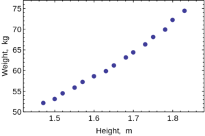
The relationship between two numerical variables or between one numerical variable and one categorical variable may be assessed using a scatter diagram, also known as dispersion diagram. In this diagram, each pair of values is represented by a symbol or a dot, whose horizontal and vertical positions are determined by the value of the first and second variables, respectively. By convention, vertical and horizontal axes should correspond to outcome and exposure variables, respectively. Figure 5 shows the relationship between weight and height among 18-year-old youngsters from Pelotas, Southern Brazil, in 2010. 3 , 4 The diagram presented in figure 5 should be interpreted as follows: the increase in subjects' height is accompanied by an increase in their weight.

Point diagram for the relationship between weight (kg) and height (cm) among 18-year-old youngsters from the city of Pelotas (n = 2.194). Pelotas, Brazil, 2010.
BASIC RULES FOR THE PREPARATION OF TABLES AND GRAPHS
Ideally, every table should:
- Be self-explanatory;
- Present values with the same number of decimal places in all its cells (standardization);
- Include a title informing what is being described and where, as well as the number of observations (N) and when data were collected;
- Have a structure formed by three horizontal lines, defining table heading and the end of the table at its lower border;
- Not have vertical lines at its lateral borders;
- Provide additional information in table footer, when needed;
- Be inserted into a document only after being mentioned in the text; and
- Be numbered by Arabic numerals.
Similarly to tables, graphs should:
- Include, below the figure, a title providing all relevant information;
- Be referred to as figures in the text;
- Identify figure axes by the variables under analysis;
- Quote the source which provided the data, if required;
- Demonstrate the scale being used; and
- Be self-explanatory.
The graph's vertical axis should always start with zero. A usual type of distortion is starting this axis with values higher than zero. Whenever it happens, differences between variables are overestimated, as can been seen in figure 6 .

Figure showing how graphs in which the Y-axis does not start with zero tend to overestimate the differences under analysis. On the left there is a graph whose Y axis does not start with zero and on the right a graph reproducing the same data but with the Y axis starting with zero.
Understanding how to classify the different types of variables and how to present them in tables or graphs is an essential stage for epidemiological research in all areas of knowledge, including Dermatology. Mastering this topic collaborates to synthesize research results and prevents the misuse or overuse of tables and figures in scientific papers.
Conflict of Interest: None
Financial Support: None
How to cite this article: Duquia RP, Bastos JL, Bonamigo RR, González-Chica DA, Martínez-Mesa J. Presenting data in tables and charts. An Bras Dermatol. 2014;89(2):280-5.
* Work performed at the Dermatology service, Universidade Federal de Ciências da Saúde de Porto Alegre (UFCSPA), Departamento de Saúde Pública e Departamento de Nutrição da UFSC.
Forgot password? New user? Sign up
Existing user? Log in
Data Presentation - Tables
Already have an account? Log in here.
Tables are a useful way to organize information using rows and columns. Tables are a versatile organization tool and can be used to communicate information on their own, or they can be used to accompany another data representation type (like a graph). Tables support a variety of parameters and can be used to keep track of frequencies, variable associations, and more.
For example, given below are the weights of 20 students in grade 10: \[50, 45, 48, 39, 40, 48, 54, 50, 48, 48, \\ 50, 39, 41, 46, 44, 43, 54, 57, 60, 45.\]
To find the frequency of \(48\) in this data, count the number of times that \(48\) appears in the list. There are \(4\) students that have this weight.
The list above has information about the weight of \(20\) students, and since the data has been arranged haphazardly, it is difficult to classify the students properly.
To make the information more clear, tabulate the given data.
\[\begin{array} \\ \text{Weights in kg} & & & \text{Frequency} \\ 39 & & & 2 \\ 40 & & & 1 \\ 41 & & & 1 \\ 43 & & & 1 \\ 44 & & & 1 \\ 45 & & & 2 \\ 46 & & & 1 \\ 48 & & & 4 \\ 50 & & & 3 \\ 54 & & & 2 \\ 57 & & & 1 \\ 60 & & & 1 \end{array}\]
This table makes the data more easy to understand.
Making a Table
Making and using tables.
To make a table, first decide how many rows and columns are needed to clearly display the data. To do this, consider how many variables are included in the data set.
The following is an example of a table where there are two variables.
The following is an example of a table with three variables.
A table is good for organizing quantitative data in a way that it is easy to look things up. For example, a table would be good way to associate a person’s name, age, and favorite food. However, when trying to communicate relations, such as how a person’s favorite food changes over time, a graph would be a better choice.
Using the table below, determine the average age of the group?
Good practices for making tables Label what each row or column represents Include units in labels when data is numerical Format data consistently (use consistent units and formatting)
What is wrong with this table? Flavor of Ice Cream Number Sold (cones) Chocolate 104 Vanilla two-hundred Strawberry 143 Coconut thirty Mango 126 Show answer Answer: The data isn’t consistently formatted. The number of cones sold is written in numbers in both symbols and words. It would be easier to understand if all entries were numerical symbols.
What is wrong with this table? Jack blue Sarah yellow Billy green Ron red Christina blue Margret purple Show answer Answer: There are no labels on the columns. It is not clear what the table is displaying — does the table show what color shirt each person is wearing? Do it show what each person's favorite color is? It isn't clear because labels are missing.
Many word processing softwares include tools for making tables. You can easily make tables in Microsoft Word and Excel and in Google Docs and Sheets.
Here is an example table (left blank) with which you could record information about a person's age, weight, and height.
Tables are used to present information in all types of fields. Geologists might make a table to record data about types of rocks they find while doing field work, political researchers might create a table to record information about potential voters, and physicists might make a table to record observations about the speed of a ball rolled on various surfaces.
Problem Loading...
Note Loading...
Set Loading...
Get science-backed answers as you write with Paperpal's Research feature
Presenting Research Data Effectively Through Tables and Figures

Presenting research data and key findings in an organized, visually attractive, and meaningful manner is a key part of a good research paper. This is particularly important in instances where complex data and information, which cannot be easily communicated through text alone, need to be presented engagingly. The best way to do this is through the use of tables and figures. They help to organize and summarize large amounts of data and present it in an easy-to-understand way.
Tables are used to present numerical data, while figures are used to display non-numerical data, such as graphs, charts, and diagrams. There are different types of tables and figures, and choosing the appropriate format is essential to present the data effectively. This article provides some insights on how to present research data and findings using tables and figures.
How to present research data in tables?
When complex data and statistical findings are too unwieldy or difficult to present either in text form or as figures, they can be presented through tables. Tables are best used where exact numerical values need to be analyzed and shared. It also aids in the comparison and contrast of various features or values among the different units. This allows swift and easy identification of patterns in the datasets. While presenting tables in a research paper, it is essential to incorporate certain core elements to ensure that readers are able to draw inferences and conclusions easily and quickly.
- Title of the table : The title should be concise and clear and communicate the purpose of the table. Tables must be referenced in the text through table numbers. Both the table number and the title are ideally mentioned just above the table.
- Body of the table: A crucial element in preparing the body of a table is to ensure uniformity in terms of units of measurement and the accurate use of decimal places. It is also important to format the table and ensure equal spacing between rows and columns.
- Keep it simple and accurate: It is important to ensure that only relevant information is presented in the table. One needs to be cautious not to populate tables with unnecessary information or design elements. Using plain fonts, in italics or bold, and the use of color or border styles help make the table visually appealing. Rows and columns must be labeled clearly and accurately to ensure that there is no ambiguity in analyzing the data presented.
How to present research data in figures?
Figures are a powerful tool for visually presenting research data and key study findings. Figures are usually used to communicate trends or relationships and general patterns emerging from datasets. They are also used to present research data and complex information in a simpler form. Figures can take various forms like graphs, pie charts, scatter plots, line diagrams, drawings, maps, and photos. Early career researchers need to know how best to present figures in their research papers. The following are some core elements that should be incorporated.
- Title: Every figure must have a title that is clear and concise and must summarize the main point of the data being presented. It should be placed just below the figure. The numbering of the figures should be sequential and must correspond to the reference provided in the text.
- Type of figure: The type of figure to be used is usually dictated by the kind of information to be conveyed. Researchers need to decide which type of figure will enable readers to understand the information being shared easily. For example, scatter plots can be used to show relationships between two variables, pie charts can be used to illustrate relative proportions, and graphs can be used for the quantitative relationship between variables.
- Use of Images: When using figures, care should be taken to ensure that images are of a high resolution – sharp and clear.
- Labeling: Ensuring that all parts of the figures and the axes are labeled accurately is crucial if readers are to glean important details quickly. Use standard font sizes and styles. Experts also suggest the inclusion of scale bars in maps.
Tips for Effectively Presenting Research Data through Tables and Figures
When presenting research data through tables or figures, it’s important to ensure that it is adding value to the text and not merely repeating values. This means taking care of certain vital aspects to ensure that the presentation is uniform, clear, and easy to read. Here are some tips to help you achieve that:
- Make sure that tables or figures add value to the text
- Ensure uniformity in numbering of tables, figures, and values both in the text and in the visual presentation
- Cite the source if tables and figures are used from a different source
- Use appropriate scales when creating tables and figures
- Use logarithmic scales if the data covers a wide range
- Use linear scales if the data is relatively small
- Check publication or style guide instructions of the target journal regarding the presentation of research data and findings, image resolution, presentation style, formatting, and so on
- Remember, tables and figures are only tools to convey information – using too many of them can overwhelm readers
In summary, presenting research data through tables and figures can be an effective way to convey information. However, it’s important to follow these tips to ensure that the presentation is clear and easy to read. By taking care of these vital aspects, researchers can effectively communicate their findings to their intended audience.
Paperpal is an AI writing assistant that help academics write better, faster with real-time suggestions for in-depth language and grammar correction. Trained on millions of research manuscripts enhanced by professional academic editors, Paperpal delivers human precision at machine speed.
Try it for free or upgrade to Paperpal Prime , which unlocks unlimited access to premium features like academic translation, paraphrasing, contextual synonyms, consistency checks and more. It’s like always having a professional academic editor by your side! Go beyond limitations and experience the future of academic writing. Get Paperpal Prime now at just US$19 a month!
Related Reads:
- 6 Tips for Post-Doc Researchers to Take Their Career to the Next Level
- 5 Reasons for Rejection After Peer Review
- Ethical Research Practices For Research with Human Subjects
- Ethics in Science: Importance, Principles & Guidelines
Empirical Research: A Comprehensive Guide for Academics
How to write a scientific paper in 10 steps , you may also like, phd qualifying exam: tips for success , why traditional editorial process needs an upgrade, paperpal’s new ai research finder empowers authors to..., ai + human expertise – a paradigm shift..., how to use paperpal to generate emails &..., is it ethical to use ai-generated abstracts without..., how to avoid plagiarism when using generative ai..., what are journal guidelines on using generative ai..., types of plagiarism and 6 tips to avoid..., quillbot review: features, pricing, and free alternatives.
Home Blog Design Understanding Data Presentations (Guide + Examples)
Understanding Data Presentations (Guide + Examples)

In this age of overwhelming information, the skill to effectively convey data has become extremely valuable. Initiating a discussion on data presentation types involves thoughtful consideration of the nature of your data and the message you aim to convey. Different types of visualizations serve distinct purposes. Whether you’re dealing with how to develop a report or simply trying to communicate complex information, how you present data influences how well your audience understands and engages with it. This extensive guide leads you through the different ways of data presentation.
Table of Contents
What is a Data Presentation?
What should a data presentation include, line graphs, treemap chart, scatter plot, how to choose a data presentation type, recommended data presentation templates, common mistakes done in data presentation.
A data presentation is a slide deck that aims to disclose quantitative information to an audience through the use of visual formats and narrative techniques derived from data analysis, making complex data understandable and actionable. This process requires a series of tools, such as charts, graphs, tables, infographics, dashboards, and so on, supported by concise textual explanations to improve understanding and boost retention rate.
Data presentations require us to cull data in a format that allows the presenter to highlight trends, patterns, and insights so that the audience can act upon the shared information. In a few words, the goal of data presentations is to enable viewers to grasp complicated concepts or trends quickly, facilitating informed decision-making or deeper analysis.
Data presentations go beyond the mere usage of graphical elements. Seasoned presenters encompass visuals with the art of data storytelling , so the speech skillfully connects the points through a narrative that resonates with the audience. Depending on the purpose – inspire, persuade, inform, support decision-making processes, etc. – is the data presentation format that is better suited to help us in this journey.
To nail your upcoming data presentation, ensure to count with the following elements:
- Clear Objectives: Understand the intent of your presentation before selecting the graphical layout and metaphors to make content easier to grasp.
- Engaging introduction: Use a powerful hook from the get-go. For instance, you can ask a big question or present a problem that your data will answer. Take a look at our guide on how to start a presentation for tips & insights.
- Structured Narrative: Your data presentation must tell a coherent story. This means a beginning where you present the context, a middle section in which you present the data, and an ending that uses a call-to-action. Check our guide on presentation structure for further information.
- Visual Elements: These are the charts, graphs, and other elements of visual communication we ought to use to present data. This article will cover one by one the different types of data representation methods we can use, and provide further guidance on choosing between them.
- Insights and Analysis: This is not just showcasing a graph and letting people get an idea about it. A proper data presentation includes the interpretation of that data, the reason why it’s included, and why it matters to your research.
- Conclusion & CTA: Ending your presentation with a call to action is necessary. Whether you intend to wow your audience into acquiring your services, inspire them to change the world, or whatever the purpose of your presentation, there must be a stage in which you convey all that you shared and show the path to staying in touch. Plan ahead whether you want to use a thank-you slide, a video presentation, or which method is apt and tailored to the kind of presentation you deliver.
- Q&A Session: After your speech is concluded, allocate 3-5 minutes for the audience to raise any questions about the information you disclosed. This is an extra chance to establish your authority on the topic. Check our guide on questions and answer sessions in presentations here.
Bar charts are a graphical representation of data using rectangular bars to show quantities or frequencies in an established category. They make it easy for readers to spot patterns or trends. Bar charts can be horizontal or vertical, although the vertical format is commonly known as a column chart. They display categorical, discrete, or continuous variables grouped in class intervals [1] . They include an axis and a set of labeled bars horizontally or vertically. These bars represent the frequencies of variable values or the values themselves. Numbers on the y-axis of a vertical bar chart or the x-axis of a horizontal bar chart are called the scale.

Real-Life Application of Bar Charts
Let’s say a sales manager is presenting sales to their audience. Using a bar chart, he follows these steps.
Step 1: Selecting Data
The first step is to identify the specific data you will present to your audience.
The sales manager has highlighted these products for the presentation.
- Product A: Men’s Shoes
- Product B: Women’s Apparel
- Product C: Electronics
- Product D: Home Decor
Step 2: Choosing Orientation
Opt for a vertical layout for simplicity. Vertical bar charts help compare different categories in case there are not too many categories [1] . They can also help show different trends. A vertical bar chart is used where each bar represents one of the four chosen products. After plotting the data, it is seen that the height of each bar directly represents the sales performance of the respective product.
It is visible that the tallest bar (Electronics – Product C) is showing the highest sales. However, the shorter bars (Women’s Apparel – Product B and Home Decor – Product D) need attention. It indicates areas that require further analysis or strategies for improvement.
Step 3: Colorful Insights
Different colors are used to differentiate each product. It is essential to show a color-coded chart where the audience can distinguish between products.
- Men’s Shoes (Product A): Yellow
- Women’s Apparel (Product B): Orange
- Electronics (Product C): Violet
- Home Decor (Product D): Blue

Bar charts are straightforward and easily understandable for presenting data. They are versatile when comparing products or any categorical data [2] . Bar charts adapt seamlessly to retail scenarios. Despite that, bar charts have a few shortcomings. They cannot illustrate data trends over time. Besides, overloading the chart with numerous products can lead to visual clutter, diminishing its effectiveness.
For more information, check our collection of bar chart templates for PowerPoint .
Line graphs help illustrate data trends, progressions, or fluctuations by connecting a series of data points called ‘markers’ with straight line segments. This provides a straightforward representation of how values change [5] . Their versatility makes them invaluable for scenarios requiring a visual understanding of continuous data. In addition, line graphs are also useful for comparing multiple datasets over the same timeline. Using multiple line graphs allows us to compare more than one data set. They simplify complex information so the audience can quickly grasp the ups and downs of values. From tracking stock prices to analyzing experimental results, you can use line graphs to show how data changes over a continuous timeline. They show trends with simplicity and clarity.
Real-life Application of Line Graphs
To understand line graphs thoroughly, we will use a real case. Imagine you’re a financial analyst presenting a tech company’s monthly sales for a licensed product over the past year. Investors want insights into sales behavior by month, how market trends may have influenced sales performance and reception to the new pricing strategy. To present data via a line graph, you will complete these steps.
First, you need to gather the data. In this case, your data will be the sales numbers. For example:
- January: $45,000
- February: $55,000
- March: $45,000
- April: $60,000
- May: $ 70,000
- June: $65,000
- July: $62,000
- August: $68,000
- September: $81,000
- October: $76,000
- November: $87,000
- December: $91,000
After choosing the data, the next step is to select the orientation. Like bar charts, you can use vertical or horizontal line graphs. However, we want to keep this simple, so we will keep the timeline (x-axis) horizontal while the sales numbers (y-axis) vertical.
Step 3: Connecting Trends
After adding the data to your preferred software, you will plot a line graph. In the graph, each month’s sales are represented by data points connected by a line.

Step 4: Adding Clarity with Color
If there are multiple lines, you can also add colors to highlight each one, making it easier to follow.
Line graphs excel at visually presenting trends over time. These presentation aids identify patterns, like upward or downward trends. However, too many data points can clutter the graph, making it harder to interpret. Line graphs work best with continuous data but are not suitable for categories.
For more information, check our collection of line chart templates for PowerPoint and our article about how to make a presentation graph .
A data dashboard is a visual tool for analyzing information. Different graphs, charts, and tables are consolidated in a layout to showcase the information required to achieve one or more objectives. Dashboards help quickly see Key Performance Indicators (KPIs). You don’t make new visuals in the dashboard; instead, you use it to display visuals you’ve already made in worksheets [3] .
Keeping the number of visuals on a dashboard to three or four is recommended. Adding too many can make it hard to see the main points [4]. Dashboards can be used for business analytics to analyze sales, revenue, and marketing metrics at a time. They are also used in the manufacturing industry, as they allow users to grasp the entire production scenario at the moment while tracking the core KPIs for each line.
Real-Life Application of a Dashboard
Consider a project manager presenting a software development project’s progress to a tech company’s leadership team. He follows the following steps.
Step 1: Defining Key Metrics
To effectively communicate the project’s status, identify key metrics such as completion status, budget, and bug resolution rates. Then, choose measurable metrics aligned with project objectives.
Step 2: Choosing Visualization Widgets
After finalizing the data, presentation aids that align with each metric are selected. For this project, the project manager chooses a progress bar for the completion status and uses bar charts for budget allocation. Likewise, he implements line charts for bug resolution rates.

Step 3: Dashboard Layout
Key metrics are prominently placed in the dashboard for easy visibility, and the manager ensures that it appears clean and organized.
Dashboards provide a comprehensive view of key project metrics. Users can interact with data, customize views, and drill down for detailed analysis. However, creating an effective dashboard requires careful planning to avoid clutter. Besides, dashboards rely on the availability and accuracy of underlying data sources.
For more information, check our article on how to design a dashboard presentation , and discover our collection of dashboard PowerPoint templates .
Treemap charts represent hierarchical data structured in a series of nested rectangles [6] . As each branch of the ‘tree’ is given a rectangle, smaller tiles can be seen representing sub-branches, meaning elements on a lower hierarchical level than the parent rectangle. Each one of those rectangular nodes is built by representing an area proportional to the specified data dimension.
Treemaps are useful for visualizing large datasets in compact space. It is easy to identify patterns, such as which categories are dominant. Common applications of the treemap chart are seen in the IT industry, such as resource allocation, disk space management, website analytics, etc. Also, they can be used in multiple industries like healthcare data analysis, market share across different product categories, or even in finance to visualize portfolios.
Real-Life Application of a Treemap Chart
Let’s consider a financial scenario where a financial team wants to represent the budget allocation of a company. There is a hierarchy in the process, so it is helpful to use a treemap chart. In the chart, the top-level rectangle could represent the total budget, and it would be subdivided into smaller rectangles, each denoting a specific department. Further subdivisions within these smaller rectangles might represent individual projects or cost categories.
Step 1: Define Your Data Hierarchy
While presenting data on the budget allocation, start by outlining the hierarchical structure. The sequence will be like the overall budget at the top, followed by departments, projects within each department, and finally, individual cost categories for each project.
- Top-level rectangle: Total Budget
- Second-level rectangles: Departments (Engineering, Marketing, Sales)
- Third-level rectangles: Projects within each department
- Fourth-level rectangles: Cost categories for each project (Personnel, Marketing Expenses, Equipment)
Step 2: Choose a Suitable Tool
It’s time to select a data visualization tool supporting Treemaps. Popular choices include Tableau, Microsoft Power BI, PowerPoint, or even coding with libraries like D3.js. It is vital to ensure that the chosen tool provides customization options for colors, labels, and hierarchical structures.
Here, the team uses PowerPoint for this guide because of its user-friendly interface and robust Treemap capabilities.
Step 3: Make a Treemap Chart with PowerPoint
After opening the PowerPoint presentation, they chose “SmartArt” to form the chart. The SmartArt Graphic window has a “Hierarchy” category on the left. Here, you will see multiple options. You can choose any layout that resembles a Treemap. The “Table Hierarchy” or “Organization Chart” options can be adapted. The team selects the Table Hierarchy as it looks close to a Treemap.
Step 5: Input Your Data
After that, a new window will open with a basic structure. They add the data one by one by clicking on the text boxes. They start with the top-level rectangle, representing the total budget.

Step 6: Customize the Treemap
By clicking on each shape, they customize its color, size, and label. At the same time, they can adjust the font size, style, and color of labels by using the options in the “Format” tab in PowerPoint. Using different colors for each level enhances the visual difference.
Treemaps excel at illustrating hierarchical structures. These charts make it easy to understand relationships and dependencies. They efficiently use space, compactly displaying a large amount of data, reducing the need for excessive scrolling or navigation. Additionally, using colors enhances the understanding of data by representing different variables or categories.
In some cases, treemaps might become complex, especially with deep hierarchies. It becomes challenging for some users to interpret the chart. At the same time, displaying detailed information within each rectangle might be constrained by space. It potentially limits the amount of data that can be shown clearly. Without proper labeling and color coding, there’s a risk of misinterpretation.
A heatmap is a data visualization tool that uses color coding to represent values across a two-dimensional surface. In these, colors replace numbers to indicate the magnitude of each cell. This color-shaded matrix display is valuable for summarizing and understanding data sets with a glance [7] . The intensity of the color corresponds to the value it represents, making it easy to identify patterns, trends, and variations in the data.
As a tool, heatmaps help businesses analyze website interactions, revealing user behavior patterns and preferences to enhance overall user experience. In addition, companies use heatmaps to assess content engagement, identifying popular sections and areas of improvement for more effective communication. They excel at highlighting patterns and trends in large datasets, making it easy to identify areas of interest.
We can implement heatmaps to express multiple data types, such as numerical values, percentages, or even categorical data. Heatmaps help us easily spot areas with lots of activity, making them helpful in figuring out clusters [8] . When making these maps, it is important to pick colors carefully. The colors need to show the differences between groups or levels of something. And it is good to use colors that people with colorblindness can easily see.
Check our detailed guide on how to create a heatmap here. Also discover our collection of heatmap PowerPoint templates .
Pie charts are circular statistical graphics divided into slices to illustrate numerical proportions. Each slice represents a proportionate part of the whole, making it easy to visualize the contribution of each component to the total.
The size of the pie charts is influenced by the value of data points within each pie. The total of all data points in a pie determines its size. The pie with the highest data points appears as the largest, whereas the others are proportionally smaller. However, you can present all pies of the same size if proportional representation is not required [9] . Sometimes, pie charts are difficult to read, or additional information is required. A variation of this tool can be used instead, known as the donut chart , which has the same structure but a blank center, creating a ring shape. Presenters can add extra information, and the ring shape helps to declutter the graph.
Pie charts are used in business to show percentage distribution, compare relative sizes of categories, or present straightforward data sets where visualizing ratios is essential.
Real-Life Application of Pie Charts
Consider a scenario where you want to represent the distribution of the data. Each slice of the pie chart would represent a different category, and the size of each slice would indicate the percentage of the total portion allocated to that category.
Step 1: Define Your Data Structure
Imagine you are presenting the distribution of a project budget among different expense categories.
- Column A: Expense Categories (Personnel, Equipment, Marketing, Miscellaneous)
- Column B: Budget Amounts ($40,000, $30,000, $20,000, $10,000) Column B represents the values of your categories in Column A.
Step 2: Insert a Pie Chart
Using any of the accessible tools, you can create a pie chart. The most convenient tools for forming a pie chart in a presentation are presentation tools such as PowerPoint or Google Slides. You will notice that the pie chart assigns each expense category a percentage of the total budget by dividing it by the total budget.
For instance:
- Personnel: $40,000 / ($40,000 + $30,000 + $20,000 + $10,000) = 40%
- Equipment: $30,000 / ($40,000 + $30,000 + $20,000 + $10,000) = 30%
- Marketing: $20,000 / ($40,000 + $30,000 + $20,000 + $10,000) = 20%
- Miscellaneous: $10,000 / ($40,000 + $30,000 + $20,000 + $10,000) = 10%
You can make a chart out of this or just pull out the pie chart from the data.

3D pie charts and 3D donut charts are quite popular among the audience. They stand out as visual elements in any presentation slide, so let’s take a look at how our pie chart example would look in 3D pie chart format.

Step 03: Results Interpretation
The pie chart visually illustrates the distribution of the project budget among different expense categories. Personnel constitutes the largest portion at 40%, followed by equipment at 30%, marketing at 20%, and miscellaneous at 10%. This breakdown provides a clear overview of where the project funds are allocated, which helps in informed decision-making and resource management. It is evident that personnel are a significant investment, emphasizing their importance in the overall project budget.
Pie charts provide a straightforward way to represent proportions and percentages. They are easy to understand, even for individuals with limited data analysis experience. These charts work well for small datasets with a limited number of categories.
However, a pie chart can become cluttered and less effective in situations with many categories. Accurate interpretation may be challenging, especially when dealing with slight differences in slice sizes. In addition, these charts are static and do not effectively convey trends over time.
For more information, check our collection of pie chart templates for PowerPoint .
Histograms present the distribution of numerical variables. Unlike a bar chart that records each unique response separately, histograms organize numeric responses into bins and show the frequency of reactions within each bin [10] . The x-axis of a histogram shows the range of values for a numeric variable. At the same time, the y-axis indicates the relative frequencies (percentage of the total counts) for that range of values.
Whenever you want to understand the distribution of your data, check which values are more common, or identify outliers, histograms are your go-to. Think of them as a spotlight on the story your data is telling. A histogram can provide a quick and insightful overview if you’re curious about exam scores, sales figures, or any numerical data distribution.
Real-Life Application of a Histogram
In the histogram data analysis presentation example, imagine an instructor analyzing a class’s grades to identify the most common score range. A histogram could effectively display the distribution. It will show whether most students scored in the average range or if there are significant outliers.
Step 1: Gather Data
He begins by gathering the data. The scores of each student in class are gathered to analyze exam scores.
After arranging the scores in ascending order, bin ranges are set.
Step 2: Define Bins
Bins are like categories that group similar values. Think of them as buckets that organize your data. The presenter decides how wide each bin should be based on the range of the values. For instance, the instructor sets the bin ranges based on score intervals: 60-69, 70-79, 80-89, and 90-100.
Step 3: Count Frequency
Now, he counts how many data points fall into each bin. This step is crucial because it tells you how often specific ranges of values occur. The result is the frequency distribution, showing the occurrences of each group.
Here, the instructor counts the number of students in each category.
- 60-69: 1 student (Kate)
- 70-79: 4 students (David, Emma, Grace, Jack)
- 80-89: 7 students (Alice, Bob, Frank, Isabel, Liam, Mia, Noah)
- 90-100: 3 students (Clara, Henry, Olivia)
Step 4: Create the Histogram
It’s time to turn the data into a visual representation. Draw a bar for each bin on a graph. The width of the bar should correspond to the range of the bin, and the height should correspond to the frequency. To make your histogram understandable, label the X and Y axes.
In this case, the X-axis should represent the bins (e.g., test score ranges), and the Y-axis represents the frequency.

The histogram of the class grades reveals insightful patterns in the distribution. Most students, with seven students, fall within the 80-89 score range. The histogram provides a clear visualization of the class’s performance. It showcases a concentration of grades in the upper-middle range with few outliers at both ends. This analysis helps in understanding the overall academic standing of the class. It also identifies the areas for potential improvement or recognition.
Thus, histograms provide a clear visual representation of data distribution. They are easy to interpret, even for those without a statistical background. They apply to various types of data, including continuous and discrete variables. One weak point is that histograms do not capture detailed patterns in students’ data, with seven compared to other visualization methods.
A scatter plot is a graphical representation of the relationship between two variables. It consists of individual data points on a two-dimensional plane. This plane plots one variable on the x-axis and the other on the y-axis. Each point represents a unique observation. It visualizes patterns, trends, or correlations between the two variables.
Scatter plots are also effective in revealing the strength and direction of relationships. They identify outliers and assess the overall distribution of data points. The points’ dispersion and clustering reflect the relationship’s nature, whether it is positive, negative, or lacks a discernible pattern. In business, scatter plots assess relationships between variables such as marketing cost and sales revenue. They help present data correlations and decision-making.
Real-Life Application of Scatter Plot
A group of scientists is conducting a study on the relationship between daily hours of screen time and sleep quality. After reviewing the data, they managed to create this table to help them build a scatter plot graph:
In the provided example, the x-axis represents Daily Hours of Screen Time, and the y-axis represents the Sleep Quality Rating.

The scientists observe a negative correlation between the amount of screen time and the quality of sleep. This is consistent with their hypothesis that blue light, especially before bedtime, has a significant impact on sleep quality and metabolic processes.
There are a few things to remember when using a scatter plot. Even when a scatter diagram indicates a relationship, it doesn’t mean one variable affects the other. A third factor can influence both variables. The more the plot resembles a straight line, the stronger the relationship is perceived [11] . If it suggests no ties, the observed pattern might be due to random fluctuations in data. When the scatter diagram depicts no correlation, whether the data might be stratified is worth considering.
Choosing the appropriate data presentation type is crucial when making a presentation . Understanding the nature of your data and the message you intend to convey will guide this selection process. For instance, when showcasing quantitative relationships, scatter plots become instrumental in revealing correlations between variables. If the focus is on emphasizing parts of a whole, pie charts offer a concise display of proportions. Histograms, on the other hand, prove valuable for illustrating distributions and frequency patterns.
Bar charts provide a clear visual comparison of different categories. Likewise, line charts excel in showcasing trends over time, while tables are ideal for detailed data examination. Starting a presentation on data presentation types involves evaluating the specific information you want to communicate and selecting the format that aligns with your message. This ensures clarity and resonance with your audience from the beginning of your presentation.
1. Fact Sheet Dashboard for Data Presentation

Convey all the data you need to present in this one-pager format, an ideal solution tailored for users looking for presentation aids. Global maps, donut chats, column graphs, and text neatly arranged in a clean layout presented in light and dark themes.
Use This Template
2. 3D Column Chart Infographic PPT Template

Represent column charts in a highly visual 3D format with this PPT template. A creative way to present data, this template is entirely editable, and we can craft either a one-page infographic or a series of slides explaining what we intend to disclose point by point.
3. Data Circles Infographic PowerPoint Template

An alternative to the pie chart and donut chart diagrams, this template features a series of curved shapes with bubble callouts as ways of presenting data. Expand the information for each arch in the text placeholder areas.
4. Colorful Metrics Dashboard for Data Presentation

This versatile dashboard template helps us in the presentation of the data by offering several graphs and methods to convert numbers into graphics. Implement it for e-commerce projects, financial projections, project development, and more.
5. Animated Data Presentation Tools for PowerPoint & Google Slides

A slide deck filled with most of the tools mentioned in this article, from bar charts, column charts, treemap graphs, pie charts, histogram, etc. Animated effects make each slide look dynamic when sharing data with stakeholders.
6. Statistics Waffle Charts PPT Template for Data Presentations

This PPT template helps us how to present data beyond the typical pie chart representation. It is widely used for demographics, so it’s a great fit for marketing teams, data science professionals, HR personnel, and more.
7. Data Presentation Dashboard Template for Google Slides

A compendium of tools in dashboard format featuring line graphs, bar charts, column charts, and neatly arranged placeholder text areas.
8. Weather Dashboard for Data Presentation

Share weather data for agricultural presentation topics, environmental studies, or any kind of presentation that requires a highly visual layout for weather forecasting on a single day. Two color themes are available.
9. Social Media Marketing Dashboard Data Presentation Template

Intended for marketing professionals, this dashboard template for data presentation is a tool for presenting data analytics from social media channels. Two slide layouts featuring line graphs and column charts.
10. Project Management Summary Dashboard Template

A tool crafted for project managers to deliver highly visual reports on a project’s completion, the profits it delivered for the company, and expenses/time required to execute it. 4 different color layouts are available.
11. Profit & Loss Dashboard for PowerPoint and Google Slides

A must-have for finance professionals. This typical profit & loss dashboard includes progress bars, donut charts, column charts, line graphs, and everything that’s required to deliver a comprehensive report about a company’s financial situation.
Overwhelming visuals
One of the mistakes related to using data-presenting methods is including too much data or using overly complex visualizations. They can confuse the audience and dilute the key message.
Inappropriate chart types
Choosing the wrong type of chart for the data at hand can lead to misinterpretation. For example, using a pie chart for data that doesn’t represent parts of a whole is not right.
Lack of context
Failing to provide context or sufficient labeling can make it challenging for the audience to understand the significance of the presented data.
Inconsistency in design
Using inconsistent design elements and color schemes across different visualizations can create confusion and visual disarray.
Failure to provide details
Simply presenting raw data without offering clear insights or takeaways can leave the audience without a meaningful conclusion.
Lack of focus
Not having a clear focus on the key message or main takeaway can result in a presentation that lacks a central theme.
Visual accessibility issues
Overlooking the visual accessibility of charts and graphs can exclude certain audience members who may have difficulty interpreting visual information.
In order to avoid these mistakes in data presentation, presenters can benefit from using presentation templates . These templates provide a structured framework. They ensure consistency, clarity, and an aesthetically pleasing design, enhancing data communication’s overall impact.
Understanding and choosing data presentation types are pivotal in effective communication. Each method serves a unique purpose, so selecting the appropriate one depends on the nature of the data and the message to be conveyed. The diverse array of presentation types offers versatility in visually representing information, from bar charts showing values to pie charts illustrating proportions.
Using the proper method enhances clarity, engages the audience, and ensures that data sets are not just presented but comprehensively understood. By appreciating the strengths and limitations of different presentation types, communicators can tailor their approach to convey information accurately, developing a deeper connection between data and audience understanding.
[1] Government of Canada, S.C. (2021) 5 Data Visualization 5.2 Bar Chart , 5.2 Bar chart . https://www150.statcan.gc.ca/n1/edu/power-pouvoir/ch9/bargraph-diagrammeabarres/5214818-eng.htm
[2] Kosslyn, S.M., 1989. Understanding charts and graphs. Applied cognitive psychology, 3(3), pp.185-225. https://apps.dtic.mil/sti/pdfs/ADA183409.pdf
[3] Creating a Dashboard . https://it.tufts.edu/book/export/html/1870
[4] https://www.goldenwestcollege.edu/research/data-and-more/data-dashboards/index.html
[5] https://www.mit.edu/course/21/21.guide/grf-line.htm
[6] Jadeja, M. and Shah, K., 2015, January. Tree-Map: A Visualization Tool for Large Data. In GSB@ SIGIR (pp. 9-13). https://ceur-ws.org/Vol-1393/gsb15proceedings.pdf#page=15
[7] Heat Maps and Quilt Plots. https://www.publichealth.columbia.edu/research/population-health-methods/heat-maps-and-quilt-plots
[8] EIU QGIS WORKSHOP. https://www.eiu.edu/qgisworkshop/heatmaps.php
[9] About Pie Charts. https://www.mit.edu/~mbarker/formula1/f1help/11-ch-c8.htm
[10] Histograms. https://sites.utexas.edu/sos/guided/descriptive/numericaldd/descriptiven2/histogram/ [11] https://asq.org/quality-resources/scatter-diagram

Like this article? Please share
Data Analysis, Data Science, Data Visualization Filed under Design
Related Articles

Filed under Design • March 27th, 2024
How to Make a Presentation Graph
Detailed step-by-step instructions to master the art of how to make a presentation graph in PowerPoint and Google Slides. Check it out!

Filed under Presentation Ideas • January 6th, 2024
All About Using Harvey Balls
Among the many tools in the arsenal of the modern presenter, Harvey Balls have a special place. In this article we will tell you all about using Harvey Balls.

Filed under Business • December 8th, 2023
How to Design a Dashboard Presentation: A Step-by-Step Guide
Take a step further in your professional presentation skills by learning what a dashboard presentation is and how to properly design one in PowerPoint. A detailed step-by-step guide is here!
Leave a Reply

Presenting Data – Graphs and Tables
Types of data.
There are different types of data that can be collected in an experiment. Typically, we try to design experiments that collect objective, quantitative data.
Objective data is fact-based, measurable, and observable. This means that if two people made the same measurement with the same tool, they would get the same answer. The measurement is determined by the object that is being measured. The length of a worm measured with a ruler is an objective measurement. The observation that a chemical reaction in a test tube changed color is an objective measurement. Both of these are observable facts.
Subjective data is based on opinions, points of view, or emotional judgment. Subjective data might give two different answers when collected by two different people. The measurement is determined by the subject who is doing the measuring. Surveying people about which of two chemicals smells worse is a subjective measurement. Grading the quality of a presentation is a subjective measurement. Rating your relative happiness on a scale of 1-5 is a subjective measurement. All of these depend on the person who is making the observation – someone else might make these measurements differently.
Quantitative measurements gather numerical data. For example, measuring a worm as being 5cm in length is a quantitative measurement.
Qualitative measurements describe a quality, rather than a numerical value. Saying that one worm is longer than another worm is a qualitative measurement.
After you have collected data in an experiment, you need to figure out the best way to present that data in a meaningful way. Depending on the type of data, and the story that you are trying to tell using that data, you may present your data in different ways.
Data Tables
The easiest way to organize data is by putting it into a data table. In most data tables, the independent variable (the variable that you are testing or changing on purpose) will be in the column to the left and the dependent variable(s) will be across the top of the table.
Be sure to:
- Label each row and column so that the table can be interpreted
- Include the units that are being used
- Add a descriptive caption for the table
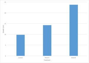
You are evaluating the effect of different types of fertilizers on plant growth. You plant 12 tomato plants and divide them into three groups, where each group contains four plants. To the first group, you do not add fertilizer and the plants are watered with plain water. The second and third groups are watered with two different brands of fertilizer. After three weeks, you measure the growth of each plant in centimeters and calculate the average growth for each type of fertilizer.
Scientific Method Review: Can you identify the key parts of the scientific method from this experiment?
- Independent variable – Type of treatment (brand of fertilizer)
- Dependent variable – plant growth in cm
- Control group(s) – Plants treated with no fertilizer
- Experimental group(s) – Plants treated with different brands of fertilizer
Graphing data
Graphs are used to display data because it is easier to see trends in the data when it is displayed visually compared to when it is displayed numerically in a table. Complicated data can often be displayed and interpreted more easily in a graph format than in a data table.
In a graph, the X-axis runs horizontally (side to side) and the Y-axis runs vertically (up and down). Typically, the independent variable will be shown on the X axis and the dependent variable will be shown on the Y axis (just like you learned in math class!).
Line graphs are the best type of graph to use when you are displaying a change in something over a continuous range. For example, you could use a line graph to display a change in temperature over time. Time is a continuous variable because it can have any value between two given measurements. It is measured along a continuum. Between 1 minute and 2 minutes are an infinite number of values, such as 1.1 minute or 1.93456 minutes.
Changes in several different samples can be shown on the same graph by using lines that differ in color, symbol, etc.
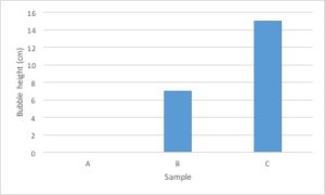
Bar graphs are used to compare measurements between different groups. Bar graphs should be used when your data is not continuous, but rather is divided into different categories. If you counted the number of birds of different species, each species of bird would be its own category. There is no value between “robin” and “eagle”, so this data is not continuous.
Scatter Plot
Scatter Plots are used to evaluate the relationship between two different continuous variables. These graphs compare changes in two different variables at once. For example, you could look at the relationship between height and weight. Both height and weight are continuous variables. You could not use a scatter plot to look at the relationship between number of children in a family and weight of each child because the number of children in a family is not a continuous variable: you can’t have 2.3 children in a family.
How to make a graph
- Identify your independent and dependent variables.
- Choose the correct type of graph by determining whether each variable is continuous or not.
- Determine the values that are going to go on the X and Y axis. If the values are continuous, they need to be evenly spaced based on the value.
- Label the X and Y axis, including units.
- Graph your data.
- Add a descriptive caption to your graph. Note that data tables are titled above the figure and graphs are captioned below the figure.
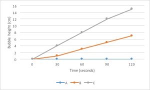
Let’s go back to the data from our fertilizer experiment and use it to make a graph. I’ve decided to graph only the average growth for the four plants because that is the most important piece of data. Including every single data point would make the graph very confusing.
- The independent variable is type of treatment and the dependent variable is plant growth (in cm).
- Type of treatment is not a continuous variable. There is no midpoint value between fertilizer brands (Brand A 1/2 doesn’t make sense). Plant growth is a continuous variable. It makes sense to sub-divide centimeters into smaller values. Since the independent variable is categorical and the dependent variable is continuous, this graph should be a bar graph.
- Plant growth (the dependent variable) should go on the Y axis and type of treatment (the independent variable) should go on the X axis.
- Notice that the values on the Y axis are continuous and evenly spaced. Each line represents an increase of 5cm.
- Notice that both the X and the Y axis have labels that include units (when required).
- Notice that the graph has a descriptive caption that allows the figure to stand alone without additional information given from the procedure: you know that this graph shows the average of the measurements taken from four tomato plants.
Descriptive captions
All figures that present data should stand alone – this means that you should be able to interpret the information contained in the figure without referring to anything else (such as the methods section of the paper). This means that all figures should have a descriptive caption that gives information about the independent and dependent variable. Another way to state this is that the caption should describe what you are testing and what you are measuring. A good starting point to developing a caption is “the effect of [the independent variable] on the [dependent variable].”
Here are some examples of good caption for figures:
- The effect of exercise on heart rate
- Growth rates of E. coli at different temperatures
- The relationship between heat shock time and transformation efficiency
Here are a few less effective captions:
- Heart rate and exercise
- Graph of E. coli temperature growth
- Table for experiment 1
Principles of Biology Copyright © 2017 by Lisa Bartee, Walter Shriner, and Catherine Creech is licensed under a Creative Commons Attribution 4.0 International License , except where otherwise noted.
Share This Book
Business Statistics
1.6 presenting data with tables and charts.
Data are usually ungrouped as they are given for each observation
Grouped data are presented by frequency table , which can be one-dimensional or two-dimensional, depending on the number of characteristics (variables) used for counting the observations
If data are quantitative (discrete or continuous) values of the variable \(X\) are noted as \(x_i\) and frequencies are noted as \(f_i\) (the subscript \(i\) denotes the \(i^{th}\) row of the table)
Considering Example 1.1 the frequency table is given:
In Table 1.3 \(x_i\) represents the number of books, and \(f_i\) represents the number of students, e.g. the frequency in a third row \(f_3=2\) indicates that 2 students carry 3 books
The total number of students corresponds to the sample size \(\displaystyle n= \sum_{i=1}^4 f_i=5\)
If data are continuous it is likely that all values are different and makes sense to group these values within a few intervals
Example 1.11 Sample data of \(50\) companies in Excel file are available at this link . Group the companies with respect to the annual revenue into \(5\) intervals of the same size by \(40\) thousands EUR, starting with \(0\) and ending with \(200\) . Insert frequencies in the second column of the table 1.4
Excel instructions : select the column of interest including the variable name (cells range E1:E51) or entire data set. On the Insert tab click PivotTable . In the next step just click OK (default location for a new pivot table is New Worksheet). Drag the Annual revenue to both Rows and Values area of the PivotTable Fields pane. In the Values area change the Field Settings to Count and click OK . Finally, right-click any single cell inside the Annual revenue and select Group from drop down options. In the grouping box edit the values Starting at: 0 , Ending at: 200 and By: 40 .
- Quantitative data from frequency table are often presented by histogram

FIGURE 1.1: Histogram of the companies with respect to the annual revenue
Visual representation of a data, helps us to see patterns and other details. Deciding which type of graph to use depends on the type of data.
The most useful types of graphs in business statistics are:
- Histogram is commonly used to visualize the distribution of data among different intervals as a series of vertical bars
- Line graph is commonly used to visualize how variable changes over time (time-series data)
- Scatter diagram is commonly used to visualize the relationship between two quantitative variables as a series of points

FIGURE 1.2: Histogram with normal curve
Histogram, in particular, may indicate the presence of extreme values above the mean (distribution has a long right tail) which means that data are positively skewed
Histogram may also indicate the presence of extreme values bellow the mean (distribution has a long left tail) which means that data are negatively skewed
Histogram 1.2 indicates that companies with respect to the annual revenue are symetrically distributed and for the same reason a distribution can be well approximated with a nice bell-shaped curve such as normal distribution
Normal distribution is the most important distribution in business statistics as it has a very nice features
Make the Most out of Tables in Your Presentation
Tables are used everywhere in business. They are one of the most practical ways to present key data and figures. So it makes sense that they have become a design staple for PowerPoint presentations. Unfortunately, poor design and formatting have given tables a bad name. Here are some tips to create standout table graphics.
Here’s a question you need to ask yourself from the start: Does my presentation really need a table? Remember, you may not have the time to explain the content of your table during your presentation. If the table isn’t working for you, you can be sure it isn’t working for the audience.
The following tips will help you make the most out of tables in your presentation:
- Make sure the table isn’t too large. Ideally, the audience should be able to see key data at a glance. If the table is large and contains too much content, you risk losing your audience’s attention.

- Make text elements as legible as possible, focusing specifically on the font and font size. Choose a typeface that can be seen from the back of the room. Also make sure that spacing is sufficient and clear.

- Highlight important content. Use color to emphasize key figures, e.g., green for positive numbers and red for negative numbers. Or, use one color to highlight important data. But don’t go overboard. Using too many colors will overwhelm your table, making the content hard to read.

- Remove unnecessary content. Omit anything redundant and condense your content to the essentials. There are other ways of avoiding repeated content. For example, write “all data as percentages” in a footnote instead of adding a percentage sign to each number. Figures should always be rounded up or down to be as legible as possible.

- Have a practical approach to sorting data. Designing tables always depends on the context of the presentation. Data is usually arranged alphabetically or chronologically. However, it may make more sense to sort your data according to key figure amounts. This is when Excel comes in handy. Choose the “Sort and Filter” function before inserting the table into PowerPoint.

- Use icons or infographics to visually enhance your tables . Tables benefit greatly from appealing graphics. Icons, such as check marks or red crosses, can be used to indicate an accomplishment. Symbolic images for specific data groups – e.g., a car icon to display automobile sales figures – can help convey numbers in a more memorable way. Process bars can be displayed in the bottom corner to show milestones or the current progress of a project.

It’s worth taking the time to make your tables as coherent as possible. The audience will be able to follow along, won’t lose focus, and will need fewer clarifications. Careful preparation and clear content will ensure your presentation is a success.
Share this post
- share
- save

Design Thinking: Problem Solving with a Difference

Why Corporate Mission Statements Are So Important

7 Tips & Learnings from the Apple Keynote
- List of Commerce Articles
- Tabular Presentation Of Data
Tabular Presentation of Data
What is tabular presentation of data.
It is a table that helps to represent even a large amount of data in an engaging, easy to read, and coordinated manner. The data is arranged in rows and columns. This is one of the most popularly used forms of presentation of data as data tables are simple to prepare and read.
The most significant benefit of tabulation is that it coordinates data for additional statistical treatment and decision making. The analysis used in tabulation is of four types. They are:
- Qualitative
- Quantitative
1. Qualitative classification: When the classification is done according to traits such as physical status, nationality, social status, etc., it is known as qualitative classification.
2. Quantitative classification: In this, the data is classified on the basis of features that are quantitative in nature. In other words, these features can be estimated quantitatively.
3. Temporal classification: In this classification, time becomes the categorising variable and data are classified according to time. Time, maybe in years, months, weeks, days, hours, etc.,
4. Spatial classification: When the categorisation is done on the basis of location, it is known as spatial classification. The place may be a country, state, district, block, village/town, etc.
Related read: T.R. Jain and V.K. Ohri Solutions for Presentation of Data
Basics of Tabular Presentation
Objectives of tabulation.
Following are the o bjectives of tabulation :
- To simplify the complex data
- To bring out essential features of the data
- To facilitate comparison
- To facilitate statistical analysis
- Saving of space
What are the Three Limitations of a Table?
Following are the major limitations of a table:
(1) Lacks description
- The table represents only figures and not attributes.
- It ignores the qualitative aspects of the facts.
(2) Incapable of presenting individual items
- It does not present individual items.
- It presents aggregate data.
(3) Needs special knowledge
- The understanding of the table requires special knowledge.
- It cannot be easily used by a layman.
Explain the Main Parts of a Table:
Following are the main parts of a table:
Multiple choice questions
The above-mentioned concept is for CBSE class 11 Statistics for Economics – Tabular Presentation of Data. For solutions and study materials for class 11 Statistics for Economics, visit BYJU’S or download the app for more information and the best learning experience.
Important Topics in Commerce:
- What is a Balance Sheet?
- What Are Current Assets
- What is Goodwill?
- Treatment of Goodwill
- What Is Partnership
Leave a Comment Cancel reply
Your Mobile number and Email id will not be published. Required fields are marked *
Request OTP on Voice Call
Post My Comment
It’s help full
It’s very helpful site
- Share Share
Register with BYJU'S & Download Free PDFs
Register with byju's & watch live videos.
- Accountancy
- Business Studies
- Commercial Law
- Organisational Behaviour
- Human Resource Management
- Entrepreneurship
- CBSE Class 11 Statistics for Economics Notes
Chapter 1: Concept of Economics and Significance of Statistics in Economics
- Statistics for Economics | Functions, Importance, and Limitations
Chapter 2: Collection of Data
- Data Collection & Its Methods
- Sources of Data Collection | Primary and Secondary Sources
- Direct Personal Investigation: Meaning, Suitability, Merits, Demerits and Precautions
- Indirect Oral Investigation : Suitability, Merits, Demerits and Precautions
- Difference between Direct Personal Investigation and Indirect Oral Investigation
- Information from Local Source or Correspondents: Meaning, Suitability, Merits, and Demerits
- Questionnaires and Schedules Method of Data Collection
- Difference between Questionnaire and Schedule
- Qualities of a Good Questionnaire and types of Questions
- What are the Published Sources of Collecting Secondary Data?
- What Precautions should be taken before using Secondary Data?
- Two Important Sources of Secondary Data: Census of India and Reports & Publications of NSSO
- What is National Sample Survey Organisation (NSSO)?
- What is Census Method of Collecting Data?
- Sample Method of Collection of Data
- Methods of Sampling
- Father of Indian Census
- What makes a Sampling Data Reliable?
- Difference between Census Method and Sampling Method of Collecting Data
- What are Statistical Errors?
Chapter 3: Organisation of Data
- Organization of Data
- Objectives and Characteristics of Classification of Data
- Classification of Data in Statistics | Meaning and Basis of Classification of Data
- Concept of Variable and Raw Data
- Types of Statistical Series
- Difference between Frequency Array and Frequency Distribution
- Types of Frequency Distribution
Chapter 4: Presentation of Data: Textual and Tabular
- Textual Presentation of Data: Meaning, Suitability, and Drawbacks
Tabular Presentation of Data: Meaning, Objectives, Features and Merits
- Different Types of Tables
- Classification and Tabulation of Data
Chapter 5: Diagrammatic Presentation of Data
- Diagrammatic Presentation of Data: Meaning , Features, Guidelines, Advantages and Disadvantages
- Types of Diagrams
- Bar Graph | Meaning, Types, and Examples
- Pie Diagrams | Meaning, Example and Steps to Construct
- Histogram | Meaning, Example, Types and Steps to Draw
- Frequency Polygon | Meaning, Steps to Draw and Examples
- Ogive (Cumulative Frequency Curve) and its Types
- What is Arithmetic Line-Graph or Time-Series Graph?
- Diagrammatic and Graphic Presentation of Data
Chapter 6: Measures of Central Tendency: Arithmetic Mean
- Measures of Central Tendency in Statistics
- Arithmetic Mean: Meaning, Example, Types, Merits, and Demerits
- What is Simple Arithmetic Mean?
- Calculation of Mean in Individual Series | Formula of Mean
- Calculation of Mean in Discrete Series | Formula of Mean
- Calculation of Mean in Continuous Series | Formula of Mean
- Calculation of Arithmetic Mean in Special Cases
- Weighted Arithmetic Mean
Chapter 7: Measures of Central Tendency: Median and Mode
- Median(Measures of Central Tendency): Meaning, Formula, Merits, Demerits, and Examples
- Calculation of Median for Different Types of Statistical Series
- Calculation of Median in Individual Series | Formula of Median
- Calculation of Median in Discrete Series | Formula of Median
- Calculation of Median in Continuous Series | Formula of Median
- Graphical determination of Median
- Mode: Meaning, Formula, Merits, Demerits, and Examples
- Calculation of Mode in Individual Series | Formula of Mode
- Calculation of Mode in Discrete Series | Formula of Mode
- Grouping Method of Calculating Mode in Discrete Series | Formula of Mode
- Calculation of Mode in Continuous Series | Formula of Mode
- Calculation of Mode in Special Cases
- Calculation of Mode by Graphical Method
- Mean, Median and Mode| Comparison, Relationship and Calculation
Chapter 8: Measures of Dispersion
- Measures of Dispersion | Meaning, Absolute and Relative Measures of Dispersion
- Range | Meaning, Coefficient of Range, Merits and Demerits, Calculation of Range
- Calculation of Range and Coefficient of Range
- Interquartile Range and Quartile Deviation
- Partition Value | Quartiles, Deciles and Percentiles
- Quartile Deviation and Coefficient of Quartile Deviation: Meaning, Formula, Calculation, and Examples
- Quartile Deviation in Discrete Series | Formula, Calculation and Examples
- Quartile Deviation in Continuous Series | Formula, Calculation and Examples
- Mean Deviation: Coefficient of Mean Deviation, Merits, and Demerits
- Calculation of Mean Deviation for different types of Statistical Series
- Mean Deviation from Mean | Individual, Discrete, and Continuous Series
- Mean Deviation from Median | Individual, Discrete, and Continuous Series
- Standard Deviation: Meaning, Coefficient of Standard Deviation, Merits, and Demerits
- Standard Deviation in Individual Series
- Methods of Calculating Standard Deviation in Discrete Series
- Methods of calculation of Standard Deviation in frequency distribution series
- Combined Standard Deviation: Meaning, Formula, and Example
- How to calculate Variance?
- Coefficient of Variation: Meaning, Formula and Examples
- Lorenz Curveb : Meaning, Construction, and Application
Chapter 9: Correlation
- Correlation: Meaning, Significance, Types and Degree of Correlation
- Methods of measurements of Correlation
- Calculation of Correlation with Scattered Diagram
- Spearman's Rank Correlation Coefficient
- Karl Pearson's Coefficient of Correlation
- Karl Pearson's Coefficient of Correlation | Methods and Examples
Chapter 10: Index Number
- Index Number | Meaning, Characteristics, Uses and Limitations
- Methods of Construction of Index Number
- Unweighted or Simple Index Numbers: Meaning and Methods
- Methods of calculating Weighted Index Numbers
- Fisher's Index Number as an Ideal Method
- Fisher's Method of calculating Weighted Index Number
- Paasche's Method of calculating Weighted Index Number
- Laspeyre's Method of calculating Weighted Index Number
- Laspeyre's, Paasche's, and Fisher's Methods of Calculating Index Number
- Consumer Price Index (CPI) or Cost of Living Index Number: Construction of Consumer Price Index|Difficulties and Uses of Consumer Price Index
- Methods of Constructing Consumer Price Index (CPI)
- Wholesale Price Index (WPI) | Meaning, Uses, Merits, and Demerits
- Index Number of Industrial Production : Characteristics, Construction & Example
- Inflation and Index Number
Important Formulas in Statistics for Economics
- Important Formulas in Statistics for Economics | Class 11
What is Tabulation?
The systematic presentation of numerical data in rows and columns is known as Tabulation . It is designed to make presentation simpler and analysis easier. This type of presentation facilitates comparison by putting relevant information close to one another, and it helps in further statistical analysis and interpretation. One of the most important devices for presenting the data in a condensed and readily comprehensible form is tabulation. It aims to provide as much information as possible in the minimum possible space while maintaining the quality and usefulness of the data.

“Tabulation involves the orderly and systematic presentation of numerical data in a form designed to elucidate the problem under consideration.” – L.R. Connor
Objectives of Tabulation
The aim of tabulation is to summarise a large amount of numerical information into the simplest form. The following are the main objectives of tabulation:
- To make complex data simpler: The main aim of tabulation is to present the classified data in a systematic way. The purpose is to condense the bulk of information (data) under investigation into a simple and meaningful form.
- To save space: Tabulation tries to save space by condensing data in a meaningful form while maintaining the quality and quantity of the data.
- To facilitate comparison: It also aims to facilitate quick comparison of various observations by providing the data in a tabular form.
- To facilitate statistical analysis: Tabulation aims to facilitate statistical analysis because it is the stage between data classification and data presentation. Various statistical measures, including averages, dispersion, correlation, and others, are easily calculated from data that has been systematically tabulated.
- To provide a reference: Since data may be easily identifiable and used when organised in tables with titles and table numbers, tabulation aims to provide a reference for future studies.
Features of a Good Table
Tabulation is a very specialised job. It requires a thorough knowledge of statistical methods, as well as abilities, experience, and common sense. A good table must have the following characteristics:
- Title: The top of the table must have a title and it needs to be very appealing and attractive.
- Manageable Size: The table shouldn’t be too big or too small. The size of the table should be in accordance with its objectives and the characteristics of the data. It should completely cover all significant characteristics of data.
- Attractive: A table should have an appealing appearance that appeals to both the sight and the mind so that the reader can grasp it easily without any strain.
- Special Emphasis: The data to be compared should be placed in the left-hand corner of columns, with their titles in bold letters.
- Fit with the Objective: The table should reflect the objective of the statistical investigation.
- Simplicity: To make the table easily understandable, it should be simple and compact.
- Data Comparison: The data to be compared must be placed closely in the columns.
- Numbered Columns and Rows: When there are several rows and columns in a table, they must be numbered for reference.
- Clarity: A table should be prepared so that even a layman may make conclusions from it. The table should contain all necessary information and it must be self-explanatory.
- Units: The unit designations should be written on the top of the table, below the title. For example, Height in cm, Weight in kg, Price in ₹, etc. However, if different items have different units, then they should be mentioned in the respective rows and columns.
- Suitably Approximated: If the figures are large, then they should be rounded or approximated.
- Scientifically Prepared: The preparation of the table should be done in a systematic and logical manner and should be free from any kind of ambiguity and overlapping.
Components of a Table
A table’s preparation is an art that requires skilled data handling. It’s crucial to understand the components of a good statistical table before constructing one. A table is created when all of these components are put together in a systematic order. In simple terms, a good table should include the following components:
1. Table Number:
Each table needs to have a number so it may be quickly identified and used as a reference.
- If there are many tables, they should be numbered in a logical order.
- The table number can be given at the top of the table or the beginning of the table title.
- The table is also identified by its location using subscripted numbers like 1.2, 2.1, etc. For instance, Table Number 3.1 should be seen as the first table of the third chapter.
Each table should have a suitable title. A table’s contents are briefly described in the title.
- The title should be simple, self-explanatory, and free from ambiguity.
- A title should be brief and presented clearly, usually below the table number.
- In certain cases, a long title is preferable for clarification. In these cases, a ‘Catch Title’ may be placed above the ‘Main Title’. For instance , the table’s contents might come after the firm’s name, which appears as a catch title.
- Contents of Title: The title should include the following information: (i) Nature of data, or classification criteria (ii) Subject-matter (iii) Place to which the data relates (iv) Time to which the data relates (v) Source to which the data belongs (vi) Reference to the data, if available.
3. Captions or Column Headings:
A column designation is given to explain the figures in the column at the top of each column in a table. This is referred to as a “Column heading” or “Caption”.
- Captions are used to describe the names or heads of vertical columns.
- To save space, captions are generally placed in small letters in the middle of the columns.
4. Stubs or Row Headings:
Each row of the table needs to have a heading, similar to a caption or column heading. The headers of horizontal rows are referred to as stubs. A brief description of the row headers may also be provided at the table’s left-hand top.
5. Body of Table:
The table’s most crucial component is its body, which contains data (numerical information).
- The location of any one figure or data in the table is fixed and determined by the row and column of the table.
- The columns and rows in the main body’s arrangement of numerical data are arranged from top to bottom.
- The size and shape of the main body should be planned in accordance with the nature of the figures and the purpose of the study.
- As the body of the table summarises the facts and conclusions of the statistical investigation, it must be ensured that the table does not have irrelevant information.
6. Unit of Measurement:
If the unit of measurement of the figures in the table (real data) does not change throughout the table, it should always be provided along with the title.
- However, these units must be mentioned together with stubs or captions if rows or columns have different units.
- If there are large figures, they should be rounded up and the rounding method should be stated.
7. Head Notes:
If the main title does not convey enough information, a head note is included in small brackets in prominent words right below the main title.
- A head-note is included to convey any relevant information.
- For instance, the table frequently uses the units of measurement “in million rupees,” “in tonnes,” “in kilometres,” etc. Head notes are also known as Prefatory Notes .
8. Source Note:
A source note refers to the place where information was obtained.
- In the case of secondary data, a source note is provided.
- Name of the book, page number, table number, etc., from which the data were collected should all be included in the source. If there are multiple sources, each one must be listed in the source note.
- If a reader wants to refer to the original data, the source note enables him to locate the data. Usually, the source note appears at the bottom of the table. For example, the source note may be: ‘Census of India, 2011’.
- Importance: A source note is useful for three reasons: -> It provides credit to the source (person or group), who collected the data; -> It provides a reference to source material that may be more complete; -> It offers some insight into the reliability of the information and its source.
9. Footnotes:
The footnote is the last part of the table. The unique characteristic of the data content of the table that is not self-explanatory and has not previously been explained is mentioned in the footnote.
- Footnotes are used to provide additional information that is not provided by the heading, title, stubs, caption, etc.
- When there are many footnotes, they are numbered in order.
- Footnotes are identified by the symbols *, @, £, etc.
- In general, footnotes are used for the following reasons: (i) To highlight any exceptions to the data (ii)Any special circumstances affecting the data; and (iii)To clarify any information in the data.
.webp "data presentation in a table are usually arranged in")
Merits of Tabular Presentation of Data
The following are the merits of tabular presentation of data:
- Brief and Simple Presentation: Tabular presentation is possibly the simplest method of data presentation. As a result, information is simple to understand. A significant amount of statistical data is also presented in a very brief manner.
- Facilitates Comparison: By grouping the data into different classes, tabulation facilitates data comparison.
- Simple Analysis: Analysing data from tables is quite simple. One can determine the data’s central tendency, dispersion, and correlation by organising the data as a table.
- Highlights Characteristics of the Data: Tabulation highlights characteristics of the data. As a result of this, it is simple to remember the statistical facts.
- Cost-effective: Tabular presentation is a very cost-effective way to convey data. It saves time and space.
- Provides Reference: As the data provided in a tabular presentation can be used for other studies and research, it acts as a source of reference.
Please Login to comment...
Similar reads.
- Statistics for Economics

Improve your Coding Skills with Practice
What kind of Experience do you want to share?
Scientific Data Presentation: a Picture Is Worth a Thousand Words
- Research Process
- Peer Review
Graphs and tables are powerful storytelling tools and are critical components of scientific publications. Learn different ways to present data and things to consider
Updated on September 9, 2020

Why are graphs and tables important in scientific publications?
Graphs and tables are powerful storytelling tools and are critical components of scientific publications. Often readers will skip reading the main text of the manuscript entirely and will only look at the display items. Large complex datasets that would be complicated to explain in words can be quickly communicated via tables and figures. Therefore, it is important that your display items clearly communicate your most important findings and can stand alone from the text. Tables are an easy way to summarize large amounts of data, and a well-composed figure can convey a convincing argument just by visualizing the data. Below we present some guidelines to consider when presenting data in a manuscript.
Different ways to present data and things to consider
Tables are a concise and effective way to present large amounts of data. If you simply want to summarize specific information or if your message requires precise values, you should use a table. Tables are also a convenient display tool when you have many different units of measure, which can be difficult to present in an easy-to-read manner in a graph.
A well-designed table should have:
- clearly defined categories divided into rows and columns
- sufficient spacing between columns and rows
- clearly defined units
- easy-to-read font type and size
- a clear and concise legend or caption

Tables are a great way to present large amounts of data; however, they can take a long time to interpret and do not easily communicate data trends. The viewer must connect the dots between the data to see these trends in tables. When you want to show the relationship of the data, illustrate trends, or make comparisons, data plots are best.
2. Data plots
Data plots can quickly convey information from large quantities of data and are often used to show a functional or statistical relationship between two or more items.
Well-designed data plots should have:
- clearly labeled axes
- clearly specified units for the quantities displayed
- clearly defined plot elements in the legend (e.g., error bars, significance notations)
Data plots are used to display quantitative data or objective measurements or counts that can be either discrete or continuous. Examples of quantitative data include weight, height, temperature, counts, etc.
2.1 Discrete data
Discrete quantitative data are counts of categorical data and cannot be meaningfully divided into smaller increments. For example, a single household can have 1 or 2 pets, but it cannot have 1.5. Only a finite number of possible values can be recorded for a single observation.
Common display formats for discrete data include:
- Bar graphs: Bar graphs are a standard way to display discrete variables where each bar represents the proportion of observations within each category.

Figure 1. Bar graph summarizing questionnaire responses.
- Line graphs: Line graphs are a useful way to graph changes in discrete variables (usually over time).

Figure 2. Line graph summarizing the number of recovered patients over time.
2.2 Continuous data
Continuous data can take on any numeric value and can be divided into smaller increments, including fractional and decimal values. There are an infinite number of possible values between any two values. Measurements such as height, weight, and temperature can take on any numeric value, including fractional or decimal values, and are all examples of continuous data.
Common display formats for continuous data include:
- Histograms: Histograms show the distribution of continuous data and illustrate whether the distribution is symmetric (i.e., normal) or skewed.

Figure 3. Normal vs. skewed distributions displayed as histograms.
- Dot plots: Dot plots also show the distribution of data but are especially useful for highlighting clusters of data points and outliers.

Figure 4. Example of clustered data points and data point outlier displayed as dot plots.
- Box plots: Box plots are useful for displaying continuous variables divided into groups as box plots display the central tendency, spread, and outliers of each group.

Figure 5. Average monthly temperatures.
- Scatterplots: Scatterplots show the relationship between two continuous variables. Correlations often accompany scatterplots to assess the strength of the relationship.

Figure 6. Scatter plot demonstrating a positive and negative relationship and the corresponding Pearson's correlations.
Avoid using bar or line graphs to plot continuous data. Bar and line graphs obscure the data distribution and don't provide a complete picture to the reader as many different distributions can produce similar bar and line graphs. The figure below demonstrates how different datasets can produce the same bar graph.
Each of the scatterplots displayed on the right could produce the bar graph shown on the left which shows a difference between groups. The data shown in panel B demonstrate that the data are symmetrically distributed with a high degree of overlap between groups. In panel C, the difference between groups is largely driven by an outlier. The data shown in panel D are bimodally distributed in each group, suggesting potential subgroups that may warrant further investigation. In panel E, there are twice as many data points in Group A as there are in Group B. The narrower distribution of Group B may simply be due to the fact that there are fewer data points suggesting that more data are needed to verify the apparent between group difference.
Summary statistics (e.g., the bar graph above) may suggest conclusions that differ from what is concluded from the full dataset. When displaying continuous data, be sure to use a graph format that clearly indicates the distribution of the data so that readers can appropriately interpret the data.

Figure 7. Example of different data distributions producing the same bar graph. The data shown in panels B-E could all produce the bar graph shown in panel A.
The reader's understanding of a dataset is limited to what the authors present in their manuscripts. Figures and tables are an effective tool for communicating large amounts of data that would be complicated to explain in text. When composing a figure, be sure to choose a graph format that fully describes the data and provides readers with a complete picture. To make the most of your figures, consider the question that you aim to ask, the type of data that you are presenting, and what your readers can learn from it.
Published on 09/10/2020

Roma Konecky, PhD
Editorial Quality Advisor
See our "Privacy Policy"
Data Collection, Presentation and Analysis
- First Online: 25 May 2023
Cite this chapter

- Uche M. Mbanaso 4 ,
- Lucienne Abrahams 5 &
- Kennedy Chinedu Okafor 6
510 Accesses
This chapter covers the topics of data collection, data presentation and data analysis. It gives attention to data collection for studies based on experiments, on data derived from existing published or unpublished data sets, on observation, on simulation and digital twins, on surveys, on interviews and on focus group discussions. One of the interesting features of this chapter is the section dealing with using measurement scales in quantitative research, including nominal scales, ordinal scales, interval scales and ratio scales. It explains key facets of qualitative research including ethical clearance requirements. The chapter discusses the importance of data visualization as key to effective presentation of data, including tabular forms, graphical forms and visual charts such as those generated by Atlas.ti analytical software.
This is a preview of subscription content, log in via an institution to check access.
Access this chapter
- Available as PDF
- Read on any device
- Instant download
- Own it forever
- Available as EPUB and PDF
- Durable hardcover edition
- Dispatched in 3 to 5 business days
- Free shipping worldwide - see info
Tax calculation will be finalised at checkout
Purchases are for personal use only
Institutional subscriptions
Bibliography
Abdullah, M. F., & Ahmad, K. (2013). The mapping process of unstructured data to structured data. Proceedings of the 2013 International Conference on Research and Innovation in Information Systems (ICRIIS) , Malaysia , 151–155. https://doi.org/10.1109/ICRIIS.2013.6716700
Adnan, K., & Akbar, R. (2019). An analytical study of information extraction from unstructured and multidimensional big data. Journal of Big Data, 6 , 91. https://doi.org/10.1186/s40537-019-0254-8
Article Google Scholar
Alsheref, F. K., & Fattoh, I. E. (2020). Medical text annotation tool based on IBM Watson Platform. Proceedings of the 2020 6th international conference on advanced computing and communication systems (ICACCS) , India , 1312–1316. https://doi.org/10.1109/ICACCS48705.2020.9074309
Cinque, M., Cotroneo, D., Della Corte, R., & Pecchia, A. (2014). What logs should you look at when an application fails? Insights from an industrial case study. Proceedings of the 2014 44th Annual IEEE/IFIP International Conference on Dependable Systems and Networks , USA , 690–695. https://doi.org/10.1109/DSN.2014.69
Gideon, L. (Ed.). (2012). Handbook of survey methodology for the social sciences . Springer.
Google Scholar
Leedy, P., & Ormrod, J. (2015). Practical research planning and design (12th ed.). Pearson Education.
Madaan, A., Wang, X., Hall, W., & Tiropanis, T. (2018). Observing data in IoT worlds: What and how to observe? In Living in the Internet of Things: Cybersecurity of the IoT – 2018 (pp. 1–7). https://doi.org/10.1049/cp.2018.0032
Chapter Google Scholar
Mahajan, P., & Naik, C. (2019). Development of integrated IoT and machine learning based data collection and analysis system for the effective prediction of agricultural residue/biomass availability to regenerate clean energy. Proceedings of the 2019 9th International Conference on Emerging Trends in Engineering and Technology – Signal and Information Processing (ICETET-SIP-19) , India , 1–5. https://doi.org/10.1109/ICETET-SIP-1946815.2019.9092156 .
Mahmud, M. S., Huang, J. Z., Salloum, S., Emara, T. Z., & Sadatdiynov, K. (2020). A survey of data partitioning and sampling methods to support big data analysis. Big Data Mining and Analytics, 3 (2), 85–101. https://doi.org/10.26599/BDMA.2019.9020015
Miswar, S., & Kurniawan, N. B. (2018). A systematic literature review on survey data collection system. Proceedings of the 2018 International Conference on Information Technology Systems and Innovation (ICITSI) , Indonesia , 177–181. https://doi.org/10.1109/ICITSI.2018.8696036
Mosina, C. (2020). Understanding the diffusion of the internet: Redesigning the global diffusion of the internet framework (Research report, Master of Arts in ICT Policy and Regulation). LINK Centre, University of the Witwatersrand. https://hdl.handle.net/10539/30723
Nkamisa, S. (2021). Investigating the integration of drone management systems to create an enabling remote piloted aircraft regulatory environment in South Africa (Research report, Master of Arts in ICT Policy and Regulation). LINK Centre, University of the Witwatersrand. https://hdl.handle.net/10539/33883
QuestionPro. (2020). Survey research: Definition, examples and methods . https://www.questionpro.com/article/survey-research.html
Rajanikanth, J. & Kanth, T. V. R. (2017). An explorative data analysis on Bangalore City Weather with hybrid data mining techniques using R. Proceedings of the 2017 International Conference on Current Trends in Computer, Electrical, Electronics and Communication (CTCEEC) , India , 1121-1125. https://doi/10.1109/CTCEEC.2017.8455008
Rao, R. (2003). From unstructured data to actionable intelligence. IT Professional, 5 , 29–35. https://www.researchgate.net/publication/3426648_From_Unstructured_Data_to_Actionable_Intelligence
Schulze, P. (2009). Design of the research instrument. In P. Schulze (Ed.), Balancing exploitation and exploration: Organizational antecedents and performance effects of innovation strategies (pp. 116–141). Gabler. https://doi.org/10.1007/978-3-8349-8397-8_6
Usanov, A. (2015). Assessing cybersecurity: A meta-analysis of threats, trends and responses to cyber attacks . The Hague Centre for Strategic Studies. https://www.researchgate.net/publication/319677972_Assessing_Cyber_Security_A_Meta-analysis_of_Threats_Trends_and_Responses_to_Cyber_Attacks
Van de Kaa, G., De Vries, H. J., van Heck, E., & van den Ende, J. (2007). The emergence of standards: A meta-analysis. Proceedings of the 2007 40th Annual Hawaii International Conference on Systems Science (HICSS’07) , USA , 173a–173a. https://doi.org/10.1109/HICSS.2007.529
Download references
Author information
Authors and affiliations.
Centre for Cybersecurity Studies, Nasarawa State University, Keffi, Nigeria
Uche M. Mbanaso
LINK Centre, University of the Witwatersrand, Johannesburg, South Africa
Lucienne Abrahams
Department of Mechatronics Engineering, Federal University of Technology, Owerri, Nigeria
Kennedy Chinedu Okafor
You can also search for this author in PubMed Google Scholar
Rights and permissions
Reprints and permissions
Copyright information
© 2023 The Author(s), under exclusive license to Springer Nature Switzerland AG
About this chapter
Mbanaso, U.M., Abrahams, L., Okafor, K.C. (2023). Data Collection, Presentation and Analysis. In: Research Techniques for Computer Science, Information Systems and Cybersecurity. Springer, Cham. https://doi.org/10.1007/978-3-031-30031-8_7
Download citation
DOI : https://doi.org/10.1007/978-3-031-30031-8_7
Published : 25 May 2023
Publisher Name : Springer, Cham
Print ISBN : 978-3-031-30030-1
Online ISBN : 978-3-031-30031-8
eBook Packages : Engineering Engineering (R0)
Share this chapter
Anyone you share the following link with will be able to read this content:
Sorry, a shareable link is not currently available for this article.
Provided by the Springer Nature SharedIt content-sharing initiative
- Publish with us
Policies and ethics
- Find a journal
- Track your research
Talk to our experts
1800-120-456-456
- Tabular Presentation of Data

Understanding tabular representation of statistical data
The statistical data usually refers to the aggregate of the numerical data which eventually contributes to its collection, interpretation, and analysis. Quantifying this data helps with the research and statistical operations. In the tabular presentation, the data is presented in the form of rows and columns, and this data positioning makes reading and understanding the data more feasible. The logical and statistical conclusions are derived from the presentation of the data.
Objectives of Tabular Data Presentation
The objectives of tabular data presentation are as follows.
The tabular data presentation helps in simplifying the complex data.
It also helps to compare different data sets thereby bringing out the important aspects.
The tabular presentation provides the foundation for statistical analysis.
The tabular data presentation further helps in the formation of graphs, as well as diagrams for the purpose of advanced data analysis.
Parts of the Table that are Used in the Tabulation
Some of the parts that are used in the table of tabular data presentation are as follows.
Table number: This is included for the purpose of identification and it provides for easy reference.
Title: It provides the nature of information which is included in the table. This information is included adjacent to table number.
Stub: This is provided on the left-side of tabular form. The specific issues that are mentioned in the stub are presented in the horizontal rows.
Caption: The caption is put on the top of columns within the table. The columns come with the specific unit within which figures are noted down.
Body: This is the most significant of the table and it is located in the middle or centre of the table. It is made up of numerical contents.
Footnote: The footnote gives the scope or potential for further explanation that might be required for any item which is included in the table. The footnote helps with the clarification of data that is mentioned within the table.
Information source: The information source is included on the bottom of the table. It gives the source related to the specific piece of information and the authenticity of the sources that are cited here helps in contributing to the credibility of the data.
You can check out the illustration of the tabular presentation of data through the provided sample included in the Vedantu notes related to this topic. The different forms of tabular analysis are quantitative analysis, qualitative analysis, spatial analysis, and temporal analysis. When it comes to limitations related to the tabular presentation of the data, they are lack of focus on the individual items, no scope or potential for description, and requiring expert knowledge.
Illustration Of A Tabular Representation of Data
Tabular presentation of data example is shown below.
Test Your Knowledge –
1. Where Is A “Headnote” Placed In A Table?
A headnote comprises the main title
It follows the primary title within a small bracket
A headnote can be placed anywhere in the table
2. Which Of The Following is Used for Explanation of Column Figures?
Caption
Title
Forms of Tabular Analysis
Quantitative .
The quantitative tabular analysis provides a description and interpretation of items based on statistics. Such analysis is undertaken through numeric variables as well as statistical methods.
Qualitative
Qualitative analysis is done, taking into account various attributes that are non-numerical. For instance, it may include social status, nationality, and physical specifications, among others. In such classification, the attributes that are taken into consideration cannot be subjected to quantitative measurement.
Spatial
Categorisation, when done based on location such as a state, country, block, and district, etc., is called spatial analysis.
Temporal
In this analysis method, time becomes a variable for data analysis. Such consideration of time may be in the form of hours, days, weeks, and months among others.
Limitations of A Tabular Presentation
There are certain drawbacks to a table presentation of data that have been mentioned below.
Lack of Focus on Individual Items
Individual items are not presented distinctly. A tabular presentation shows data in an aggregated manner.
No Scope for Description
It is only the figures that are indicated in a tabular presentation. The attributes of those figures cannot be mentioned in tables. Moreover, the qualitative aspects of figures cannot be mentioned.
Requires Expert Knowledge
A layperson will not be able to decipher the intricacies that are mentioned in the figures within a tabular presentation. Its interpretation and analysis can only be undertaken by a person with the requisite expertise.
To know more about this topic and others, install the Vedantu app on your device and read from online study materials available over our platform.
FAQs on Tabular Presentation of Data
1. What is tabular data presentation?
The specific methods that are used for presenting statistical data in the tabular format is known as tabular presentation of data. The data is systematically and logically arranged within the rows and the columns with regards to the specific characteristics of the data. The tabular data presentation makes forthright interpretation as well as comprehensible dataset. This is the reason why tabular data presentation format is widely used in a number of applications where data needs to be organised and analysed.
2. What are the objectives related to data tabulation?
There are specific and well-defined objectives that are associated with the presentation of data tabulation. The data tabular presentation helps with the easy conversion of data into a simple and comprehensible form through tabulation. Besides data arrangement convenience, the tabular presentation of data also creates the foundation for statistical analysis. This statistical analysis might include dispersion, averages, and correlation amongst other factors. These well-laid out objectives are the primary reason behind the usage of tabular data presentation.
3. What are the primary benefits of using tabular presentation of data?
The tabular presentation of data helps with the organisation of data that is easy to understand and analyse. It also helps with the comparison of data. The data is presented in such a way that it helps reduce the time and effort of the user through the organisation as well as the simplicity of the data presentation. The easy organisation plus presentation of data in tabular form is one of the reasons why it is widely used in data analysis.
4. Can I rely on the tabular presentation of data notes from Vedantu?
Yes, you can rely on the Vedantu note for tabular presentation of data. These notes and chapters are compiled by well-qualified teachers or experts who have distinguished knowledge in the subject and who understand the comprehension skills of the students. These notes are carefully created to provide the best explanation of the topic and help students understand the concept in detail through text and illustrations wherever essential.
5. How can I access the tabular presentation of data notes provided by Vedantu?
If you want access to the Vedantu notes on tabular presentation of data then you can download it from the Vedantu app or website. These notes are available for download in the PDF file format for free. Once you are on the relevant section of the website, you will find the “Download PDF” button and when you click on that option, the file will be downloaded on your device. Now you can access the Vedantu notes even offline as per your convenience.
You are here
- [email protected]'s blog
Presentation of Data in Tables (Tabulation of Data)

Reference: • Health information and basic medical statistics: Park’s Textbook of PSM, 23rd ed. 2016 • Methods in Biostatistics: B.K. Mahajan, Jaypee Brothers Medical Publishers • Informative Presentation of Tables, Graphs and Statistics: University of Reading, Statistical Services Centre. Biometrics Advisory and Support Service to DFID, March 2000 • Making Data Meaningful, A guide to presenting statistics, UNITED NATIONS, Geneva, 2009

- school Campus Bookshelves
- menu_book Bookshelves
- perm_media Learning Objects
- login Login
- how_to_reg Request Instructor Account
- hub Instructor Commons
- Download Page (PDF)
- Download Full Book (PDF)
- Periodic Table
- Physics Constants
- Scientific Calculator
- Reference & Cite
- Tools expand_more
- Readability
selected template will load here
This action is not available.
1.5: Organizing Data and Frequency Tables
- Last updated
- Save as PDF
- Page ID 19999

Once you have a set of data, you will need to organize it so that you can analyze how frequently each datum occurs in the set. However, when calculating the frequency, you may need to round your answers so that they are as precise as possible.
Answers and Rounding Off
A simple way to round off answers is to carry your final answer one more decimal place than was present in the original data. Round off only the final answer. Do not round off any intermediate results, if possible. If it becomes necessary to round off intermediate results, carry them to at least twice as many decimal places as the final answer. For example, the average of the three quiz scores four, six, and nine is 6.3, rounded off to the nearest tenth, because the data are whole numbers. Most answers will be rounded off in this manner.
It is not necessary to reduce most fractions in this course. Especially in Probability Topics , the chapter on probability, it is more helpful to leave an answer as an unreduced fraction.
Levels of Measurement
The way a set of data is measured is called its level of measurement . Correct statistical procedures depend on a researcher being familiar with levels of measurement. Not every statistical operation can be used with every set of data. Data can be classified into four levels of measurement. They are (from lowest to highest level):
- Nominal scale level
- Ordinal scale level
- Interval scale level
- Ratio scale level
Data that is measured using a nominal scale is qualitative . Categories, colors, names, labels and favorite foods along with yes or no responses are examples of nominal level data. Nominal scale data are not ordered. For example, trying to classify people according to their favorite food does not make any sense. Putting pizza first and sushi second is not meaningful.
Smartphone companies are another example of nominal scale data. Some examples are Sony, Motorola, Nokia, Samsung and Apple. This is just a list and there is no agreed upon order. Some people may favor Apple but that is a matter of opinion. Nominal scale data cannot be used in calculations.
Data that is measured using an ordinal scale is similar to nominal scale data but there is a big difference. The ordinal scale data can be ordered. An example of ordinal scale data is a list of the top five national parks in the United States. The top five national parks in the United States can be ranked from one to five but we cannot measure differences between the data.
Another example of using the ordinal scale is a cruise survey where the responses to questions about the cruise are “excellent,” “good,” “satisfactory,” and “unsatisfactory.” These responses are ordered from the most desired response to the least desired. But the differences between two pieces of data cannot be measured. Like the nominal scale data, ordinal scale data cannot be used in calculations.
Data that is measured using the interval scale is similar to ordinal level data because it has a definite ordering but there is a difference between data. The differences between interval scale data can be measured though the data does not have a starting point.
Temperature scales like Celsius (C) and Fahrenheit (F) are measured by using the interval scale. In both temperature measurements, 40° is equal to 100° minus 60°. Differences make sense. But 0 degrees does not because, in both scales, 0 is not the absolute lowest temperature. Temperatures like -10° F and -15° C exist and are colder than 0.
Interval level data can be used in calculations, but one type of comparison cannot be done. 80° C is not four times as hot as 20° C (nor is 80° F four times as hot as 20° F). There is no meaning to the ratio of 80 to 20 (or four to one).
Data that is measured using the ratio scale takes care of the ratio problem and gives you the most information. Ratio scale data is like interval scale data, but it has a 0 point and ratios can be calculated. For example, four multiple choice statistics final exam scores are 80, 68, 20 and 92 (out of a possible 100 points). The exams are machine-graded.
The data can be put in order from lowest to highest: 20, 68, 80, 92.
The differences between the data have meaning. The score 92 is more than the score 68 by 24 points. Ratios can be calculated. The smallest score is 0. So 80 is four times 20. The score of 80 is four times better than the score of 20.
Twenty students were asked how many hours they worked per day. Their responses, in hours, are as follows:
5; 6; 3; 3; 2; 4; 7; 5; 2; 3; 5; 6; 5; 4; 4; 3; 5; 2; 5; 3.
Table lists the different data values in ascending order and their frequencies.
Definition: Relative Frequency
A frequency is the number of times a value of the data occurs. According to Table Table \(\PageIndex{1}\), there are three students who work two hours, five students who work three hours, and so on. The sum of the values in the frequency column, 20, represents the total number of students included in the sample.
Definition: Relative frequencies
A relative frequency is the ratio (fraction or proportion) of the number of times a value of the data occurs in the set of all outcomes to the total number of outcomes. To find the relative frequencies, divide each frequency by the total number of students in the sample–in this case, 20. Relative frequencies can be written as fractions, percents, or decimals.
The sum of the values in the relative frequency column of Table \(\PageIndex{2}\) is \(\frac{20}{20}\), or 1.
Definition: Cumulative Relative Frequency
Cumulative relative frequency is the accumulation of the previous relative frequencies. To find the cumulative relative frequencies, add all the previous relative frequencies to the relative frequency for the current row, as shown in Table \(\PageIndex{3}\).
The last entry of the cumulative relative frequency column is one, indicating that one hundred percent of the data has been accumulated.
Because of rounding, the relative frequency column may not always sum to one, and the last entry in the cumulative relative frequency column may not be one. However, they each should be close to one.
Table \(\PageIndex{4}\) represents the heights, in inches, of a sample of 100 male semiprofessional soccer players.
The data in this table have been grouped into the following intervals:
- 61.95 to 63.95 inches
- 63.95 to 65.95 inches
- 65.95 to 67.95 inches
- 67.95 to 69.95 inches
- 69.95 to 71.95 inches
- 71.95 to 73.95 inches
- 73.95 to 75.95 inches
This example is used again in Descriptive Statistics , where the method used to compute the intervals will be explained.
In this sample, there are five players whose heights fall within the interval 59.95–61.95 inches, three players whose heights fall within the interval 61.95–63.95 inches, 15 players whose heights fall within the interval 63.95–65.95 inches, 40 players whose heights fall within the interval 65.95–67.95 inches, 17 players whose heights fall within the interval 67.95–69.95 inches, 12 players whose heights fall within the interval 69.95–71.95, seven players whose heights fall within the interval 71.95–73.95, and one player whose heights fall within the interval 73.95–75.95. All heights fall between the endpoints of an interval and not at the endpoints.
Exercise \(\PageIndex{1}\)
- From the Table \(\PageIndex{4}\), find the percentage of heights that are less than 65.95 inches.
- Find the percentage of heights that fall between 61.95 and 65.95 inches.
- If you look at the first, second, and third rows, the heights are all less than 65.95 inches. There are \(5 + 3 + 15 = 23\) players whose heights are less than 65.95 inches. The percentage of heights less than 65.95 inches is then \(\frac{23}{100}\) or 23%. This percentage is the cumulative relative frequency entry in the third row.
- Add the relative frequencies in the second and third rows: \(0.03 + 0.15 = 0.18\) or 18%.
Exercise \(\PageIndex{2}\)
Table \(\PageIndex{5}\) shows the amount, in inches, of annual rainfall in a sample of towns.
- Find the percentage of rainfall that is less than 9.01 inches.
- Find the percentage of rainfall that is between 6.99 and 13.05 inches.
- \(0.56\) or \(56%\)
- \(0.30 + 0.16 + 0.18 = 0.64\) or \(64%\)
Exercise \(\PageIndex{3}\)
Use the heights of the 100 male semiprofessional soccer players in Table \(\PageIndex{4}\). Fill in the blanks and check your answers.
- The percentage of heights that are from 67.95 to 71.95 inches is: ____.
- The percentage of heights that are from 67.95 to 73.95 inches is: ____.
- The percentage of heights that are more than 65.95 inches is: ____.
- The number of players in the sample who are between 61.95 and 71.95 inches tall is: ____.
- What kind of data are the heights?
- Describe how you could gather this data (the heights) so that the data are characteristic of all male semiprofessional soccer players.
Remember, you count frequencies . To find the relative frequency, divide the frequency by the total number of data values. To find the cumulative relative frequency, add all of the previous relative frequencies to the relative frequency for the current row.
- quantitative continuous
- get rosters from each team and choose a simple random sample from each
Exercise \(\PageIndex{4}\)
From Table \(\PageIndex{5}\), find the number of towns that have rainfall between 2.95 and 9.01 inches.
\(6 + 7 + 15 = 28\) towns
Collaborative Exercise \(\PageIndex{7}\)
In your class, have someone conduct a survey of the number of siblings (brothers and sisters) each student has. Create a frequency table. Add to it a relative frequency column and a cumulative relative frequency column. Answer the following questions:
- What percentage of the students in your class have no siblings?
- What percentage of the students have from one to three siblings?
- What percentage of the students have fewer than three siblings?
Example \(\PageIndex{7}\)
Nineteen people were asked how many miles, to the nearest mile, they commute to work each day. The data are as follows: 2; 5; 7; 3; 2; 10; 18; 15; 20; 7; 10; 18; 5; 12; 13; 12; 4; 5; 10. Table \(\PageIndex{6}\) was produced:
- Is the table correct? If it is not correct, what is wrong?
- True or False: Three percent of the people surveyed commute three miles. If the statement is not correct, what should it be? If the table is incorrect, make the corrections.
- What fraction of the people surveyed commute five or seven miles?
- What fraction of the people surveyed commute 12 miles or more? Less than 12 miles? Between five and 13 miles (not including five and 13 miles)?
- No. The frequency column sums to 18, not 19. Not all cumulative relative frequencies are correct.
- False. The frequency for three miles should be one; for two miles (left out), two. The cumulative relative frequency column should read: 0.1052, 0.1579, 0.2105, 0.3684, 0.4737, 0.6316, 0.7368, 0.7895, 0.8421, 0.9474, 1.0000.
- \(\frac{5}{19}\)
- \(\frac{7}{19}\), \(\frac{12}{19}\), \(\frac{7}{19}\)
Exercise \(\PageIndex{8}\)
Table \(\PageIndex{5}\) represents the amount, in inches, of annual rainfall in a sample of towns. What fraction of towns surveyed get between 11.03 and 13.05 inches of rainfall each year?
\(\frac{9}{50}\)
Example \(\PageIndex{9}\)
Table \(\PageIndex{7}\) contains the total number of deaths worldwide as a result of earthquakes for the period from 2000 to 2012.
Answer the following questions.
- What is the frequency of deaths measured from 2006 through 2009?
- What percentage of deaths occurred after 2009?
- What is the relative frequency of deaths that occurred in 2003 or earlier?
- What is the percentage of deaths that occurred in 2004?
- What kind of data are the numbers of deaths?
- The Richter scale is used to quantify the energy produced by an earthquake. Examples of Richter scale numbers are 2.3, 4.0, 6.1, and 7.0. What kind of data are these numbers?
- 97,118 (11.8%)
- 67,092/823,356 or 0.081 or 8.1 %
- Quantitative discrete
- Quantitative continuous
Exercise \(\PageIndex{10}\)
Table \(\PageIndex{8}\) contains the total number of fatal motor vehicle traffic crashes in the United States for the period from 1994 to 2011.
- What is the frequency of deaths measured from 2000 through 2004?
- What percentage of deaths occurred after 2006?
- What is the relative frequency of deaths that occurred in 2000 or before?
- What is the percentage of deaths that occurred in 2011?
- What is the cumulative relative frequency for 2006? Explain what this number tells you about the data.
- 190,800 (29.2%)
- 260,086/653,782 or 39.8%
- 75.1% of all fatal traffic crashes for the period from 1994 to 2011 happened from 1994 to 2006.
- “State & County QuickFacts,” U.S. Census Bureau. quickfacts.census.gov/qfd/download_data.html (accessed May 1, 2013).
- “State & County QuickFacts: Quick, easy access to facts about people, business, and geography,” U.S. Census Bureau. quickfacts.census.gov/qfd/index.html (accessed May 1, 2013).
- “Table 5: Direct hits by mainland United States Hurricanes (1851-2004),” National Hurricane Center, http://www.nhc.noaa.gov/gifs/table5.gif (accessed May 1, 2013).
- “Levels of Measurement,” infinity.cos.edu/faculty/wood...ata_Levels.htm (accessed May 1, 2013).
- Courtney Taylor, “Levels of Measurement,” about.com, http://statistics.about.com/od/Helpa...easurement.htm (accessed May 1, 2013).
- David Lane. “Levels of Measurement,” Connexions, http://cnx.org/content/m10809/latest/ (accessed May 1, 2013).
Some calculations generate numbers that are artificially precise. It is not necessary to report a value to eight decimal places when the measures that generated that value were only accurate to the nearest tenth. Round off your final answer to one more decimal place than was present in the original data. This means that if you have data measured to the nearest tenth of a unit, report the final statistic to the nearest hundredth.
In addition to rounding your answers, you can measure your data using the following four levels of measurement.
- Nominal scale level: data that cannot be ordered nor can it be used in calculations
- Ordinal scale level: data that can be ordered; the differences cannot be measured
- Interval scale level: data with a definite ordering but no starting point; the differences can be measured, but there is no such thing as a ratio.
- Ratio scale level: data with a starting point that can be ordered; the differences have meaning and ratios can be calculated.
When organizing data, it is important to know how many times a value appears. How many statistics students study five hours or more for an exam? What percent of families on our block own two pets? Frequency, relative frequency, and cumulative relative frequency are measures that answer questions like these.
Exercise \(\PageIndex{11}\)
What type of measure scale is being used? Nominal, ordinal, interval or ratio.
- High school soccer players classified by their athletic ability: Superior, Average, Above average
- Baking temperatures for various main dishes: 350, 400, 325, 250, 300
- The colors of crayons in a 24-crayon box
- Social security numbers
- Incomes measured in dollars
- A satisfaction survey of a social website by number: 1 = very satisfied, 2 = somewhat satisfied, 3 = not satisfied
- Political outlook: extreme left, left-of-center, right-of-center, extreme right
- Time of day on an analog watch
- The distance in miles to the closest grocery store
- The dates 1066, 1492, 1644, 1947, and 1944
- The heights of 21–65 year-old women
- Common letter grades: A, B, C, D, and F
IMAGES
VIDEO
COMMENTS
Abstract. The present paper aims to provide basic guidelines to present epidemiological data using tables and graphs in Dermatology. Although simple, the preparation of tables and graphs should follow basic recommendations, which make it much easier to understand the data under analysis and to promote accurate communication in science.
Data Presentation - Tables. Tables are a useful way to organize information using rows and columns. Tables are a versatile organization tool and can be used to communicate information on their own, or they can be used to accompany another data representation type (like a graph). Tables support a variety of parameters and can be used to keep ...
Figures are a powerful tool for visually presenting research data and key study findings. Figures are usually used to communicate trends or relationships and general patterns emerging from datasets. They are also used to present research data and complex information in a simpler form. Figures can take various forms like graphs, pie charts ...
Graph or table. For a presentation, you should almost always use a graph, rather than a table, to present your data. It's easier to compare numbers to each other if they're represented by bars or symbols on a graph, rather than numbers. Here's data from the one-way anova page presented in both a graph and a table:
Row- or column-heads may include a multiplier to limit the number of digits in each cell: for example, instead of filling the cells with values such as $ 12,000, $ 8,000, and $ 32,000, the heading says "$, in thousands," and the values are given as 12, 8, and 32. Avoid using a string of zeros in such headings; in the above example, do not give ...
Step 1: Define Your Data Hierarchy. While presenting data on the budget allocation, start by outlining the hierarchical structure. The sequence will be like the overall budget at the top, followed by departments, projects within each department, and finally, individual cost categories for each project. Example:
The information in a table must be arranged logically and clearly to validate the central subject of the presentation. A presentational table should have limited data. It is pointless to copy-paste a table from statistical software; such a copy does not work in presentations.
The easiest way to organize data is by putting it into a data table. In most data tables, the independent variable (the variable that you are testing or changing on purpose) will be in the column to the left and the dependent variable(s) will be across the top of the table. Be sure to: Label each row and column so that the table can be interpreted
Tables usually show exact numerical values, and the data are arranged in an or derly display of . ... 12 Data Presentation: Table and Figure Design Page . 501. Basic Guidelines for ...
1.6 Presenting data with tables and charts. 1.6. Presenting data with tables and charts. Data are usually ungrouped as they are given for each observation. Grouped data are presented by frequency table, which can be one-dimensional or two-dimensional, depending on the number of characteristics (variables) used for counting the observations.
Designing tables always depends on the context of the presentation. Data is usually arranged alphabetically or chronologically. However, it may make more sense to sort your data according to key figure amounts. This is when Excel comes in handy. Choose the "Sort and Filter" function before inserting the table into PowerPoint.
Explain the Main Parts of a Table: Following are the main parts of a table: (1) Table number. Table number is the very first item mentioned on the top of each table for easy identification and further reference. (2) Title. Title of the table is the second item that is shown just above the table.
It differs in that the bars, whose heights are still directly proportional to the frequency, are arranged in order of decreasing height from left to right, that is starting with the tallest on the left. The figure below is a Pareto chart constructed using our student data from Table 2.1 (Fig. 2.5).
The columns and rows in the main body's arrangement of numerical data are arranged from top to bottom. ... the source note enables him to locate the data. Usually, the source note appears at the bottom of the table. ... Tabular presentation is possibly the simplest method of data presentation. As a result, information is simple to understand. ...
Different ways to present data and things to consider. 1. Tables. Tables are a concise and effective way to present large amounts of data. If you simply want to summarize specific information or if your message requires precise values, you should use a table.
1. Content: Ensure that a table is the best format to present the data you've presented. Think about whether the data would be more visually appealing if presented as a figure or within the text. Try and combine tables that convey similar information. At the same time, split up tables that are too cluttered or too long, or consider presenting ...
Abstract. This chapter covers the topics of data collection, data presentation and data analysis. It gives attention to data collection for studies based on experiments, on data derived from existing published or unpublished data sets, on observation, on simulation and digital twins, on surveys, on interviews and on focus group discussions.
The objectives of tabular data presentation are as follows. The tabular data presentation helps in simplifying the complex data. It also helps to compare different data sets thereby bringing out the important aspects. The tabular presentation provides the foundation for statistical analysis. The tabular data presentation further helps in the ...
- The tables should be numbered e.g. Table 1, Table 2 etc. - A title must be given to each table. The title must be brief and self-explanatory. - The headings of columns and rows should be clear and concise - The data must be presented in an order e.g. • size • importance; • chronologically, • alphabetically or • geographically
A frequency is the number of times a value of the data occurs. According to Table Table 1.5.1, there are three students who work two hours, five students who work three hours, and so on. The sum of the values in the frequency column, 20, represents the total number of students included in the sample.
Tables usually show exact numerical values, and the data are arranged in an orderly display of ... 12 Data Presentation: Table and Figure Design Page
In tabular representation of data, the given data set is presented in rows and columns. When a table is used to represent a large amount of data in an arranged, organised, engaging, coordinated and easy to read form it is called the tabular representation of data. The main parts of a Table are table number, title, headnote, captions or column ...
This method presents the collected data in narrative and paragraphs forms. Tabular Method. This method presents the collected data in table which are orderly arranged in rows and columns for an easier and more comprehensive comparison of figures. Graphical Method. This method presents the collected data in visual or pictorial form to get a ...