- Personal Finance
- Practice Management
- Early Career and Young Professionals
- The Specialist Series
- Business Management Resources
- Personal Finances Resources
- Podcasting Resources
- SoMeDocs: Doctors on Social Media
- Online Courses
- Recommended Books
- Recommended Blogs, Websites, and Podcasts
- Work with Me
- The Scope of Practice Podcast
- All Episodes
- The Sunday Special
- Women in Medicine
- Apply to be a guest on The Scope of Practice Podcast
- Recommended Podcasts
- Invite Brent to be a guest on your podcast
Written by Brent Lacey on July 5, 2020 . Posted in Early Career and Young Professionals , Practice Management .

17 “Do’s” and “Don’ts” for Giving a Great Presentation

Public speaking is the #1 fear for a huge percentage of people . It’s above the fear of dying for many people. How can you think about giving a great presentation when you’re worried about even giving a basic presentation?
I’ve been doing public speaking events for over a decade, but it definitely wasn’t an easy journey. It’s hard to get comfortable talking in front of groups of 10 people, let alone a hundred or a thousand. Still, this is a skill that you can learn and even master with some study and practice.
Let’s look at some major “do’s” and “don’ts” for creating a great presentation.

11 “Do’s” for Giving a Great Presentation
1. believe that giving a great presentation is a learnable skill..
Giving a good presentation is a learnable skill. Even true introverts can give excellent presentations. In fact, introverted people actually tend to plan better presentations though they may be more afraid to give them. Extroverts are more likely to “wing it” but are more naturally comfortable being on a stage.
Both approaches have value, but both have their pitfalls. Learning to give a great speech isn’t like putting a hammer to a nail. It’s an organic process, and it takes time to get good at it. But, through practice and repetition, you can be an amazing presenter !
2. Prepare for the presentation!
It takes a tremendous amount of work to make something appear effortless. My general rule of thumb is to allocate 45-60 minutes of preparation time for every 5 minutes of speaking time . So, for an hour-long presentation, I may prepare 10-12 hours ahead of time.
One important question is whether script the entire speech. It depends on what you’re speaking about, but it’s generally advisable to not script 100% of your remarks. It’s good to rehearse but not “sound rehearsed.” Outline the presentation, make notes of any stories you want to tell and major points to drive home. But, it’s not critical that you script every single word.
You can also prepare by having great-looking slides that will impress your audience. That will give you more confidence going into the presentation.
3. When you’re with your peers, it’s ok to “speak your geek.”
Know your audience! If you’re speaking to a group of colleagues, you don’t need to “dumb things down.” It’s good to speak in layman’s terms with patients and audiences who are unfamiliar with your work. However, with peers, feel free to use technical jargon that’s widely understood.
4. Use stories to transform your communication.
Listeners will only remember data 5% of the time, but they’ll remember stories 60% of the time . That’s because stories are how we naturally communuicate ! Our brains are wired to think that way.
Listen to the podcast episode with Nancy Duarte to learn the formula for creating the most memorable story.
Every presentation is more memorable with stories. In fact, stories may be the only parts of your presentation that anyone remembers. One thing you can do is build a “story library” for yourself. Basically, that’s a collection of 10-20 stories that are memorable/impactful to you that you can pull out and use in a variety of different presentations when the need arises.
5. Develop a good “pre-talk ritual.”
Immediately prior to your presentation, what are you doing to get yourself ready to go up on stage? Some people like to “pump themselves up,” and others prefer to “calm themselves down.” I’m more of a calm-yourself-down kind of presenter.
If I’m presenting at a conference, for example, I like to sit in on the presentation right before mine and just listen. I shut my brain off and don’t think about my presentation at all. It’s helpful for me to be calm and just relax. Otherwise, I find that I “get in my head” too much and I start getting anxious.
I know other people that prefer to listen to some Rocky music and box an imaginary punching bag. Whatever your needs, pick a pre-talk ritual that helps you get in the right frame of mind so you can go out on that stage and crush it!
6. Follow the structure of a great presentation as outlined in Nancy Duarte’s podcast episode.
Jump to 19:52 to hear Nancy eloquently express the formula of a great presentation. This is backed by thousands of analyses from the greatest speeches in history.
7. Use repetition, familiar phrases, imagery, and metaphors to help transport the audience.
If you’ve ever listened to Martin Luther King’s “I Have a Dream” speech, you’ll hear him use a lot of references that would have been familiar to his audience. These references include Scriptures, hymns, and cultural references.
He also used repetition to great effect. The phrase “I have a dream” appears 8 times in his speech. That repetition made the speech more memorable and helped transport the audience to a new plane of comprehension.
8. Have the right level of emotional appeal to fit your audience.
Passion and emotion are good, but it needs to fit the “mood” of the audience to some degree. You’re probably not going to do well giving a eulogy if you’re yelling and pumping people up like it’s halftime at the Super Bowl.
Emotional appeals are good and can help audience members feel the weight of your words in a more high-impact way. Just make sure to “read the room” as you consider how to bring emotion into the presentation. Sitting in the presentation before yours can be a great way to gauge how the people in the room are feeling.
9. Use your presentation to translate to real growth in your business.

If you’re doing public speaking, what’s the point? That is, what value does the speaking engagement bring to your business? If you’re just in it to make money or get some experience, that’s fine as far as that goes. But, a speaking engagement could be more valuable in propelling your business growth forward.
Are you going to a conference ? You can network with other presenters and look for opportunities to collaborate. You could meet the attendees and perhaps earn some new clients.
Speeches can also help establish you as a thought leader. If your speech is being recorded, a great presentation can even be an opportunity for free promotion.
Whatever your plan, be intentional! If you get invited to speak at an event, take that opportunity and use it for real business growth!
10. Use a speaking coach.
I haven’t used a speaking coach before, but I’ve definitely been considering it since my interview with Nancy Duarte . Even the most seasoned veterans can benefit from coaching.
A good speaking coach can show you how to change your inflection, insert pauses and places to emphasize your points, and help you craft the structure of your speech. You might not be able to afford one when you’re first starting out, but it’s worth considering if you’re going to be doing public speaking on a regular basis.
11. Use data to support your presentation.
Data are important to support the validity and authority of your talk, but you’ve got to weave it effectively into the story structure. Don’t just spout random bits of data with no context. Offer the data as supporting evidence within your story narrative.
6 “Don’ts” for Giving a Great Presentation
1. don’t be the hero in your story..
Always be the guide in your story ! The audience is the hero. You don’t want to be Luke Skywalker! You want to be Yoda!! The hero is the lead character in the story. If you make yourself the hero, the audience who already thinks of themselves as the hero sees you as competition in the story.
If you play the guide instead, the audience looks to you to help them solve their problems. Always be the guide, not the hero!!
2. Don’t be afraid to speak “off the cuff” occasionally.
I don’t generally advise “winging it,” but sometimes a little extemporaneous speaking is called for. This is where the “story library” idea can come in handy. You may be able to tell the same story in a variety of settings and emphasize different aspects of the story each time. This strategy can give the feel of spontaneity but with the confidence of you generally knowing what you’re going to say.
3. Don’t create slides in a “linear fashion.”
When you’re creating a slide deck, don’t just do it in a linear fashion (e.g. slide 1, slide 2, etc). Start with the “guiding light” or main central point, and then every slide serves to drive home that central point. You should be constantly driving your audience towards that central point. All slides support that central point because it may be the only point your audience remembers.
4. Don’t read directly off the powerpoint slides.
I have gotten up and left in the middle of lectures when the lecturer was reading directly off the slides. It’s so boring! I can read faster than they talk. They aren’t saying anything new by the time I’m finished reading, so I’m ready to move on to the next thing.
Powerpoint slides are fine, and you can even use it as a sort of teleprompter, but just don’t read directly off it! Did you know you can hit the “B” button to turn your screen black or “W” to turn the screen white? Then, you could use the powerpoint as a teleprompter and the audience doesn’t see it.
Put one central point on each slide and use it as a way to jog your memory for what you want to say. You can have a couple of hundred slides with only one point or image per slide and it’s better than having 20 that are jam-packed with too much info.
5. Don’t use the podium as a crutch.
Move around the stage! It projects confidence and keeps the audience engaged. The best way to feel comfortable moving around the stage is spending a lot of time preparing the presentation beforehand. Then, you’ll feel more confident breaking away from the podium.
6. Don’t be so afraid of public speaking that you never give it a try!
Public speaking is a genuine fear for a lot of people, but it’s so much fun! You can do it! Just give it a shot!
Final Thoughts
Public speaking isn’t an innate talent, and it’s not limited to extreme extroverts and “naturally charismatic” people. Anyone can learn to be a public speaker. If you’re worried about how it’ll go, start small. Join the Toastmasters or similar club in your area. Get with a speaking coach. Read, study, and learn the tips and techniques of the best speakers.
Then, start looking for opportunities to speak to others. Start with yourself, your friends, and your family. Move up to local clubs and organizations, then gradually step it up from there. There’s so much value in being good at public speaking, and I think it’s worth it to step out in faith and try!
Further Reading
- Listen to the companion podcast episode with Nancy Duarte
- 5 Big Mistakes Physicians Make with Social Media
- What Makes a Great Physician Leader? 10 Lessons from a Surgeon General.
Please leave a comment below! What’s your top tip for someone interested in public speaking?
Full Disclosure: Some of the links to the resources listed above may be affiliate links, which means that I will receive a small commission if you click through and make a purchase. But it doesn’t cost you anything extra—it’s just a way to show you appreciate what we do here. Thanks for this.
Related posts:
business , dentist , leadership , marketing , personal growth , physician , practice management
Leave a Reply Cancel reply
Your email address will not be published. Required fields are marked *
Save my name, email, and website in this browser for the next time I comment.
Post Comment
- Early Career & Young Professionals
- All Articles
- Additional Resources
- Specialist Series
- Subscribe to Network
- Privacy Policy
Copyright © 2024 The Scope of Practice. All Rights Reserved.
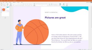
Don’t Present Without These 16 PowerPoint Dos and Don’ts

Table of Contents
Have you ever struggled to hold your audience’s interest during a presentation? Painstakingly created slide after slide only to be met with bored, disengaged faces?
Even the most confident speakers can falter when it comes to crafting compelling PowerPoint decks. Without proper slide design best practices, it’s easy to lose your audience in a sea of dense text, chaotic graphics, and disorganized content.
You don’t have to suffer through presenting lackluster slides anymore. In fact, following simple PowerPoint best practices can totally transform your deck from meh to marvelous.
In this post, we’ll share 16 PowerPoint dos and don’ts to level up your presentations and captivate audiences. These tips will help you create professional, visually striking slides your viewers will remember.

16 Dos And Don’ts Of Powerpoint Presentations
Here are some important 16 presentation dos and don’ts you need to keep in mind while creating slides and presenting them.
PowerPoint Dos
Let’s start with the best practices and strategies to implement when designing PowerPoint presentations . What techniques should you use to create memorable, polished slides?
1. Keep It Simple With Minimalist Design
Let’s start with a common mistake – overcrowded, distracting slide design. We get the temptation to tart up slides with fancy backgrounds. But resist the urge! Fancy templates with complex colored patterns or photos unrelated to your content just make it harder to digest key information.
Instead, embrace the power of simplicity. Stick to minimalist templates and avoid template themes with extra decorations. Use neutral backgrounds and empty negative space to let your content shine. Remember, your audience came for your message, not for clip art kittens. Keep slides clean and attention stays where it should be.
2. Cut the Clutter – Follow the 6×6 Rule
Now for another slide buzzkill – mammoth blocks of dense text. You may be tempted to pack slides with long sentences and paragraphs. Don’t give in! Text-heavy slides are guaranteed to lose audiences fast.
For easy-to-digest nuggets, follow the handy 6×6 rule. Limit slides to just 6 lines of text maximum, with each line containing 6 words max. Anything more turns into an overwhelming wall of words.
Stick to concise phrases, short sentences, and bulleted lists. Use just keywords and supporting stats – leave nonessential info out. With this less is more approach, key points will stick better.
SlidesAI is a text-to-presentation add-on tool that converts walls of text into beautiful slides. It does this automatically generate condensed phrases and bullet points from your text ensuring clutter-free slides throughout your presentation.
3. Boost Engagement With Quality Visuals
Speaking of key points sticking better…you know what helps even more? Quality graphics and visuals!
Research shows we process images 60,000 times faster than text. So reinforce your points with strong visuals. Use high-resolution photos, charts, illustrations, and infographics. But avoid clipart or random stock photos – ensure every graphic clearly supports your narrative.
Well-designed visuals make presentations more memorable and engaging. Just remember to optimize graphics for high-resolution viewing and include alt-text (alternative text) descriptions for accessibility. Then watch those visual aids boost information retention and audience interest.
SlidesAI has a library of 1.5M high-quality premium stock images that you can select and include in your slides.
4. Create Brand Consistency With Formatting
Imagine a presentation where every slide had a totally different layout, colors, and font… no visual consistency at all. It would look sloppy and amateurish, right?
Formatting matters – big time! Brand your presentation by using consistent design elements throughout all your slides.
Pick one professional font combination and stick to it. Limit your color palette to 2-3 colors max. Maintain alignment and space elements consistently.
With unified branding, your deck will feel polished, intentional, and visually pleasing. Bonus – consistent branding also boosts memorability as the audience becomes familiar with your “look”.
SlidesAI ensures complete branding consistency across all presentation slides by applying your color schemes , fonts, etc to designs through artificial intelligence.
5. Check Accessibility Settings
Speaking of memorability, if some audience members can’t actually view your slides, they certainly won’t remember your message.
Ensure your presentation is inclusive and accessible to all by checking key settings. Use color contrast and legible fonts so those with visual impairments can still grasp the content. Optimize images with alt text descriptions. Verify videos are captioned.
It may take a bit more effort up front but making your presentation accessible opens your message to a wider audience. It also demonstrates corporate responsibility.
6. Create Custom Icons and Illustrations
Most PowerPoint templates come with generic icons. However, you can amplify brand personality and memorability by creating custom icons and simple illustrations.
Don’t just use a generic checkmark when you can insert your own branded indicator relevant to your company. Design illustrated characters to represent concepts. Even use emojis strategically to inject fun and improve recall.
Handcrafted visuals, even if basic in style, make presentations stand out and drive home key points better than generic clip art ever could.
7. Use Subtle Animations – But Not Too Many!
Animations, when used well, can help guide the audience’s eye and transition between ideas smoothly. Emphasize key points and important transitions with subtle animations.
Entrance and exit effects can focus attention while builds and motion path animations can demonstrate processes dynamically. Use sparingly and subtly for the best impact.
But avoid going animation crazy with sounds and excessive movement. That becomes more distracting than engaging. Limit animations so they enhance content rather than detract.
8. Pace Your Delivery
Creating stellar slides is an excellent start but don’t stop there. The live delivery is just as crucial. Invest time practicing your presentation with your slides.
Rehearse the flow and pace of your narrative. Refine and memorize transitions between slides . Nail your timing to keep the audience engaged. Get so comfortable delivering your content that the slides become natural visual aids.
With great slides and honed delivery skills, your audience will hang on to your every word from the introduction to a powerful conclusion.

PowerPoint Donts
Just as important as the dos are the don’ts. What pitfalls should you avoid when designing PowerPoint presentations?
9. Don’t Use Distracting Backgrounds
Remember our tip to embrace minimalism? Well, the opposite is using distracting backgrounds. Avoid loud colors, complex patterns, or images totally unrelated to your content. At best, they are distracting. At worst, they make key info harder to comprehend.
Stick to simple, neutral backgrounds. If using an image, ensure it directly reinforces your narrative. Anything extra risks your message getting visually lost. Keep backgrounds clean so content remains the focal point.
SlidesAI avoids using distracting backgrounds like crowded templates or unrelated images in the presentations. It focuses on simple, clean backgrounds to keep attention on your key content.
10. Don’t Overwhelm With Walls of Text
We covered the 6×6 text limit rule earlier. But even with 6 lines and 6 words, slides can become text walls without good visual breakdown. Big blocks of text are tiring to read and make retainment tough.
Instead, thoughtfully chunk text into concise sections. Use headers, subheaders, and bullet points to organize key bits. Align text left for easier scanning. Supplement with supporting imagery. Breaking up text improves comprehension drastically.
11. Don’t Rely On Boring Bullets
Speaking of bulleted lists, bullet overkill is another issue that turns slides into snore fests. Slides crammed with back-to-back bullet points lose audiences fast. The endless text blurs together with minimal memorability.
For memorable content, limit bullets to key takeaways only. Then reinforce each point visually – a photo, icon, chart, etc. Quality visuals boost memorability way more than a slide stuffed with 11 bullet points ever could.
12. Don’t Use Inconsistent Formatting
Remember, formatting matters! Shifting layouts, fonts, and color schemes appear disjointed and sloppy. The mismatched design screams amateur hour.
Establish a visual style and stick to it slide to slide. Use the same fonts, limit your color palette, and space elements consistently. Most importantly – maintain alignment across all slides. With unified branding, your presentation will look polished and professional.
SlidesAI ensures your presentation formatting stays consistent slide to slide by applying your preferred color palette, fonts, etc through its intelligent algorithms.
13. Don’t Include Unnecessary Animations
Animations can be great for guiding the viewer’s eye and demonstrating motion. But avoid going overboard. Excessive animations, sounds, and movement become more distracting than engaging.
Use animations subtly and intentionally . Emphasize only key points and important transitions with simple builds or entrance effects. Anything superfluous, whether flying text or whooshing sounds, pulls attention away rather than enhancing content.
Keep it simple and purposeful. Let smooth, minimal animations work behind the scenes rather than take center stage away from your narrative.
14. Don’t Use Unsupported Graphics
Only include images, photos, charts, etc that directly support the ideas and messaging in your presentation. Don’t insert fluffy visuals that have no clear tie to your content.
Every visual aid you present should clearly reinforce your narrative rather than derail tangents. Unsupported graphics quickly become distractions. They also undermine your credibility if audiences can’t grasp the connection.
Keep it focused. Be intentional about every visual you include. Remove anything superfluous that doesn’t serve a purpose.
15. Don’t Plagiarize Content
While it’s fine to find inspiration from other presentations, copying chunks of text or visuals without proper attribution is unethical. Never pass off someone else’s hard work as your own.
Always credit sources directly within your presentation if incorporating external ideas, quotes, charts, images, etc. Also, avoid violating copyright laws by inserting visuals without licensing them appropriately first.
Your presentation should showcase your unique ideas, voice, and message. Ensure you create original content or properly cite anything derived from others. Your integrity depends on it.
16. Don’t Wing Your Speech
With great slides completed, don’t just wing it on presentation day. The live delivery is just as crucial. Invest time to refine your pacing, transitions, slide timing, and flow.
Practice your speech thoroughly with the deck so your narrative and movements feel natural. Nail down transition phrases between slides. Get 100% comfortable presenting your content.
With stellar slides and a well-rehearsed delivery, your presentation is sure to wow audiences from start to finish.

There you have it – 16 PowerPoint dos and don’ts for creating memorable, professional PowerPoint presentations. Apply the dos to make high-impact slides, and avoid the don’ts for mistake-free presentations.
Put these PowerPoint best practices into play and watch your ordinary slides transform into extraordinary visual stories. Your audiences will be engaged from start to finish.
But even with these tips, crafting stunning presentations can be time-intensive. Instead, let SlidesAI do the work for you using the power of AI.
SlidesAI integrates with Google Slides and PowerPoint (coming soon) to instantly generate professional presentation decks from your content. Simply input your text – SlidesAI will turn them into visually cohesive slides designed for audience engagement.
SlidesAI saves tons of time by handling slide layouts, formats, graphic design, and branding tailored to you. The AI delivers presentation-ready slides in seconds.
Take your Presentation skills from amateur to pro – try SlidesAI for free today!
What are the dos and don’ts of PowerPoint presentations?
Key PowerPoint dos include simple designs, concise text, quality visuals, consistency, accessibility, custom icons, subtle animations, and practice. Don’ts involve distracting backgrounds, walls of text, boring bullets, inconsistent formatting, excessive animations, irrelevant graphics, plagiarism, and winging it.
What is the 5 by 5 rule in PowerPoint?
The 5 by 5 rule recommends having no more than 5 lines of text per slide and 5 words per line. This keeps each slide focused and text easy to digest. Too much text overwhelms audiences.
What is the 7 rule on a PowerPoint presentation?
The 7 rule states that your slides should have no more than 7 bullet points. Like the 5 by 5 rule, this maintains simplicity for the audience. More than 7 bulleted items become hard to retain.
What are the 5 rules of PowerPoint?
5 key rules are: don’t cram slides with too much text, minimize slides for emphasis, utilize quality visuals, stick to a consistent format, and limit animations. Following these makes presentations professional, clean, and engaging.
Frequently Asked Questions
Key PowerPoint dos include simple designs, concise text, quality visuals, consistency, accessibility, custom icons, subtle animations, and practice. Don'ts involve distracting backgrounds, walls of text, boring bullets, inconsistent formatting, excessive animations, irrelevant graphics, plagiarism, and winging it.
5 key rules are: don't cram slides with too much text, minimize slides for emphasis, utilize quality visuals, stick to a consistent format, and limit animations. Following these makes presentations professional, clean, and engaging.
Save Time and Effortlessly Create Presentations with SlidesAI


Presentation Do’s and Don’ts for a Winning Deck
- October 2, 2023

Presentations have long been a powerful medium for conveying information, engaging audiences, showing information in visual ways, and leaving a lasting impact.
However, there’s something of an art to creating effective slides that takes careful consideration of design, content, and delivery. Here are some of the main presentation do’s and don’ts to keep in mind for the next time you’re in front of an audience.
Contents Toggle 1. The do’s 2. The dont’s
1. the do’s.
Know what you’re doing
Before diving into slide creation, clarify to yourself what the purpose of the presentation actually is. Think about what you want to achieve, who’s going to be presented to, and the key messages you wish to convey. This may seem obvious, but having a plan before diving in can really create a better flow of information.
Use visuals
Presentations come with the advantage of having space for images, charts, tables and so on. Not only will they help bring different colours and shapes to the content, they will break up the text and keep attention spans as high as possible. Keep in mind that any visuals you use are of high-quality, well-sized, and properly aligned with the content. As stated by The Presentation Training Institute , visual content has a lasting impact on the audience’s memory. Three hours later, they can recall 85% of what they saw, compared to 70% of what they heard. Three days later, the gap widens: 60% vs. 10%.
Stay consistent
Consistency in design elements across slides creates a cohesive and professional visual identity. Use a consistent color scheme, typography, and slide layout throughout your presentation to keep things looking smooth. Consider utilizing Master Slides or templates to ensure consistent formatting and design across all slides.
Remember visual hierarchy
Establish a clear visual hierarchy to guide your audience’s attention and emphasize key points. Use font size, bolding, color contrast, and layout to distinguish between headings, subheadings, and body text to make sure that the information flow is logical and easily digestible.
Tell a story
This one is a bit of a cliché, but is still important! Structure your slides in a narrative format that begins with an attention-grabbing introduction, presents supporting information, and concludes with a memorable takeaway. Remember to use common storytelling techniques, anecdotes, and examples to make your content relatable and engaging.
Practice and keep time
One of the most important things ahead of your presentation is to practice, practice, practice. Make sure your slides flow smoothly and fit within your time limit. Nobody wants a presentation to go on forever, so keep a decent pace and remember to leave room for questions and discussion at the end.
Use white space
White space is the empty space on your slides, which you shouldn’t consider as ‘wasted’. It makes your slides easier to read, gives them a clean look, and highlights the important parts. Don’t cram your slides with too much information, as this will end up being confusing or distracting.
Know your audience
Think about who you are talking to and what they need to know. Do they like deep dives into data, or do they prefer to know the headlines only. Use phrases and visuals that they can understand and relate to, with plenty of examples and references that matter to them.
Connect with the audience
If appropriate, make your presentation fun and interactive (within reason). Ask questions, do polls, or use other features to get your audience involved. You can also use slides to start group discussions, brainstorming sessions, or reflection exercises. Here’s a fantastic resource from Icebreaker Speech on h ow to connect with audiences before and during a presentation .
Get feedback
Every presentation is a chance to grow and get better, so if its an internal presentation, ask for feedback to find out what worked, and what didn’t. If you’ve been working on it for too long, you’ll not notice mistakes, or sections that can be edited down, so if you can, get feedback before the presentation itself to make sure it’s as good as it can be.
2. The dont’s
Only rely on text
Slides can do more than show words: They can also show images, videos, audio clips, or animations that make your presentation more exciting and memorable. Use different media to appeal to different senses and make your presentation more lively and varied, or risk losing the attention of your audience.
Forget to proofread and edit
Even if you’re proofread your presentation 12 times, there will still likely be typos or formatting errors that can be embarrassing when shown in front a bunch of people – especially if they are clients, or you’re doing a job interview task. After using spellcheck and the usual tools to check it, ask someone else to give it a good read as well. They will have fresh eyes and will be much better placed to spot any problems you missed.
Overwhelm with too much data
Resist the temptation to include every detail on your slides, and instead focus on key points, essential data, and impactful visuals. Your slides should provide a framework for your narrative, prompting discussion and elaboration, rather than bombarding your audience with too much data. If needed, you can print and hand out supplementary materials that go into more depth.
Overuse bullet points
Bullet points can be handy for listing key facts, but they can also be boring and dull when used slide after slide. Mix it up with short sentences, impact statements, quotes, images, charts and infographics. Otherwise, you might as well be showing them a completely plain and unworked word document.
Read from your slides
Your slides are there to help you, not do all the work. Don’t just read what’s on the screen or use your slides as a script. Instead, look at your audience and talk to them, using the slides as visual guides and summaries of the information you want to get across.
Forget about readability
Readability is paramount in effective slide design, so avoid using small fonts or complex typefaces are difficult to read. Stick to legible fonts, and ensure a sufficient contrast between the text and the background – for instance, yellow text on a white background.
Overload the text
One common mistake is cramming slides with excessive text that goes on for paragraphs. Instead, use concise and impactful phrases or keywords to convey your message, with any extra information being expressed verbally.
Overuse Transitions Or Animations
While animations and slide transitions can add visual interest, excessive use can be distracting and detract from your message. Opt for subtle and purposeful animations that enhance the flow and comprehension of your content, instead of having your words and images spin, zoom or bounce into view.
Use low-quality graphics
Low-resolution images, pixelated graphics, and stretched visuals can detract from the professionalism of your slides. Invest time in finding high-quality visuals or create custom graphics to maintain a polished appearance. Also, avoid using using clip art or generic stock images, as these can be easily spotted, lessening the impact of your work
You’re good to go
A good presentation can go a long way if done correctly. Of course, the human element of nerves plays its part, but if you know that you have a great deck, it will help with your confidence, and will get your messages across in engaging and professional ways. All of the above presentation do’s and don’ts can be achieved with OfficeSuite Slides , built to create beautiful presentations, allowing you to easily create decks that get the job done, and then some.
- presentation
- productivity
You May Also Like

- 15 minute read
The Best Microsoft Office Alternatives in 2024
- by OfficeSuite
- March 19, 2024

- 6 minute read
How To Copy A Word Document
- March 8, 2024

- 8 minute read
How to Stay Productive During a Business Trip
- February 28, 2024

Write It Right: How To Choose A Free Word Processor
- February 20, 2024

Strikethrough Shortcuts: The How & When
- February 13, 2024

- 5 minute read
How to Use OfficeSuite on Multiple Devices and Platforms
- January 19, 2024
Presentation Training Institute
A division of bold new directions training, do’s and don’ts of presentations.
Giving a presentation can be very stressful. Not only does it require hours of preparation and rehearsing, but you also have to overcome the fear that comes along with speaking in public. There are so many different components to keep in mind when preparing a presentation, such as interesting content, a strong opener, effective body language, good eye contact, visual aids and the list goes on. With so many different balls to juggle, getting ready for a presentation can easily become overwhelming. That’s why we have compiled a list of presentation do’s and don’ts that will help you deliver a dynamic and effective presentation.
The Do’s of Presenting
Know your audience.
Take some time to figure out who you will be presenting to and learn as much as you can about them. It is important to understand things like age, demographics, professional experience, prior knowledge of your topic, and what they might want to learn. Knowing your audience helps you figure out what content will be most meaningful to them and it allows you to tailor your message to meet their specific needs.
Prepare for Your Presentation
It might sound obvious but preparation is key to delivering a successful presentation. Spend time focusing on the primary goal of your presentation, and then create an outline of your content. You may also want to prepare a slideshow to accompany your presentation. Adequately preparing content and visual aids takes time, so don’t wait until the last minute.
Have a Strong Opener
You only have a few minutes to make a good first impression so develop a strong opener that will capture your audience’s attention right away. Stay away from boring introductions and wow your audience with a shocking statistic, a meaningful quote, a thought-provoking question, or an interesting story.
Make Eye Contact
When you are presenting to an audience, you want to make eye contact with them. This creates a bond between the speaker and the audience and establishes a connection. When you look someone in the eye, they are more likely to listen to you and buy into your message. In addition, eye contact communicates confidence and credibility, both of which are important components of a successful presentation.
Pay Attention to Your Body Language
Communication involves much more than just the words we speak. Our body language is an important part of non-verbal communication, equally important as spoken word. The way a speaker moves, uses gestures, and holds their posture will determine how much the audience will trust them. Speakers can generate great emotion and interest through non-verbal communication and their body language plays a huge part in their overall stage presence. Therefore, command the stage by standing upright, moving around as you speak, using meaningful gestures with your hands, and using your eyes to display confidence.
Incorporate Meaningful Visuals
Visuals are an important tool in delivering a memorable presentation. For starters, visuals transmit information faster than spoken or written words, meaning you can deliver more information in less time by using visuals. Visuals also help your audience understand your message. In fact, 65% of people are visual learners, which means visuals are more likely to be an effective means of communication. Finally, visuals make a presentation more interesting. Powerful photography, an interesting video clip, or an informative graph is all more visually appealing to an audience.
The Don’ts of Presenting
Read from your slides.
One of the worst things a presenter can do is to read verbatim from their slides. This makes you look unprepared and unprofessional. It also bores the audience to death, considering they can all read just fine on their own. Your slides are simply there to accompany what you are saying. So, remember that YOU are the main source of information, not your slides.
Talk Too Fast
Many people speak faster when they are nervous, but this can be detrimental to your presentation. Take a deep breath before you begin and focus on speaking at a steady speed to ensure the audience can clearly understand everything you are saying.
Use Filler Words
Another common occurrence when people get nervous is to insert filler words such as “um,” “uh,” and “so” into their speech. Oftentimes this occurs as the result of anxiety, and may even happen subconsciously. Therefore, rehearse several times in advance and pay attention to your use of filler words. When you feel one coming on, practice pausing and thinking in your head rather than using a filler word.
Fidget with Your Hands
Try your best not to fidget with your hands, as this is a common practice among nervous presenters. The audience will notice your body language and fidgeting will make you appear nervous and less credible. All that fidgeting can also be a huge distraction for your audience.
- Free Brand Audit
Powerpoint Do’s and Don’ts
by Michelle Stevens

Believe it or not, but PowerPoint, the ever present presentation tool, has been with us for nearly three decades. As anyone who has ever sat through a particularly dull slide deck can attest, there is a fine art to building and exhibiting a compelling presentation that keeps an audience’s attention. Here are a few tips to make your next PowerPoint something special:
DO: Stay Concise
The biggest rookie PowerPoint mistake is to copy and paste all your information verbatim into the slides.
Not only is this incredibly boring, but no one is going to have the time or inclination to read a wall of text. Don’t turn a presentation into a book.
There’s no hard rule, but a good general principle is to limit yourself to five words per line and five lines per slide.
DON’T: Overdo the Special Effects
After years of updates, PowerPoint is extremely full featured at this point.
But, while it can be fun to play with all the bells and whistles, too often they just end up being distractions,
Avoid overusing animations, flashy transitions, jarring sound effects, busy backgrounds, unnecessary drop shadows, ornate fonts, or any other effect that doesn’t make your information clearer.
DO: Use Humor
Because the format is so well established and we’ve all seen thousands of them, even the best powerpoint presentations can struggle to engage audiences.
Don’t treat a presentation like an open mic night at the comedy club, but the occasional comic, snappy pun, or amusing anecdote will liven things up, make your arguments more memorable, and prevent monotony from setting in.
DON’T: Just Read the Slides
Your audience, presumably, can already read. They don’t want to have the words on the screen read back to them word for word. Your slides should support an oral presentation, not just reiterate it.
Know the material well enough that your bullet points will jog your memory of the finer details that need to be addressed.
DO: Look Up!
Even if you aren’t just reading from the slides and are just referring to them, you should still look up now and then to maintain eye contact with the audience– how else will you know if they are still awake?
DON’T: Rush
Give your audience ample time to read each slide, but don’t delay so long as to lose their attention.
Also, don’t start speaking as soon as the next slide loads. Give the audience a few moments to scan the slide and get ready to hear what you have to say about it.
Likewise, don’t hit the next slide as soon as you finish discussing the current one. Give readers time to digest the information, and check out the room to see if they look ready to move on.
DO: Be Bold and Direct
Use bold colors and sharp contrasts, not only because it will enhance legibility but because it imparts emotion and energy into your presentation.
Similarly, when it comes to fonts for presentations, bigger is almost always better. A point size of 18 is just about the bare minimum. Shoot for something closer to the mid to upper 20s. Also, bear in mind, sans serif fonts are considered more legible at big sizes.
DON’T: Over Rely on Clipart
Especially in creative fields, people will notice clip art that doesn’t quite fit. Pull images and video from the web that are highly relevant and help drive your point home in an appealing way.
DO: Save Handouts for the End
There’s some debate about this one. Some authorities believe following a handout will improve audience recall, but many believe it just pulls awareness away from the presenter.
Attendees already have the constant threat of smartphones to distract them. Don’t give them anything else that might overshadow the main event.
Be the center of attention at all times. Make your case and make it well, and then provide supplementary materials for people to look over at their leisure.
DON’T: Overuse Statistics
No one needs to see all the raw data that went into your presentation. They want you to synthesize that information for them.
Slides overloaded with too many facts and figures will be tuned out. Besides anyone who needs all the granular details will ideally be able to get them on your website or handout materials.
If you have a stat you think is vital to the story you are telling, try to at least format it in a visually interesting way like a simple chart or graph.
DO: Use Bullets and Numbered Lists
Humans process information better when it’s organized in discrete chunks. Take out information and break it down into major sections, and then break those down into subsections.
Information should flow in an orderly fashion and be extremely easy to understand and digest.
Progressively released bullet points (that pop up one at a time) can also be useful for helping the audience keep track of where you are in the presentation.
DON’T: Be Afraid to Take a Pause
You don’t have to run through your slides unceasingly. Some presenters prefer to leave questions to the end, but others allow questions at any time.
But, if a question arises that causes a digression, consider hitting the letter “B” on the keyboard. This will pause the presentation and clear the screen,
If you leave the current slide up many eyes will stay fixated on it even as you are discussing something totally different.
Presentation Guru
5 dos and don’ts of presentation design.

Three out of every 5 people are visual learners. The human brain processes visuals 60,000X faster than any amount of text. And we remember 80% of what we see , compared to 20% of what we read and only 10% of what we hear. That’s why presentation design – from the intentional stringing together of text into a compelling narrative to the precise selection of relevant and attention-grabbing visuals – should be an essential aspect to any presenter’s agenda. There is a science, an art, a simple list of best practices to designing a presentation with impact. Below are five Do’s and Don’ts of presentation design that every presenter needs to know:
1. Do use the Rule of Thirds
The effective employment of this design tactic doesn’t involve experience with design software, much less a background in design.
Envision an image or slide as a grid, which is split up into three chunks of equal size horizontally and vertically . If you want to elevate yourself from amateur to professional presenter, utilize the vertical Rule of Thirds and place the object of an image to the left or right side. With an image of an animal or a person, always put the eyes in the horizontal upper third of the imaginary grid.
This design principle helps a presenter effectively harness the influence of their deck’s visuals, while creating opportunity for more white space.
2. Do include visuals
Minimal text, more images – every presenter’s new design mantra. Rightly so, considering that images increase retention by 42%.
To enhance whatever message you are trying to get across to an audience, always incorporate a relevant visual . Research has determined that if you present a piece of information with just text or in a verbal manner, your audience will only remember 10% of it three days later. However, include a relevant image and members will remember 65% of the information a few days after the presentation.
3. Do choose stock photography wisely
Have you ever witnessed a presentation where most every slide looked like the designer was trying to choose an even stockier photo than the one before it? Selecting the most appropriate stock image for each slide can seem like a daunting task. The ability to spot the differences between an insanely hokey stock image and a professional and alluring one separates the savvy from the lazy.
When searching for a stock image, you will likely have to revise your search terms until you receive a solid search query. Instead of searching for office desk, try office desk black and white or office desk modern.
To find stock images, check out iStock and Fotolia and purchase photos for under $10 per image. Or, make a compromise on library size and image options for free resources such as Pexel or Flickr .
4. Do continue learning
Just because you may not have adequate presentation design skills now, doesn’t mean you can’t ever obtain them. Take advantage of low-cost online education opportunities like those offered through Lynda.com and enhance your design software capabilities.
Start small by learning how to precisely crop an image in Photoshop. Or start big and learn how to design a data visualization in Illustrator. Virtually anything you desire to know is literally at your fingertips.
5. Do update old presentations
Busy professionals and presenters likely don’t have gobs of time to devote to producing embellished, wholly unique content for every media channel that exists today. The good thing is, all of the time spent on one deck isn’t in vain if you continue to revisit it in the months and years following a presentation. Update the design to reflect current trends. Then, use the deck and elements of it to distribute quality content on social media and LinkedIn.
1. Don’t overload slides with text
Take a cue from human psychology and minimize the amount of text you put on any one slide. According to Cognitive Load Theory, the more complex information a presenter places on a slide, the more easily our brains will become overloaded as we try to process the information chunk.
A simple way to cut down the extraneous load of content starts with providing an overview of what your audience can expect to hear throughout your talk. According to Matt Abrahams of the Stanford Graduate School of Business, audiences can retain structured presentations 40% easier than freeform presentations. Other strategies include presenting one idea per slide, eliminating jargon from your deck, and of course, utilizing visuals.
2. Don’t use bullet points
The whole premise of bullet points is that an individual is attempting to display more than one piece of information on each slide. Therefore, if you are adhering to the guidelines outlined in Don’t #1, you should have no use for the dreaded bullet points at all. If that isn’t enough to persuade you away from those little dots, take into account this 2014 study , which discovered that audience members experience enhanced difficulty paying attention to bulleted lists, as well as agreeing with and recalling them.
A relevant, high-quality visual will relay whatever point you want to make more effectively and efficiently than any bulleted list could even dream of accomplishing. Friends don’t let friends use bulleted lists…and we consider you our friend.
3. Don’t rely on templates
Presentation templates are tempting. But don’t give in to their ease and conveniency. Once you get started working within one, you’ll swirl into a rabbit hole of bullet points and lackluster slide designs.
On top of that, templates convey one ugly truth to your audience. That you don’t care about the presentation you are giving. That you didn’t even try. Swap the restriction of a template for a bold background image and a little bit of large text.
4. Don’t use low-resolution images
Spreading low-resolution images and subpar photography throughout your presentation will only set a negative tone. Primarily, it will project unprofessionalism, a lack of expertise, and an altogether lack of enthusiasm in your own ideas and thoughts.
All of that to say… Put the time and effort into selecting high-resolution images and well-intentioned photography. Because the majority of your audience will be visually-driven, the clarity and quality of your images is paramount to the ultimate success of your presentation and message.
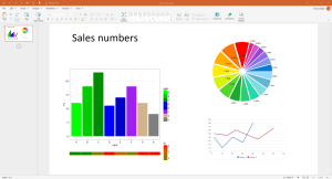
5. Don’t abuse charts and graphs
You’ve seen it before. Some presenter has shown you an atrocity of bar and line graphs and pie charts (oh my!). Despite their best intentions, you probably didn’t retain the message they hoped you would from that slide. According to a recent study conducted by Harvard and MIT researchers, people prefer unique data visualizations over traditional formats. Consider displaying information with a clean, crisp, creative data visualization .
You can design an engaging, professional, and elegant presentation – whether you graduated with a degree in graphic design or have never opened up an Adobe Creative Suites program. If you keep these 10 tips and tricks in mind, you will be one step closer to delivering a compelling, creative, and timeless deck.
- Latest Posts
Gabrielle Reed
+gabrielle reed, latest posts by gabrielle reed ( see all ).
- The 8-Step Guide to Approaching Presentations with a Journalistic Mindset - 21st June 2016
- 5 Dos and Don’ts of Presentation Design - 12th May 2016
18th June 2016 at 7:08 pm
Good basic tips that anyone can put into practice. Taking charts out of ppt and into illustrator is a sure way to improve the quality of them and having a limited colour palette immediately makes them look more professional…oh and not too many different type sizes.
27th July 2016 at 11:57 pm
Just keep the context and audience of the presentation in mind. While overloaded graphics are bad either way, simply putting one number on the screen will have an academic audience ask “Where’s the data?” and unique visualizations have to be finely tuned so as not to generate the impression as to be an effort to distract with high quality visuals from low quality data… Us scientists are a suspicious lot 😉
Mulesoft Course
10th August 2021 at 4:24 pm
Hello, this post has valuable information. Appreciate the efforts you put into writing this, and sharing with us.
Your email address will not be published. Required fields are marked *
Follow The Guru

Join our Mailing List
Join our mailing list to get monthly updates and your FREE copy of A Guide for Everyday Business Presentations

The Only PowerPoint Templates You’ll Ever Need
Anyone who has a story to tell follows the same three-act story structure to...

Sharpen your presentation skills while you work – 3 great audiobooks for FREE
If you’re always saying that you want to work on your presentation skills but...
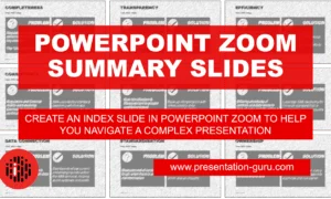
Powerpoint Zoom Summary for interactive presentations – everything you need to know
In this article I’ll be showing you how you can use Powerpoint Zoom to...

How to get over ‘Impostor Syndrome’ when you’re presenting
Everybody with a soul feels like an impostor sometimes. Even really confident and experienced...
now accepting new clients

Dec 18, 2019
PowerPoint Presentations: Do’s and Don’ts

The problem
Picture this: You attend a meeting a work. The presenter pulls up their white PowerPoint slides cluttered with paragraphs and charts. They drone on about the gap between point A and point B on a complicated graph. Of course, you can see neither point A nor B so you trust that their gap estimate is correct…and significant. Significant enough to take six minutes to cover. You look at your watch. The meeting is nowhere near complete. Though you feel happy for this vacation from your desk, you cannot seem to focus on what the presenter is saying. Speaking of vacation, you think about the tropical destination ad you saw this morning. A beach vacation would be nice…
Does this situation seem all too familiar? For many businesspeople, this is a weekly, if not daily, occurrence. The cycle continues: bad presentation after bad presentation. None are memorable. Few are tolerable. Put bluntly, these presentations are inefficient, ineffective time wasters. Though the present PowerPoint presentation situation feels bleak, you can be the agent of a positive future.
To turn you into a positive agent, let’s cover the dos and don’ts of PowerPoint presentations.
Dos and Don’ts
Don’t confuse your PowerPoint with your presentation. Your presentation includes your speech aiming to reach a goal with your audience (i.e. persuade, inform, educate, etc.). YOU are your presentation. Whether you accept the fact or hide in the dark, YOU either make or break your presentation. PowerPoint, or any other presentation software, whiteboard, chalkboard, paper, etc., is a visual aid. An aid to you, the presenter. A tool for you to either harness or misuse.
Do use visual aids. Though PowerPoint is a tool, not the presentation, using this visual aid does not have to be a bad thing. Visual aids help listeners follow along and understand key points.
Don’t build your presentation based on your PowerPoint. Most presentation preparation should include determining an attention-grabbing opener and closer and appropriate and well-supported content, gathering your thoughts in an organized and easy-to-follow way, and practicing the presentation for extemporaneous delivery, full of great eye contact and expression. A small part of presentation preparation should include preparing a PowerPoint. Unfortunately, many presenters instead use their PowerPoints as notes from which to read. In a study, four hundred fifty-three frequent PowerPoint viewers (1-2 times daily) were asked for the major aspects of PowerPoint presentations that annoyed them most [1]. The most frequent answers were 1) reading word-for-word from slides (71.7%) and 2) including full sentences (48.6%) [1]. The lesson learned: your PowerPoint should not be a written version of your presentation.
Do focus on one message per slide. Putting more than one message on a slide causes the audience to choose which message to focus on and takeaway [2]. Instead, save yourself the slide space and choose one message for your audience per slide.
Don’t overcomplicate your slides. White space (aka “empty” space) on your slide is good. When your slides become too cluttered, the audience will, at best, have a difficult time following, at worst, give up trying to understand. What is too cluttered? For example, if a single slide has more than one chart or graph, the slide is too cluttered. A good rule of thumb is six components per slide, with a component being a single bit of information like a bullet point with text, an image, or a title [2]. David Phillips, a Swedish presentation guru, explained that including any more than six pieces of information forces your audience to use 500% more cognitive resources [2]. Being that humans are energy-savers, this loosely translates to, you will lose your audience’s attention .
Do be careful when using charts and graphs. Though data can be helpful in illustrating a point or backing up an argument, most charts and graphs are too complex to understand quickly. To combat this, presenters will add red lines, data labels, and different markings to clarify [3]. Instead of helping, these marks further clutter the content [3]. If you must use a graph or chart, try using contrast to focus in your audience on the key message. For example, make all the numbers in your chart a faint light gray except the number you wish to focus in on, which can be a solid dark black [2]. Or, to avoid complicated charts and graphs, pull out the significant statistic and write it as a bullet point or phrase.
Don’t use hard-to-read fonts. Stick to serif and sans serif typefaces and use 18-point font or larger [1]. Also, avoid using all uppercase letters. Lowercase letters are easier for your audience to read [1]. Make sure the most important content on your slide stands out due to contrast and also, size [2]. Use larger font sizes for your content, rather than your titles [2].
Do use dark backgrounds on your slides. As stated above, you are your presentation. However, when you stand next to a huge bright screen, the presentation becomes less about you and more about the slides [2]. The audience will be drawn to look at the PowerPoint instead of you. Instead, utilize adept presenter and well-known entrepreneur, Steve Jobs’ technique of dark backgrounds accompanied with minimalism in text and imagery [1].
There you have it. Just four dos and four don’ts for creating infinitely more effective, efficient, and even entertaining PowerPoint slides for your next presentation. This will help your audience focus on you and your message, rather than using your presentation time to plan their next vacation.
[1] Hamilton, C., Kroll, T. (2018) Communicating for Results: A Guide for Business and the Professions. (11 th ed.). Boston, MA: Cengage Learning.
[2] https://www.youtube.com/watch?v=Iwpi1Lm6dFo
[3] https://www.youtube.com/watch?v=kRIcD7v-Vm8
FIND WHAT YOU'RE LOOKING FOR
Business Management
Content marketing, digital marketing, linkedin for business, marketing strategy, newsletter management, newsletters, social media marketing.
9 Dos and Don’ts of Presenting

Henry Caplan explains what you should and shouldn’t do during your next presentation.
1. Do – Manage your nerves
Often our nerves are internalised. There is always a difference between our perception of ourselves and how others see us. Sometimes this perspective can help with nerves as well.
So seek out feedback from people you trust when practising, but during your presentation take your time and try to enjoy your moment; chances are you don’t look anywhere near as nervous as you feel.
Remember, trying to deny nerves makes them worse. You can use nerves as energy.
2. Don’t – Use filler words
Many presentations begin with ‘so… um…’ and we all have moments where a filler creeps in. They take up space and they make us look unprofessional or unprepared, even when we’re not.
Instead of saying ‘errr…’ as you move to the next point or answer a question, take your time and take a breath if you have to. Silence for a couple of seconds is more powerful than a ‘well, er, anyway…’ ever will be.
3. Do – Move your hands but not without purpose
Failing to move your hands during a presentation is a sure way of making you look stiff and nervous.
I recommend starting with a relaxed one hand over the other about at the belly button in front of you. This is hands at rest; a fixed position when we want to be still.
Next position is hands in motion. You can have quite an impact when you use your hands to illustrate a point. Then when you complete a gesture, back to hands at rest.
I am not a fan of holding a pencil, pen, notes, clicker, clasping a podium. It tends to either be distracting or deaden our energy.
The only question I ever ask around hands is… Are you moving them with purpose? A sure-fire way to know if you are moving with purpose is if a gesture has an end. If not, you’re probably fidgeting.
Can you have your hands by your side? Absolutely, as long as they are not behind your back, in your pockets, flailing around or clasping onto something for dear life.
4. Don’t – Visualise your presentation going badly
It can be very easy for some people to get caught up in thoughts of their presentation going badly, and because they become preoccupied by their own fears, it becomes a self-fulfilling prophecy.
Try to focus on what you’re saying and what’s coming up next, but if you start to become self-conscious remember to take your time and find your position, and that it’s probably going better than you might fear. Resist the desire to analyse your progress whilst still giving your talk.
5. Don’t – Panic if you make a mistake

If you need to reiterate a point you perhaps garbled or gave incorrect information for, calmly correct yourself and don’t apologise; apologising is unnecessary, wastes time, and can make you look weak.
6. Do – Humanise your audience
If you can ask a question as you set up, you are already building the relationship and establishing rapport. By humanising your audience, you can also manage nerves. Sometimes even starting a talk with a question can create a response that helps you focus outward and reduces nerves.
If you build the audience up in your mind as a room of brutal critics, and fail to recognise that they’re human and have flaws and worries of their own, you risk overloading your nerves and failing to reach out to them.
7. Don’t – Let your guard down
Especially relevant after your presentation has finished, relaxing is good but letting your guard down with a ‘thank God that’s over, I hate public speaking,’ sort of phrase won’t do anything for your professional image.
The credibility of your presentation can be severely damaged if you become too friendly with the audience or reveal things you shouldn’t afterwards.
They don’t need to know how nervous you were. Relax and remember you’re still presenting until you leave the room.
8. Do – Ask questions
The question and answer session is easily forgotten at the end of a presentation, but is vital to demonstrating your knowledge and settling any problems. Answering questions clearly can really give the audience the sense that you know what you’re talking about.
The final Q & A is important, but it’s also good to ask questions throughout the presentation. This keeps the audience engaged and can be a useful tool if you forget anything or need a moment to find your place.

Henry Caplan
9. Do – Enjoy it
It’s a tough call for many people who dread giving presentations, but try to enjoy it! You’ve got a room full of people listening to you!
If you are too nervous or can’t enjoy it, try to learn from it, and just think – next time you’ll be a little bit better.
With thanks to Henry Caplan, an Interpersonal Skills Consultant at Working Voices
Recommended Pages

- All Templates
- Persuasive Speech Topics
- Informative
- Architecture
- Celebration
- Educational
- Engineering
- Food and Drink
- Subtle Waves Template
- Business world map
- Filmstrip with Countdown
- Blue Bubbles
- Corporate 2
- Vector flowers template
- Editable PowerPoint newspapers
- Hands Template
- Red blood cells slide
- Circles Template on white
- Maps of America
- Light Streaks Business Template
- Zen stones template
- Heartbeat Template
- Web icons template
- Business Planning

Is It A Good Time To Start a Business During a Pandemic?

A Brave New Entrepreneur for A Brave New World

Things Entrepreneurs Should Watch Out For
- Accounting & Finance
- People & Culture
- Sales & Marketing

Why Women Entrepreneurship Boosts Caribbean Economic Growth

How Do You Navigate The Business Landscape Post COVID-19?

How Do You Build Your Business Recovery Roadmap?

Leading with Integrity; Leading by Example

Integrity and the Entrepreneur at Work

Creating a Business-Friendly Environment – Part 2
- About Navig8
- Entrepreneurs Business Builder Programme
- Export Development Partnership
- UWI and Republic Bank Management Challenge
- Business Development Loan
- Commercial Mortgage
- Debt Consolidation
- Start-Up Costs
- Ad Spend ROI
- Facebook Engagement
- Instagram Engagement
- LinkedIn Engagement
- Home-Owner’s Guide To Securing A Mortgage
- Getting Business Credit From Your Bank
- Succeeding in the Low Touch Economy
- Get Going With Ecommerce
- Mindset To Success
- Business Bites
Do’s and Don’ts Tips for an Effective Presentation
Provided by the International Finance Corporation
Good presentation skills are vital to your success at work, both individual success and the company success. With poor presentation skills you cannot inspire and retain your employees, sell your products, attract the funding you need for your new venture, nor evolve in your career.
Improve your presentation skills with the following tips:
- Know your audience.
- Make an outline of what you will present with 3 or 4 main points.
- Familiarize yourself with the location and equipment before presenting.
- Use simple sentences.
- Use examples to illustrate your ideas.
- Practice your presentation.
- Breathe deeply, relax and smile at your audience before presenting.
- Use body language to reflect the content of the presentation.
- Make eye contact at random with audience.
- Talk to audience, don’t talk about them.
- Give the audience chances to join in your presentation.
- Use humor, when appropriate.
- Use too much jargon or specialized words/expressions.
- Turn your back to the audience.
- Have no eye contact during your presentation or fix your eye contact on one person.
- Talk and do something else at the same time.
- Move constantly in front of the audience.
- Distract your audience by doing something like jingling any metal objects in your pocket.
- Move your hands too much.
- Fold your arms either on your front or your back.
- Keep your hands in your pockets during your presenting.
- Dress yourself gaudily or wear too many ornaments.
- Imitate someone’s style.
For more resources:
- Find out how to close successfully your sales by honing your sales presentation skills
- Explore ‘ How to get what you want through effective communication ’
- Learn how to run an effective meeting
- Save time and money with those tips about better managing your time
Copyright © 2000 – 2017, International Finance Corporation. All Rights Reserved.
2121 Pennsylvania Avenue, N.W., Washington, D.C. 20433, www.ifc.org
The material in this work is copyrighted. Copying and/or transmitting portions or all of this work without permission may be a violation of applicable law. IFC does not guarantee the accuracy, reliability or completeness of the content included in this work, or for the conclusions or judgments described herein, and accepts no responsibility or liability for any omissions or errors (including, without limitation, typographical errors and technical errors) in the content whatsoever or for reliance thereon.
Want to be on our mailing list?
Business stage, commercial banking links, additional links.
- Privacy Policy
- Terms & Conditions
© 2023 Republic Bank Limited. All Rights Reserved.
- Financial Calculators
- Digital Media Calculators
- Fireside Chats
Find the images you need to make standout work. If it’s in your head, it’s on our site.
- Images home
- Curated collections
- AI image generator
- Offset images
- Backgrounds/Textures
- Business/Finance
- Sports/Recreation
- Animals/Wildlife
- Beauty/Fashion
- Celebrities
- Food and Drink
- Illustrations/Clip-Art
- Miscellaneous
- Parks/Outdoor
- Buildings/Landmarks
- Healthcare/Medical
- Signs/Symbols
- Transportation
- All categories
- Editorial video
- Shutterstock Select
- Shutterstock Elements
- Health Care
- PremiumBeat
- Templates Home
- Instagram all
- Highlight covers
- Facebook all
- Carousel ads
- Cover photos
- Event covers
- Youtube all
- Channel Art
- Etsy big banner
- Etsy mini banner
- Etsy shop icon
- Pinterest all
- Pinterest pins
- Twitter all
- Twitter Banner
- Infographics
- Zoom backgrounds
- Announcements
- Certificates
- Gift Certificates
- Real Estate Flyer
- Travel Brochures
- Anniversary
- Baby Shower
- Mother’s Day
- Thanksgiving
- All Invitations
- Party invitations
- Wedding invitations
- Book Covers
- Editorial home
- Entertainment
- About Creative Flow
- Create editor
- Content calendar
- Photo editor
- Background remover
- Collage maker
- Resize image
- Color palettes
- Color palette generator
- Image converter
- Contributors
- PremiumBeat blog
- Invitations
- Design Inspiration
- Design Resources
- Design Elements & Principles
- Contributor Support
- Marketing Assets
- Cards and Invitations
- Social Media Designs
- Print Projects
- Organizational Tools
- Case Studies
- Platform Solutions
- Generative AI
- Computer Vision
- Free Downloads
- Create Fund

Visual Dos and Don’ts for Powerful and Effective Presentations
Creating a dynamic presentation is an excellent way to engage with your audience and clearly communicate your message. However, distracting visuals or a lack of diverse media can detract from your overall message.
Whether you’re designing a PowerPoint presentation for a business meeting or class project, here are some key PowerPoint dos and don’ts for using visuals.
Do: Create a Clear Structure

A clear structure allows your audience to understand the key points of your message. From humorous graphics to detailed data, create a presentation that’s clear, consistent, and easy to read .
Simple text, a clear narrative, and an engaging introduction and conclusion help your audience to remember the essentials of your presentation.
Consider the ideal length of your presentation. If you find yourself speaking too much for a single slide, consider how an image, video, or graph could convey your idea faster than speaking about it.
Visuals, when used properly, not only add another layer of interest, but also provide a clearer form of communication for complex ideas.
If you want to combine the aforementioned things—image, graphics, etc.—you can also make an infographic-based presentation.
If presenting on behalf of your company, be sure to add brand colors , fonts , and color schemes that make the most sense.
If presenting for schools, use school colors and the like. Everything else? Make sure you have a clear concept and build from there.
Do: Understand Your Audience
Before you focus on the visual techniques of effective presentation, you need to understand your audience.
A graph that highlights your company’s finances can include many details, but other presentations don’t need as much detailed information.
Keep your audience focused by knowing the ideal time limit of your presentation, understanding the kinds of visuals that’ll add to the tone of your message, and staying on task with a variety of slides.
A humorous image may be appropriate if it describes a main point, but may not be appropriate if it takes your audience down a rabbit trail.
Do: Choose a Variety of Media

There’s nothing worse than a PowerPoint presentation lacking in images. Regardless of your audience, you need to use visuals to add interest and another layer of information to your presentation.
By choosing the right images, you can save yourself time, convey more detailed information, and connect with your audience.
Your presentation doesn’t have to use only images and text. There are many kinds of media you can use in PowerPoint and other presentation software.
A multimedia approach can include the following dynamic content:
Choosing the right video is important in keeping your audience engaged, rather than distracted. Consider the mood of your presentation, the expectations of your audience, and the information you’re intending to convey.
A video of your CEO describing your brand goals may not be any more effective than describing those goals yourself. However, a short clip of students stating why they love your new educational programming can be a powerful addition to your presentation.
Vectors can add a level of professionalism, drawing the eye to important information, like contact information. Music, when used in moderation, can add an engaging background for your presentation.
Remember to use the right formats for all your media, ensuring it’s compatible with your presentation software. Typically, PowerPoint accepts MP3, AIFF, WAV, and other common audio options.
If you’re planning on using any audio in your presentation, make sure the presentation location has adequate technical support. Check volume levels and adjust them before you begin your presentation. Otherwise, your presentation may be either uncomfortably loud or too quiet to hear.
Don’t: Add Large Blocks of Text
Multiple paragraphs of text on a single slide can be intimidating. Without presentation visuals, a PowerPoint presentation can quickly become dull, monotonous, and hard to understand.
Keep your message clear and your audience on task with short phrases and single sentences. An image can summarize an entire paragraph easily, keeping the focus on the presenter.
Adding presentation visuals not only allows you to reduce the number of text blocks, it can also help connect one point to the next. Use a common color scheme or image category to connect ideas.
Don’t: Start Without a Clear Structure

While powerful visuals can create interest and help guide your audience, a series of images and videos without structure can be confusing and distracting.
Even the best media needs to be carefully structured for an orderly progression from one idea to the next.
Don’t just focus on the informational structure, think about the mood and media structure, as well. Even colors prompt different emotions and messages , so consider each design choice as you go.
If you have a powerful, heart-breaking documentary clip, ease into it with some images or music. Afterward, you’ll need a careful transition to prepare your audience for upbeat images or brightly colored vectors.
Don’t: Use Unclear Images
Finally, adding a pixelated, blurry, or vague image can distract from your purpose, communicating an unprofessional presentation. When selecting images for presentation slides, choose clear, relevant, high-resolution images for best results.
For a wide selection of leading royalty-free images, visit Shutterstock and browse our library today. Pick the images, illustrations, and vectors that help you connect with your audience, increase interest, and clearly communicate relevant information.
Plus, within Create lives 1+ million assets to use in your design. Simply click Images > Stock Photos and type in keywords to search your images.
Presenting can be as natural as you make it. Follow these guidelines for an intuitive and impactful presentation.
Practice makes perfect, so don’t shy away from repetitions, memorization, and hyping yourself up. Establishing a strong routine each day can help you “play how you practice,” as you would in sports.
When it comes to presentation day, know there are always unexpected happenings, so do your best to prepare ahead of time.
Master the material, check body language, and show up with confidence and a welcome tone. So long as you care, your audience will care.
If you need a place to start, hop into Create and check out our pre-made, easily customizable presentation templates, or click File > Create new > Blank Canvas to scroll for the presentation specs. Click to open and craft your best material yet.
License this cover image via fourSage .
Recently viewed
Related Posts

Sustainable Design: 10 Brand Color Palettes to Stop Greenwashing
Try 10 FREE color palettes that sidestep greenwashing, offering more interesting—and just as eco-minded—color inspiration for sustainable design.

What Is Low Poly Art?
Explore the fascinating world of low poly art and delve…

Understanding Typography
Want to understand typography? Discover how font selection, spacing, and…

Understanding Basic Image File Types
This article will delve into image file types and formats,…
© 2023 Shutterstock Inc. All rights reserved.
- Terms of use
- License agreement
- Privacy policy
- Social media guidelines
- Presentation Design
Presentation Design Dos and Don’ts
- By: Kelly Allison
There are endless presentations out there, but very few are compelling and engaging enough to motivate audiences to action. That’s because creating a truly excellent presentation requires a level of design skill and knowledge that many people don’t yet have.
But you certainly don’t need to go to design school to create a high-quality presentation—you just need to have a strong idea of what works and what doesn’t. (Hint: Bullet points never work.)

Don’t use a lot of a text in your slides. If you pack your slides with lengthy text, then your audience is going to be straining to read what’s written rather than listening to what you have to say. Plus, large text blocks are the opposite of visually compelling.
Do use as few words as possible on each slide. Remember, the purpose of your slides is to create compelling visuals that complement your message; they’re not supposed to deliver the message the for you.
Don’t use the same font size throughout your slides. A uniform font throughout your presentation is not only a drag to read, but it fails to put emphasis on the most important parts of your message.
Do switch up font sizes throughout each slide. Making the most important words bigger and bolder allows your audience to take in the most valuable information first before moving on to the supporting content.
Don’t use bullet points. According to a 2014 study , audiences that viewed a bullet-point presentation had a significantly more difficult time paying attention and recalling information than those that viewed graphic-infused presentations.
Do use graphics to support your points. Rather than use bullet points, convey your information through compelling visuals and graphics. In addition to being more entertaining to look at, they also make it faster and easier for your audience to process information.
Don’t use a wide range of colors. A lot of newbie presenters think that more color means more compelling, when in reality, using an overabundance of hues can lead to a visually chaotic and confusing design.
Do adhere to a cohesive color palette. Choose three to five main colors to use throughout your presentation and try not to stray from them. This will ensure your presentation looks clean and cohesive while being more satisfying to look at.
Don’t center your text. A chunk of text or an image in the center of every slide makes all of your slides blend together, making it much more difficult for your audience to separate their attention from one point to the next.
Do switch up the alignment of your visuals. By left-aligning some images, right-aligning others, and including a few center-aligned images, you’re creating much more visual interest for your audience. Just be sure that when you use left and right alignment that you use another image or color on the other side to create a balanced visual.
Don’t use very detailed images and fonts. While detailed fonts and images can be beautiful up close, they can be difficult and confusing to interpret from the perspective of your audience.
Do use simple images and fonts. The goal of your presentation is to deliver a clear and simple message, so your fonts and images should be just that. Use clean, easy-to-read fonts and simple graphics with just a few colors to ensure your message is delivered with clarity.
Want more hands-on help developing your next presentation? Then check out Ethos3’s presentation design services .

Kelly Allison
Join our newsletter today.
© 2006-2024 Ethos3 – An Award Winning Presentation Design and Training Company ALL RIGHTS RESERVED
- Terms & Conditions
- Privacy Policy
- Diversity and Inclusion
- Is a New iPad Pro Coming Soon?
- Get It Now: Spring Tech Deals at Amazon
10 Dos and Don'ts for Technical Presentations
Designing a technical PowerPoint presentation
- Brock University
Yuri_Arcurs / Getty Images
When using PowerPoint or other presentation software for a technical presentation, your primary concerns should be:
- How technical should this presentation be?
- Can I make this information clear and concise?
A technical presentation is the most difficult type of presentation to make. Your audience may include highly skilled individuals as well as those who are not as familiar with the concepts or terminology. You will need to address both learning styles. Audience analysis is an important skill in itself and should be one of the first items on your presentation checklist.
- Keep the fonts consistent in both style and size throughout the whole presentation.
- Use common fonts that are available on every computer , such as Arial, Times New Roman, or Calibri. This way, there will not be any surprises if the computer used for the presentation does not have the unusual font you chose installed, and therefore substitutes another font.
- Include relevant photos and graphics such as simple charts or diagrams. Consider whether the audience can understand the information presented or if you need to simplify the chart/diagram for clarity.
- Make sure that graphics are of good quality so the information is easily deciphered at the back of the room.
- Make labels on charts large enough to be read at a distance.
- Use heightened contrast on your slides. Consider creating the same presentation in two formats — one presentation with dark text on a light background, and a second, duplicate presentation using light text on a dark background. This way, you are ready for either a very dark room or very bright room to present in and can choose the suitable presentation accordingly.
- Keep the number of slides to a minimum. Present only what is necessary and don't overwhelm the audience with too much information. Technical information is hard enough to digest.
- Allow time for a question period at the end of your presentation.
- Know everything about your topic so that you are prepared for any question that arises, even if the question was not covered in the material you presented.
- Have detailed handouts ready to give out after the presentation. This allows the audience to later reflect on the presentation and the information is ready at hand for any necessary follow-up.
The Don'ts
- Don't confuse the audience with disorganized slides so that the purpose of the presentation is not crystal clear.
- Don't overwhelm your audience with busy slides. Think of that old cliché — "less is more."
- Don't use small images or small text on your slides. Think about those people at the back of the room.
- Don't use script type fonts. They are notoriously difficult to read at the best of times, let alone on a screen.
- Don't use more than three or four related points on each slide.
- Don't use a fancy background . It may be pretty or even on topic, but the text will be difficult to read. Keep to a subtle backdrop for the information.
- Don't add pictures for the sake of decoration. Make sure there is a point to be made and that information is obvious to the viewer.
- Don't use sounds or animations unless they are to emphasize a point. Even then, it is risky as they can detract from the main focus of the presentation.
- Don't use acronyms unless all members of the audience are familiar with them.
- Don't include more than four or five items on a chart. Even though Excel charts can be made to show great detail, a slideshow is not the place for this information. Stick to important facts only.
Get the Latest Tech News Delivered Every Day
- The 10 Most Common Presentation Mistakes
- Change Font Colors and Styles on PowerPoint Slides
- 9 PowerPoint Presentation Tips for Students
- Beyond the Basics in PowerPoint
- 4 Parts of a Successful Presentation
- 10 Tips on Becoming a Better Presenter
- How to Lose an Audience and 10 Ways to Get Them Back
- An Introduction to PowerPoint
- What Is an Animation in Presentation Software?
- The 8 Best Google Drive Add-ons for 2024
- The Definition of a Slide (or Slides) in a PowerPoint Presentation
- How to Apply Security in PowerPoint Presentations
- 12 Tips for Delivering a Knockout Business Presentation
- PowerPoint Master Slide
- What Is Microsoft PowerPoint and How Do I Use It?
- How to Use Google Slide Animations and Transitions
PTA One Voice Blog
Official Blog of National PTA
- About One Voice
- PTA Website
- Donate to PTA
DO’s and DON’Ts of Preparing for Presentations

We’ve all attended an event at least once where the presenter failed to connect with us in a meaningful way. After such presentations, we left feeling disappointed and frustrated with what seemed to have been a waste of time. No one plans or expects for presentations to turn into a disaster but the reality is that this can happen to anyone who is not properly prepared to present effectively.
As Benjamin Franklin once said, “By failing to prepare, you are preparing to fail.” This is the first of a four-part series which focuses on best practices for preparing and conducting face-to-face and virtual presentations. In this article, we will cover the most critical DOs and DON’Ts when preparing for face-to-face presentations.
1. Do ensure your presentation format meets any specific requirements or guidelines for the event.
This is the most important step in your preparation. If for any reason you haven’t been provided with this information, don’t assume you are free to present in any manner you choose. Take the time to inquire about this information as soon as possible. Additionally, ask for a copy of the evaluation that will be used by participants after your presentation. Knowing how you will be evaluated can serve as an advantage.
2. Do confirm that your content is relevant to the needs of your audience.
If the content is not perceived as relevant, it will be quickly dismissed by your audience. If you do not know your audience well or are unsure as to whether your content will meet their needs, speak to the organizer of the event as well as anyone else who can share the level of knowledge your audience may have on the topic.
3. Do offer tools and resources that address the topic and are useful to participants.
While your audience is certainly interested in learning more about your topic, they are also hungry for tools and resources that will empower them in addressing a specific need. To accomplish this, provide your audience with copies of your presentation along with any essential handouts. Make sure to also include your contact information so that participants can reach out to you for more information in the future.
4. Do contact the event organizer to request audio/visual equipment and make any other technical arrangements.
If you need internet connectivity, don’t assume it will be provided on the spot without making a request in advance. In some rooms, wireless connection may be weak in which case a wired connection may be your only option. Similarly, if you plan on playing any audio or video content, make sure to request speakers in advance.
5. Do practice your presentation.
Practice makes perfect so take a few days to review you presentation and rehearse your notes. Also, take the time to ask others for feedback.
1. Don’t design text-heavy slides.
Slides should never serve as your notes. They should be visually appealing and include images to help reinforce concepts when necessary. The more text you pack onto a slide, the smaller the font size becomes and the more difficult it is to read. For this reason, follow the 6/6/6 rule. No more than 6 words per line, 6 lines per slide, and 6 text slides in a row before incorporating an image slide for transition to a new topic.
2. Don’t use custom fonts or fancy slide animations.
Keep in mind that if you are asked to load your presentation onto a facility laptop, your custom fonts and animations may not appear as expected. This happens because some fonts and animations may not be installed or compatible with other computers or older software. This can lead to slides that no longer appear or function as they should. Therefore, only use font styles that are common to most computers and avoid animations as much as possible unless you are certain that they will work on the computer from which you will be presenting.
3. Don’t use small text or colors that makes your content hard to read.
For bullet points and most slide content, consider using large text (font size 24 or higher) as well as theme colors that complement each other well. Making your text larger than usual will accommodate those in the back of a long room. If you’re presenting with the lights on, consider using dark text on a light background.
4. Don’t forget to interact with your audience.
Most participants don’t want to hear a lecture. They want opportunities to be engaged in meaningful discourse. Build in time for questions whether to check for comprehension during the session or for discussion at the very end of the presentation. If this is a training workshop, provide opportunities for participants to demonstrate their understanding and practice specific skills in groups. Also, if the event requires advance registration, find out how many plan to attend as this can alter the format of your presentation. In comparison to a large audience, a very small audience can allow for more interactivity and movement.
Once you have taken the time to properly plan for your presentation, you will feel more confident with its design and structure. As we move on to Part 2 of this series, we will cover techniques for engaging your audience during the presentation so that you can successfully deliver your message.
Check out the entire series on Best Practices for Effective Presentations: Part 2 , Part 3 , and Part 4 .
Read More Posts on PTA One Voice
- Parent Voices Are Needed More than Ever to Inform and Improve Public Education in America
- Tips for After School Healthy Habits
- Supporting Arts Education through PTA’s School of Excellence Program
- Plan Ahead for a Healthy School Year
- Thoughtful. Affirming. Trustworthy. Are You a Youth Champion?
- How Parents Can Support Teachers for their Child’s Back-to-School Success
- Tips to Grow Your PTA Membership
- Show Your PTA/PTSA’s Value and Grow Membership with the Reflections Program
- Meet the 2022-2023 Reflections Outstanding Interpretation Winners!
- Four Tips for Parents Whose Children Learn Differently
- Help Protect Your Child Against Meningococcal Disease
- Healthy Habits for Spring Break
Absolutely wonderful article! Thank you for these great tips!
These are all great tips for giving a presentation. Making sure that your presentation format meets the guidelines or requirements is so important. One thing you definitely need to double check is to make sure that you have the audio and visual support you need. You don’t want to show missing the specific cable or file format you need to make everything run.
Speak Your Mind Cancel reply

- #PTABackToSchool (11)
- Advocacy (183)
- Art Education (77)
- Communications (124)
- Education News (222)
- Every Child in Focus (134)
- Family Engagement (330)
- General (358)
- Health and Safety (248)
- Membership (77)
- Money Matters (33)
- PTA Spotlights (29)
Subscribe via Email
Enter your email address:
Delivered by FeedBurner
Read Older Posts
Copyright © 2024 · National PTA ·
Return to top of page
, .
, .
, .
, .
, .
, , , , , , .
- Dos and Donts
Powerpoint Templates
Icon Bundle
Kpi Dashboard
Professional
Business Plans
Swot Analysis
Gantt Chart
Business Proposal
Marketing Plan
Project Management
Business Case
Business Model
Cyber Security
Business PPT
Digital Marketing
- Digital Transformation
Human Resources
Product Management
Artificial Intelligence
Company Profile
Acknowledgement PPT
PPT Presentation
Reports Brochures
One Page Pitch
Interview PPT
All Categories

Do and Don'ts PowerPoint Templates, Dos and Don'ts PPT Slides
- Sub Categories
- 30 60 90 Day Plan
- Advertising
- Agile Development
- Aims and Objectives
- Before and After
- Blockchain Bitcoin
- Celebrations
- Certificates
- Challenges Opportunities
- Channel Distribution
- Communication
- Competitive Landscape
- Construction Management
- Crowdfunding
- Current State Future State
- Custom PowerPoint Diagrams
- Environment
- Gap Analysis
- Geographical
- Input Process Output
- Key Messages
- People Process Technology
- Post-it-Notes
- Problem Statement
- Proposal Management
- Pros and Cons
- Recruitment Strategy
- Research and Development
- Risk Mitigation Strategies
- Short Term Long Term
- Start Stop Continue
- Thesis Defense Dissertation
- Transition Plan
- Transportation
- Venture Capital Funding
Presenting Dos And Don’ts Of Social Media Happy Sad Emoji Icon PowerPoint Slide. The template is available in PowerPoint and works in sync with Google Slides too. The slide is fully customizable. You can change the color of the slide’s background. Also, the font style, size and color can be changed. You can insert your text in the text holders provided. The name of your company and the official logo can also be added. The image has a good quality. The layout can be downloaded at the ease of a click.

Presenting problem solutions presentation template. This is a problem solutions presentation template. This is a two stage process. The stages in this process are problem solution, current state future state, before after, challenges solutions, compare, comparison.

This PPT presentation is very easy to use. You just have to follow the instructions given in the slides. You can easily save the template in PDF or JPG format. The shape, size and orientation can be easily altered as per the requirements of the presentation. The font size, font style and font color can be conveniently changed. The PPT slideshow can be viewed in widescreen or standard size in the ratio of 16:9 and 4:3 respectively. So just download our designs or upload them to Google Slides and they will work smoothly.

Presenting before versus after comparison 4 text boxes powerpoint graphics. This is a before versus after comparison 4 text boxes powerpoint graphics. This is a two stage process. The stages in this process are problem solution, current state future state, before after, challenges solutions, compare, comparison.

This PPT presentation is very easy to use as all you have to do is just follow the instructions given in the sample slides. You can easily save the template in PDF or JPG format. The shape, size and orientation can be easily altered as per the requirements of the presentation. The font size, font style and font color can be conveniently changed. The PPT slideshow can be viewed in widescreen or standard size in the ratio of 16:9 and 4:3 respectively. So just download our designs or upload them to Google Slides and they will work smoothly.

Presenting current state vs future state analysis powerpoint slide designs download. This is a current state vs future state analysis powerpoint slide designs download. This is a two stage process. The stages in this process are problem solution, current state future state, before after, challenges solutions, compare, comparison.

Presenting dos and donts comparison bullet powerpoint guide. This is a dos and donts comparison bullet powerpoint guide. This is a two stage process. The stages in this process are problem solution, current state future state, before after, challenges solutions, compare, comparison.

SlideTeam brings you visually attractive and high-quality current state vs. future state creative PPT slide template. It is 100% modifiable as editing is possible. You can download and save the PPT in any desired format. Downloading is fast and can be shared quickly with no issues regarding deterioration of quality of the slide. The designs are professional. Changes can be made as per company’s branding. Infact you can add in your company name and logo for more personalization. Easy and hassle free to comprehend. Also compatible with Google Slides.

Presenting, dos and don’ts thumb up thumbs down PPT slide. Hassle free, simple and quick download. Completely modifiable text as per your need. Change the color scheme and contrast to suit the contextual requirement. Thoroughly editable orientation and size of PPT icons. Include your own company logo, tagline, watermark, trademark etc. to personalize. No alteration in original resolution of presentation images posts editing. Can be converted into pdf or jpeg format as per the need.

Presenting current state and future state text boxes powerpoint slide backgrounds. This is a current state and future state text boxes powerpoint slide backgrounds. This is a two stage process. The stages in this process are problem solution, current state future state, before after, challenges solutions, compare, comparison.

Arrows moving from current to future state PowerPoint template. Choice to display PowerPoint template in standard and widescreen view. Presentation designs are well-suited with Google slides or MS Office PowerPoint programs. Quickly downloadable and easily shareable presentation design. Can be transformed into JPG and PDF format. Trouble-free replacement of your company’s logo. Access to open on a big screen display. Perfect for business professionals, managers and industry leaders. Trustworthy and accurate PowerPoint slide show. Enough space to add your information alongside the image. Customize the fonts, colors, layout, etc.as per your requirements and business needs.

Introducing our premium set of slides with Dos And Donts Of Implementing Process Observation. Ellicudate the two stages and present information using this PPT slide. This is a completely adaptable PowerPoint template design that can be used to interpret topics like Do Model Respect Every Individual Behaviors, Do Ask Humble Inquiry Questions, Do Document And Review Observations. So download instantly and tailor it with your information.

Presenting positive and negative sign text ppt diagrams. This is a positive and negative sign text ppt diagrams. This is a two stage process. The stages in this process are plus and minus, advantages disadvantages, positive and negative.

Presenting roadmap to future PPT slide current vs future state PPT model. Simple data input like company logo, name or trademark. This PowerPoint theme is fully supported by Google slides. Picture quality of these slides does not change even when project on large screen. Fast downloading speed and formats can be easily changed to JPEG and PDF applications. This template is suitable for marketing, sales persons, business managers and entrepreneurs. Adjust PPT layout, font, text and color as per your necessity.

Presenting dos and donts circular good ppt example. This is a dos and donts circular good ppt example. This is a two stage process. The stages in this process are problem solution, current state future state, before after, challenges solutions, compare, comparison.

Presenting Positive And Negative Balance Seesaw Good PPT. These are the fully customizable templates that can be modified as per your choice. You can add text, change colors and sizes. You can also change the background colors and add icons as per your requirements. These slides are also compatible with Google Slides and are available in standard as well as widescreen.

Offering bridge between current state future state PowerPoint layout. Clean and clear PPT slide with high resolution content. Easy to customize presentation model for inclusion and exclusion of data as per individual choice. Pre designed PowerPoint model for students, teachers, financial analysts and other business professionals. Personalize the slides with your company name and logo. Flexible option for conversion in PDF or JPG formats. Easy to download and save in format of your choice. Available in both Standard and Widescreen slide size.

Stunning current state vs future state PPT template to grab the attention of your viewers. The PPT graphic is popular and in demand due to its easy use and accessibility. Edit any number of times without any resolution change. Suitable for any need of planners, strategists, engineers, designers etc. Easy and convenient downloading by following simple steps. Fully compatible with Google. Have the tendency to enhance the overall impact of your presentation. Presented to be saved in JPEG, JPG or PDF format if required.

Presenting old versus new before and after ppt template. This is a old versus new before and after ppt template. This is a two stage process. The stages in this process are problem solution, current state future state, before after, challenges solutions, compare, comparison.

Presenting current state future state comparison powerpoint slide deck. This is a current state future state comparison powerpoint slide deck. This is a two stage process. The stages in this process are problem solution, current state future state, before after, challenges solutions, compare, comparison.

Presenting yesterday today tomorrow powerpoint slide inspiration. This is a yesterday today tomorrow powerpoint slide inspiration. This is a three stage process. The stages in this process are problem solution, current state future state, before after, challenges solutions, compare, comparison.

Presenting dos and donts good and bad practices ppt slide. This is a dos and donts good and bad practices ppt slide. This is a two stage process. The stages in this process are problem solution, current state future state, before after, challenges solutions, compare, comparison.
Presenting dos and donts bullet points with tick mark icon ppt slide. This is a dos and donts bullet points with tick mark icon ppt slide. This is a two stage process. The stages in this process are problem solution, current state future state, before after, challenges solutions, compare, comparison.
This dos and don’t PowerPoint templates is completely customizable. This PPT slide is completely editable. This template is compatible with all major Microsoft PowerPoint versions and Google Slides. You can edit the color, icons and font size as per your requirement. The PPT slideshow can be viewed in widescreen or standard size in the ratio of 16:9 and 4:3 respectively. Just download the dos and don’t PPT template and use it for your next presentation with the required changes.

Presenting start to finish status update current vs future state ppt images. This is a start to finish status update current vs future state ppt images. This is a two stage process. The stages in this process are problem solution, current state future state, before after, challenges solutions, compare, comparison.

Presenting positive and negative infographic ppt slide. This is a positive and negative infographic ppt slide. This is a two stage process. The stages in this process are plus and minus, advantages disadvantages, positive and negative.

Presenting dos and dontsthumbs up thumbs down powerpoint template. This is a dos and dontsthumbs up thumbs down powerpoint template. This is a two stage process. The stages in this process are problem solution, current state future state, before after, challenges solutions, compare, comparison.

Presenting dos and donts with smiley sad emoji ppt slide. This is a dos and donts with smiley sad emoji ppt slide. This is a two stage process. The stages in this process are problem solution, current state future state, before after, challenges solutions, compare, comparison.

Presenting current state vs future state bridge powerpoint slide designs download. This is a current state vs future state bridge powerpoint slide designs download. This is a two stage process. The stages in this process are problem solution, current state future state, before after, challenges solutions, compare, comparison.

Presenting current vs future state with world map PowerPoint slide graphics template. The PPT is professionally made by our designers which can be customized according to your requirements. You only have to replace the dummy text with your original presentation content in the space provided. Our slides can also be personalized by adding your company name and logo in it. The biggest advantage of downloading our slides is that you get to use it in both widescreen and standard screen format and either saving it in a PDF or JPG format too. The slide is fully compatible with Google Slides and can be downloaded fast at the click of a button.

Presenting current state future state steps powerpoint slide. This is a current state future state steps powerpoint slide. This is a two stage process. The stages in this process are problem solution, current state future state, before after, challenges solutions, compare, comparison.

Presenting dos and donts with yes no push buttons powerpoint templates. This is a dos and donts with yes no push buttons powerpoint templates. This is a two stage process. The stages in this process are problem solution, current state future state, before after, challenges solutions, compare, comparison.

Presenting current state future state line graph powerpoint slide deck template. This is a current state future state line graph powerpoint slide deck template. This is a two stage process. The stages in this process are problem solution, current state future state, before after, challenges solutions, compare, comparison.
Presenting past present future road with arrow powerpoint slide images. This is a past present future road with arrow powerpoint slide images. This is a three stage process. The stages in this process are problem solution, current state future state, before after, challenges solutions, compare, comparison.

Presenting problem and solution powerpoint template. This is a problem and solution powerpoint template. This is a two stage process. The stages in this process are problem solution, current state future state, before after, challenges solutions, compare, comparison.

Presenting positive and negative thumbs up thumbs down ppt slide. This is a positive and negative thumbs up thumbs down ppt slide. This is a two stage process. The stages in this process are plus and minus, advantages disadvantages, positive and negative.
Presenting dos and donts with thumbs up thumbs down icon ppt icon. This is a dos and donts with thumbs up thumbs down icon ppt icon. This is a two stage process. The stages in this process are problem solution, current state future state, before after, challenges solutions, compare, comparison.

Presenting positive and negative assessment bullet example of ppt. This is a positive and negative assessment bullet example of ppt. This is a two stage process. The stages in this process are plus and minus, advantages disadvantages, positive and negative.

Bringing Dos And Don’ts Of Marketing PPT Slide. The template is available in PowerPoint and is suitable for use in Google Slides too. The slide is available in two variant ratios – 4:3 and 16:9. We ensure highest standards of quality are maintained. The slide can be edited as per your requirement. You can change the color of the background. You can replace the sample text with your own content. The font style, size and colors can be changed according to your needs. You can insert the company name and logo conveniently. It can be downloaded easily.

Presenting current state and future state comparison communication ppt design. This is a current state and future state comparison communication ppt design. This is a two stage process. The stages in this process are problem solution, current state future state, before after, challenges solutions, compare, comparison.

Presenting positive and negative feedback report infographic ppt design. This is a positive and negative feedback report infographic ppt design. This is a two stage process. The stages in this process are plus and minus, advantages disadvantages, positive and negative.

Presenting positive and negative symbol with bullet ppt example. This is a positive and negative symbol with bullet ppt example. This is a two stage process. The stages in this process are plus and minus, advantages disadvantages, positive and negative.

Presenting past present future ppt slide. This is a past present future ppt slide. This is a two stage process. The stages in this process are problem solution, current state future state, before after, challenges solutions, compare, comparison.

Presenting Dos And Don’ts Presentation Diagram PowerPoint slide. It is available in PowerPoint and is in sync with Google Slides too. The layout can be customized. You can add your content in the text holders provided, the company name and logo can be adjusted in the slide too. It is available in two variant aspect ratios – 4:3 and 16:9. The high resolution of the image ensures good quality. It can be downloaded at the ease of a click!

Presenting positive and negative assessment document sample of ppt. This is a positive and negative assessment document sample of ppt. This is a two stage process. The stages in this process are plus and minus, advantages disadvantages, positive and negative.

Bringing this Dos And Don’ts Tick Mark Cross Comparison Slide. The slide is in PowerPoint and is suitable for use in Google Slides also. The template can be edited. You can add your own content and change the font style, size and color. You can also insert your company’s name and logo. It is available in two variant aspect ratios – 4:3 and 16:9. It can be downloaded at a click!

Introducing gap analysis source and recommendation PPT slide. This is prodigiously devised PPT template expounding about the significance of organizational structure for the business. The Presentation design, verse, themes, figures, etc. are totally amend able. This is also quite feasible for business experts, business management. This Presentation graphic can be easily adaptable with the Google Slides and can be exportable into PDF or JPG formats.

Introducing our premium set of slides with Dos And Donts For Social Media Marketing. Ellicudate the two stages and present information using this PPT slide. This is a completely adaptable PowerPoint template design that can be used to interpret topics like Post Frequently, Always Sell, Value Feedback, Annoy Your Audience, Message Should Be Short And Clear, Create Personal Touch With Audience. So download instantly and tailor it with your information.

Stunning before and after PowerPoint diagram PPT template. Presentation slides can be viewed in standard and widescreen view. Fast to download, share and insert in the presentation. PowerPoint designs goes well with Google Slides. They provide high-quality performance. They have time-saving abilities. Convertible into Jpeg and Pdf document. Add logo, image and icon as per the requirement. Suitable for business leaders and managers. Awesome slides which attract the attention of the audience with realistic approach towards time.

Presenting before versus after template picture polaroids powerpoint presentation. This is a before versus after template picture polaroids powerpoint presentation. This is a two stage process. The stages in this process are problem solution, current state future state, before after, challenges solutions, compare, comparison.

Striking before and after PowerPoint slide layout PPT template. High quality visuals and colors. Presentable and easy to comprehend visual graphic. The presentation template can be downloaded and saved in any desired format. Valuable for the business presenters and entrepreneurs as they can showcase their business success in a creative way. Privilege of insertion of logo and trademarks for more personalization. Adaptable to wide screen view without the problem of pixilation. Can be used with Google Slides.

Presenting to you a slide on “Dos And Donts Of Content Writing List PowerPoint Shapes”. It is accessible in standard and widescreen view. All the instructions are given to easily edit the slides. Insertion of logo, icon and image can be done with ease as per the requirement. The various shapes in the timeline presentation template can be customized or changed according to your preference. Various options of icons are given on every topic which can be used with ease. The presentation slide is fully compatible with Google Slides and can be viewed in formats such as PDF and JPEG. Make the most of it and enjoy the wonderful presentation.

Present your slideshows with our high-quality graphics current state vs. future state image and text PowerPoint slide designs. The PPT is fully customizable. You can change the icons, colors, text and image of the template as per the instruction guidelines provided. Option to add your company name and logo is also provided. It can be saved and viewed in multiple formats. Google Slides are also compatible with it. You can easily replace the dummy content with the presentation content and present the slideshow within few minutes. Downloading and sharing is quick and hassle free.

Presenting Dos And Don’ts Vector PowerPoint Slide Template. The slide is available in wide and standard screen sizes. It is fully editable in PowerPoint and is suitable for Google Slides as well. The presentation’s content along with the company’s name and logo can be added easily. The color of the background can be altered too. It can be downloaded easily.

Presenting before after industrial growth ppt slide. This is a before after industrial growth ppt slide. This is a two stage process. The stages in this process are problem solution, current state future state, before after, challenges solutions, compare, comparison.
Presenting dos and donts with right wrong icon powerpoint slides design. This is a dos and donts with right wrong icon powerpoint slides design. This is a two stage process. The stages in this process are problem solution, current state future state, before after, challenges solutions, compare, comparison.

Presenting gap analysis action plan target and progress PowerPoint guide slideshow which is 100% editable. This PPT template is crafted with attractive display and unique components. This PPT slide is easy to customize and enables you to personalize it as per your own criteria. The presentation slide is fully compatible with Google slides, multiple format and software options. In case of any assistance, kindly take instructions from our presentation design services and it is easy to download in a very short span of time. The images, layouts, designs are of high quality and ensures quality in widescreen.

Presenting before versus after slide with market powerpoint layout. This is a before versus after slide with market powerpoint layout. This is a two stage process. The stages in this process are problem solution, current state future state, before after, challenges solutions, compare, comparison.

Presenting current state and future state compass powerpoint slide background designs. This is a current state and future state compass powerpoint slide background designs. This is a two stage process. The stages in this process are problem solution, current state future state, before after, challenges solutions, compare, comparison.

Presenting current state and future state sample slide. This is a current state and future state sample slide. This is a two stage process. The stages in this process are problem solution, current state future state, before after, challenges solutions, compare, comparison.
Item 1 to 60 of 137 total items
- You're currently reading page 1
- 0121 665 4060
- [email protected]

- Behavioural Benchmarking
- Competency Frameworks
- Development Centres
- Virtual & On-site Assessment Centres
- Workforce Diagnostics

- Apprentice Recruitment
- Industrial Placement Recruitment
- Early Career Recruitment
- Mid-Senior Level Recruitment
- Graduate Recruitment
- Temporary Recruitment
- Temporary to Permanent Recruitment
Do you need temporary staff?
Recruit graduates into temporary to permanent roles ; deliver for you business today, and prepare for tomorrow.

Our Programmes
- Customer Service Excellence Programme
- Introduction to Business and Customers Programme
- Aspiring Leaders Programme
- Emerging Leaders Programme
- Empowered Leaders Programme
- Sales Success Programme
Areas we cover
- Apprenticeship Programmes
- Closed Programmes
- Commercial Acumen Training
- Leadership & Management Training
- Sales Training
- Virtual Training
We Can Deliver All Of Our Programmes Virtually
Click here to find out how we can develop your teams across cities, counties and countries!

- Board of Governance
- Diversity & Inclusion
- Resource Centre
© Discovery ADR Group Ltd

Five Do’s & Five Don’ts of Delivering a Presentation
Whether you present frequently in your job or you present just once in a while, our Head of Training and Development has put together some simple but effective Do’s and Don’ts to help you get deliver good, strong presentations to your colleagues, stakeholders and customers:
Presenting Dos:
- DO be yourself – gather feedback from trusted people about what you do well when interacting at work. This will give you a solid foundation to add extra attributes to and overcomes the challenge that people sometimes perceive of having to become a different person to present well.
- DO slow down – practice speaking out loud fairly slowly and make a conscious effort to slow yourself down when the presentation starts. The tendency is to rush (sometimes to get through it!) but this accelerates any nerves and can hinder clarity of speech.
- DO ask questions early – Q&A doesn’t need to be just at the end of a presentation. We are used to getting responses when we communicate so just hearing other people can make us feel less “in the spotlight”.
- DO learn from others – if you watch what you think is a really good presentation, have a think about what made it so engaging and try some of those things in your own presentations. Practice first though and get some feedback from a peer before you do it ‘on the day’!
- DO use acronyms or memorable alliteration – a strong presentation will focus around three key points and making these three key points memorable will give your audience some ‘take-aways’. Try using simple alliteration. For example:
‘Every presentation should be delivered with…Confidence, Conviction, Control’.
Presenting Don’ts:
- DON’T use a font size (PowerPoint) of anything less than 30! The writing is too small and you have too much text on one slide!
- DON’T wing it! You are risking everything if you don’t prepare and people will feel that their investment of time isn’t being taken seriously.
- DON’T end abruptly – ensure your presentation is rounded off nicely. A good way of doing this is by asking yourself the question ‘so what?’ How does the presentation you have delivered relate to your audience? What action do you want the audience to take as a result? Summarising these things can be a great way to draw things to a close.
- DON’T read from the projected screen (PowerPoint) – you will have your back to the audience and will appear underprepared. And it will be pretty boring too!
- DON’T be afraid to enter the ‘death zone’ – this is the space between you (the presenter) and the audience. Walk around and use the space you have – this will help you to relax, look less rigid and feel less isolated.
Remember that whether you are delivering to a group of 10 or a group of 100, the same rules apply. If larger audiences make you more nervous, try ‘acting as if’ you’re in front of a smaller group. Envision the room where you’ve been practicing in, rather than the audience you’re actually faced with. But make sure this doesn’t prevent you from making eye contact throughout!
The latest course dates for our Presenting with Impact course have been released! Click here to book onto the course…
Ipsley Court
Berrington Close
Call: 0121 665 4060
Policies & Procedures
Terms & Conditions

IMAGES
VIDEO
COMMENTS
Take a pause after you ask a question or make a strong statement. Spare your audience a moment to think, reflect, and ponder. Or leave a gap of silence right before you present something exciting to build suspense and anticipation. No one expects you to go on talking for 10-15 minutes without a pause.
11 "Do's" for Giving a Great Presentation. 1. Believe that giving a great presentation is a learnable skill. Giving a good presentation is a learnable skill. Even true introverts can give excellent presentations. In fact, introverted people actually tend to plan better presentations though they may be more afraid to give them.
The DON'TS of Giving a Presentation. *Don't Read from Your Slides: It's perfectly acceptable to use a slideshow in your presentations, but you should never read directly from your slides. The text on your slides should be short and concise and serve as a guide for your speaking points. *Don't Read from a Script: You will sound like a ...
5. Don't Use Hard-to-Read Fonts. Your audience will rely on your presentation to guide them through understanding the topic you're discussing. Make sure that your points are readable and clearly state the key points. You don't have to use the most aesthetic font available. Stick to basic and easy-to-read options.
14. Don't Use Unsupported Graphics. Only include images, photos, charts, etc that directly support the ideas and messaging in your presentation. Don't insert fluffy visuals that have no clear tie to your content. Every visual aid you present should clearly reinforce your narrative rather than derail tangents.
Here are some of the main presentation do's and don'ts to keep in mind for the next time you're in front of an audience. Contents. 1. The do's; 2. The dont's; 1. The do's. Know what you're doing. ... not do all the work. Don't just read what's on the screen or use your slides as a script. Instead, look at your audience and ...
Do's and Don'ts of Presentations. March 1, 2022. Giving a presentation can be very stressful. Not only does it require hours of preparation and rehearsing, but you also have to overcome the fear that comes along with speaking in public. There are so many different components to keep in mind when preparing a presentation, such as interesting ...
1. Do keep your slides simple and succinct. "The most common mistake I see is slides that are overcrowded. People tend to want to spell everything out and cover too much information," says Jurczynski. Not only are these everything-but-the-kitchen-sink slides unattractive and amateurish, they also divert your audience's attention away from ...
1. Avoid crowding your slides. Although adding more information to your presentation may be beneficial, putting too much on a single slide can make it difficult for viewers to follow or identify the important points. When working on your slides, pay attention to the density of content.
DO: Stay Concise. The biggest rookie PowerPoint mistake is to copy and paste all your information verbatim into the slides. Not only is this incredibly boring, but no one is going to have the time or inclination to read a wall of text. Don't turn a presentation into a book. There's no hard rule, but a good general ...
5. Do update old presentations. Busy professionals and presenters likely don't have gobs of time to devote to producing embellished, wholly unique content for every media channel that exists today. The good thing is, all of the time spent on one deck isn't in vain if you continue to revisit it in the months and years following a ...
Dos and Don'ts. Don't confuse your PowerPoint with your presentation. Your presentation includes your speech aiming to reach a goal with your audience (i.e. persuade, inform, educate, etc.). YOU are your presentation. Whether you accept the fact or hide in the dark, YOU either make or break your presentation.
3. Do - Move your hands but not without purpose. Failing to move your hands during a presentation is a sure way of making you look stiff and nervous. I recommend starting with a relaxed one hand over the other about at the belly button in front of you. This is hands at rest; a fixed position when we want to be still.
Use examples to illustrate your ideas. Practice your presentation. Breathe deeply, relax and smile at your audience before presenting. Use body language to reflect the content of the presentation. Make eye contact at random with audience. Talk to audience, don't talk about them. Give the audience chances to join in your presentation.
Don't use more than four fonts in any one publication. Clearly label each screen. Use a larger font (35-45 points) or different color for the title. Use larger fonts to indicate importance. Use ...
Don't: Start Without a Clear Structure. Make sure your presentation is structured from one idea to the next. License this image via fourSage. While powerful visuals can create interest and help guide your audience, a series of images and videos without structure can be confusing and distracting.
Presentation Design Dos and Don'ts. There are endless presentations out there, but very few are compelling and engaging enough to motivate audiences to action. That's because creating a truly excellent presentation requires a level of design skill and knowledge that many people don't yet have. But you certainly don't need to go to ...
The Don'ts. Don't confuse the audience with disorganized slides so that the purpose of the presentation is not crystal clear. Don't overwhelm your audience with busy slides. Think of that old cliché — "less is more." Don't use small images or small text on your slides. Think about those people at the back of the room.
1. Don't design text-heavy slides. Slides should never serve as your notes. They should be visually appealing and include images to help reinforce concepts when necessary. The more text you pack onto a slide, the smaller the font size becomes and the more difficult it is to read. For this reason, follow the 6/6/6 rule.
Or maybe you want to shift the mood or tempo of the presentation." The blank slide is the visual equivalent of a pause, and most stories could use at least one. And with blank slides, Jurczynski has one main "don't": "You cannot use white blank slides, because if you do, people will see it and think something is broken." 6.
SlideTeam presents do and don't's PowerPoint templates for your next presentation. Whether you have to showcase right and wrong, positive and negative, thumbs up thumbs down, feedback, do and don't's ppt templates. We have them all. You can get access to this awesome collection of PPT templates.
For example: 'Every presentation should be delivered with…Confidence, Conviction, Control'. Presenting Don'ts: DON'T use a font size (PowerPoint) of anything less than 30! The writing is too small and you have too much text on one slide! DON'T wing it! You are risking everything if you don't prepare and people will feel that their ...
Don't sit down during your presentation unless you're with a small group and everyone can see and hear you. Don't use a microphone unless you have to. If you face the group and speak in a clear voice, you probably won't need the microphone. Watch the "ummms." Avoid using your favorite verbal placeholder as your speak; replace it with a silent ...
Mar 1, 2024 - Here are five do's and five don'ts to keep in mind when pitching your business ideas or having a class presentation :
While we've all spent the last week freezing to death in this 50-degree nightmare, the calendar says it's finally springtime in Richmond. Driving the news: Spring officially kicked off last week, earlier than usual because of the leap year. Regardless, spring is technically here and after a long winter stuck indoors, the city's ready to embrace warmer weather with our favorite springtime rituals.