

Regina Ball Design
Sketches | case studies | thoughts.
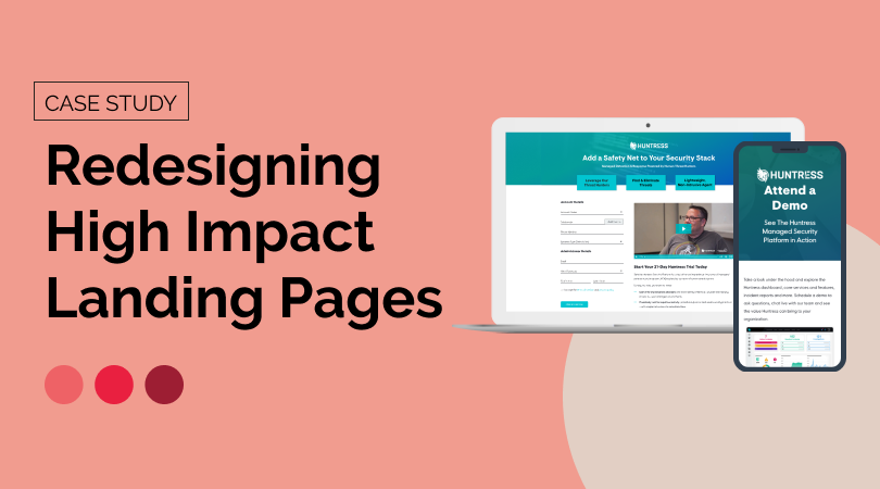
Case Study: Redesigning High Impact Landing Pages
Now that I’m a few months out from redesigning two of the most high impact landing pages on the Huntress website, I wanted to reflect on the process and try to answer what makes a high impact landing page and what elements drive conversion.
The Trial Registration Process

When I first joined Huntress and made my passion for design as a conversion optimization tool known, I took on the project of redesigning the Free Trial Signup experience. That included the landing page where users signed up, and the following digital touchpoints and user onboarding. The conversion rate for the existing page was fairly strong (16%), but the page design was not consistent with the overall site and did not provide enough information to the user.
The first step was to levelset the need for a redesign with our stakeholder group:

Our stakeholder group of Brand + Content leads, the Chief Marketing Officer, and key Sales leads agreed that this project was worth prioritizing. I then documented some goals for this undertaking so that we had something to measure the final product against.

The first step was to start gathering data from Google Analytics, Google Pagespeed Insights, Hubspot (our CRM + CMS), and Hotjar. Not only did we need to establish a baseline for typical web metrics like time on page and view to submission rate, but I also wanted to get a sense of how a user behaved on the existing page; were they getting frustrated? Were they going back to previous pages? Was it clear what was being asked of them and why?

After reviewing heatmaps, scroll maps, watching a lot of user recordings, and looking at the data, it became clear that there were opportunities for improving the user experience in terms of information but also function:

The current page wasn’t loading fast enough, wasn’t accessible, and wasn’t giving the users the information they needed to quickly make an informed decision. Now that we knew the weak points we needed to address, and had a good understanding of how our user base (aligned with our existing Marketing personas) was behaving, I compiled some inspiration and best practices.

Knowing what information we needed to prioritize and industry best practices, I began creating wireframes.

Once my team and I decided this was the right direction, I created high fidelity mockups that we could present to the stakeholder group. We knew we needed to prioritize the top three value propositions, what would happen during the trial period, and social proof in the form of partner testimonials. We also wanted to include a testimonial video to instill more trust with a real partner sharing their experience on camera.

After gathering feedback from our stakeholder group, we decided the following design was the strongest, and iterated on it:

This version highlights the value propositions, clearly and visually outlines what happens during the trial, has a testimonial video, and provides some stats about the Huntress platform.
With our resources at the time, we knew there would need to be some tweaks once this was created in Hubspot. Since I had already been learning Hubspot as a CMS, I decided to undertake building the page myself in the Hubspot Design Manager (when we later had more resources, this was properly recreated by our development team to be more easily editable).

We ran into some limitations, as to be expected, that meant we had to push some of the content further down the page, but visually it was a cleaner experience that used our existing website modules.
One thing that we had realized during the process was that once the user submitted the form they were redirected immediately into the platform, which could be a bit jarring. We decided to create a Trial Success page that acted as a confirmation as well as a guide to users to answer the question of “what’s next?” This page includes a short video explaining the keys to a successful trial, along with a datasheet that explains those keys in more depth. We also wanted to make sure that users could easily contact the Partner Success team with any questions.

There was an existing nurture email sequence that we now needed to overhaul, in terms of visuals and content. Content writer Rachel Bishop retooled all three emails to guide the user through the trial process and I redesigned the visuals of the emails to match the new web experience and Huntress branding.

With all three touchpoints launched, we began to collect data and validate our hypotheses. After some time, we saw the view to submission rate climb to 21% (it was previously 16%). Recent Hotjar click maps indicate users are utilizing the testimonial slider and watching the testimonial video, validating the need for social proof that was previously missing.

While we are still running A/B tests on the trial page, I turned my focus to one of the other most important pages on our site: the demo page, which suffered from many of the same problems as the old trial page had.
The Demo Page

Because we had recently completed the trial redesign and had seen success, we used that as the model for the demo page and were able to use it as a framework.
A lot of the reasons to redesign the page were similar to the trial page:

With similar goals for the outcome of the project:

We repeated the research process so that we could set a baseline for the page performance, and examined user behavior on the current page to see the pain points.

I also gathered some inspiration and best practices for landing pages that are very form focused.

Because we planned to use the trial page as a framework for the visuals (and to be cohesive with the rest of the site), I did not create wireframes but went right to high fidelity mockups.

Drawing on the trial page learnings and design, the demo page provides an at a glance view of the Huntress Security Platform to tease what the user will see in a live demo, and provides social proof in the form of partner testimonials in a carousel.

As with the trial, our stakeholder group reviewed the mockups and selected the above as the layout to pursue.

Having learned our technical constraints, the first published version of the redesigned page did not differ widely from the final mockup; the only changes were subtle, visual changes. We also revamped the content to make it more relevant and straightforward.
What I did not expect was that only a few months after launching the new demo page, the conversion rate (form submissions/pageviews) had increased 46% and our view to submission rate was up to 19%.
Given that we were able to make a significant impact on the conversion rate of both of these pages, I wanted to think about and put forth some potential answers to the question of what makes a high impact landing page?
What makes a high impact landing page?
Based on my experience with these redesign projects, a high impact landing page needs to have the following:
A clear call to action that has a higher level of effort, like a form
It’s a relatively easy ask for a user to click a button, but taking the time to fill out a form means the user expects something more in return, and the brand is receiving something higher in value than a single click metric (lead information, etc)
Clear value proposition(s)
What is going to make this user fill out the form? What pain points will this action solve? With the Huntress Trial, by completing the form the user is granted access to the platform for 21-days to see how it works and how effective it is.
Cohesive visual appearance
It’s extremely jarring to go from one page on a website to another page that looks completely different and visually disconnected from the one you came from. A lack of visual cohesiveness leads to confusion and potentially event doubt, lowering the chance that the user will take that high-value action.
Social proof (testimonials, stats, etc)
It’s a bit silly to say “but don’t take my word for it,” but that’s what users need to see. Any company will tell you their product is great and you should fill out their form, but what about the people who have gone before them? Did they literally get what they signed up for?
I learned so much and flexed so many new skills throughout this process, from being able to really leverage analytics and user behavior data to dusting off my wireframing skills. The increase in conversion rates provided proof that design can have a huge impact on conversion, and really demonstrates that it’s not just about “making it pretty” but presenting information in a way that makes sense, is easy to understand, and solves a problem or pain point for the user. On the other side, higher conversion rates on pages like these lead to more leads (pun was unavoidable), and therefore more revenue.
More cohesive brand appearance? ✅ Better user experience? ✅ More revenue? ✅
Share this:
- Click to share on Twitter (Opens in new window)
- Click to share on Facebook (Opens in new window)
- Click to email a link to a friend (Opens in new window)
Leave a comment Cancel reply

- Already have a WordPress.com account? Log in now.
- Subscribe Subscribed
- Copy shortlink
- Report this content
- View post in Reader
- Manage subscriptions
- Collapse this bar
- Case Studies
Landing Page Redesign Case Study

Problem statement
The Harvard Business Review shared a whitepaper from Microsoft where simple design changes represented millions of dollars in revenue.
You might be wondering, "what simple design changes could increase my bottom line?"
There is no one size fits all website design. Design can change depending on your branding or your user's needs. What is effective for one brand might not work at all for your brand. In this case study, we were tasked with finding the optimal design for a business with hundreds of local landing pages.
Solution summary
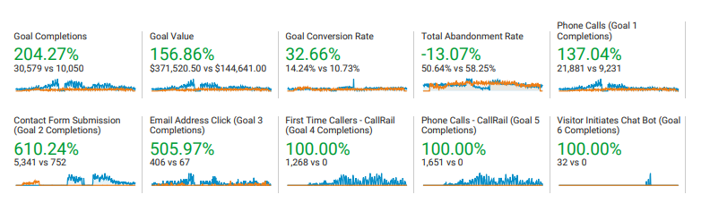
After extensive A/B testing and design iterations, we arrived at an optimal design that, once implemented, improved sitewide conversion rates, including all blog pages and location pages, from 5.03%> to 10.73%> to 14.24%.
Due to my team's SEO initiatives, user sessions increased by 122%, from 90,000 to 207,000 .
The effect of both was a mind-boggling increase in sales.
By the project's end, my team's changes resulted in an estimated $1,255,512 million from 12,650 additional phone calls.
We performed numerous tests over six months on multiple platforms. Making only minor tweaks to the design.
We tested several design changes, such as:
- Mobile menu
- User reviews
- Changed the CTA wording
- Added breadcrumbs
- Shortened the title length
- Added a footer bar on mobile
- Added a mobile responsive design
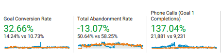
My team's efforts translated into 137% additional phone calls over 12 months .
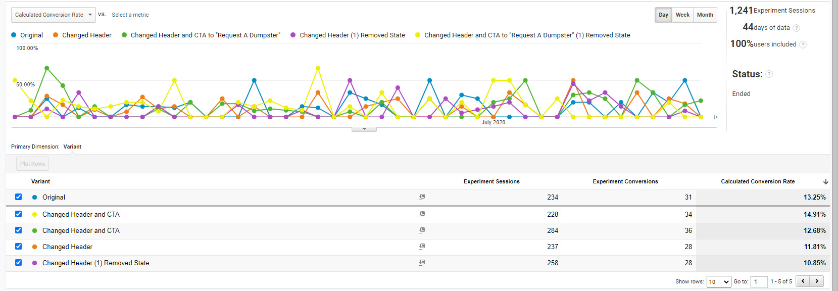
Changing the headline in Google Optimize doubled the conversion rate
One of marketing professionals' most effective conversion rate and most commonly explored techniques is experimenting with the headline.
Imagine if I walked up to you and told you that I could double your phone calls simply by removing two words on your landing page.
That is what happened with our initial tests on the Las Vegas location page; those results were confirmed with the Kansas City location page tests.
- Simply removing "Roll off" from "Roll off Dumpster Rental" on the Las Vegas landing page doubled the conversion rate from 5.03% to 11.19%.
- Changing the Kansas City landing page's title increased the conversion rate to 11.01%, confirming the results.
- Google Optimize was 95% confident that the version with the shorter headline worked better than the version with the longer headline.
- Experimenting further, changing the CTAs increased the conversion rate to as high as 14.91%.
Another way to phrase it is if this test were performed 100 times, 95 out of 100 times, the shorter headline would work better.
Testing the buttons also helped

We found that changing the text on the buttons improved the conversion rate.
Call to actions (CTAs) are another commonly explored conversion rate optimization. The colors and placement of the CTAs are simple and effective optimizations.
One problem we addressed in this redesign was that the "request a call" buttons would lead a user to a page with a contact form where they could enter their email address, where a salesperson would follow up with their request.
- 'Callback' leads closed 10% of the time, whereas direct phone call leads closed 25% of the time.
- Therefore, simply making it easier to call in any way increased sales.
Instead of directing some users to a contact page, we ensured all the buttons had a "click to call" CTA.
This change increased both calls and revenue because instead of asking users to "request a call," we made it evident that they would be calling us instead.
A/B testing in Unbounce produced promising results
Unbounce is a cloud A/B testing tool. It allows you to conduct multivariate testing in the cloud. It's an excellent tool for PPC traffic because you can control which users visit your cloud pages and get a clear answer on the optimal design for your audience.
It's also great for complete design overhauls. Your client will often be thoroughly attached to their current site, so it helps to return to the team with a fully redesigned mockup with various testing controls and sound data.
This may be no surprise, but while testing designs in Unbounce, we found that users were likelier to make a phone call on a mobile-optimized site.
The above screenshot is from one of many tests we conducted. We reached an average 21.88% average PPC conversion rate while testing pages within Unbounce.
- Button colors: In Unbounce, we tested different button colors to see how they affected conversion rates. The most influential colors were blue and green, outperforming orange significantly. That was interesting because of the infamy of the Amazon orange.
- Trust elements: Trust elements can do a lot for conversion rates. In Google's groundbreaking whitepaper " How people decide what to buy lies in the ‘messy middle' of the purchase journey ," the researchers identify six consistencies in every buyer's journey. In the whitepaper, reviews, specifically star reviews, were the most influential factor they tested.
- Content length: Note how long the content is; interestingly, with the Unbounce tests, we discovered that totaL length did not matter. Instead, what mattered more was the button design, mobile friendliness, and the inclusion of trust elements in the above-the-fold content .
- Heuristics: A category heuristic might be like megapixels in a camera; in the case of dumpster rentals, it was dimensional and weight capacities. These elements are essential for comparison shoppers. Users like to see categorical information because it helps users make quicker purchasing decisions.
See the final Unbounce landing page design below. Note the differences in the above-the-fold content.

- Different logo
- Large buttons
- Different CTA
- Categorical heuristics
- Star reviews
Call quality also increased during the same timeframe because we negated irrelevant keywords .
The original PPC landing pages had an average conversion rate of 3.41%, whereas one Unbounce page had a conversion rate of 21.88%. That is a dramatic difference. Note that one Unbounce page still performed well without a mobile version! Suggesting that the changes worked.
We made the site mobile responsive
This seems like a no-brainer. And most of the time, mobile responsiveness is a priority. Yet, I've been at corporations without a mobile-optimized site in 2022!
Discount Dumpster had a mobile responsive site; it just needed work. What a user sees in that first moment on your site matters a lot. We ensured every viewport had some call to action. In addition, the website design was optimized for various viewports.
From the Unbounce tests, we determined that the most significant change we could make was to include a mobile-optimized version of the site. The mobile-optimized site performed at 21.88% versus the 11.92% conversion rate of the desktop-only Unbounce landing page. This made perfect sense because our conversion type was phone calls.
You can see a before and after of the mobile design changes.
- The original mobile menu took up more than a third of the viewport
- The original design had the "Request pricing" wording
- The title's font size was large in relation to the viewport
- Breadcrumbs were not visible
- The headline was much wordier
These minor changes influenced the probability that someone would make a phone call.

On mobile, we A/B tested a floating footer element to the bottom of the page with an easy-to-click button making it even easier for users to call us.
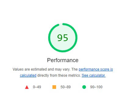
We re-did the whole site to meet Google's Core Web Vitals
After working on the mobile responsive design, the last change was optimizing the site's scripts to meet Google's UX Lighthouse scores .
I don't think many appreciate how difficult optimizing for speed can be. I've worked on many sites for many organizations and have seen countless roadblocks from internal and external stakeholders and doubts about the possible rewards of focusing on the user experience.
With today's audience increasingly online, shopping decisions are even more competitive. A bad user experience or a slow site could harm your business. The Core Web Vitals are here to stay; your company could suffer if it adapts too slowly.
- Mozilla saw 60 million more downloads each year by making its webpage 2.2 seconds faster.
- Amazon calculated that webpage load slowdown of just one second could price it $1.6 billion in revenue annually.
- Amazon observed a 1% increase in earnings for every 100 milliseconds (.1 seconds) of improved webpage speed.
- Walmart saw conversions increase by 2% for every 1-second decrease in load times.
- Bing discovered that a 2-second delay in page loading time led to a 1.8% drop-off in queries, a 3.75% reduction in clicks, a 4% reduction in satisfaction, and a 4.3% reduction in revenue per visitor.
- Shopzilla improved its site speed from 6 seconds to 1.2 seconds, which increased earnings by 12% and page views by 25%.
At one point, these scores were 100/100, and getting perfect Core Web Vitals took some creative problem-solving.
Generally, script optimization requires extensive knowledge and expertise. To top it all off, Google counts all scripts, even its own tracking scripts, against you.
Combining all we learned - before and after

The final design had a 26.06% nationwide average conversion rate when combined with Paid Ads
After implementing all the changes above on the live site, we followed Adwords optimizations that saved us 94% in PPC costs , such as keyword negatives and using single keyword adgroups.
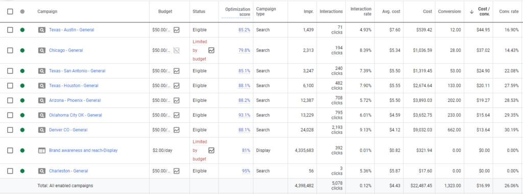
In Figure 7, you can see that the result was that we spent over $20,000 with an average 26.06% nationwide PPC conversion rate .
Note that we used a combination of hyper-targeted keywords with hyper-targeted landing pages.
With all that we've tested in this case study, to my surprise, in this case, the above-the-fold content mattered the most.
This makes sense, and many eCommerce pages are pretty dense in information but are organized in a way that doesn't look dense.
And that makes sense on a user level; some users will be ready to make a purchase and only need the essential elements to make an informed decision. But, at the same time, other users will need more detailed information to make an informed decision. An excellent landing page is catered to multiple buyer personas.
In this case study, I've walked you through the steps necessary to create a conversion rate-optimized website.
We increased the sitewide conversion rate with simple design changes and saw an average sitewide conversion rate of 14.24% from all traffic, paid, organic, and social.
We achieved an average 26% conversion rate when isolating for PPC traffic. Other metrics, such as a 137% increase in call volume, resulted from the combination of design changes, local SEO, and PPC spend.
About the author
The results are surprising, Quality Score and Cost Per Click are more clearly correlated when you look at Exact Match keywords.
I love WordPress for its customizations. Styling code snippets enhances user perceptions. Copy and paste the code below to style your WordPress code blocks.
The code snippet plugin changed my life. I no longer edit the raw PHP files to add simple functions like titles to users' profiles.
By restructuring your account and using hyper-targeted ad text, CPA can be reduced.
YMYL stands for "Your Money or Your Life." Google uses YMYL to help understand if a web page's main content could impact people's safety, health, or financial well-being.
With slight modifications to Optinmonster's native A/B testing capabilities, it becomes an excellent CRO testing tool.
3 examples of landing page case studies that inspire trust
A case study should inspire trust that you're the right provider for a specific job. These 3 landing page examples do just that...

Oliver Meakings
A case study is a key part of any B2B sales process, which is why I've put together a list of landing pages for you to draw inspiration from.
These landing pages demonstrate useful techniques that can take your conversion rate to the next level.
Case studies aren't the same as "normal" landing pages, but they have a similar purpose: to convince website visitors that you are the right person/company for the job. And there's nothing more convincing in marketing than somebody finding success with your product.
A good case study takes the reader through a journey; from painful realization of a big problem that lies ahead all the way to overcoming the hurdle.
In the midst of all of that "chaos" is where your product or service comes in, so here are a few ways to help you tell the right stories.
A Few Ways To Write Your Case Study
Case studies don't necessarily have to live on a landing page to be effective, they can also be distributed via PDF files, videos, or even live webinars to capture a specific audience.
When it comes to highlighting a story on a landing page though, the most important thing is to start with the benefits provided and work your way through the challenges.
Remember that you're speaking to a business audience so all they care about is what's in it for them. You have to provide this answer immediately at the top of your case study.

Although this is the first thing the prospect will see, it's not the first one you'll write. The process of getting your case study down is much more treacherous than that. First, you have to ask yourself why...
» Why did the customer go through such lengths to use your product?
The problem is always the biggest factor in a customer's success story. If the product was able to solve it, then the process of getting there was worth it and the money was well-spent.
In most cases, customers will never get there.
Sometimes because the product or service wasn't good enough, other times because they didn't really know what they wanted.

But when they do get on the other side of the fence, that's when a case study is crucial for you to get the most out of the business relationship, and I have some examples to show you.
The 3 Case Study Page Examples I've Picked
For each of the 3 examples you'll see in a moment, there are different ways to convey a similar message—that of success.
That's what a case study is all about, it's where customers are celebrated for being the "hero" in the story and your product being the means to an end. The elements of a good case study landing page are:
- A banner image at the top that recaps the entire story in a quick summary for the reader to understand whether they'd like to go through with the entire article
- Quick benefits below the main banner with information on what the customer was able to achieve after going through the "trouble" of implementing the solution
- Some high-level information on the type of business the customer runs like the industry they operate in and the size of their company compared to target market
- The complete story of how a customer first realized they had a problem and then identified your product or service as a potential solution leading to success
All these elements must be included for a case study that inspires trust. Fancy design isn't as important here as sending the message of success across using a real-life example.
Example of Case Study #1: Miro's Thoughtful Formatting
There's no denying that Miro has one of the most beautifully-intricate visual identities I've come across, so it's good to see that they're passing that effort onto their case studies as well.

Miro is a collaborative software most known for its digital whiteboard, where customers can conduct brainstorming sessions and store some of their most important Eureka moments.
Essentially, it's a place where team members go to "throw it all out on the table" and then start putting the pieces together.
It's a wonderful tool that has a unique angle on collaboration.
Upwork saw an opportunity to use the tool in a way that would help them fully-embrace design thinking as part of their culture and thus requiring a complete organizational restructuring across multiple departments.
Miro beautifully illustrates the complexity of the situation by pairing it with a sleek profile of the company and the type of business they run.

Addressing the problem is only one part of the equation though; they go as far as to highlight what design thinking is with beautiful cards right below the fold not only guiding you through the journey of Upwork but also educating you on the topic itself which coincidentally is exactly what Miro is strong at: helping teams foster innovation via collaborative effort.

In just two visual steps, Miro has given us a lot of information to work with, and now I'm left wondering: "Was Upwork ultimately able to deploy their design thinking approach?"
That's when Miro fills in the context from within Upwork's culture, making it clear that this was a big shift for them and that if they wanted to do it, they'd have to be aligned in full.

The reason why I'm putting this landing page first is that it screams trust; from the thoughtfully-placed quotes to the authoritative sources, Miro knows exactly what they're trying to achieve with this case study and they execute it almost with surgical precision.
What's even better is that, being a software tool, Miro can embed their own solution within the case study itself, making the experience that much more compelling.

Of course, not everybody will be able to afford creating a software suite as complex as Miro's just to make their case study stand out, but I just think it's absolutely brilliant. The problem with case studies is that they are often boring, uninspired chunks of text that don't say anything other than:
"We did this for customer A so you should buy our product."
Miro flips that coin by focusing on Upwork's problem first and only getting to what Miro did as a solution towards the bottom of the article, cementing their commitment to customer success.

Overall, Miro checks all the boxes here:
- An immediate understanding of the problem
- Tackling the story from an educational standpoint
- Removing themselves only to enter when relevant
- Focusing on the customer success and not theirs
If you had to copy one landing page for your next case study, this is it. One of the most elegant ways to compliment a customer that's found success with your product or service.
Example of Case Study #2: Ghost's Unorthodox Approach
Ghost is a Content Management System that claims to be the best way for news publishers to claim back their independence through a variety of monetization features.

Just like Miro's landing page, the best case studies are the ones that embed your product or service within the content itself, essentially showing the benefit rather than talking about it.
That's where Ghost's approach truly shines.
They created a "showcase" of websites built on Ghost.
From this seemingly-endless pool of gorgeous designs, you can draw a lot of inspiration, with many of them having their own dedicated mini-spotlights to celebrate the customer.

Although not a case study landing page in the "traditional" sense since this is more of a gallery of customers who built their publications using Ghost, it's still impressive how they were able to pass that feeling of trust and empowerment by simply taking screenshots of their client's sites.
The cool thing is that Ghost has dozens of the examples to show, making it an effective marketing tool due to its compelling visuals and variety of choices.

As unusual as it might seem, Ghost's approach is extremely effective at producing exactly the effect they are looking for:
» building trust in the blink of an eye
As soon as you open up the showcase page, you're greeted with a world of Ghost creations that look amazing. The next in line is obviously you then.
Example of Case Study #3: Kiflo's Simple Yet Effective Page

To close this deep dive into some of the most powerful case study landing page designs available on the internet, I'm now picking something more in tune with a "typical" success story.
Similar to HubSpot's case study design, Kiflo (a Partner Relationship Management software suite) highlights the main benefits provided by their product at the top of the page.
In the hero section, they include details about the representative who's given a short interview for the case study, and later they'll link that information with quotes from them.

Quotes with real faces and names reinforce the message of the case study
With its simple approach, Kiflo's case study landing page is half-article, half feature page. Below the fold, you get a clear understanding of the company they've interviewed, the challenge that they were facing, and how they came to find and ultimately choose Kiflo as a solution.
The page does a great job at separating each section so that the reader can follow along with PerceptionPredict's point of view which is that of the hero going through incredible challenges to find the superpower which would lend him the tools to succeed in his quest.

By then connecting the features of the product back to the original problem, Kiflo is effectively affirming itself as the solution to creating a partner program from scratch with practically no experience nor advanced knowledge on how to operate one day-to-day.
In their "Strategy" section, Kiflo describes how each feature helped the customer tackle a part of the overall puzzle, up until finally solving the problem at scale.
The results shown are convincing and they really show the effort that the team at Kiflo made to help PerceptionPredict succeed.
The landing page world isn't just made of eye-popping colors and quirky animations; it's meant to deliver value to the reader in a way that helps them move forward and down your funnel.

If you're looking to create a case study page but don't really know where to start, try and bring a first version of it live rather than aiming for perfection. Then see what sticks.
I've reviewed 100s of landing pages over the years and I can tell you that what I care about seeing the most is upfront value.
If you don't tell me what you do NOW, I'm gone.
A similar thing can be said about case studies; if I can't find anything that tells me I should trust you above the fold, I won't go on to read the rest.
So put those benefits up there :)
(And convince me you're the only solution to my problem!)
Originally published 27 Apr 2021
Sign up for more like this.
Learn / Guides / LP optimization
Back to guides
6 real-life landing page optimization examples in action
High-converting landing pages don’t just decrease customer acquisition costs and ensure you’re driving the most value possible from your campaigns. They also help you create a better experience for the people who matter the most—your users.
But to create a high-converting page with an excellent user experience (UX), you need to look at successful landing page optimization (LPO) examples and learn how to implement their strategies.
Last updated
Reading time.

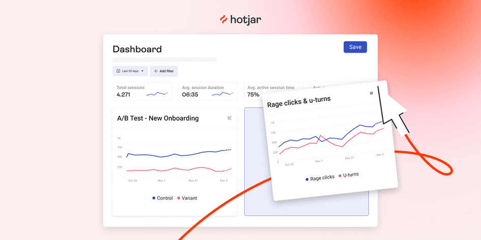
In this chapter of the LPO guide , we examine some of the most effective landing page optimization examples. With some help from Hotjar (hi there! 👋), each of these companies created pages that delight visitors with a user experience so great, they continue to come back for more .
These real-world case studies help you understand exactly why you need to optimize your landing pages, which LPO techniques work best, and how they look in action, so you can set up your own pages for success.
Use Hotjar to supercharge your landing pages
Use Hotjar’s digital experience tools to understand why users behave the way they do—and find solutions that increase conversions.
6 highly effective landing page optimization examples to learn from
Your landing page’s main objective is to deliver a laser-focused user experience that helps your visitors achieve their jobs to be done and helps you achieve your conversion goals.
As you review these practical LPO examples—and see how companies used Hotjar’s tools to up their landing page game— take note of which strategies and tactics you can implement on your landing pages to replicate their results.
1. How ClickMechanic used heatmaps for cost-effective redesigns
When UK-based marketplace ClickMechanic decided to redesign their landing pages, Hotjar’s digital experience insights tools turned out to be exactly what they needed to keep the process cost-effective.
After receiving some enlightening feedback about their sign-up process using surveys , the team realized their landing pages could also use some optimizing, so they turned to heatmaps.
Heatmap data showed that the vast majority of their landing page visitors never even scrolled beyond the hero (the main image on the homepage). As a result, the ClickMechanic team focused on redesigning the content above the fold, instead of giving the entire page a revamp.
This approach helped the company save money on design and engineering and deliver a 15% increase in conversions .
Why this LPO strategy works
Visual user insights—like those that come from analyzing heatmaps or recordings —help you spot simple ways to improve your user’s experience and deliver small incremental changes that have a big impact.
Heatmaps visually represent where visitors click, move, and scroll, helping you understand how they really engage with your site , so you know which landing page elements to optimize to improve their experience.
💡 Pro tip: use concept testing alongside heatmaps to bring fast and effective user insights into your redesign process.
A landing page redesign takes a lot of time—it pays to ensure you get it right. Hotjar’s concept testing feature helps you test your new landing page design, lead generation form fields, calls to action (CTAs), landing page copy, testimonials, or other online marketing assets with users before you launch.
This effectively diminishes risk, brings user insights into your design process, and even collects ideas to help refine your landing page optimizations. Plus, it’s way cheaper than running an entire A/B test .
Use Hotjar to set up a concept testing survey and quickly find out which version of your design users like better
2. How CCV Shop used behavior analytics to identify issues
Landing pages are crucial to CCV Shop —they use them to generate leads for their online storefront business, which helps over 17,000 entrepreneurs run their ecommerce stores.
When it comes to optimizing these landing pages, CCV Shop leverages Hotjar’s suite of behavior analytics tools to observe and analyze user actions, understand their prospective customers, and increase conversions. Here’s how:
The result? A 38% increase in their conversion rate , which got them really close to reaching their 2% conversion goal.
With user behavior at the center of your landing page optimization strategy, your creations are guaranteed to resonate.
Platforms like Hotjar give you a front-row seat to how your audience interacts with your top-performing campaigns . They help inform your next optimizations with insight into users' habits, behaviors, frustrations, and needs, so you know exactly what to prioritize.
As you see the landing page experience through your users' eyes, you get an unbiased view of your work—what hits the mark and, more importantly, what doesn’t. This type of compelling data helps you validate your LPO strategy, make changes to streamline the user journey, and reduce guesswork in these important decisions.
💡 Pro tip : use Hotjar Funnels to make sense of drop-offs on your landing pages.
Drop-offs are the bane of every landing page’s existence. Traditional web page analytics, with its big-picture traffic data, will only get you so far. What you need is to understand why users are dropping off, so you can do something about it.
Hotjar Funnels helps you visualize your landing page conversion flows, and shows you the relevant recordings at each step, making it easier than ever to connect your numbers to real user behavior.
This full overview of your funnel lets you quickly spot where most users drop off of your landing page—and the real reason behind it, so you can identify issues and pain points that make people leave, and confidently optimize for impact.
Visualize your conversion flows—and the real user behavior behind it—at every step with Funnels
3. How Unbounce solved UI/UX issues to improve user sign-ups
Unbounce’s experience with landing page optimization shows that sometimes, it takes a bird’s eye view to realize that the user’s experience doesn’t meet expectations.
The idea of improving UX on their landing page’s sign-up form seemed pretty straightforward at first: integrate with an auto-completion API to save time and simplify the whole process for the user and increase conversions. They even ran usability tests to ensure everyone loved and was on board with the new feature.
But they were in for a surprise. Once the team actually rolled out the changes—and enabled Hotjar Recordings to monitor their performance— they realized that auto-complete was the number one spot people got stuck :
Watching real people fail to use our brand-new ‘improved’ UX was cringe-inducing and painful to see when all we wanted to do was help them. I can't think of any other tool that would give such valuable insights.
Implementing your assumptions without seeking the truth in your user’s experience is one of the challenges of designing seamless user interfaces (UIs).
In this landing page optimization case study, Unbounce used Hotjar to debunk assumptions in the design of their processes and interface:
Watching Hotjar Recordings was both a humbling and exciting experience because we knew exactly what we needed to change and identified some serious bugs which would have cost us a lot in losses of sign-ups.
By analyzing real visitor actions, the UI team was able to make informed decisions in rolling out fixes , which significantly improved their sign-up process and even prevented them from losing a customer who was signing up for an annual plan of $2,000+.
💡 Pro tip: supplement recordings data with insights from voice-of-the-customer (VOC) tools , like surveys, to determine what users expect from specific pages.
For example, asking questions with surveys and polls helps you dive deeper into user actions on your landing page. Recordings show you which landing page elements they use first and how they use them, and surveys help you understand why .
Some of the responses may validate work you’ve already done, while others may be surprising. Either way, with the context for these actions in hand, optimizing your landing page becomes an easier task.
Use surveys and polls to collect feedback from people who are visiting your landing pages
4. How Creatopy engaged in continuous discovery to improve conversions
Back when they were known as Bannersnack , online banner-maker and design tool Creatopy relied on web analytic tools to track and measure traffic on their landing pages. However, they were in the dark when it came to understanding what people were actually doing there, and why.
To speed up their optimization work, the product, design, and marketing teams turned to Hotjar.
In a cycle of continuous discovery, Creatopy used heatmaps on landing pages they needed to optimize, regularly gathering evidence of how people interacted with them, and then leveraged these insights to produce an alternative design and A/B test the old and new versions against one another.
By applying this LPO strategy, the team increased sign-ups by 25%.
A structured and sustainable approach to continuous discovery helps you infuse your landing page optimization decisions with customer insights . Continuously gathering information on user needs helps you refine your ideas, which leads to happier customers, better prioritization, and improved targeting for your pay-per-click (PPC) campaigns.
For example, consistently analyzing heatmaps of your landing pages gives you quick visual cues about their current results, performance, and scope for improvements—like areas of intensity that reflect where most customers hover their mouse, or cold spots that need a boost.
You can integrate heatmaps into your business’s workflow and make them part of ongoing analytics, updating them on a regular basis to reflect your growth and efforts.
With the right mindset and tools, continuous discovery helps you deeply empathize with your visitors and feel confident your landing pages meet their evolving needs.

💡 Pro tip: unlock the secrets to high-converting pages with Hotjar Trends.
As you optimize your landing pages for conversions, use Hotjar Trends to see if sign-ups increase over time, and then view the corresponding heatmaps and recordings to understand why.
Traditional analytics only show you the numbers, but Trends lets you see the full picture by visualizing your metrics, so you can spot user behavior patterns and uncover the ‘why’ behind the data.
This lets you connect the dots between user behavior and numbers in a single tool, by linking product metrics to qualitative user insights.
Hotjar Trends lets you create custom conversion metrics and KPIs, and visualize them as charts to spot trends over time
5. How TomTom leveraged user feedback to create copy that converts
The team behind independent navigation software TomTom doesn't have to wonder whether their website and landing page optimizations actually improve the user experience. Using Hotjar alongside other analytic tools , they get all the quantitative and qualitative data they need to make meaningful improvements to the customer journey .
For example, one of their favorite Hotjar tools is Surveys , which allows them to ask satisfied customers why they signed up or made a purchase—information they can then turn into compelling copy for landing pages and email campaigns. The results speak for themselves:
Using the information gathered from Surveys helped us make substantial changes that resulted in a +491% increase in email CTR and a +49% conversion rate increase for our landing pages.
Improving the user experience means answering questions about why users behave the way they do. To leverage LPO and increase conversions, marketing and UX teams need to go beyond the raw numbers they get from traditional tools like Google Analytics to really understand user behavior .
Tools like surveys or feedback widgets bring VOC insights to your decision-making, allowing you to:
Prioritize what to optimize with real user feedback
Validate every idea with reliable user insights
💡 Pro tip : connect with customers 1:1 to gather even more valuable insights for your landing pages.
By enabling you to seamlessly conduct user interviews, Hotjar Engage brings you closer to your customers than ever before, so you can understand their needs better and create landing page experiences that truly help them achieve their goals .
Focus on how customers talk about your brand while Engage seamlessly hosts, records, and transcribes your calls. You can even get your team involved, compare notes, and turn these insights into action.
Tap into Hotjar's pool of 175,000+ users to automate recruiting people for interviews
6. How re:member revived affiliate traffic
When the digital marketing team at Scandinavian credit card company re:member noticed affiliate users—a significant traffic source—were bouncing from their landing page form more than usual, they knew traditional analytics wouldn’t be enough to tell why.
Sure, the team could try to dissect these numbers in search of a motive, but they wanted to visually see what went wrong. To pinpoint the issue—and find a solution for it—they turned to Hotjar:
If a user decided to leave the website, with Hotjar, we’re able to see if maybe the location of important information was out of the screen using Heatmaps. With click maps, we can see if users click on objects that aren’t meant to be clicked. But most importantly, Recordings allow us to see specific users anonymously, what went wrong, and when they had a hiccup.
Pairing recordings with heatmaps, re:member noticed that these affiliate users were experiencing technical difficulties—like attempting to click on unclickable elements—and were also looking for more information that wasn’t available on the landing page—by searching for and analyzing benefits before making a decision.
Seeing the credit card application form experience through their users’ eyes helped re:member understand why their affiliate visitors were leaving, so they could build a solution that increased conversions by 43% .

Without Hotjar, the re:member team may have never discovered what caused affiliate traffic to leave. But because they used the right tools, they had no problem spotting the issue and crafting a simple solution to reduce their bounce rate.
By studying users engaging with your page, you develop a deeper understanding of their needs with qualitative and quantitative data — less guesswork and more features guaranteed to help your visitors convert or complete a desired action. This helps you avoid costly mistakes and fix issues that can have a long-term impact on your bottom line.
💡 Pro tip : use the Hotjar Dashboard to quickly find out why visitors don’t convert.
With all the user metrics that matter in one place, the Hotjar Dashboard brings together the insights you need to improve your users’ landing page experience.
This tool paints the big picture by showing you quantitative data about your landing page at a glance. As you identify trends on the Dashboard, you can zoom in on the qualitative insights—by viewing related heatmaps and recordings—to validate your assumptions.
With no extra time and external integrations needed, the Dashboard showcases high-level user behavior to help you spot problems before they have a negative impact on your audience —perfect for fast-paced teams who don’t have the time to sift through data.
Track your important metrics in one place with custom dashboards
Next steps to landing page optimization
Even with the best of intentions, a poorly optimized landing page leaves potential customers confused and hesitant, ultimately leading to a user experience that just doesn’t do it for them.
These landing page examples show the impact that LPO has on a variety of different businesses, but they all revolve around one common principle: improving performance starts and ends with users.
Keep your landing pages user centric with actionable insights that uncover exactly why your visitors convert, and why not, to build exceptional digital experiences and confidently optimize your UX and revenue stream.
FAQs about landing page optimization examples
Why is it important to optimize landing pages.
A well-optimized landing page helps your business increase the effectiveness of your marketing campaign by improving the user experience, increasing traffic, and converting more visitors into leads or customers.
By testing and improving the key aspects of a landing page, you’re also ensuring that your work continues to resonate with your target audience as your business grows and evolves over time.
What’s the difference between conversion rate optimization and landing page optimization?
Landing page optimization (LPO) is a subset of conversion rate optimization (CRO) that only deals with improving the performance of landing pages, instead of the entire conversion process on a website.
LPO is also mostly aligned with a one-touch customer point and usually offers value in the landing page itself—like downloading a lead magnet, making a payment, or subscribing to a newsletter.
CRO, on the other hand, involves an investment from customers in terms of time and process funnels that extend beyond landing pages to increase the chance of better targeting and conversion.
What is the best way to optimize a landing page?
Use Hotjar’s suite of digital experience tools to spot simple ways to improve your users’ experience and deliver small incremental changes that have a big impact. This helps you:
Discover issues and pain points that make visitors drop off your site
Get a front-row seat to how your audience interacts with your top-performing campaigns
Get inspired with new ideas to improve your landing pages and grow your revenue
Previous chapter
LPO mistakes
Next chapter

Landing Page Redesign (UX Case Study)

Creative Fields

Product Design

- landing page
- product design
- UI Case study
No use is allowed without explicit permission from owner
IMAGES
COMMENTS
Landing Page Redesign. For my redesign, I wanted to draw attention to Coco Canary's practices that inspire inclusion, support social justice, and promote equality. I wanted the information and copy to be front and center to the user, supported by maximized use of white space and the use of amorphous shapes in calm, welcoming colors.
Introduction. In this case study, we will delve into a landing page redesign project that I undertook as part of the highly competitive UI/UX design contest organized by Zuno. With a limited time of just 48 hours, this project challenged my abilities and pushed me to showcase my skills under pressure. Through this case study, we will explore ...
Strengthen your Landing Pages -LUMI Website Redesign (UI/UX Case Study) In this case study, I will explain how I redesigned a product website, LUMI from scratch. I will talk about my process, the decisions I took, my approach to this project and what I learned while working on it. Vedant Jain.
A landing page is much more than just a digital business card; it's a tool that captures the essence of a professional's skills and their services. It is the first interaction that sets the tone and a carefully crafted entry point designed to engage, inform, and lead visitors to take action. This case study goes into the process of crafting ...
Now that I'm a few months out from redesigning two of the most high impact landing pages on the Huntress website, I wanted to reflect on the process and try to answer what makes a high impact landing page and what elements drive conversion. The Trial Registration Process A before and after overview of the Huntress Free Trial Registration page
Published in. UX Planet. ·. 9 min read. ·. Jun 14, 2021. 1. 📌In this case study, I'm going to articulate my process of redesigning a landing page of the BimaPe website. I will share my process, design decisions, and logic behind the decisions.
Website Redesign Case study above the fold before and after. Different logo; Large buttons; Different CTA; Categorical heuristics; Star reviews; Call quality also increased during the same timeframe because we negated irrelevant keywords.. The original PPC landing pages had an average conversion rate of 3.41%, whereas one Unbounce page had a conversion rate of 21.88%.
1. A giant header image with a phone mockup and title text. View the live site here! Wedge is a SaaS startup in the HR Tech space and recently just completed its latest investment round. With that said, Wedge is focused on two things, growth and customer retention. While that is where the company is focusing its effort, their previous digital ...
On the process and learnings of redesigning the highest traffic page of a 600,000+ users video streaming service. In late October of 2019 me and our CRO lead Lucas, set up a project at Videoland to redesign our main landing page for prospect customers (if they already have a subscription, they will go to the actual streaming product).
Case studies don't necessarily have to live on a landing page to be effective, they can also be distributed via PDF files, videos, or even live webinars to capture a specific audience. When it comes to highlighting a story on a landing page though, the most important thing is to start with the benefits provided and work your way through the ...
About Paperfly. Founded in 2016, Paperfly offers doorstep delivery services all around Bangladesh at the union level, along with warehousing and fulfillment services. They have the broadest cash-on-delivery coverage and handle the highest e-commerce volume in the country as a 3PL (3rd Party Logistics). Paperfly has completed almost 10 million ...
Most important elements of a successful landing page: 2. Explain how you value it (Subtitle) 3. Give a picture for them to see (Hero image) 4. Make them believe (Social proof) 5. Make the next ...
Extremely simple landing page. I'm not sure what the "85% of my hottest business hacks" is about, but the text under the CTA and the testimonial help clarify the page's purpose. 6. The Copy Cure. The Copy Cure's landing page. Again, a very simple landing page with a video that further describes the free training.
As you review these practical LPO examples—and see how companies used Hotjar's tools to up their landing page game— take note of which strategies and tactics you can implement on your landing pages to replicate their results. 1. How ClickMechanic used heatmaps for cost-effective redesigns. When UK-based marketplace ClickMechanic decided ...
UI Design Case Study: Colony. Landing Page for Collaboration Platform. A sufficient landing page plays a vital role in a successful web marketing campaign. It presents a specific product or service so that the visitor could find the needed information quickly and without distractions. The effective landing page draws potential customers ...
Paperfly Landing Page Redesign — UX Case Study Though Paperfly is working on a vast scale, the user experience of their website isn't so good and the design is outdated. There is no clear info Read More. 138. 2.4k. 15. Published: July 25th 2022. Tools. Photoshop. Figma; Creative Fields. UI/UX. Web Design. Product Design. Case Study; courier;
This landing page redesign case study will dive into the different stages of the UX design process to address these challenges. 📌 About SoDo Services: SoDo Services is a B2B platform that provides assured and verified freelancers and agencies to entrepreneurs, start-ups and businesses for their personalized on demand business & IT services ...
Landing Page Redesign (UX Case Study) 12. 751. 4. Published: November 13th 2021.
Since one of EverWeb's target audiences is the older generation, I conducted some research on the best practices in digital design for seniors. The key takeaways are as follows: Use clear navigation structure, larger UI design elements, a lot of whitespace, and choose distinctive colors. Focus on real-life application to get the audience ...
Case Study: A landing page redesign. ... Bearing all this in mind while working on the landing page redesign, I felt it was necessary to have the USSD code *5100# placed prominently on the landing page, so that the first thing a prospective user sees is the USSD code. I then made sure to include a clear and direct Call To Action (CTA) inviting ...
1. Google Developer Student Clubs ( GDSC) are university based community groups for students interested in Google developer technologies. My college also has a GDSC chapter which had been inactive due to the pandemic. But as offline classes resumed, it gained traction again. So back in December 2022, I decided to spend two days to re-design its ...
Objective. 1. Find out the user's perception of how Fundex's current landing page looks. 2. Review and evaluation the current appearance of the Fundex landing page. 3. Get an overview of the ...
As a result, I decided to redesign the landing page to solve the previous problems. What you will read below is the process of redesigning the landing page and finally comparing the first landing with the redesigned (second) landing. ... This case study is about my redesign of the BookMyShow app, where I crafted a user-friendly experience that ...