Graphical Representation of Data
Graphical representation of data is an attractive method of showcasing numerical data that help in analyzing and representing quantitative data visually. A graph is a kind of a chart where data are plotted as variables across the coordinate. It became easy to analyze the extent of change of one variable based on the change of other variables. Graphical representation of data is done through different mediums such as lines, plots, diagrams, etc. Let us learn more about this interesting concept of graphical representation of data, the different types, and solve a few examples.

Definition of Graphical Representation of Data
A graphical representation is a visual representation of data statistics-based results using graphs, plots, and charts. This kind of representation is more effective in understanding and comparing data than seen in a tabular form. Graphical representation helps to qualify, sort, and present data in a method that is simple to understand for a larger audience. Graphs enable in studying the cause and effect relationship between two variables through both time series and frequency distribution. The data that is obtained from different surveying is infused into a graphical representation by the use of some symbols, such as lines on a line graph, bars on a bar chart, or slices of a pie chart. This visual representation helps in clarity, comparison, and understanding of numerical data.
Representation of Data
The word data is from the Latin word Datum, which means something given. The numerical figures collected through a survey are called data and can be represented in two forms - tabular form and visual form through graphs. Once the data is collected through constant observations, it is arranged, summarized, and classified to finally represented in the form of a graph. There are two kinds of data - quantitative and qualitative. Quantitative data is more structured, continuous, and discrete with statistical data whereas qualitative is unstructured where the data cannot be analyzed.
Principles of Graphical Representation of Data
The principles of graphical representation are algebraic. In a graph, there are two lines known as Axis or Coordinate axis. These are the X-axis and Y-axis. The horizontal axis is the X-axis and the vertical axis is the Y-axis. They are perpendicular to each other and intersect at O or point of Origin. On the right side of the Origin, the Xaxis has a positive value and on the left side, it has a negative value. In the same way, the upper side of the Origin Y-axis has a positive value where the down one is with a negative value. When -axis and y-axis intersect each other at the origin it divides the plane into four parts which are called Quadrant I, Quadrant II, Quadrant III, Quadrant IV. This form of representation is seen in a frequency distribution that is represented in four methods, namely Histogram, Smoothed frequency graph, Pie diagram or Pie chart, Cumulative or ogive frequency graph, and Frequency Polygon.

Advantages and Disadvantages of Graphical Representation of Data
Listed below are some advantages and disadvantages of using a graphical representation of data:
- It improves the way of analyzing and learning as the graphical representation makes the data easy to understand.
- It can be used in almost all fields from mathematics to physics to psychology and so on.
- It is easy to understand for its visual impacts.
- It shows the whole and huge data in an instance.
- It is mainly used in statistics to determine the mean, median, and mode for different data
The main disadvantage of graphical representation of data is that it takes a lot of effort as well as resources to find the most appropriate data and then represent it graphically.
Rules of Graphical Representation of Data
While presenting data graphically, there are certain rules that need to be followed. They are listed below:
- Suitable Title: The title of the graph should be appropriate that indicate the subject of the presentation.
- Measurement Unit: The measurement unit in the graph should be mentioned.
- Proper Scale: A proper scale needs to be chosen to represent the data accurately.
- Index: For better understanding, index the appropriate colors, shades, lines, designs in the graphs.
- Data Sources: Data should be included wherever it is necessary at the bottom of the graph.
- Simple: The construction of a graph should be easily understood.
- Neat: The graph should be visually neat in terms of size and font to read the data accurately.
Uses of Graphical Representation of Data
The main use of a graphical representation of data is understanding and identifying the trends and patterns of the data. It helps in analyzing large quantities, comparing two or more data, making predictions, and building a firm decision. The visual display of data also helps in avoiding confusion and overlapping of any information. Graphs like line graphs and bar graphs, display two or more data clearly for easy comparison. This is important in communicating our findings to others and our understanding and analysis of the data.
Types of Graphical Representation of Data
Data is represented in different types of graphs such as plots, pies, diagrams, etc. They are as follows,
Related Topics
Listed below are a few interesting topics that are related to the graphical representation of data, take a look.
- x and y graph
- Frequency Polygon
- Cumulative Frequency
Examples on Graphical Representation of Data
Example 1 : A pie chart is divided into 3 parts with the angles measuring as 2x, 8x, and 10x respectively. Find the value of x in degrees.
We know, the sum of all angles in a pie chart would give 360º as result. ⇒ 2x + 8x + 10x = 360º ⇒ 20 x = 360º ⇒ x = 360º/20 ⇒ x = 18º Therefore, the value of x is 18º.
Example 2: Ben is trying to read the plot given below. His teacher has given him stem and leaf plot worksheets. Can you help him answer the questions? i) What is the mode of the plot? ii) What is the mean of the plot? iii) Find the range.
Solution: i) Mode is the number that appears often in the data. Leaf 4 occurs twice on the plot against stem 5.
Hence, mode = 54
ii) The sum of all data values is 12 + 14 + 21 + 25 + 28 + 32 + 34 + 36 + 50 + 53 + 54 + 54 + 62 + 65 + 67 + 83 + 88 + 89 + 91 = 958
To find the mean, we have to divide the sum by the total number of values.
Mean = Sum of all data values ÷ 19 = 958 ÷ 19 = 50.42
iii) Range = the highest value - the lowest value = 91 - 12 = 79
go to slide go to slide

Book a Free Trial Class
Practice Questions on Graphical Representation of Data
Faqs on graphical representation of data, what is graphical representation.
Graphical representation is a form of visually displaying data through various methods like graphs, diagrams, charts, and plots. It helps in sorting, visualizing, and presenting data in a clear manner through different types of graphs. Statistics mainly use graphical representation to show data.
What are the Different Types of Graphical Representation?
The different types of graphical representation of data are:
- Stem and leaf plot
- Scatter diagrams
- Frequency Distribution
Is the Graphical Representation of Numerical Data?
Yes, these graphical representations are numerical data that has been accumulated through various surveys and observations. The method of presenting these numerical data is called a chart. There are different kinds of charts such as a pie chart, bar graph, line graph, etc, that help in clearly showcasing the data.
What is the Use of Graphical Representation of Data?
Graphical representation of data is useful in clarifying, interpreting, and analyzing data plotting points and drawing line segments , surfaces, and other geometric forms or symbols.
What are the Ways to Represent Data?
Tables, charts, and graphs are all ways of representing data, and they can be used for two broad purposes. The first is to support the collection, organization, and analysis of data as part of the process of a scientific study.
What is the Objective of Graphical Representation of Data?
The main objective of representing data graphically is to display information visually that helps in understanding the information efficiently, clearly, and accurately. This is important to communicate the findings as well as analyze the data.
- Math Article
Graphical Representation
Graphical Representation is a way of analysing numerical data. It exhibits the relation between data, ideas, information and concepts in a diagram. It is easy to understand and it is one of the most important learning strategies. It always depends on the type of information in a particular domain. There are different types of graphical representation. Some of them are as follows:
- Line Graphs – Line graph or the linear graph is used to display the continuous data and it is useful for predicting future events over time.
- Bar Graphs – Bar Graph is used to display the category of data and it compares the data using solid bars to represent the quantities.
- Histograms – The graph that uses bars to represent the frequency of numerical data that are organised into intervals. Since all the intervals are equal and continuous, all the bars have the same width.
- Line Plot – It shows the frequency of data on a given number line. ‘ x ‘ is placed above a number line each time when that data occurs again.
- Frequency Table – The table shows the number of pieces of data that falls within the given interval.
- Circle Graph – Also known as the pie chart that shows the relationships of the parts of the whole. The circle is considered with 100% and the categories occupied is represented with that specific percentage like 15%, 56%, etc.
- Stem and Leaf Plot – In the stem and leaf plot, the data are organised from least value to the greatest value. The digits of the least place values from the leaves and the next place value digit forms the stems.
- Box and Whisker Plot – The plot diagram summarises the data by dividing into four parts. Box and whisker show the range (spread) and the middle ( median) of the data.

General Rules for Graphical Representation of Data
There are certain rules to effectively present the information in the graphical representation. They are:
- Suitable Title: Make sure that the appropriate title is given to the graph which indicates the subject of the presentation.
- Measurement Unit: Mention the measurement unit in the graph.
- Proper Scale: To represent the data in an accurate manner, choose a proper scale.
- Index: Index the appropriate colours, shades, lines, design in the graphs for better understanding.
- Data Sources: Include the source of information wherever it is necessary at the bottom of the graph.
- Keep it Simple: Construct a graph in an easy way that everyone can understand.
- Neat: Choose the correct size, fonts, colours etc in such a way that the graph should be a visual aid for the presentation of information.
Graphical Representation in Maths
In Mathematics, a graph is defined as a chart with statistical data, which are represented in the form of curves or lines drawn across the coordinate point plotted on its surface. It helps to study the relationship between two variables where it helps to measure the change in the variable amount with respect to another variable within a given interval of time. It helps to study the series distribution and frequency distribution for a given problem. There are two types of graphs to visually depict the information. They are:
- Time Series Graphs – Example: Line Graph
- Frequency Distribution Graphs – Example: Frequency Polygon Graph
Principles of Graphical Representation
Algebraic principles are applied to all types of graphical representation of data. In graphs, it is represented using two lines called coordinate axes. The horizontal axis is denoted as the x-axis and the vertical axis is denoted as the y-axis. The point at which two lines intersect is called an origin ‘O’. Consider x-axis, the distance from the origin to the right side will take a positive value and the distance from the origin to the left side will take a negative value. Similarly, for the y-axis, the points above the origin will take a positive value, and the points below the origin will a negative value.

Generally, the frequency distribution is represented in four methods, namely
- Smoothed frequency graph
- Pie diagram
- Cumulative or ogive frequency graph
- Frequency Polygon
Merits of Using Graphs
Some of the merits of using graphs are as follows:
- The graph is easily understood by everyone without any prior knowledge.
- It saves time
- It allows us to relate and compare the data for different time periods
- It is used in statistics to determine the mean, median and mode for different data, as well as in the interpolation and the extrapolation of data.
Example for Frequency polygonGraph
Here are the steps to follow to find the frequency distribution of a frequency polygon and it is represented in a graphical way.
- Obtain the frequency distribution and find the midpoints of each class interval.
- Represent the midpoints along x-axis and frequencies along the y-axis.
- Plot the points corresponding to the frequency at each midpoint.
- Join these points, using lines in order.
- To complete the polygon, join the point at each end immediately to the lower or higher class marks on the x-axis.
Draw the frequency polygon for the following data
Mark the class interval along x-axis and frequencies along the y-axis.
Let assume that class interval 0-10 with frequency zero and 90-100 with frequency zero.
Now calculate the midpoint of the class interval.
Using the midpoint and the frequency value from the above table, plot the points A (5, 0), B (15, 4), C (25, 6), D (35, 8), E (45, 10), F (55, 12), G (65, 14), H (75, 7), I (85, 5) and J (95, 0).
To obtain the frequency polygon ABCDEFGHIJ, draw the line segments AB, BC, CD, DE, EF, FG, GH, HI, IJ, and connect all the points.

Frequently Asked Questions
What are the different types of graphical representation.
Some of the various types of graphical representation include:
- Line Graphs
- Frequency Table
- Circle Graph, etc.
Read More: Types of Graphs
What are the Advantages of Graphical Method?
Some of the advantages of graphical representation are:
- It makes data more easily understandable.
- It saves time.
- It makes the comparison of data more efficient.
Leave a Comment Cancel reply
Your Mobile number and Email id will not be published. Required fields are marked *
Request OTP on Voice Call
Post My Comment
Very useful for understand the basic concepts in simple and easy way. Its very useful to all students whether they are school students or college sudents
Thanks very much for the information
- Share Share
Register with BYJU'S & Download Free PDFs
Register with byju's & watch live videos.


Graphical Representation
Graphical representation definition.
Graphical representation refers to the use of charts and graphs to visually display, analyze, clarify, and interpret numerical data, functions, and other qualitative structures.

What is Graphical Representation?
Graphical representation refers to the use of intuitive charts to clearly visualize and simplify data sets. Data is ingested into graphical representation of data software and then represented by a variety of symbols, such as lines on a line chart, bars on a bar chart, or slices on a pie chart, from which users can gain greater insight than by numerical analysis alone.
Representational graphics can quickly illustrate general behavior and highlight phenomenons, anomalies, and relationships between data points that may otherwise be overlooked, and may contribute to predictions and better, data-driven decisions. The types of representational graphics used will depend on the type of data being explored.
Types of Graphical Representation
Data charts are available in a wide variety of maps, diagrams, and graphs that typically include textual titles and legends to denote the purpose, measurement units, and variables of the chart. Choosing the most appropriate chart depends on a variety of different factors -- the nature of the data, the purpose of the chart, and whether a graphical representation of qualitative data or a graphical representation of quantitative data is being depicted. There are dozens of different formats for graphical representation of data. Some of the most popular charts include:
- Bar Graph -- contains a vertical axis and horizontal axis and displays data as rectangular bars with lengths proportional to the values that they represent; a useful visual aid for marketing purposes
- Choropleth -- thematic map in which an aggregate summary of a geographic characteristic within an area is represented by patterns of shading proportionate to a statistical variable
- Flow Chart -- diagram that depicts a workflow graphical representation with the use of arrows and geometric shapes; a useful visual aid for business and finance purposes
- Heatmap -- a colored, two-dimensional matrix of cells in which each cell represents a grouping of data and each cell’s color indicates its relative value
- Histogram – frequency distribution and graphical representation uses adjacent vertical bars erected over discrete intervals to represent the data frequency within a given interval; a useful visual aid for meteorology and environment purposes
- Line Graph – displays continuous data; ideal for predicting future events over time; a useful visual aid for marketing purposes
- Pie Chart -- shows percentage values as a slice of pie; a useful visual aid for marketing purposes
- Pointmap -- CAD & GIS contract mapping and drafting solution that visualizes the location of data on a map by plotting geographic latitude and longitude data
- Scatter plot -- a diagram that shows the relationship between two sets of data, where each dot represents individual pieces of data and each axis represents a quantitative measure
- Stacked Bar Graph -- a graph in which each bar is segmented into parts, with the entire bar representing the whole, and each segment representing different categories of that whole; a useful visual aid for political science and sociology purposes
- Timeline Chart -- a long bar labelled with dates paralleling it that display a list of events in chronological order, a useful visual aid for history charting purposes
- Tree Diagram -- a hierarchical genealogical tree that illustrates a family structure; a useful visual aid for history charting purposes
- Venn Diagram -- consists of multiple overlapping usually circles, each representing a set; the default inner join graphical representation
Proprietary and open source software for graphical representation of data is available in a wide variety of programming languages. Software packages often provide spreadsheets equipped with built-in charting functions.
Advantages and Disadvantages of Graphical Representation of Data
Tabular and graphical representation of data are a vital component in analyzing and understanding large quantities of numerical data and the relationship between data points. Data visualization is one of the most fundamental approaches to data analysis, providing an intuitive and universal means to visualize, abstract, and share complex data patterns. The primary advantages of graphical representation of data are:
- Facilitates and improves learning: graphics make data easy to understand and eliminate language and literacy barriers
- Understanding content: visuals are more effective than text in human understanding
- Flexibility of use: graphical representation can be leveraged in nearly every field involving data
- Increases structured thinking: users can make quick, data-driven decisions at a glance with visual aids
- Supports creative, personalized reports for more engaging and stimulating visual presentations
- Improves communication: analyzing graphs that highlight relevant themes is significantly faster than reading through a descriptive report line by line
- Shows the whole picture: an instantaneous, full view of all variables, time frames, data behavior and relationships
Disadvantages of graphical representation of data typically concern the cost of human effort and resources, the process of selecting the most appropriate graphical and tabular representation of data, greater design complexity of visualizing data, and the potential for human bias.
Why Graphical Representation of Data is Important
Graphic visual representation of information is a crucial component in understanding and identifying patterns and trends in the ever increasing flow of data. Graphical representation enables the quick analysis of large amounts of data at one time and can aid in making predictions and informed decisions. Data visualizations also make collaboration significantly more efficient by using familiar visual metaphors to illustrate relationships and highlight meaning, eliminating complex, long-winded explanations of an otherwise chaotic-looking array of figures.
Data only has value once its significance has been revealed and consumed, and its consumption is best facilitated with graphical representation tools that are designed with human cognition and perception in mind. Human visual processing is very efficient at detecting relationships and changes between sizes, shapes, colors, and quantities. Attempting to gain insight from numerical data alone, especially in big data instances in which there may be billions of rows of data, is exceedingly cumbersome and inefficient.
Does HEAVY.AI Offer a Graphical Representation Solution?
HEAVY.AI's visual analytics platform is an interactive data visualization client that works seamlessly with server-side technologies HEAVY.AIDB and Render to enable data science analysts to easily visualize and instantly interact with massive datasets. Analysts can interact with conventional charts and data tables, as well as big data graphical representations such as massive-scale scatterplots and geo charts. Data visualization contributes to a broad range of use cases, including performance analysis in business and guiding research in academia.
Understanding Graphics
Design For The Human Mind
Understanding Presentation Graphics
in Brainy Stuff

Although this piece of news could shock anyone involved in visual communication, I’ll say it anyway. It’s time to realize that audiences do not attend a presentation because of the slides. They attend because they want to hear what the speaker has to say.
With this in mind, let’s look at how and why an audience can benefit from presentation graphics. How can a designer or presenter know what to show on a slide? One straightforward approach is to first consider the purpose of the slide and then use a graphic that will meet your goal.
Meeting Your Goal
In their article, Visual-rhetoric Ethics (Manning and Amore), the authors developed a structure for thinking about visual strategies based on the rhetorical goals of philosopher Charles S. Pierce. In this approach, your visual strategy can encompass one or more of the following goals.
- Evoking Feelings : Through choice of color, typeface and other visual attributes, the purpose of your visual is to draw on the emotions. Visual strategies that correspond to this goal are called decoratives .
- Evoke Action: Another goal of presentation graphics can be to move an audience to take action. This is often done through the build of a bulleted list that will influence the audience to commit. These visual strategies are known as indicatives .
- Promote Understanding: A third reason for using visuals is to promote understanding through informative visuals like charts, graphs, diagrams and tables that express a concept. Visual strategies that promote understanding are considered informatives .
By identifying the purpose of the slide you can use this structure to ensure that your visual language is effectively communicating your goal.
Timing is Essential
It’s vital to leverage the synergy of a presentation and its corresponding visuals through perfect timing. Here’s why. Within the mind of your audience members, auditory information (flowing from the speaker) is most likely processed separately from visual information (projected from the slides). If the channels are synchronized, the audience can attend to one single concept.
If the presentation and slide graphics don’t match, the audience won’t know which to follow. If they attend to and process the words of the speaker, they’ll miss the point of the visual. If they focus on the graphic, they’ll fail to process the speaker’s words. If you don’t have a graphic for every point, simply turn the slide to black when discussing something unrelated. This is how you can avoid distracting the audience. See my article on splitting attention for more on this.
Enhance Meaning
Probably in the majority of presentations, the most important aspect of the slide visual is to promote and extend the audience’s grasp of the speaker’s words. This is usually accomplished with functional graphics that can add to and refine the internal knowledge structures or schemata of those in the audience.
For example, if a presenter such as myself, is explaining how we construct schemata as a framework for understanding, listeners might have a vague idea of what I mean. If I say, “Schemata help us generalize about the world, so your schemata for the concept house helps you recognize when a structure is a house,” they may still be slightly confused. If at the same time, I show a visualization of schemata for the concept house , it serves to clarify and refine the audience’s concept of internal knowledge structures.
Visualization of schemata for "house"
Every presentation involves a new audience and a nuanced topic, which means it’s incredibly important to think through the visual design of a talk each time it’s presented. If you determine the goal of each slide, identify a way to use a visual to promote meaning, and ensure the visual is synchronized with the presenter’s words, then you’ll be way ahead of the game.
Reference: Alan Manning and Nicole Amare, Visual-rhetoric Ethics: Beyond Accuracy and Injury. Technical Communication, volume 53, number 2, May 2006.
Related Article: How to Avoid Designs that Split Attention
Book Recommendation: Presentation Zen Design
Tagged as: presentations , slide graphics , slide visuals , slides
{ 4 comments… read them below or add one }
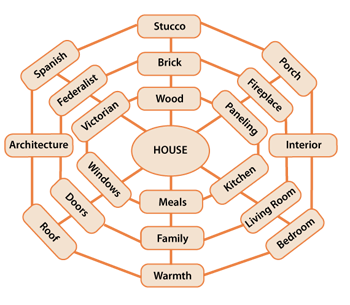
I can’t hear the presenter because I’ve shut down my audio channel while trying to visualize why paneling is connected to fireplace and porch is connected to interior and meals are connected to windows.
Hi Ed, Thanks for contributing. Well, you’ve got a totally different issue! Try meditation or yoga to get yourself singly focused =)
lol. In my haste maybe I sounded grouchy because I left out the smiley. I would definitely choose to hear you speak because I enjoy your blog . The reason I read it? I’m in instructional design and consider it essential to understand the concepts of data presentation so that I may make the best choices when designing instructional messages.
I definitely get the point of your post but in this particular case my attention has been split by trying to resolve why Spanish and Federalist are connected to Architecture but Victorian is not. 😉
Not grouchy at all. I thought it was funny. Um … that theoretical visualization of what a schemata might look like is really just theoretical. I was just foolin’ around with ideas. Next time I get into Illustrator, I’ll connect Victorian to Architecture so you can sleep at night =)
And yes, data presentation for instructional designers is super important. That’s how I often come at it too. I’m going to be speaking at a few eLearning events coming up – eLearning Guild and ASTD in 2011 so maybe we can chat about visual communication and cognitive science if you’re attending. Also, you might be interested in the Society of News Design because of the infographics. Best, Connie
Leave a Comment
Previous post: Guidelines for Designing Tables
Next post: Designing Interactions for a Positive Experience
When you know how people understand graphics, yours will be more effective. That's why I wrote Visual Language For Designers . This website is an extension of my book. Hope you enjoy it! -- Connie Malamed

Visual Design for Learning Professionals
Top reads last month.
- 10 Reasons to Use Color
- Guidelines for Designing Tables
- Visual Language of Timelines
- Information Display Tips
- Communicating with Animated Infographics
BROWSE BY TOPIC
- Brainy Stuff (12)
- Graphic Analysis (5)
- Reviews (1)
- Visual Design (16)
- Visualizations (7)
Copyright ©2024 Connie Malamed. All Rights Reserved.
Critical PowerPoint Shortcuts – Claim Your FREE Training Module and Get Your Time Back!
PowerPoint Graphics: How to Improve Your Presentations w/ Graphics
- PowerPoint Tutorials
- Pictures, Icons, Videos, Etc.
- Presentation Design
- August 21, 2018
If you’ve ever touched a PowerPoint slide, chances are that you’ve already used PowerPoint graphics already.
But you may have questions: How do you find good graphics? How do you manipulate them correctly? And how do you customize them?
That’s what this article will answer for you.
What is a PowerPoint graphic?
There seems to be a wide range of things that people label as a graphic for PowerPoint.
Here at Nuts & Bolts, we define a graphic in PowerPoint as any image that is not a picture. This includes SmartArt, which is a type of native PowerPoint graphic and has special attributes.
A PowerPoint graphic most typically refers to a grouping of shapes into an image, commonly referred to as vectors.
From PowerPoint’s perspective, vectors are considered to be shapes – and that means that you can customize them as you would any rectangle, circle, or freeform shape… giving you complete freedom to create the visual you need.
Vector graphics can come in the following file types:
- EPS (Encapsulated PostScript – create by Adobe – this is perhaps the most common vector image format)
However, PowerPoint will only accept certain file types. To see which ones, go to the section on how to use vectors in PowerPoint below.
Why use a graphic in PowerPoint
As the representation of an idea, a graphic is the perfect way to help your audience immediately visualize and grasp a concept you are sharing with them.
On top of that, it’s a great way to add some flair to any presentation and a quick way to take it up a notch.
Graphics can be better than pictures in some situations, when you need to be able to edit elements in a visual. For example, maybe you need to remove, add or re-color a certain item.

You cannot do this with pictures – but with the right graphic (and in particular a vector graphic), you could potentially customize it to your heart’s content.
Where to get free graphics for PowerPoint
Getting free graphics for PowerPoint is easy – you just have to know where to look.
Here are our favorite 2 places to find free vector graphics for PowerPoint:
- Freepik – Great database with tons of very high-quality and modern icons, flat icons, vectors, and PSD files to use. Freepik does require you to give them credit if you use their material, but they make it very easy with a simple html code.
- Pixabay – Awesome site for 100% free and Creative Commons CC0 licensed images, illustrations, vectors, and videos.
To learn where to get more free PowerPoint graphics, images, videos, etc. check out this list of our favorite PowerPoint resources . Another way to get free vector graphics is to create them from scratch. There are two tools that can help you do this:
- Text-to-Outline by YouPresent – Allows you to convert text into vectors/shapes, which you can then format any way you like in PowerPoint.
- Vector Magic – Creates a vector out of any image…truly magic!
Keep in mind that because these are all free methods for finding vector graphics for PowerPoint, you will be limited in what you find or create. If you want a very specific and professional-looking vector, you may have to go to a paid service to purchase well-designed graphics that suit your need better.
Where to buy graphics for PowerPoint
By far the easiest way to get professional & unique graphics onto your slides (especially now that ClipArt is gone) is to use a service like GetMyGraphics .
They are custom-built graphics designed for PowerPoint. All you need to do is download and insert them onto your slide and then tweak them like you would SmartArt.
Although this is a paid service, we’ve found that we’ve reused these graphics again and again, so we see it as a good investment in sharper looking slides.
How to use vector graphics in PowerPoint
Using vectors in PowerPoint depends on what file type you have. If you have an older version of PowerPoint (2013 and earlier), you can insert the following vector files types into PowerPoint:
If you have Office 365, you can no longer insert EPS files. However, you can still use EMF files, and you can also insert SVG files (except for on a Mac).
If you have an EPS file and can’t import it into your version of PowerPoint, check out our article on how to import EPS files into PowerPoint .
Note: If you’re trying to use a file type that is not supported by your version of PowerPoint, you can try converting your file into the correct file type.
For a really good tutorial on how to convert vectors into usable PowerPoint objects without Adobe software, check out Microsoft MVP Dave Paradi’s post on finding and using vector images in PowerPoint.
Once you have an SVG file downloaded onto your computer, you’ll want to insert it into your presentation.
There are two ways to insert a vector file onto your PowerPoint slide:
Method #1: Drag the file from wherever it is sitting on your computer and drag it onto your slide.
Method #2: Go to the Insert tab in the Ribbon and select ‘Pictures’ (make sure to select the ‘Pictures’ icon and not the ‘Online Pictures’ icon). Then find your vector file and click on ‘Open.’
Note: If you have PowerPoint 2016 with Office 365, you have a new object class, called Icons. These are also vector files (SVG).
You can insert them by going to the Insert tab in the Ribbon and selecting ‘Icons’ (or using this shortcut: Alt, N, Y1). You can learn more about the icons feature in this Office blog article .
Once you have a vector file inserted on your slide, you can manipulate its various pieces.
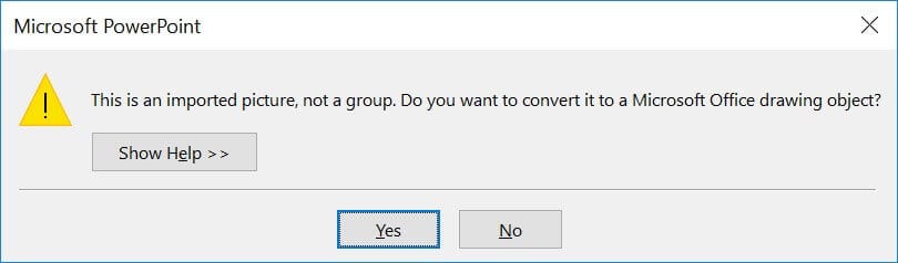
To do that, you’ll need to ungroup it twice. To ungroup a vector image, select it and then use one of the following methods:
- Hit the ungroup shortcut: Ctrl + Shift + G
- Right-click the vector and select ‘Group’ and then ‘Ungroup’
- Go to the Drawing Tools > Format tab in the Ribbon, select ‘Group’ and then ‘Ungroup’
A pop-up box will appear, asking you if you want to ungroup it. Click on ‘Yes.’
And now you have a series of shapes (instead of a picture) that you can edit and format however you like, just like for regular PowerPoint shapes.
Note: Keep in mind that some things might come out strangely as vectors in PowerPoint:
- Gradients and shadows
- Lines (the lines will likely come out as one object and may lose their original weight)
- Complex artwork, such as sketching and other artistic effects
Some things you can do with your vector images now include:
- Change the fill color
- Add an outline with a custom weight
- Move and resize pieces of the vector
- Edit the points of certain pieces to change even the shape of it
And much more!
What’s next?
Related articles, about the author.

Popular Tutorials
- How to Strikethrough Text (l̶i̶k̶e̶ ̶t̶h̶i̶s̶) in Word, Excel & PowerPoint
- How to Make Animated Fireworks in PowerPoint (Step-by-Step)
- Strikethrough Shortcut (l̶i̶k̶e̶ ̶t̶h̶i̶s̶) for Word, Excel & PowerPoint
- How to Create a Flash Card Memory Game in PowerPoint (Like Jeopardy)
- Keyboard Shortcuts Not Working: Solved
PowerPoint Tutorial Categories
- Strategies & Opinions
- Shortcuts & Hacks
- New Features
- Miscellaneous
- Charts & Data Viz
We help busy professionals save hours and gain peace of mind, with corporate workshops, self-paced courses and tutorials for PowerPoint and Word.
Work With Us
- Corporate Training
- Presentation & Template Design
- Courses & Downloads
- PowerPoint Articles
- Word Articles
- Productivity Resources
Find a Tutorial
- Free Training
- For Businesses
We help busy office workers save hours and gain peace of mind, with tips, training and tutorials for Microsoft PowerPoint and Word.
Master Critical PowerPoint Shortcuts – Secure Your FREE Training Module and Save Valuable Time!
⌛ Master time-saving expert techniques.
🔥 Create powerful presentations.
🚀 Propel your career to new heights.
We value your privacy – we keep your info safe.
Discover PowerPoint Hacks Loved by Industry Giants - KKR, AmEx, HSBC!
Over 114,880 professionals in finance, marketing and sales have revolutionized their PPT skills with our proven methods.
Gain FREE access to a full module of our premium PowerPoint training program – Get started today!
We hate spam too and promise to keep your information safe.
You are currently viewing a placeholder content from Facebook . To access the actual content, click the button below. Please note that doing so will share data with third-party providers.
.css-1qrtm5m{display:block;margin-bottom:8px;text-transform:uppercase;font-size:14px;line-height:1.5714285714285714;-webkit-letter-spacing:-0.35px;-moz-letter-spacing:-0.35px;-ms-letter-spacing:-0.35px;letter-spacing:-0.35px;font-weight:300;color:#606F7B;}@media (min-width:600px){.css-1qrtm5m{font-size:16px;line-height:1.625;-webkit-letter-spacing:-0.5px;-moz-letter-spacing:-0.5px;-ms-letter-spacing:-0.5px;letter-spacing:-0.5px;}} Best Practices The #1 rule for improving your presentation slides
by Tom Rielly • May 12, 2020

When giving presentations, either on a video conference call or in person, your slides, videos and graphics (or lack of them) can be an important element in helping you tell your story or express your idea. This is the first of a series of blog posts that will give you tips and tricks on how to perfect your visual presentations.
Your job as a presenter is to build your idea -- step-by-step -- in the minds of your audience members. One tool to do that is presentation graphics, such as slides and videos.
Why graphics for your presentation?
A common mistake is using slides or videos as a crutch, even if they don’t actually add anything to your presentation. Not all presentations need graphics. Lots of presentations work wonderfully with just one person standing on a stage telling a story, as demonstrated by many TED Talks.
You should only use slides if they serve a purpose: conveying scientific information, art, and things that are hard to explain without pictures. Once you have decided on using slides, you will have a number of decisions to make. We’ll help you with the basics of making a presentation that is, above all, clear and easy to understand. The most important thing to remember here is: less is more.
Less is so much more
You want to aim for the fewest number of slides, the fewest number of photos, the fewest words per slide, the least cluttered slides and the most white space on your slides. This is the most violated slide rule, but it is the secret to success. Take a look at these examples.

As you can see in the above example, you don’t need fancy backgrounds or extra words to convey a simple concept. If you take “Everything you need to know about Turtles”, and delete “everything you need to know about” leaving just “turtles”, the slide has become much easier for your audience to read, and tells the story with economy.

The above example demonstrates that a single image that fills the entire screen is far more powerful than a slide cluttered with images. A slide with too many images may be detrimental to your presentation. The audience will spend more mental energy trying to sort through the clutter than listening to your presentation. If you need multiple images, then put each one on its own slide. Make each image high-resolution and have it fill the entire screen. If the photos are not the same dimensions as the screen, put them on a black background. Don’t use other colors, especially white.

Your slides will be much more effective if you use the fewest words, characters, and pictures needed to tell your story. Long paragraphs make the audience strain to read them, which means they are not paying attention to you. Your audience may even get stressed if you move on to your next slide before they’ve finished reading your paragraph. The best way to make sure the attention stays on you is to limit word count to no more than 10 words per slide. As presentation expert Nancy Duarte says “any slide with more than 10 words is a document.” If you really do need a longer explanation of something, handouts or follow-up emails are the way to go.
Following a “less is more” approach is one of the simplest things you can do to improve your presentation visuals and the impact of your presentation overall. Make sure your visuals add to your presentation rather than distract from it and get your message across.
Ready to learn more about how to make your presentation even better? Get TED Masterclass and develop your ideas into TED-style talks.
© 2024 TED Conferences, LLC. All rights reserved. Please note that the TED Talks Usage policy does not apply to this content and is not subject to our creative commons license.
- Graphic Presentation of Data
Apart from diagrams, Graphic presentation is another way of the presentation of data and information. Usually, graphs are used to present time series and frequency distributions. In this article, we will look at the graphic presentation of data and information along with its merits, limitations , and types.
Suggested Videos
Construction of a graph.
The graphic presentation of data and information offers a quick and simple way of understanding the features and drawing comparisons. Further, it is an effective analytical tool and a graph can help us in finding the mode, median, etc.
We can locate a point in a plane using two mutually perpendicular lines – the X-axis (the horizontal line) and the Y-axis (the vertical line). Their point of intersection is the Origin .
We can locate the position of a point in terms of its distance from both these axes. For example, if a point P is 3 units away from the Y-axis and 5 units away from the X-axis, then its location is as follows:

Browse more Topics under Descriptive Statistics
- Definition and Characteristics of Statistics
- Stages of Statistical Enquiry
- Importance and Functions of Statistics
- Nature of Statistics – Science or Art?
- Application of Statistics
- Law of Statistics and Distrust of Statistics
- Meaning and Types of Data
- Methods of Collecting Data
- Sample Investigation
- Classification of Data
- Tabulation of Data
- Frequency Distribution of Data
- Diagrammatic Presentation of Data
- Measures of Central Tendency
- Mean Median Mode
- Measures of Dispersion
- Standard Deviation
- Variance Analysis
Some points to remember:
- We measure the distance of the point from the Y-axis along the X-axis. Similarly, we measure the distance of the point from the X-axis along the Y-axis. Therefore, to measure 3 units from the Y-axis, we move 3 units along the X-axis and likewise for the other coordinate .
- We then draw perpendicular lines from these two points.
- The point where the perpendiculars intersect is the position of the point P.
- We denote it as follows (3,5) or (abscissa, ordinate). Together, they are the coordinates of the point P.
- The four parts of the plane are Quadrants.
- Also, we can plot different points for a different pair of values.
General Rules for Graphic Presentation of Data and Information
There are certain guidelines for an attractive and effective graphic presentation of data and information. These are as follows:
- Suitable Title – Ensure that you give a suitable title to the graph which clearly indicates the subject for which you are presenting it.
- Unit of Measurement – Clearly state the unit of measurement below the title.
- Suitable Scale – Choose a suitable scale so that you can represent the entire data in an accurate manner.
- Index – Include a brief index which explains the different colors and shades, lines and designs that you have used in the graph. Also, include a scale of interpretation for better understanding.
- Data Sources – Wherever possible, include the sources of information at the bottom of the graph.
- Keep it Simple – You should construct a graph which even a layman (without any exposure in the areas of statistics or mathematics) can understand.
- Neat – A graph is a visual aid for the presentation of data and information. Therefore, you must keep it neat and attractive. Choose the right size, right lettering, and appropriate lines, colors, dashes, etc.
Merits of a Graph
- The graph presents data in a manner which is easier to understand.
- It allows us to present statistical data in an attractive manner as compared to tables. Users can understand the main features, trends, and fluctuations of the data at a glance.
- A graph saves time.
- It allows the viewer to compare data relating to two different time-periods or regions.
- The viewer does not require prior knowledge of mathematics or statistics to understand a graph.
- We can use a graph to locate the mode, median, and mean values of the data.
- It is useful in forecasting, interpolation, and extrapolation of data.
Limitations of a Graph
- A graph lacks complete accuracy of facts.
- It depicts only a few selected characteristics of the data.
- We cannot use a graph in support of a statement.
- A graph is not a substitute for tables.
- Usually, laymen find it difficult to understand and interpret a graph.
- Typically, a graph shows the unreasonable tendency of the data and the actual values are not clear.
Types of Graphs
Graphs are of two types:
- Time Series graphs
- Frequency Distribution graphs
Time Series Graphs
A time series graph or a “ histogram ” is a graph which depicts the value of a variable over a different point of time. In a time series graph, time is the most important factor and the variable is related to time. It helps in the understanding and analysis of the changes in the variable at a different point of time. Many statisticians and businessmen use these graphs because they are easy to understand and also because they offer complex information in a simple manner.
Further, constructing a time series graph does not require a user with technical skills. Here are some major steps in the construction of a time series graph:
- Represent time on the X-axis and the value of the variable on the Y-axis.
- Start the Y-value with zero and devise a suitable scale which helps you present the whole data in the given space.
- Plot the values of the variable and join different point with a straight line.
- You can plot multiple variables through different lines.
You can use a line graph to summarize how two pieces of information are related and how they vary with each other.
- You can compare multiple continuous data-sets easily
- You can infer the interim data from the graph line
Disadvantages
- It is only used with continuous data.
Use of a false Base Line
Usually, in a graph, the vertical line starts from the Origin. However, in some cases, a false Base Line is used for a better representation of the data. There are two scenarios where you should use a false Base Line:
- To magnify the minor fluctuation in the time series data
- To economize the space
Net Balance Graph
If you have to show the net balance of income and expenditure or revenue and costs or imports and exports, etc., then you must use a net balance graph. You can use different colors or shades for positive and negative differences.
Frequency Distribution Graphs
Let’s look at the different types of frequency distribution graphs.
A histogram is a graph of a grouped frequency distribution. In a histogram, we plot the class intervals on the X-axis and their respective frequencies on the Y-axis. Further, we create a rectangle on each class interval with its height proportional to the frequency density of the class.

Frequency Polygon or Histograph
A frequency polygon or a Histograph is another way of representing a frequency distribution on a graph. You draw a frequency polygon by joining the midpoints of the upper widths of the adjacent rectangles of the histogram with straight lines.

Frequency Curve
When you join the verticals of a polygon using a smooth curve, then the resulting figure is a Frequency Curve. As the number of observations increase, we need to accommodate more classes. Therefore, the width of each class reduces. In such a scenario, the variable tends to become continuous and the frequency polygon starts taking the shape of a frequency curve.
Cumulative Frequency Curve or Ogive
A cumulative frequency curve or Ogive is the graphical representation of a cumulative frequency distribution. Since a cumulative frequency is either of a ‘less than’ or a ‘more than’ type, Ogives are of two types too – ‘less than ogive’ and ‘more than ogive’.

Scatter Diagram
A scatter diagram or a dot chart enables us to find the nature of the relationship between the variables. If the plotted points are scattered a lot, then the relationship between the two variables is lesser.

Solved Question
Q1. What are the general rules for the graphic presentation of data and information?
Answer: The general rules for the graphic presentation of data are:
- Use a suitable title
- Clearly specify the unit of measurement
- Ensure that you choose a suitable scale
- Provide an index specifying the colors, lines, and designs used in the graph
- If possible, provide the sources of information at the bottom of the graph
- Keep the graph simple and neat.
Customize your course in 30 seconds
Which class are you in.

Descriptive Statistics
- Nature of Statistics – Science or Art?
2 responses to “Stages of Statistical Enquiry”
Im trying to find out if my mother ALICE Desjarlais is registered with the Red Pheasant Reserve, I applied with Metie Urban Housing and I need my Metie card. Is there anyway you can help me.
Quite useful details about statistics. I’d also like to add one point. If you need professional help with a statistics project? Find a professional in minutes!
Leave a Reply Cancel reply
Your email address will not be published. Required fields are marked *
Download the App

We use essential cookies to make Venngage work. By clicking “Accept All Cookies”, you agree to the storing of cookies on your device to enhance site navigation, analyze site usage, and assist in our marketing efforts.
Manage Cookies
Cookies and similar technologies collect certain information about how you’re using our website. Some of them are essential, and without them you wouldn’t be able to use Venngage. But others are optional, and you get to choose whether we use them or not.
Strictly Necessary Cookies
These cookies are always on, as they’re essential for making Venngage work, and making it safe. Without these cookies, services you’ve asked for can’t be provided.
Show cookie providers
- Google Login
Functionality Cookies
These cookies help us provide enhanced functionality and personalisation, and remember your settings. They may be set by us or by third party providers.
Performance Cookies
These cookies help us analyze how many people are using Venngage, where they come from and how they're using it. If you opt out of these cookies, we can’t get feedback to make Venngage better for you and all our users.
- Google Analytics
Targeting Cookies
These cookies are set by our advertising partners to track your activity and show you relevant Venngage ads on other sites as you browse the internet.
- Google Tag Manager
- Infographics
- Daily Infographics
- Template Lists
- Graphic Design
- Graphs and Charts
- Data Visualization
- Human Resources
- Beginner Guides
Blog Infographics
What is an Infographic? Examples, Templates & Design Tips
By Midori Nediger , Oct 12, 2023

Since infographics exploded onto the graphic design scene about 15 years ago, they’ve become a staple for communication in classrooms, in the workplace, and across the web.
But if you’re new to the world of design, the term “infographic” might still be foreign to you.
You might wonder: what are infographics?
Today, I’ll give you a crash course on infographics and infographic design to answer all of your questions and more. Don’t worry if you’re no designer — I’ll also show you how you can easily customize designs with Venngage’s Infographic Maker and easy-to-edit infographic templates .
Your guide to infographics 101:
What is an infographic.
- Why use infographics?
12 infographic examples for different use cases
How do i create an infographic, what is the importance of using visual elements in an infographic, what are the different types of infographics, what makes an infographic design effective, faqs about creating infographics.
According to the Oxford English Dictionary , an infographic (or information graphic) is “a visual representation of information or data”.
But the meaning of an infographic is something much more specific.
An infographic is a collection of imagery, data visualizations like pie charts and bar graphs, and minimal text that gives an easy-to-understand overview of a topic.
As in the example below, infographics use striking, engaging visuals to communicate information quickly and clearly.

Infographics are a valuable tool for visual communication . The most visually unique, creative infographics are often the most effective because they grab our attention and don’t let go.
But it’s crucial to remember that the visuals in an infographic must do more than excite and engage.
They must help us understand and remember the content of the infographic, as seen in this infographic about employee resignation announcements:

Ready to dive right in and create your first infographic? Check out our ultimate infographic design guide for everything you need to get started.
Why should you use infographics?
Infographics are great for making complex information easy to digest. They can be helpful anytime you want to:
- Provide a quick overview of a topic
- Explain a complex process
- Display research findings or survey data
- Summarize a long blog post or report
- Compare and contrast multiple options
- Raise awareness about an issue or cause
When you need to give someone a really quick rundown on something that can be hard to explain in words alone, an infographic is a good way to go.
Ever noticed infographics can be useful in pretty much any industry? It’s true! They can explain tough topics, show off cool data or just grab your attention, depending on what you’re after.
Here are just some of its use cases:
- Infographics for marketing
- Infographics for consulting and freelancing
- Infographics for small businesses and entrepreneurs
- Infographics for government
- Infographics for nonprofits
- Infographics for education
Marketing infographics
What are infographics used for in marketing?
Marketers use infographics to build brand awareness and boost engagement about topics important to the company, such as this infographic on diversity and inclusion:

Marketers can use infographics to:
- Showcase your business’s achievements on a landing page or downloadable one-pager
- Send a visually striking newsletter to deliver news, showcase a new product or service or demonstrate thought leadership
- Improve their online courses or course handouts
- Drive interest on social media . Share snippets on Instagram or the full infographic on Pinterest.
- Make a roundup infographic. Collect quotes from influencers, compile them into an infographic and write a blog post on that. Here’s an example: 61 Women In Tech Speak Up [Infographic]
- Summarize key points in a white paper or ebook .
Informational infographic examples, like this one about the effect of excess sodium, are great tools for educating a variety of audiences.

Consulting and freelancer infographics
Consultants use timeline infographics to visualize project timelines and to simplify new or industry-specific topics to their clients:

Consultants use infographics to:
- Present data in a fresh way in client presentations
- Strengthen your argument and visualize timelines in client proposals
- Deliver progress reports to clients. Include an infographic in your report to visualize project timelines or progress “by the numbers”
Small business and entrepreneurship infographic examples
Small businesses and entrepreneurs use infographics to reach new audiences and increase brand awareness :
This brand style guide cheat sheet is a great infographic example for small businesses. It’s visual and compact, which helps readers absorb the information faster.

Lists are a common type of document that all businesses have. But long lists can get tedious to read. It’s unlikely that readers will even remember the items on the list.
Businesses can use infographics to visualize lists for better learning retention, like this colorful infographic example below.

Or this list infographic which discusses three different change styles:

A business may also want to visualize processes and activities. This infographic example on supply chain analysis could easily have been a boring document. Instead, the topic is covered more thoroughly and succinctly in an infographic:

Small businesses and entrepreneurs can use infographics to:
- Create their brand style guide
- Highlight their offerings and past successes in flyers and brochures
- Promote their business or demonstrate thought leadership on social media
- Better showcase products/services and past successes on their website’s sales page or in a downloadable one-pager
- Showcase your company’s history on their website’s about page
- Send creative newsletters
- Create more interesting webinars
Government infographics
What are infographics used for in the governmental sector? Governments use infographics to share statistics and census data, like in this visual from the Government of Canada :

Government can also use infographics to spread useful healthcare information , such as vaccine infographics which promote accurate vaccine information and increase vaccination rates. Here’s an example:

Nonprofit infographics
Nonprofits use infographics to promote events and raise awareness for their causes or to showcase their successful fundraising efforts:

Nonprofits use infographics to:
- Make data and information about a given cause easy to understand. This can be applied to a newsletter , social media campaign , donation page , poster, and more.
- Plan a campaign strategy
- Show the impact of a fundraiser that can be sent to donors in an email
- Highlight results in an annual report
- Showcase successes in an impact report or case study
- Visualize information in crisis communications
Education infographics
Educators and trainers use infographics to make content more memorable for students and employees:

Need to explain a complex process? Our process infographics can help communicate cumbersome processes in a visual way.

Infographics can be useful whenever you need to communicate information quickly, or any time you want to make an impact with your data or your message.
If I’ve convinced you that infographics are a tool you should be using, you’re probably wondering how you can create your own infographic.
Our step-by-step guide on how to create an infographic is a great resource to design an infographic.
No matter how excited you are to get started making your very first infographic, you shouldn’t jump into the design process without a game plan.
Instead, start by creating an infographic outline.
- Organize your information with an infographic outline
- Pick an infographic template
- Customize your infographic
1. Organize your information with an infographic outline
The process of creating an outline will help you organize your thoughts and ensure that your content will work in an infographic.
Create an infographic outline from existing content using these 4 steps:
- Determine the key takeaways of your content
- Determine the title, headers, subheaders, and facts
- Consider the length of paragraphs and points
- Include notes for the designer

Starting with an outline in this format will ensure that the rest of the design process goes smoothly.
For a more detailed run-down of this process, check out our guide on how to create an infographic outline .
2. Pick an infographic template
Once you’ve got an outline, you’re ready to pick an infographic template .
Pre-made infographic templates (like the one below) can give you the design inspiration you need to get your infographic rolling. Even just using them as a jumping-off point can be helpful.

There’s a lot to consider when picking an infographic template, including the colors, fonts, length, size, and style of each template, and how well each of those factors aligns with your content.
But most importantly, you need to pick the right type of infographic template for your content.
3. Customize your infographic
Once you’ve chosen an infographic template, you can start customizing it to your needs. This infographic can be adapted for other types of lists with the Venngage editor.

Here are a few ways to adapt the infographic examples in this post:
- Change the background and text colors
- Adjust the text to suit your message
- Add or swap out icons that are relevant to your story
- Add your brand logo in the footer
- Increase or decrease the size of the list
Want more information about creating infographics? This video guide will show you how you can make an infographic in just 5 steps:
The use of visual elements in an infographic can help enhance the overall effectiveness of the communication. Here are some key points highlighting the importance of using visual elements in an infographic:
- Enhanced comprehension: Visual elements, such as graphs, charts and illustrations can simplify complex information, making it easier for the audience to understand the data presented.
- Improved retention: Human beings tend to remember visual information more effectively than text alone. By incorporating visual elements, infographics can improve the retention of information, ensuring that the key points are more likely to be remembered by the audience.
- Increased engagement: Visual elements in infographics make the content more engaging and appealing. People are naturally drawn to visuals, and the use of color, images and graphics can capture the audience’s attention, encouraging them to spend more time interacting with the information.
- Facilitated comparison: Infographics often involve the presentation of data sets, comparisons or contrasts. Visual elements can effectively facilitate such comparisons, enabling the audience to discern patterns, trends and differences more easily.
- Universal understanding: Visual elements can transcend language barriers, making infographics a powerful tool for communicating with diverse audiences across different cultural and linguistic backgrounds.
- Aesthetic appeal: Infographics that are well-designed and visually appealing are more likely to be shared and distributed widely, especially in the context of social media and online platforms. Aesthetically pleasing visual elements can attract more attention and help the infographic reach a broader audience.
- Storytelling: Visual elements can contribute to the storytelling aspect of an infographic, allowing for the creation of a narrative that flows logically and is visually engaging. By combining text and visuals, infographics can effectively communicate a compelling story or message.
In summary, the use of visual elements in infographics is critical for conveying complex information in a more accessible and engaging manner, enhancing comprehension, improving retention, and increasing overall audience engagement and appeal.
At Venngage, our library of infographic templates is sorted into 9 different categories:
- Statistical infographics
- Informational infographics
- Timeline infographics
- Process infographics
- Geographic infographics
- Comparison infographics
- Hierarchical infographics
- List infographics
- Resume infographics
This video summarizes these 9 types of infographics and when to use them:
Each type of infographic is tailored to visualize a different type of content .
Informational infographics , for example, are typically more text-heavy than the other types of infographics.
Like this example from Course Hero below, they work best as summative, standalone pieces that provide a high-level explanation of a topic.

There are also informational infographics that explain something niche, but very simply. These are handy to have as visual references for topics that are new and unfamiliar.
TalentLyft’s infographic on recruitment metrics is a great example – a short and sweet summary of the six key recruitment metrics hiring managers should understand and track.
Statistical infographics , on the other hand, are more focused on numbers and data visualizations, charts, and data, for example:

They tend to contain much less text than informational infographics and have less of a narrative flow.
Instead, they make a statement with big numbers and standalone facts, like this infographic from the Internet of Things .

Similarly, this sample infographic from Podia on the “ State of the Side Hustle ” uses numbers and stylization to make its most important points prominent with sparse supporting text.

Choosing the right type of template for your content is one of the keys to a successful infographic.
For a full description of each type of infographic, and when to use them, check out this guide to the 9 types of infographic templates .
When it comes to designing an effective infographic, it’s important to recognize that our brain seeks patterns in visual information to help us make sense of the world.
We can use this idea to structure our information visually and create patterns that will enhance the message that we’re trying to communicate.
Let’s run through some infographic design best practices to help you create infographics that are as effective as they are beautiful.
Also, check out our post on 7 ways to customize your infographic template for more easy hacks on how to make your design pop.
Use lines, borders, and shapes to group related information
Even something as simple as the position and grouping of elements on a page can influence the way our readers understand our graphics.
If we use basic design elements like borders, lines, circles, and squares to visually organize our content, our readers will find it easier to interpret that content.
For example, we can enclose related elements within an outline or a shape. Most infographics, like the sample below, use this tactic to break up the design into multiple sections, making the graphic easier to scan.

Alternatively, when the structure of the information is the main focus of the infographic (like in an organizational chart or a flow chart ) it can be helpful to explicitly connect related elements with lines. Like in this marketing flow chart infographic:

Click the template above to make an organizational chart . Edit the template to your liking — no design experience needed.
Want more tips on organizing your information in an infographic? Check out our step-by-step guide on how to summarize information and present it visually .
Use contrasting colors to guide your readers’ attention
Another major design element to think about is color. We’re naturally inclined to use color to make infographics look pretty, but color can also be used as a powerful communication tool .
Just like lines and borders, colors can be used to indicate information groupings, as seen in the business strategy infographic example below:

But more importantly, we can use color to draw attention to particular pieces of information and push supporting information into the background.
Pick one color that contrasts with all of the other colors in the graphic, and use it to make the most important information stand out.
Take the infographic below, for example. The bright teal icons contrast with the plain white background to make the icons (the most important visual aspect of the graphic) stand out.

This strategy also happens to be highly trendy. Pops of color are one of the biggest graphic design trends of 2022 .
Need some infographic color scheme inspiration? Check out our guide on how to pick colors for infographics .
Create a text hierarchy with three different font styles
Fonts are one of the first things people notice when they first look at an infographic. If chosen poorly, fonts can ruin an otherwise great infographic.
Our roundup of popular font types will steer you on the right path.
The key to using fonts correctly in infographics is to create a clear text hierarchy with three different font styles–one for the main heading, one for the section headings, and one for the body text.

The main header font should be the biggest and can be the most stylized. Think of it as the way to set the mood of your infographic.
The font for the section headers should be a bit smaller and less stylized, but it should still stand out on the page.
Finally, the font for the body text should be the smallest, and not stylized at all. It needs to be as easy to read as possible.
Not sure what a readable font looks like? Here’s a quick reference guide to fonts that are great for body text:

For more infographic font tips and best practices, check out our guide all about choosing infographic fonts .
Use images, icons, and illustrations to make key takeaways memorable
Last but certainly not least, make sure that the focus of your infographic is on visuals like images, symbols , icons, illustrations , and data visualizations like charts and graphs.
Visuals are crucial for making your information engaging and memorable. The best infographics have an equal balance of text and visuals.
The easiest way to make sure you have enough visuals in your graphic is to add an icon to represent each header, as seen in the example below:
Or even better, create visual examples of each main point in the infographic, as seen in this sample infographic from Elle & Company :

It’s important to have fun with your design, too. It doesn’t need to be strictly business-y and serious.
Infographics are supposed to be engaging and memorable, and illustrations are great story-telling devices.
Making a data-heavy infographic and need help visualizing your data? Check out our guides on designing effective charts and choosing the best charts for your infographic .
What does infographic mean?
The word “infographic” is a combination of two words (you guessed it!): “information” and “graphic”.
Simply put, an infographic is a graphic that presents information and/or data — most importantly, in an easy-to-understand way.
What is an infographic example?
An infographic example is a visual representation of information. Infographics examples include a variety of elements, such as images, icons, text, charts, and diagrams to convey messages at a glance.
What is the purpose of an infographic?
The purpose of an infographic is to visually present information and data in a clear and engaging manner, making complex concepts more understandable.
Are infographics limited to one page?
Infographics are not limited to one page and can vary in length. That said, they are often designed to be concise and easily digestible, frequently fitting on a single page for optimal accessibility.
What are infographics used for?
An infographic has numerous uses in different industries. Infographics can be used to convey complicated data in a simple visual format. They are also visual tools to tell stories.
Visual information graphics help people understand information quickly and more accurately.
Infographics can also be used to show changes or comparisons in data, time, and place, as well as statistics, maps, and hierarchies.
What are the five types of infographics?
We’ve mentioned the nine major infographic categories, among which these are the most common types of infographics are:
- Statistical
- Informational
Different types of infographics require specific elements. Timeline infographics need to include the date and time stamps. A comparison infographic usually includes columns and rows.
The infographic examples in this post will help you understand what type you need to use for your message so you can make the right choice.
Do you need quantitative data to make an infographic?
Simple answer: No! You don’t need quantitative data (numbers) to create an infographic. Infographics are meant to convey information in an easy-to-understand way, and that applies whether the information you have on hand is purely qualitative:

Or quantitative:

Or a combination of both, like in this infographic example:

Conclusion : Create an infographic to make the most out of your knowledge and data
The best infographics use a combination of text, images, and data to inform and engage.
If you’re ready to create infographics that strike the perfect balance between fun and educational, make sure you follow these infographic design best practices:
- Use lines, borders, and shapes to group related information.
- Use one contrasting color to draw attention to key information.
- Create a text hierarchy with three different font styles.
- Use images, icons , and illustrations to make key takeaways memorable.
For more help getting started on your first infographic, check out this guide: How to make an infographic in 5 steps .
Not a designer? No problem. Create an infographic today using our easy-to-edit templates and simple online editor.
- Trending Now
- Foundational Courses
- Data Science
- Practice Problem
- Machine Learning
- System Design
- DevOps Tutorial
- Hard-Copy Devices in Computer Graphics
- What is Computer Art?
- What is Color CRT Display?
- Beam Penetration Technique in Computer Graphics
- Geometric Computing in Computer Graphics
- What is Graphics Software?
- Graphics Monitors and Workstations
- Pointing and Positioning Techniques in Computer Graphics
- Concept of Mask
- HSV Color Model in Computer Graphics
- Constant-Intensity Shading in Computer Graphics
- Clipping in Homogeneous Coordinates
- Line Attributes in Computer Graphics
- Computer Graphics Homogeneous Coordinates
- Computer Graphics Curve in Computer Graphics
- Polygon-Rendering Methods in Computer Graphics
- Projections in Computer Graphics
- Gouraud Shading in Computer Graphics
- C++ Implementation of Scaling in Computer Graphics
What are Presentation Graphics?
Pre-requisites: Introduction to Computer Graphics
Graphics are defined as any sketch or a drawing or a special network that pictorially represents some meaningful information. Computer Graphics is used where a set of images needs to be manipulated or the creation of the image in the form of pixels and is drawn on the computer. Computer Graphics can be used in digital photography, film, entertainment, electronic gadgets, and all other core technologies which are required. It is a vast subject and area in the field of computer science. Computer Graphics can be used in UI design, rendering, geometric objects, animation, and many more.
Presentation graphics provides predefined backgrounds and simple page layouts to help in the creation of slides. These slides can be moved automatically within seconds.
Slides:
Slides mean we have text, graphics, audio clips, video clips, animations, and other effects Presentation graphics is also known as Presentation Software. The best example of presentation graphics is Microsoft PowerPoint.
In recent days we have a new presentation tool that is: our Web browser and that is for creating Web pages, like Microsoft’s FrontPage and Adobe’s PageMill.
Rules to Design Presentation:
- Keep it simple: Make it simple to understand. It only contains information regarding your topic.
- Correct Spelling: We have to be careful with the spelling that we have written.
- Consistency: There is need to be continuous flow from one slide to another.
- Don’t put too much on a Slide: Don’t write too much. just give a brief description and important points.
- Use Fonts Properly: Only you can use two font styles in the presentation.
- Find Your Equipment: First, you have to be confident with your topic and details about it.
Uses:
Presentation graphics programs are mainly concerned with the display of graphs and charts but now allow users to attach anything from text to animations. When Compared to other programs like Excel, PowerPoint follows a slideshow format.
Applications:
In the following areas we can use presentation software:
- Google Slides
- Microsoft Office
- WPS Office
- Photo Slideshow with Music
Advantages:
- Less Cost: The cost is low to use presentation software
- Logical Ideas: Tables and graphs are used to represent information then a logical order is created to give a clear idea for viewers.
- Acceptability: By using this busy person can easily get an idea about the topic.
Disadvantages:
- Time-taking process. It needs more time to prepare.
- Data can sometimes be lost.
- Errors and Mistakes can occur during design.
Please Login to comment...
Similar reads.
- Computer Graphics Basics
- Computer Graphics

Improve your Coding Skills with Practice
What kind of Experience do you want to share?
All Formats
Table of Contents
Presentation definition & meaning, what is a presentation, 10 types of presentations, presentation uses, purpose, importance, what’s in a presentation parts, how to design a presentation, presentation vs. deck, what’s the difference between a presentation, representation, & speech, presentation sizes, presentation ideas & examples, graphic design, presentation.
Presentations are staple communication tools in school, business, or any professional matter where presenters impart topics to an audience. Often presented as a slideshow or digital animation, relaying a well-thought-out presentation to an audience is a creative and compelling way to share content while making discussions fun and engaging.

Multipurpose Business Presentation

PowerPoint Slide Presentation

Software Product Presentation

Business Timeline Presentation

University Presentation

Dashboard Presentation

Animated Presentation

Fall Wedding Planners Presentation

Trucking Logistics Presentation

Gantt Chart PowerPoint Presentation

Audiovisual Content
Multi-faceted presentations, flexibility for effective communication, not limited to slide presentations, collaboration features, mode of presentation.
- Formal Business Presentation Ideas and Examples
- Creative Real Estate Presentation Ideas and Examples
- Wedding PowerPoint Presentation Ideas and Examples
- Music PowerPoint Presentation Ideas and Examples
- Glossy Business Presentation Ideas and Examples
- Education Presentation Ideas and Examples
- Poster PowerPoint Presentation Ideas and Examples
- Simple Work From Home Presentation Ideas and Examples
- Chalkboard Presentation Ideas and Examples
- Modern Real Estate Presentation Ideas and Examples
What does a presentation convey?
Who are the two main parties of a presentation, what are examples of presentations, what consists of a presentation, what are the types of presentations, what are some tips to make a presentation, what are the 5ps of a presentation, what are the top three elements of a presentation, what makes a good presentation, what are the 4ps for oral presentations, more in graphic design, esport gaming presentation template, project presentation template, simple chart presentation template, architecture infographic presentation template, health presentation template, exploring the earth presentation template, electric bike campaign presentation template, graduation presentation template, marketing agency presentation template, fashion designer portfolio presentation template.
- How To Make/Create an Invitation in Google Docs [Templates + Examples]
- How To Create an ID Card in Google Docs [Template + Example]
- How to Make an ID Card in Microsoft Word [Template + Example]
- How To Make a Letterhead in Google Docs [Template + Example]
- How To Make a Letterhead in Microsoft Word [Template + Example]
- How To Create a Chart Design in Google Docs [Template + Example]
- How To Create a Chart Design in Microsoft Word [Template + Example]
- How To Make/Create a Calendar Design in Google Docs [Templates + Examples]
- How To Make/Create a Calendar Design in Microsoft Word [Templates + Examples]
- How To Make/Create a Book Cover in Google Docs [Templates + Examples]
- How To Make/Create a Book Cover in Microsoft Word [Templates + Examples]
- Vacancy Sizes
- Wedding Album Ideas
- Tarot Ideas
File Formats
Word templates, google docs templates, excel templates, powerpoint templates, google sheets templates, google slides templates, pdf templates, publisher templates, psd templates, indesign templates, illustrator templates, pages templates, keynote templates, numbers templates, outlook templates.
Talk to our experts
1800-120-456-456
- Graphical Representation

What is a Graph
In mathematics, a graph is a diagrammatic illustration that is used to represent data values in a systematic, organized and understandable manner. It is indeed a very tedious task to analyze lots of data. However, when the same numerical data is represented in a pictorial form, it becomes easy to understand the relationship between the provided data objects and the concepts represented. It is often said that a picture is worth a thousand words. Therefore, graphs are particularly useful when it comes to displaying and analyzing data.
The data have shown on the graph usually represents a relationship between various things for comparison among them. It could also help us to understand the changing trends over some time. With the help of graphs, it becomes easier to comprehend information.
Types of Graphical Representation
To represent various kinds of data, different kinds of graphs are used. Some of the commonly used graphs are as follows:
In a line graph, a line shows trends in data. It can also be used to predict the changing trends of the displayed data objects in the future.
A bar graph is used when data has been categorized or sorted. It is the best kind of graph for comparing data. In this, solid bars are used to represent different categories or data values.
A histogram is similar to a bar graph. However, instead of making comparisons, it groups the numerical data into ranges. It is most commonly used to show frequency distributions.
Pie or Circle Graph
In a pie chart, a circle represents statistical graphics. It is divided into many slices or pies to represent the proportion of numbers. The length of the arc of each pipe corresponds to the quantity represented by it.
Stem and Leaf Graph
A stem and leaf plot is a special type of table in which the data values are divided into a stem, which represents the initial digit or digits, and a leaf, which usually represents the last digit.
How to plot the Data Accurately on Graphs?
It is of utmost importance that the information which is being represented graphically should be accurate and easy to understand. The various points that should be kept in mind are:
The scale chosen to plot the graph should be according to the data values that have to be represented.
The index makes it easier for the reader to read and interpret the data represented by various colours, patterns, designs, etc.
The Source of Data
As and when necessary, the source of data can be mentioned at the bottom of the graph.
The purpose of making the graph is defeated if the representation does not look tidy. Hence, it must be ensured that the data so represented is neat and visually appealing.
There is no need to unnecessarily complicate the graph. The simpler, the better.
Basics of Graphical Representation
A graph usually consists of two lines called the coordinate axes. The horizontal line is called the x-axis, and the vertical line is called the y axis. The intersection of the two axes is the point of origin. The values on the x-axis towards the right of the origin are considered positive, and towards the left are negative. Similarly, on the y-axis, the values above the origin will be positive and the values below the origin will be negative.
Benefits of using Graphs
Graphs save time. If the same information is written down, it becomes a period process to spot the trends and be able to analyze the data properly.
A graph can be used to represent information neatly and also takes less space.
It is easy to understand.
Analysing a graphical representation of data does not take much and helps in making quick decisions.
Graphs give you a summarized version of a long report that contains a large amount of data.
Graphs and tables are less likely to have any errors and mistakes.
Graphical representation of two or more data sets will allow you to compare the information and take preventive measures to avoid mistakes in the future.
By making the data easy to understand, graphs eliminate the literacy barriers so that anyone can analyse and interpret the presented data.
With just a glance at the graphical representation, a person can make quick and informed decisions.
Some Rules for Graphical Representation of Data
Like any other mathematical concept, graphical representation also has some rules you must follow. These rules will help you present the information on a graph effectively. Below are the rules for graphical representation of data:
When you are making a graph, you should give it an appropriate title that highlights the subject of the given data.
While making a graph, do not forget to mention the measurement unit.
Make an index using colours, designs, shades, lines, etc. to make the graphical representation easier to understand.
You have to choose an appropriate scale to represent the given set of data.
Construct the graph as simple as possible so that everyone can easily understand the presented data.
Whether you are making a pie chart or a bar graph, it should look neat and clean so that the teacher can easily read the figures.
Importance of Graphical Representation
Graphical representation gives you a visual presentation of the given data to make it easier to understand. Graphs help you identify different patterns over a short and long period. It assists you in the interpretation of data and comparison of two or more data sets. Here are reasons why graphical representation is important:
Graphs are widely accepted in the corporate world as it summarises the data into an understandable format and avoids wastage of time.
When you want to compare two or more different data sets, graphs are your best choice. A graphical representation of all the data sets will allow you to quickly analyze the information and help you in making quick decisions.
Through descriptive reports and information, it becomes difficult to make decisions. However, with graphs, the management can analyse the situation more clearly and make the right decisions.
With tables and graphs, the information can be presented in an organised and logical manner, making it easier to understand for anyone.
Graphical representation of data does not demand much of your time, improving the overall efficiency. You can quickly make the graphs within minutes and focus on other important work.
Qualitative representation might include many grammatical errors and other mistakes that can mislead the person reading it. Since graphs involve numerical representation of data, there are fewer chances of errors and mistakes.
Graphs give you the entire summary of a large amount of data.
FAQs on Graphical Representation
1. What is a frequency polygon graph?
A frequency polygon graph can be used to represent the same set of data which is represented by a histogram. In this type of graph, lines are used to connect the midpoints of each interval. The frequencies of the data interval are represented by the height at which the midpoints are plotted in the graph. A frequency polygon can be created using the already drawn histogram, or by calculating the midpoint from the intervals of the frequency distribution table. To calculate the midpoint, we need to find the average of the upper and the lower values of the interval/range.
Frequency polygon gives us an idea regarding the shape of the data and the trends that it follows during a particular duration of time.
Steps to draw a frequency polygon:
Calculate the classmark for each interval, which is equal to (upper limit + lower limit)/2.
Represent the class marks on the x-axis and their corresponding frequencies on the y-axis.
For every class mark on the x-axis, plot the frequencies of the y-axis.
Join all the obtained points to get a curve.
The figure obtained is called a frequency polygon.
2. What is the difference between a Bar Graph and a Histogram?
The most commonly visible difference between a bar graph and a histogram is that, in a bar graph, the bars have spaces between them, whereas, in a histogram, the bars are drawn adjacent to each other, without leaving any spaces.
As they both make use of bars to represent the data, it becomes slightly difficult to understand the fundamental difference between the two. A histogram is a graphical representation that uses bars to demonstrate the frequency of numerical data. In a histogram, elements are grouped, so they can be considered as ranges.
A bar graph is a diagrammatic representation that uses bars for the comparison of different categories of data. The plotted elements are treated as individual entities, and not as a range. The bars can be drawn horizontally or vertically. The height of the bar corresponds to the size of the data object.
3. From which platform can I learn Graphical Representation?
Vedantu is the best e-learning platform from where you can learn Graphical Representation. To start studying the concept of graphical representations, you can visit our official website or download our mobile app from the app store or play store. Our learning platform is available to all students across the globe for absolutely free. Apart from the Graphical Representation, you will find plenty of study material for different topics of Maths. From the website, you can learn concepts, such as Number System, Area of Triangle, Factorisation, and much more.
4. What are the advantages of a Bar Graph?
A bar graph is the most widely used method of graphical representation. Below are some of the advantages of a bar graph:
A bar graph shows every category from the given frequency distribution.
Bar graphs summarize a large chunk of data into a simple, understandable, and interpretable form.
With a bar graph, you can easily compare two or more different data sets.
You can study the varying patterns in a bar graph over a long period.
A bar graph makes the trends easier to highlight than other types of graphical representation.
5. How to decide which graph is suitable for a situation?
Sometimes, the question does not specify which type of graph you have to use. In these cases, you will have to analyze the given data and decide which graph will be more suitable. When you have to compare two different categories of data sets, you should use a bar graph as it makes the data easy to interpret. If you have to find the trends and progress over a short period, you can use line graphs. Moreover, when you have to represent a whole graphically, a pie chart is the best option.
Example sentences graphical representation
They then begin volleying a ball back and forth across a graphical representation of a net.
In this graphical representation of reflective sampling, the shape indicates the bounds of a sampling slice.
A graphical representation relates the various subsystems or parts of a system through functions, data, or interfaces.
Unit quaternions, while computationally convenient, do not lend themselves to graphical representation because of their four-dimensional nature.
In order to calculate with vectors, the graphical representation may be too cumbersome.
Definition of 'graphical' graphical

Definition of 'representation' representation
Cobuild collocations graphical representation, browse alphabetically graphical representation.
- graphical display unit
- graphical representation
- graphical user interface
- graphics adapter
- All ENGLISH words that begin with 'G'
Quick word challenge
Quiz Review
Score: 0 / 5
Wordle Helper

Scrabble Tools
adjective combining form
- More from M-W
- To save this word, you'll need to log in. Log In
Definition of graphic
(Entry 1 of 3)
Definition of graphic (Entry 2 of 3)
Definition of -graphic (Entry 3 of 3)
- picturesque
- illustration
graphic , vivid , picturesque mean giving a clear visual impression in words.
graphic stresses the evoking of a clear lifelike picture.
vivid suggests an impressing on the mind of the vigorous aliveness of something.
picturesque suggests the presentation of a striking or effective picture composed of features notable for their distinctness and charm.
Examples of graphic in a Sentence
These examples are programmatically compiled from various online sources to illustrate current usage of the word 'graphic.' Any opinions expressed in the examples do not represent those of Merriam-Webster or its editors. Send us feedback about these examples.
Word History
Adjective and Noun
Latin graphicus , from Greek graphikos , from graphein
Adjective combining form
Late Latin -graphicus , from Greek -graphikos , from graphikos
1660, in the meaning defined at sense 3c
1889, in the meaning defined at sense 3b
Phrases Containing graphic
- graphic arts
- graphic design
- graphic equalizer
- graphic novel
Dictionary Entries Near graphic
Cite this entry.
“Graphic.” Merriam-Webster.com Dictionary , Merriam-Webster, https://www.merriam-webster.com/dictionary/graphic. Accessed 22 Apr. 2024.
Kids Definition
Kids definition of graphic.
(Entry 1 of 2)
Kids Definition of graphic (Entry 2 of 2)
More from Merriam-Webster on graphic
Nglish: Translation of graphic for Spanish Speakers
Britannica English: Translation of graphic for Arabic Speakers
Subscribe to America's largest dictionary and get thousands more definitions and advanced search—ad free!

Can you solve 4 words at once?
Word of the day.
See Definitions and Examples »
Get Word of the Day daily email!
Popular in Grammar & Usage
Commonly misspelled words, how to use em dashes (—), en dashes (–) , and hyphens (-), absent letters that are heard anyway, how to use accents and diacritical marks, on 'biweekly' and 'bimonthly', popular in wordplay, the words of the week - apr. 19, 10 words from taylor swift songs (merriam's version), a great big list of bread words, 9 superb owl words, 10 words for lesser-known games and sports, games & quizzes.

IMAGES
VIDEO
COMMENTS
Graphical representation is a form of visually displaying data through various methods like graphs, diagrams, charts, and plots. It helps in sorting, visualizing, and presenting data in a clear manner through different types of graphs. Statistics mainly use graphical representation to show data.
General Rules for Graphical Representation of Data. There are certain rules to effectively present the information in the graphical representation. They are: Suitable Title: Make sure that the appropriate title is given to the graph which indicates the subject of the presentation. Measurement Unit: Mention the measurement unit in the graph.
Graphical representation refers to the use of intuitive charts to clearly visualize and simplify data sets. Data is ingested into graphical representation of data software and then represented by a variety of symbols, such as lines on a line chart, bars on a bar chart, or slices on a pie chart, from which users can gain greater insight than by ...
Graphic presentation represents a highly developed body of techniques for elucidating, interpreting, and analyzing numerical facts by means of points, lines, areas, and other geometric forms and symbols. Graphic techniques are especially valuable in presenting quantitative data in a simple, clear, and effective manner, as well as facilitating ...
Every presentation involves a new audience and a nuanced topic, which means it's incredibly important to think through the visual design of a talk each time it's presented. If you determine the goal of each slide, identify a way to use a visual to promote meaning, and ensure the visual is synchronized with the presenter's words, then you ...
Method #1: Drag the file from wherever it is sitting on your computer and drag it onto your slide. Method #2: Go to the Insert tab in the Ribbon and select 'Pictures' (make sure to select the 'Pictures' icon and not the 'Online Pictures' icon). Then find your vector file and click on 'Open.'. Note: If you have PowerPoint 2016 ...
General Rules for Graphical Representation of Data. The following are a few rules to present the information in the graphical representation: Suitable title: The title of the graph should be appropriate that indicates the subject of the presentation. Measurement unit: The measurement unit in the graph should be mentioned. Proper scale: Choose a proper scale to represent the data accurately.
Graphic Presentation Handbook | 2 Introduction What does the Graphic Presentation Handbook cover? The Graphic Presenta on Handbook provides a general overview of the what, where, when, why and how issues of graphic presenta on in academic writing. It is designed to assist you with any ques ons or difficu s you may
The best way to make sure the attention stays on you is to limit word count to no more than 10 words per slide. As presentation expert Nancy Duarte says "any slide with more than 10 words is a document.". If you really do need a longer explanation of something, handouts or follow-up emails are the way to go.
A good presentation doesn't just rely on presentation design. There's your public speaking, the ability to connect with your audience and how well you understand your topic. However that doesn't mean that presentation design isn't important. Everything goes hand-in-hand when creating a presentation that will keep your audience engaged and talking about your topic for
Graphic design is important for a lot of reasons. First, it's the basis of every logo design you've ever seen. Second, think about all of the social media content and advertisements you see every day. Yep, all graphic design. In addition, graphic design is a part of book cover design, magazine page layouts, product design, apparel design ...
Graphic Presentation: Graphic presentation enjoys numerous forms of expression ranging from the written word to the most abstract of drawings or statistical graphs. When expressed in other than the written word, it affords an important medium of expression which, in health education helps to clarify literally, verbally, or statistically ...
Data Sources - Wherever possible, include the sources of information at the bottom of the graph. Keep it Simple - You should construct a graph which even a layman (without any exposure in the areas of statistics or mathematics) can understand. Neat - A graph is a visual aid for the presentation of data and information.
Graphical Presentation of Data - Definition. It is a way of analyzing numerical data. It is a sort of chart which shows statistical data in the form of lines or curves which are plotted on the surface. It enables studying the cause and effect relationships between two variables. It helps to measure the extent of change in one variable when ...
presentation software (presentation graphics): Presentation software (sometimes called "presentation graphics") is a category of application program used to create sequences of words and pictures that tell a story or help support a speech or public presentation of information. Presentation software can be divided into business presentation ...
An infographic is a collection of imagery, data visualizations like pie charts and bar graphs, and minimal text that gives an easy-to-understand overview of a topic. As in the example below, infographics use striking, engaging visuals to communicate information quickly and clearly. CREATE THIS INFOGRAPHIC TEMPLATE.
Presentation graphics provides predefined backgrounds and simple page layouts to help in the creation of slides. These slides can be moved automatically within seconds. Slides: Slides mean we have text, graphics, audio clips, video clips, animations, and other effects Presentation graphics is also known as Presentation Software.
Presentation graphics software provides predefined backgrounds and sample page layouts to assist in the creation of computer-driven slide shows, which, in combination with a data projector, made ...
Presentation Definition & Meaning. Presentations, in the form of public speaking communication means, refer to an informative speech, demo, or slideshow where presenters articulate their ideas with slide presentation software such as Microsoft PowerPoint.. A presentation is a must-have content creation tool to conduct engaging and audiovisual meetings, discussions, or team briefings.
Importance of Graphical Representation. Graphical representation gives you a visual presentation of the given data to make it easier to understand. Graphs help you identify different patterns over a short and long period. It assists you in the interpretation of data and comparison of two or more data sets.
GRAPHICAL REPRESENTATION definition | Meaning, pronunciation, translations and examples
graphic: [adjective] of, relating to, or involving such reproductive methods as those of engraving, etching, lithography, photography, serigraphy, and woodcut. of or relating to the art of printing. relating or according to graphics.
A presentation graphics program is an application designed to create and enhance charts and graphs so that they are visually appealing and easily understood by an audience through the use of a slideshow. A full-featured presentation graphics package such as Lotus Freelance Graphics or Microsoft PowerPoint includes facilities for making a wide ...