- Ebooks & Courses
- Practice Tests

How To Write an IELTS Pie Chart Essay
Using this 5 steps process to plan and write IELTS pie chart essays will help you to achieve high marks in Task 1:
1) Analyse the question
2) Identify the main features
3) Write an introduction
4) Write an overview
5) Write the details paragraphs
In this lesson, we’re going to work thorough each step as we answer a practice question and I want to start by highlighting the importance of steps 1 and 2. It is essential that you learn how to do this planning stage properly if you hope to write a high-scoring essay.
Before we begin, here’s a model essay structure that you can use as a guideline for all IELTS Academic Task 1 questions.
Ideally, your essay should have 4 paragraphs:
Paragraph 1 – Introduction
Paragraph 2 – Overview
Paragraph 3 – 1 st main feature
Paragraph 4 – 2 nd main feature
We now have everything we need to begin planning and writing our IELTS pie chart essay.
Here’s our practice question:
The chart below shows the reasons why people travel to work by bicycle or by car.
Summarise the information by selecting and reporting the main features, and make comparisons where relevant.
Write at least 150 words.
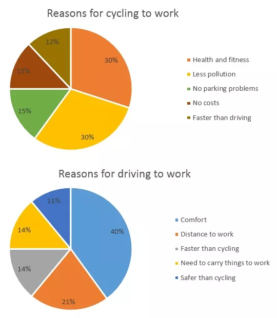
Source: Official website IELTS Essentials
Step 1 – Analyse the question
The format of every Academic Task 1 question is the same. Here is our practice question again with the words that will be included in all questions highlighted .
The chart below shows the reasons why people travel to work by bicycle or by car.
Every question consists of:
- Sentence 1 – A brief description of the graphic
- Sentence 2 – The instructions
- The graphic – chart, graph, table, etc.
Sentence 2 tells you what you have to do.
You must do 3 things:
1. Select the main features.
2. Write about the main features.
3. Compare the main features.
All three tasks refer to the ‘ main features ’ of the graphic. You do not have to write about everything. Just pick out 2 or 3 key features and you’ll have plenty to write about.
Step 2 – Identify the Main Features
The graphic in IELTS pie chart questions should not be difficult to interpret. Each question has been created to test your language skills, not your mathematics ability.
Pie charts always show percentages or proportions. Apart from that, they are essentially the same as bar charts and line graphs in that they are a way of presenting data visually.
All you are looking for are the main features. These will usually be the easiest things to spot. There will be lots of information in the graphic to help you identify them.
Here are some useful questions to ask?
- What are the units of measurements?
- What are the time periods?
- What can you learn from the title and any labels?
- What is the most obvious trend?
- Are there any notable similarities?
(I give more detail on how to use these questions, plus downloadable checklists for identifying the main features of all 7 different types of IELTS Academic Writing Task 1 questions, in the lesson on How To Understand & Analyse Task 1 Questions .)
Pie charts generally have titles and labels or sometimes a key instead of segment labels as in our practice question. The key explains what each segment of the pie chart represents.
So, what information is contained in the two pie charts?
Here's our IELTS pie chart again.

They show two different methods of travelling to work and illustrate the reason why people choose these types of transport.
What main features stand out?
There are 2 main features in these IELTS pie charts:
Main feature 1: The largest proportion of people who cycle do so for health and environmental reasons.
Main feature 2: The highest percentage of people who drive do so because it’s comfortable.
Another notable feature is that the only reason included in both pie charts – that the method is faster – shares almost the same proportion for both modes of transport.
We may not have space to cover this final feature but we’ll note it just in case we need it to make up the words.
The key features you select will be the starting point for your essay. You will then go on to add more detail. However, with just 20 minutes allowed for Task 1, and a requirement of only 150 words, you won't be able to include many details.
We’re now ready to begin writing our essay. Here’s a reminder of the 4 part structure we’re going to use.
Step 3 – Write an Introduction
In the introduction, you should simply paraphrase the question, that is, say the same thing in a different way. You can do this by using synonyms and changing the sentence structure. For example:
Introduction (Paragraph 1):
The two pie charts display the key reasons why people choose to either cycle or drive to work by percentage.
This is all you need to do for the introduction.
Step 4 – Write an Overview (Paragraph 2)
In the second paragraph, you should report the main features you can see in the pie charts, giving only general information. The detail comes later in the essay. You should also make any clear comparisons you spot.
Here are the ones we picked out above. I’ve added the additional feature as it will fit well in the overview.
Main feature 3: For an almost equal proportion of people, their chosen method is the fastest.
Now form these ideas into two or three sentences with a total of around 40 words. State the information simply, using synonyms where possible. No elaborate vocabulary or grammar structures are required, just the appropriate words and correct verb tenses.
For example:
Overview (Paragraph 2):
The largest proportion of people who cycle, have made this choice for health and environmental reasons whilst the prime advantage of driving to work is considered to be the comfort of travelling by car. Notably, for an almost equal proportion of people, their chosen method is the fastest.
Step 5 – Write the 1st Detail Paragraph
Paragraphs 3 and 4 of your IELTS pie chart essay are where you include more detailed information about the data in the graphic. In paragraph 3, you should give evidence to support your first key feature. Don’t forget to make comparisons where relevant.
Here is our first main feature again:
Main feature 1: The largest proportion of people who cycle do so for health and environmental reasons.
And this is an example of what you could write:
Paragraph 3 :
T aken together, health and fitness and less pollution are reasons given by over half of all people who prefer travelling by bike. Each represents a 30% portion which is double the next most popular reason which is a lack of parking issues at 15%.
Step 6 – Write the 2nd Detail Paragraph
For the fourth and final paragraph, you do the same thing for your second key feature.
I’ve added the third main feature again as it will round off the essay well. In an exam situation, I would include it if I had time.
Here’s an example of what you could write:
Paragraph 4 :
A different set of concerns has affected the decision of those who choose to commute by car. Comfort is by far the most significant factor at 40% of people, but distance to work is a more important concern for just over a fifth of drivers. For 14% of people, a faster journey time is the key factor compared to a figure of 12% of cyclists who find their means of transport quicker.
I just want to say a quick word about verb tense in this sample essay. Since there is no time frame given in the question, you could use either the present simple tense or the past simple tense. I've used the present simple tense. Whichever tense you choose, remember to be consistent throughout your whole essay.
Here are the four paragraphs brought together to create our finished essay.
Finished IELTS Pie Chart Essay
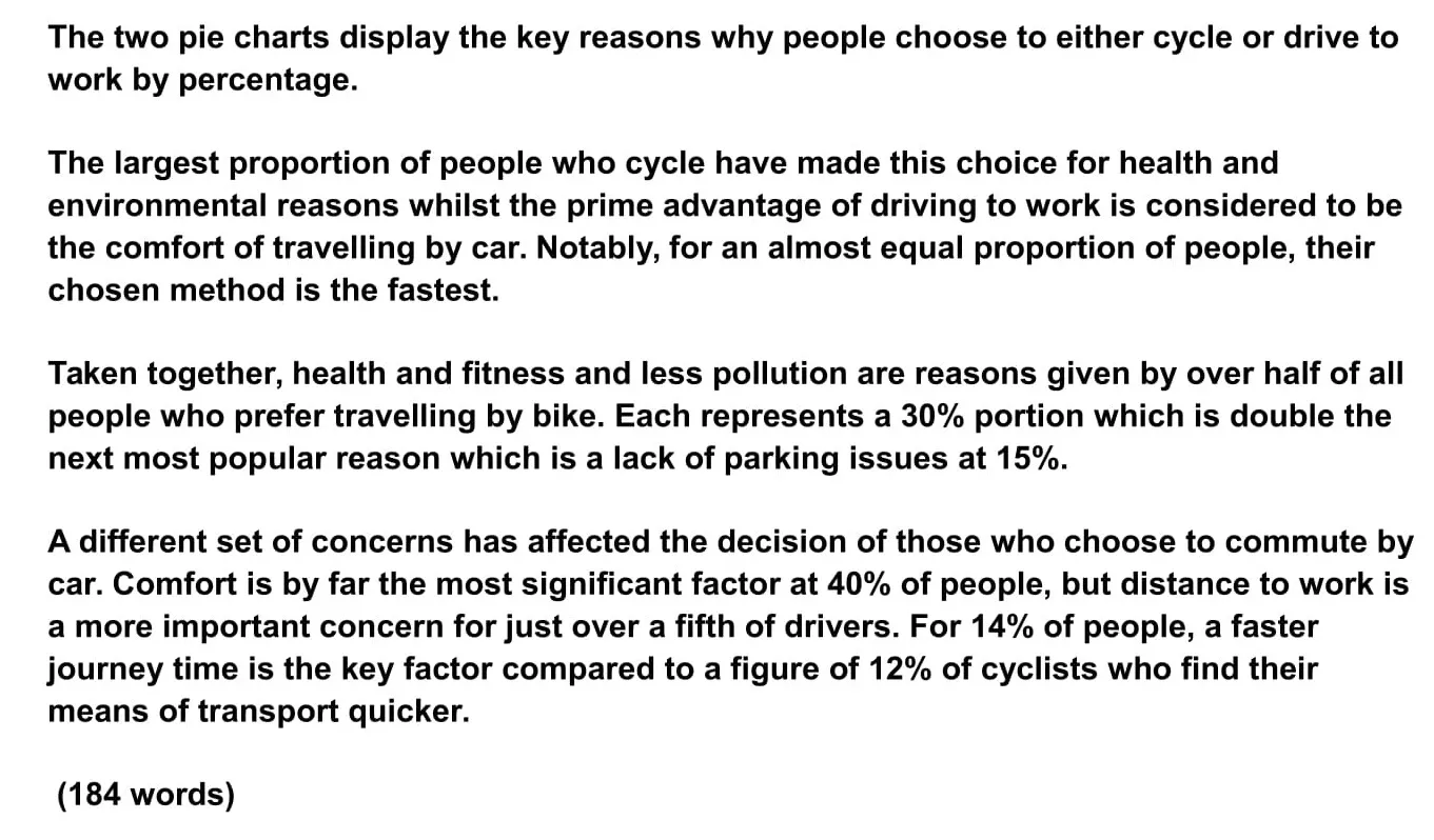
This sample IELTS pie chart essay is over the minimum word limit so you can see that you don’t have space to include very much detail at all. That’s why it is essential to select just a couple of main features to write about.
Now use what you’ve learnt in this lesson to practice answering other IELTS pie chart questions. Start slowly at first and keep practicing until you can plan and write a complete essay in around 20 minutes.
Want to watch and listen to this lesson on how to write an IELTS Pie Chart essay?
Click on this video.
Would you prefer to share this page with others by linking to it?
- Click on the HTML link code below.
- Copy and paste it, adding a note of your own, into your blog, a Web page, forums, a blog comment, your Facebook account, or anywhere that someone would find this page valuable.
Like this page?
Ielts academic writing task 1 – all lessons.
IELTS Academic Writing – A summary of the test including important facts, test format & assessment.
Academic Writing Task 1 – The format, the 7 question types & sample questions, assessment & marking criteria. All the key information you need to know.
Understanding Task 1 Questions – How to quickly and easily analyse and understand IELTS Writing Task 2 questions.
How To Plan a Task 1 Essay – Discover 3 reasons why you must plan, the 4 simple steps of essay planning and learn a simple 4 part essay structure.
Vocabulary for Task 1 Essays – Learn key vocabulary for a high-scoring essay. Word lists & a downloadable PDF.
Grammar for Task 1 Essays – Essential grammar for Task 1 Academic essays including, verb tenses, key sentence structures, articles & prepositions.
The 7 Question Types:
Click the links below for a step-by-step lesson on each type of Task 1 question.
- Table Chart
- Process Diagram
- Multiple Graphs
- IELTS Writing
- IELTS Pie Chart
- Back To Top
* New * Grammar For IELTS Ebooks
$9.99 each Full Set Just $ 23.97
Find Out More >>
IELTS Courses

Full details...

IELTS Writing Ebook
Discount Offer
$7 each Full Set Just $ 21

Find out more >>
Testimonials
“I am very excited to have found such fabulous and detailed content. I commend your good work.” Jose M.
“Thanks for the amazing videos. These are ‘to the point’, short videos, beautifully explained with practical examples." Adari J.
"Hi Jacky, I bought a listening book from you this morning. You know what? I’m 100% satisfied. It’s super helpful. If I’d had the chance to read this book 7 years ago, my job would be very different now." Loi H.
"Hi Jacky, I recently got my IELTS results and I was pleased to discover that I got an 8.5 score. I'm firmly convinced your website and your videos played a strategic role in my preparation. I was able to improve my writing skills thanks to the effective method you provide. I also only relied on your tips regarding the reading section and I was able to get a 9! Thank you very much." Giano
“After listening to your videos, I knew I had to ditch every other IELTS tutor I'd been listening to. Your explanations are clear and easy to understand. Anyways, I took the test a few weeks ago and my result came back: Speaking 7, listening 9, Reading 8.5 and Writing 7 with an average band score of 8. Thanks, IELTS Jacky." Laide Z.
Contact
About Me
Site Map
Privacy Policy
Disclaimer
IELTS changes lives.
Let's work together so it changes yours too.
Copyright © 2024 IELT Jacky
All Right Reserved
IELTS is a registered trademark of the University of Cambridge, the British Council, and IDP Education Australia. This site and its owners are not affiliated, approved or endorsed by the University of Cambridge ESOL, the British Council, and IDP Education Australia.
Free IELTS lessons signup

- Academic practice
- General practice
- Task 1 Academic
- Task 1 General
- Task 2 (essay)
IELTS writing task 1: describing a pie chart
In this lesson we're going to learn how to effectively describe a pie chart in IELTS Writing task 1 . To get a band 9 for your answer, you should follow this answer structure :
- Introduction
- General overview
- Specific features
Let's look in detail how to apply this structure to answer IELTS pie chart question .
IELTS pie chart Question :
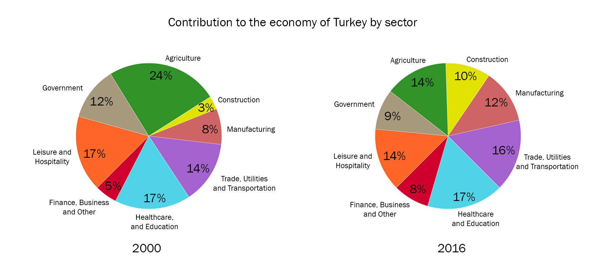
The two pie charts below show the percentages of industry sectors' contribution to the economy of Turkey in 2000 and 2016. Summarize the information by selecting and reporting the main features and make comparisons where relevant.
You can watch a video tutorial on how to describe pie charts in IELTS Academic Writing task 1:
And now let's learn how to describe IELTS pie charts by doing this example.
IELTS pie chart answering strategy :
1. Introduction
The first paragraph you write is an introduction . The introduction is 1 or 2 sentences, where you introduce your chart. In the introduction you have to paraphrase the information from your question and mention 2 important things:
- what your graph shows
- for what period of time
In our example, I wrote the introduction this way:
The two pie charts illustrate how different industry sectors contributed to the economy of Turkey percentagewise in the years 2000 and 2016.
So, I just took the information from the question card and paraphrased it in such way:
show → illustrate the percentages of industry sectors' contribution to the economy of Turkey → how different industry sectors contributed to the economy of Turkey percentagewise in 2000 and 2016 → in the years 2000 and 2016.
pie charts = pie charts (don't change this!)
2. General Overview
The second paragraph of your answer is a general overview , where you briefly describe 2-4 key features of your chart.
In our case there are two main options to describe key feature s:
- find the biggest and smallest slices of each pie chart
- find which slices became bigger/smaller or didn't change
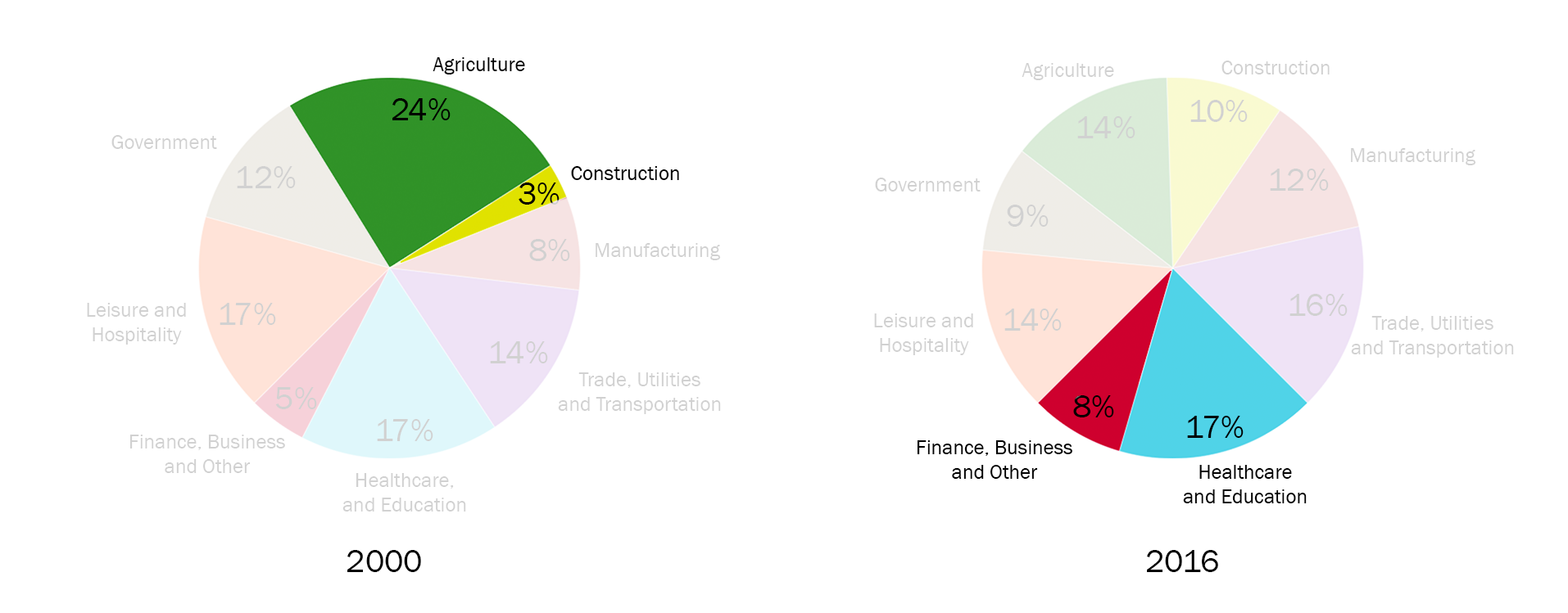
Each option is fine, but don't write both of them because you have to keep your overview short. I have chosen then first option . Let's look again at our pie charts and identify the biggest/smallest slices :
Now include the information you've gathered from the chart into your overview. Always start your general overview with the word overall :
Overall, at the beginning of the period construction contributed the least to the economy of Turkey and agriculture was the most significant economic sector. In comparison, at the end of the period healthcare and education became the largest economic segment and the lowest contribution was made by financial, business and other services.
3. Specific details
The last part of your answer is specific details . You should group the specific details of your chart in 2 or 3 paragraphs .
You can group data in such way :
- Sectors that had an increase (construction; trade utilities & transportation; manufacturing; finance, business and other services)
- Sectors that had a decrease or didn't change (agriculture; government; leisure and hospitality; healthcare and education)
In our case, paragraphs with specific details may look as follows:
Construction sector accounted for 3% of Turkey's economy in 2000, and experienced a more than threefold increase to one-tenth in 2016. Economic income from trade, utilities and transportation was 14% in 2000 and experienced a slight growth of 2% in 2016. At the beginning of the period, manufacturing and finance, business and other services made up 8% and 5% of Turkey's economy, respectively, and these figures rose to 12% and 8% in 2016. Agriculture, which comprised almost a quarter of Turkey's economy in 2000, fell to 14% in 2016. In 2000 economic outputs from government and leisure and hospitality sectors were at 12% and 17%, respectively, and both decreased by 3% after 16-year period. In contrast, contribution from healthcare and education sector remained constant in both years at 17%.
Useful vocabulary to write a percentage of a certain sector: :
- sector X was 3%
- sector X made up 3%
- sector X accounted for 3%
- sector X comprised 3% of [the whole chart]
The full answer + Practice
It's the end, we have finally written the answer for IELTS bar chart question. And now, let's practice: fill in the gaps in this answer with appropriate words .
The two illustrate how different industry sectors contributed to the economy of Turkey percentagewise in the years 2000 and 2016.
, at the beginning of the period construction contributed the least to the economy of Turkey and agriculture was the most significant economic sector. In , at the end of the period healthcare and education became the largest economic segment and the lowest contribution was made by financial, business and other services.
Construction sector accounted for 3% of Turkey's economy in 2000, and experienced a more than increase to one-tenth in 2016. Economic income from trade, utilities and transportation was 14% in 2000 and experienced a slight of 2% in 2016. At the beginning of the period, manufacturing and finance, business and other services made up 8% and 5% of Turkey's economy, respectively, and these figures rose to 12% and 8% in 2016.
Agriculture, which almost a quarter of Turkey's economy in 2000, fell to 14% in 2016. In 2000 economic outputs from government and leisure and hospitality sectors were at 12% and 17%, , and both decreased by 3% after 16-year period. In contrast, contribution from healthcare and education sector remained in both years at 17%.
(203 words)
IELTS Academic Writing Task 1: Pie Chart with Model Answer

This IELTS Academic Writing Task 1 question type might make you a little hungry. That’s because we’re going over pie charts today! To help give you an idea of what to expect and how to write a response, let’s look at this pie chart practice question with a model band 9 essay .
To see why this essay is band 9, see our Band 9 essay with scorer commentary , and check out the official IELTS rubric for Task 1 (PDF) .
This particular prompt is a pie chart. Your approach to this chart should be the same as your approach to any other Task 1 infographic Take a look at the information and think carefully. What is the best way to summarize the way the information is structured and the main points? From there, how can you best compare the most relevant pieces of information? Finally, how should you structure that summary and comparison? For more advice on how to approach this, see our article on IELTS Academic Task 1 paragraph structure , as well as our main page for IELTS sample questions and practice resources .
Try to do this prompt yourself. Then check out our band 9 model essay below the prompt and compare it to your own work to see how you did.
Model IELTS Academic Writing Task 1 Prompt: Pie Chart
The chart below gives information about the household percentage of spending on essential goods in China for the years 1995 and 2011
Summarise the information by selecting and reporting the main features and make comparisons where relevant.
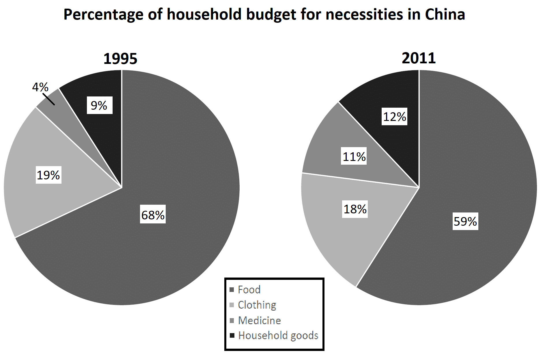
The two pie graphs show differences in Chinese household spending in four essential categories. These categories are marked as percentages of total spending, with differences in spending for 1995 and 2011.
Food and clothing remained the largest categories in both years, with medicine and household goods remaining the smallest. Nonetheless, there were measurable changes in all four categories over the years. Changes to the household budget shares of food and medicine were particularly noticeable.
Both of the top two categories, clothing and food, shrank during this 16 year period. Clothing lost just 1% of its share, going from 19% to 18%, while food dropped more dramatically, starting at 68% but losing 9 points of share by 2011.
In both 1995 and 2011, medicine and household goods represented the lowest and second-lowest spending categories, respectively. Still, both gained a larger share of household spending in China by 2011. Medicine jumped 7 points from 4% to 11%, while household goods made a smaller but still-noticeable increase from 9 to 12 percent.
More Practice IELTS Academic Writing Task 1 Sample Questions and Model Essays
- IELTS Academic Writing Task 1: Process Diagram with Model Answer
- IELTS Academic Writing Task 1: Bar Chart With Model Answer
- IELTS Academic Writing Task 1: Map With Model Answer
- IELTS Academic Writing Task 1: Line Graph with Model Answer
- IELTS Academic Writing Task 1: Comparing two Graphics with Model Answer
And don’t forget to use Magoosh’s complete guide to IELTS Writing .

David is a Test Prep Expert for Magoosh TOEFL and IELTS. Additionally, he’s helped students with TOEIC, PET, FCE, BULATS, Eiken, SAT, ACT, GRE, and GMAT. David has a BS from the University of Wisconsin-Eau Claire and an MA from the University of Wisconsin-River Falls. His work at Magoosh has been cited in many scholarly articles , his Master’s Thesis is featured on the Reading with Pictures website, and he’s presented at the WITESOL (link to PDF) and NAFSA conferences. David has taught K-12 ESL in South Korea as well as undergraduate English and MBA-level business English at American universities. He has also trained English teachers in America, Italy, and Peru. Come join David and the Magoosh team on Youtube , Facebook , and Instagram , or connect with him via LinkedIn !
View all posts
More from Magoosh
2 responses to “IELTS Academic Writing Task 1: Pie Chart with Model Answer”
The pie charts show data about the proportion of money which people spent on 4 main categories in China, between 1995 and 2011. İn general, more money reserved, which was a large proportion of pie charts, for food category.The proportion of household products and medicine was doubled total in 2 years.The percentage of money reserved for clothing category saw a decrease over the period in China. When looked in detail, in the beginning of the period, food category had the proportion of 68%. However, the figure dropped significantly to 59%. Household products and medicine category started at 9% and 4%. When the figure of household products went up slightly to 12%, the figure of medicine accounted for 11% which was an overwhelming change. The pie charts clearly show that, the amount of clothing category stood at 18%in 2011, which was 19% in the beginning.It is clear that clothing category had a minimal change.
The presented pie charts give information on household expenditures for staple commodities of the people of China. The charts indicate the changes for the years 1995 and 2011. Calibration of data is done in percentages and the outlays are represented by dividing them into 4 sections. As an overall trend food and clothing remained the biggest category during the mentioned period. Whereas the other two groups of medicine and household utilities showed the same indices relative to one another by the end of the timeframe. It is explicitly observed that spending on food stayed prevalent over the period demonstrating a slight change from 68% in 1995 to 59% in 2011. Expenses on clothing, likewise, mildly shrank from 19% to 18%. Concerning expenses on medicine and household goods both witnessed a moderate ascent, the former started at 4% in 1995 and eventuated at 11% in 2011. On the other hand, household goods gained 3 points and uplifted from 9% at the beginning to 12% by the end of the span.
Leave a Reply Cancel reply
Your email address will not be published. Required fields are marked *
- IELTS Scores
- Life Skills Test
- Find a Test Centre
- Alternatives to IELTS
- General Training
- Academic Word List
- Topic Vocabulary
- Collocation
- Phrasal Verbs
- Writing eBooks
- Reading eBook
- All eBooks & Courses
- Task 1 Lessons & Tips
- Ielts Pie Chart
How to Write an IELTS Pie Chart
This lesson will provide you with tips and advice on how to write an IELTS pie chart for task 1.
To begin, take a look at the pie chart below, and then answer the quiz questions.
If you prefer or if you want extra tips you can also view this lesson in a video ( but don't forget afterwards to do the quizzes on this page that give you the language practice ! ):
You should spend about 20 minutes on this task .
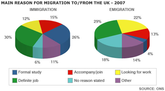
The pie charts show the main reasons for migration to and from the UK in 2007.
Summarise the information by selecting and reporting the main features and make comparisons where relevant.
Write at least 150 words.
Answer these questions about the IELTS pie chart:
Now take a look at a model answer:

The pie charts illustrate the primary reasons that people came to and left the UK in 2007. At first glance it is clear that the main factor influencing this decision was employment.
Having a definite job accounted for 30 per cent of immigration to the UK, and this figure was very similar for emigration, at 29%. A large number of people, 22%, also emigrated because they were looking for a job, though the proportion of people entering the UK for this purpose was noticeably lower at less than a fifth.
Another major factor influencing a move to the UK was for formal study, with over a quarter of people immigrating for this reason. However, interestingly, only a small minority, 4%, left for this.
The proportions of those moving to join a family member were quite similar for immigration and emigration, at 15% and 13% respectively. Although a significant number of people (32%) gave ‘other’ reasons or did not give a reason why they emigrated, this accounted for only 17% with regards to immigration.
(173 words)
Choose the most important points to write about first
These will usually be the largest ones. As you can see in the model answer, definite job, looking for work , and formal study were all written about first, in order of importance, as these are the main reasons that were chosen for moving.
Items such as ‘other ’ are usually less important and account for small amounts, so can be left till the end.
Make it easy to read
When you write a task 1, you should always group information in a logical way to make it easy to follow and read.
With an IELTS pie chart, the most logical thing to do is usually to compare categories together across the charts, focusing on similarities and differences, rather than writing about each chart separately.
If you write about each one separately, the person reading it will have to keep looking between the paragraphs in order to see how each category differs.
Vary your language
As with any task 1, this is important. You should not keep repeating the same structures. The key language when you write about pie charts is proportions and percentages .
Common phrases to see are " the proportion of… " or " the percentage of… "
However, you can also use other words and fractions. These are some examples from the model answer:
- A large number of people
- over a quarter of people
- a small minority
- A significant number of people
- less than a fifth
This table presents some examples of how you can change percentages to fractions or ratios:
You can improve your flexibility in using these words or test your knowledge of them in this percentage and proportions quiz .
If the percentages are not exact as above, then you can use qualifiers to make sure your description remains accurate. Here are some examples:
This table presents some examples of how you can change percentages to other phrases:
The words above are interchangeable, though number is for countable nouns and amount is for uncountable nouns .
You can practice or test yourself with the language used to approximate figures in this online quiz .
More Task 1 Academic Lessons:
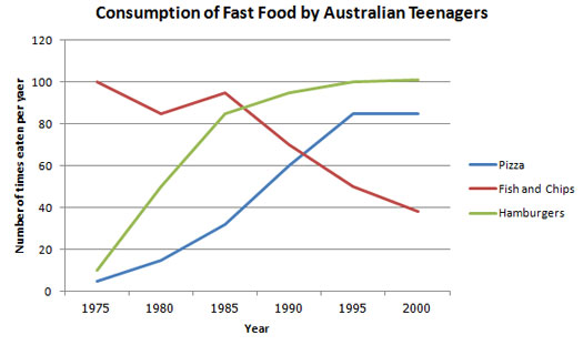
Describing IELTS Graphs: Tips to avoid a common mistake
IELTS Graphs: A common mistake In IELTS graphs is to get the subject of the graph wrong. This lesson explains how this mistake is made and show you what you need to do to avoid it. There is a also a practice exercise.
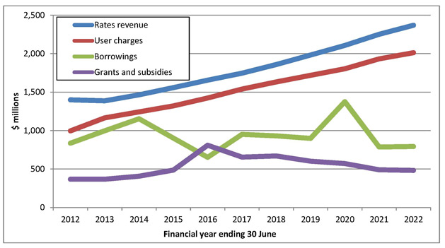
Writing Tips for a Graph in the Future in IELTS Academic
Graph in the future: Sometimes graphs in IELTS refer to a future time. You must know the language to write about these. In this lesson, learn how to write about an IELTS graph in the future. Getting the tenses right is an important part of the IELTS writing task 1.
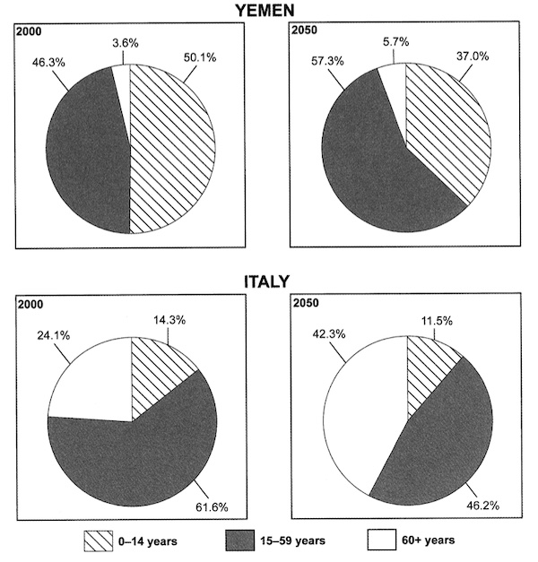
Task 1 Pie Chart: Using the past and future tenses
Task 1 pie chart for IELTS with model answer and tips on how to develop a high-scoring response to this type of chart. You need to use past and future tenses.
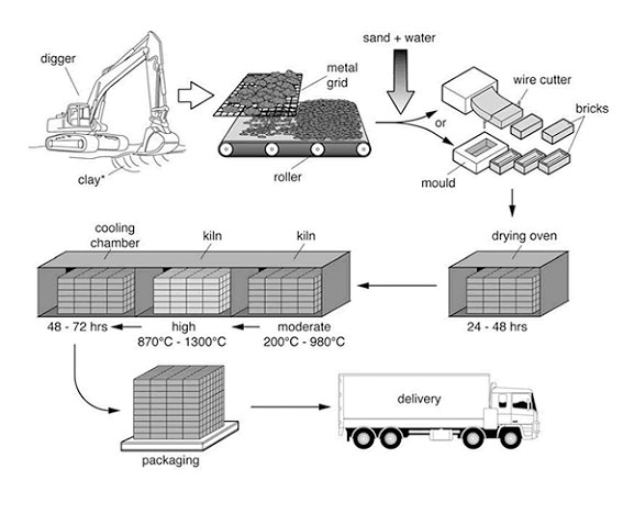
IELTS Process Diagram Strategies and Tips
IELTS Process Diagram: In task 1 of IELTS writing you usually have to describe some kind of graph or chart. But sometimes you get a process. It is therefore crucial that you know how to do this. This easy to follow lesson explains how.
IELTS Pie Chart Exercise: Improve your language flexibility
With this IELTS pie chart exercise you can Improve your language and grammar for writing about Task One charts. The focus is on comparing and on 'proportions'.
How to Describe an IELTS Academic Writing Task 1 Graph
IELTS Academic Writing Task 1: This lesson describes in a simple way how you should describe a graph for the academic part of the test for task 1. You need an introduction, overview and body paragraphs. These simple steps will show you how, and how to get a high score.
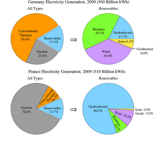
IELTS Sample Pie Chart: Describing four pie charts together
View a sample pie chart for the IELTS test on electricity generation, with a model answer. In a pie chart you have to use language connected to proportions and percentages.
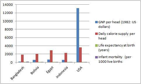
IELTS Table: Tips and techniques for a high score.
IELTS Table advice for a high score. Learn how to describe an IELTS table, which is just another way to present data.
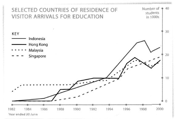
Tips for Organising an IELTS Line Graph
Organising an IELTS Line Graph - This lesson shows you have to improve the coherency of your graph in order to achieve a high band score.
Describing Graph Trends Using the Language of Change
Describing graph trends: In IELTS you must know how to describe the trends that you see in the graph you are given. This lesson provides practice with some common language used to describe trends.
Learn Compare and Contrast Language for IELTS Graphs
Compare and Contrast Language: In the academic IELTS task 1, you have to know the right language if you want to get a band 7 or higher. Practice your IELTS language for bar charts in this task 1 writing lesson.
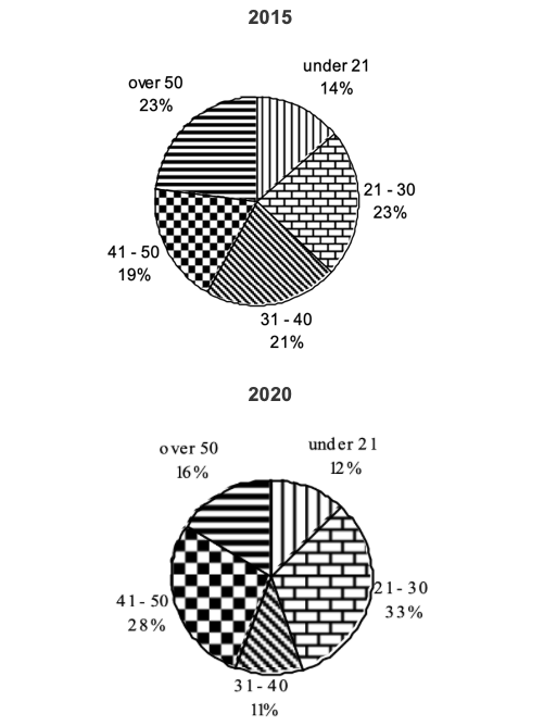
Writing Task 1 Pie Chart: Describing two pie charts over time
Writing Task 1 Pie Chart: This sample chart compares the structure of a company in terms of the ages of the workforce.
Prepositions in Graphs Quiz: Between; from; to; at; of; in; with; by
Prepositions in Graphs: Practice using prepositions in the IELTS test. View a model answer and practice using a gap fill.
Which Tenses for IELTS are the Most Important?
Candidates often ask which tenses for IELTS are needed in order to do well in the exam. This lesson goes through the grammar tenses and how they apply to the test.
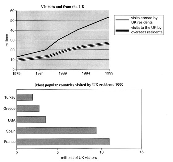
IELTS Bar and Line Graph: How to describe two graphs together
This Bar and Line Graph example shows you how you can write about two charts together in the IELTS test for task 1, with strategies and techniques.
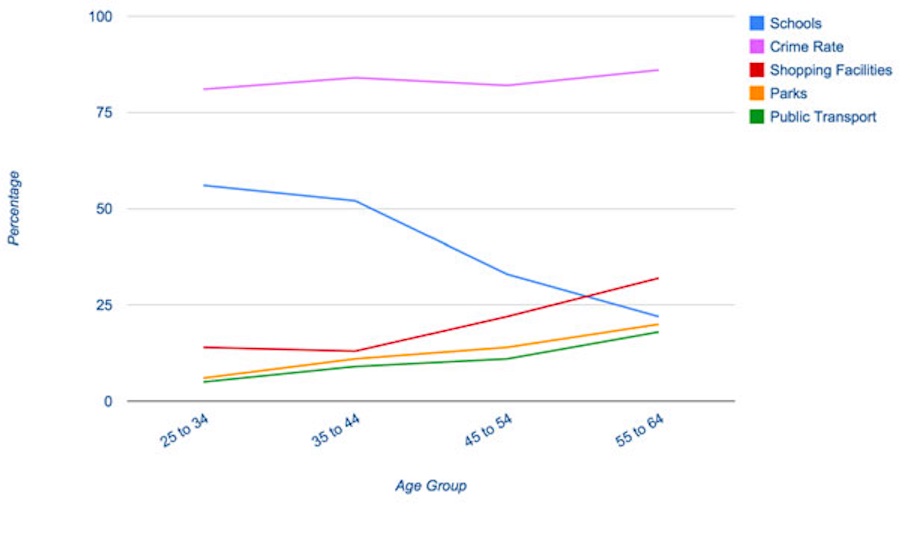
IELTS Task 1 Line Graph Structure Using Groups
For an IELTS Task 1 Line Graph there are different ways to organise your answer. Grouping information is a good way to get a logically structured response.
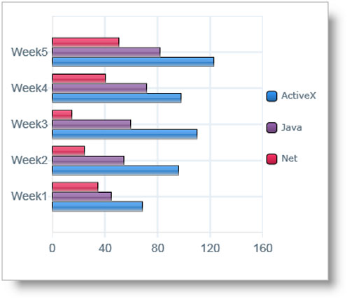
Describing an IELTS task 1 graph over time
This lesson shows you how to write an IELTS task 1 graph or chart that is over time.

Take an IELTS Quiz to test your IELTS knowledge
IELTS Quizzes to test and train you on the writing task and task 2 of the IELTS test. Gap fills and multiple choice.
Any comments or questions about this page or about IELTS? Post them here. Your email will not be published or shared.
Before you go...
Check out the ielts buddy band 7+ ebooks & courses.
Would you prefer to share this page with others by linking to it?
- Click on the HTML link code below.
- Copy and paste it, adding a note of your own, into your blog, a Web page, forums, a blog comment, your Facebook account, or anywhere that someone would find this page valuable.
Band 7+ eBooks
"I think these eBooks are FANTASTIC!!! I know that's not academic language, but it's the truth!"
Linda, from Italy, Scored Band 7.5
IELTS Modules:
Other resources:.
- All Lessons
- Band Score Calculator
- Writing Feedback
- Speaking Feedback
- Teacher Resources
- Free Downloads
- Recent Essay Exam Questions
- Books for IELTS Prep
- Useful Links

Recent Articles
Decreasing House Sizes Essay
Apr 06, 24 10:22 AM

Latest IELTS Writing Topics - Recent Exam Questions
Apr 04, 24 02:36 AM

IELTS Essay: English as a Global Language
Apr 03, 24 03:49 PM
Important pages
IELTS Writing IELTS Speaking IELTS Listening IELTS Reading All Lessons Vocabulary Academic Task 1 Academic Task 2 Practice Tests
Connect with us
Copyright © 2022- IELTSbuddy All Rights Reserved
IELTS is a registered trademark of University of Cambridge, the British Council, and IDP Education Australia. This site and its owners are not affiliated, approved or endorsed by the University of Cambridge ESOL, the British Council, and IDP Education Australia.
IELTS Writing Task 1 – Pie Chart Example Essay 1
In this post, we will look at a Writing Task 1 Academic pie chart essay example from the IELTS writing task 1 Academic Test. Students often ask if the questions are repeated year after year and the answer is no, but the type of chart or graph can be.
There are so many questions written each year, you may find you practice answering various questions on different topics. It is best practice to learn how to answer each one of the various types of writing task 1 questions , from bar charts, line graphs, maps, process etc.
If you would like to learn how to structure a pie chart essay please click the button below >
Take a look at the IELTS Writing Task 1 Academic essay example below >>
*This pie chart question and answer were provided by a student. IELTS Achieve did not design this question*
The chart below shows how much money is spent in the budget on different sectors by the UAE government in 2000.
Summarize the information by selecting and reporting the main features, and make comparisons where relevant.
The diagram describes the comparative statistics of the annual expenditure of ten departments of the government of the United Arab Emirates in 2000. The units were measured in billion AED.
Overall, the Social security sector received the largest amount of budget while the Department of Transportation got the lowest amount of funds.
On the one hand, the receiver of the largest portion of the annual budget of the United Arab Emirates government in 2000 is the Social security sector with 100 billion AED followed by the Health and personal social services and the Education department with 53 billion AED and 38 billion AED respectively. Landing in the fourth spot is the other expenditures and the Debt sector with both 23 billion AED.
On the other hand, the Defense Department had 22 billion AED and trailing behind are the Departments of Law and order and the Housing, heritage and environment sector with 17 billion AED and 15 billion AED correspondingly. The Industry, agriculture and employment department received 13 billion AED and then finally, the Department of Transportation got the least amount of budget with only 9 billion AED.
Word count – 187 / Band score 8

- Task Achievement – The answer provides a paraphrased question, to begin with, followed by an overview that gives the reader key information.
- Coherence and Cohesion – The answer has been divided into clear logical paragraphs.
- Lexical Resource – There is evidence of paraphrasing, synonyms and some less common words.
- Grammatical Range and Accuracy – The answer has no grammatical errors. The sentences are mainly made up of multiple clauses and have a variety of structures.
We hope you found this post useful in helping you to study for the IELTS Test . If you have any questions please let us know in the comments below or on the Facebook page.
The best way to keep up to date with posts like this is to like us on Facebook , then follow us on Instagram and Pinterest . If you need help preparing for the IELTS Test, join the IELTS Achieve Academy and see how we can assist you to achieve your desired band score. We offer an essay correction service, mock exams and online courses.
Related Posts
Write to the singer about his/her performance: semi-formal letter [ielts general writing task 1 ].
You should spend about 20 minutes on this task. You recently went to a concert and thought…
![sample pie chart essay ielts After being involved in an accident, you were looked after by a person you did not know before: Semi-Formal Letter [IELTS General Writing Task 1 ]](https://www.ieltsachieve.com/wp-content/uploads/2023/08/You-eat-in-your-college-cafeteria-everyday-lunchtime-Semi-Formal-Letter-IELTS-General-Writing-Task-1-1-1.png)
After being involved in an accident, you were looked after by a person you did not know before: Semi-Formal Letter [IELTS General Writing Task 1 ]
You should spend about 20 minutes on this task. After being involved in an accident,…
Leave a Comment Cancel Reply
Your email address will not be published. Required fields are marked *
Save my name, email, and website in this browser for the next time I comment.
IELTS Preparation with Liz: Free IELTS Tips and Lessons, 2024
- Test Information FAQ
- Band Scores
- IELTS Candidate Success Tips
- Computer IELTS: Pros & Cons
- How to Prepare
- Useful Links & Resources
- Recommended Books
- Writing Task 1
- Writing Task 2
- Speaking Part 1 Topics
- Speaking Part 2 Topics
- Speaking Part 3 Topics
- 100 Essay Questions
- On The Day Tips
- Top Results
- Advanced IELTS
How to Describe Pie Charts in IELTS Writing Task 1
Learn in easy steps how to describe IELTS Pie Charts for writing task 1. Below are easy techniques to help you write each paragraph: introduction, overview, body paragraph 1 and body paragraph 2.
Source: The above pie charts were not created by IELTS Liz.
Describing Pie Charts Step by Step
Below you will find easy to follow advice on how to describe your IELTS pie chart paragraph by paragraph.
Introduction
You must paraphrase the information given at the top of the charts “The graph shows the main sources of energy for the USA in 1980 and 1990”. You cannot copy this, you must use your own language.
- the graph = the pie chart
- shows = illustrates
- main sources of energy = energy production from different sources
- for the USA = don’t change this
- in 1980 and 1990 = in two different years (1980 and 1990)
The overview contains the key features of the charts. Answer the questions below to find the key features.
- What was the main source of energy in 1980?
- What was the main source of energy in 1990?
- Which produced the least energy in 1980?
- Which produced the least energy in 1990?
- Did the amount of energy produced by each source change a lot or just a little between the years?
- Did all types of energy increase by 1990?
Body Paragraph 1
This paragraph will give details about oil and hydroelectric power, which we highlighted in the overview above.
- You will need to write one sentence about oil comparing the percentage each year and then one sentence about hydroelectric power comparing the years.
- You must add data (percentages and dates) to support each sentence
Here are two example sentences. Fill in the gaps with the right words.
The amount of energy produced by oil in the USA 1. ………………. 42% in 1980 and this, then, 2. ………………….. to a third (33%) in 1990. The proportion of energy from hydroelectric power, 3………………, remained constant in both years ………a mere 5%.
- accounted for / comprised of / made up / was
- fell / declined / dropped / went down / decreased
- on the other hand / by contrast / in contrast ( we use a linker to highlight that this is opposing information to the previous sentence)
Body Paragraph 2
This paragraph will give detail about the other sources of energy in the pie charts.
- which sources increased?
- which sources decreased?
- what were the percentages for each source?
Again, fill in the gaps in these model sentences.
The energy generated by natural gas, which was the second 1. …………… source of energy in the USA in 1980, fell 2. ………. 1% to a quarter of all energy produced in 1990. In contrast, production by coal 3. ……………… from 22% to 27% in 1990 4. …………….. there was a 5% rise in energy from nuclear power to reach 10% in the second year.
- largest / major
- by (this is used when writing about differences in amounts)
- increased / rose / went up / climbed / grew
- while / whereas
Recommended Lessons
IELTS PIE Chart Model Practice Writing Task 1 Charts
……………………….
Free Subscribe to get new Posts by Email
Type your email…
Hi liz ,,, why did you use “while / whereas” to fill the fourth gap although the following information is not a contrast ? I mean both increased by 5% why you didnt use and instead of while ?
The words “while” and “whereas” are not only used as contrasts. They are also used for comparisons. Therefore, they are the perfect linking words to use when making comparisons. Always remember that many words in any language might have more than one meaning, more than one usage and much will depend on context.
The pie charts illustrate different sources of energy production for two different years (1980 and 1990) in America. The energy from different sectors are shown in perecentage.
It is apparent from the pie charts that oil constitutes the major source of energy in both the years , whereas hydroelectric power was the least source of energy for the two different years.The oil sector shows a decline in energy production in the next year whereas the hydroelectric power sector remained stable.
The energy generated by oil was 42% of the total energy in 1980 which then declined to a third of all energy generated in 1990. On the contrary , the hydroelectric power shares only 5% of the energy which remained to the same figure in the other year as well.
Natural gas was the second major energy generator with a share of 26% in 1980 which drops by 1% and became a quarter of all energy generated in 1990.Additionally coal and nuclear power which contributed to 22% ad 5% of all energy increased to 27% and 10% in 1990 respectively. (suggestions are welcome)
The pie chart unveils the information about the production of energy from various sources in USA in two years’ comparison (1980 and 1990).
Overall, the highest proportion of oil was being used to produce energy in both the years. Whereas, hydroelectric power was the least interested amongst all. There has also been a significant drop in producing energy from oil in ten years. Moreover, a considerable increase in coal and nuclear energy was noticed despite the drop in other categories.
In 1980, the oil constituted about two-fifths (42%) of the whole energy production which dropped to nearly one-third of the total in 1990. In opposite, hydroelectric power only produces 5% of energy in both the years (1980 and 1990).
The energy produced from natural gas covered nearly one in five (26%) of the whole in 1980. This figure was dropped by 1% only to a quarter of all energy produced in 1990. On the contrary, coal and nuclear power went up by 5% to 27% and 10%, respectively.
The pie chart illustrates the the changes in energy production from five different sources (oil, natural gas, hydroelectric power and nuclear power) for the USA in two different years(1980 and 1990).
Overall, it can be observed that in both years oil was used the most to produce energy, while hydroelectric power constituted the least energy. There was a slight decrease in the production from oil and natural gas, whereas an increase can be seen in the figures for coal and nuclear power.
In 1980, the percentage of power generation from oil and natural gas was 42% and 26% respectively. However these figures slightly dropped in 1990, with oil at mere 33% and natural gas at 25%.
Conversely, in the total amount of enegy production of 1980, coal and nuclear power contributed 22% and 5% respectively, while the contribution of each source increased by 5% which reached at 27% for coal and and at 10% for nuclear power in 1990. Remarkably, in both years, the same amount of enegery was produced from hydroelectric power (5%).
Hi Liz, I cannot thank you enough to show my gratitude on your work. Great job!
Regarding one phrase that stuck in my mind: “The energy generated by natural gas, which was the second major source of energy in the USA in 1980, fell by 1% to a quarter of all energy in 1990.” Here, we know that in 1980 natural gas constituted 26% of total energy generated but in 1990 it was 25%. However, we do not know that the change was by 1% as the we do not know the numbers. Overall, I wanted to be sure if we can describe the “weight” change in percentages like that.
thank you for your generosity! I can’t thank you enough. I have a questions regarding tenses. In scenarios like the task 1 here, should we stick to “past tense” when describing? Or we can simply use simple present tense since we are stating facts.
Your tense will depend on the data given. Data given in the past will require past tense. If not dates are given, you can use the present tense. And look out for any predictive graphs or charts which will require future forms.
The given pie chart delineates five main manufactures, namely oil, natural gas, coal, hydroelectric power and nuclear power, of energy for the United States of America in 1980 compared to 1990. Looking from an overall perspective, it is readily apparent that there were two downward trends in the proportion of natural gas and oil, while coal and nuclear power had upward trends in producing energy. The share of oil was below a half of energy in 1980, which is then decreased significantly by 9% from 42% to 33%. By contrast, natural gas produced 26% energy in 1980, then declined by 1% and accounted for the quarter of energy production in 1990. The energy generated by the proportion of coal underwent a considerable increase by 5% to 27% to over the quarter of the energy manufacturing. Hydroelectric power and nuclear power, on the other hand, were the same (5%) in 1980, however, the first one remained unchanged, whereas the latter rose by half to 10% in the USA.
I have one doubt about the phrase “the energy generated by natural gas in this example “, ‘energy’ is mentioned as an uncountable noun in your uncountable word list but here it is with the article ‘the’.
You are doing a great job by spending your valuable time and thank you so much for that.
Best wishes to you.
There are two articles “a” and “the”. The article “a” is never used with uncountable nouns because there are never one of them. For example, “traffic”, we do not say “a traffic” because there is no singular. However, the article “the” is not about numbers or counting how many there is. It is about whether the noun is defined or not. We can say “the traffic” which means we are referring to specific traffic. Please get my Grammar E-book to learn more about articles: https://elizabethferguson.podia.com/
The pie charts illustrates the percentage of energy produced from five different sources such as oil, natural gas, coal, hydroelectric power and nuclear power in the USA in two different years (1980 and 1990).
Overall, it can be seen that the main source of energy in 1980 and 1990 was through the use of oil whereas hydroelectric power produced the least energy. Similarly, there was a slight decrease in energy production from oil and natural gas while an increase can be seen in the figures for coal and nuclear power.
As seen in the graph, In the first year, the amount of energy produced from oil accounted for 42% of the total energy produced from different sources, however, this then decreased to 33% in 1990. Meanwhile the proportion of energy generated from hydroelectric power remained constant in both years.
Furthermore, nuclear power saw an increase in its energy production by 5% in the second year. Similarly, the amount of energy generated through the use of coal experienced a slight rise from 22% to 27% in that same year while natural gas which was the second largest source of energy in the USA, fell by 1%.
Thank you so much Ma’am…..it’s helps alot….extremely useful website😊
You’re welcome 🙂
The pie chart illustrates the percentage of five different forms of energy(oil, natural gas, coal, hydroelectric power and nuclear power) produced in the USA in two different years (1980 and 1990). Overall, it can be clearly seen that the most common form of energy was oil within the given period, even though there was a significant fall recorded in 1990. While more than half of the energy came from the two sources (oil and natural gas), the remaining only were generated from other sources (coal, hydroelectric power and nuclear power). Furthermore, it is worth to notice that there was no change in the share from hydroelectric power production. On the one hand, Oil and natural gas together occupied more than half of the total production of energy in the USA during 1980 and 1990. However, while there was a dramatic fall in oil energy, declining from 42% to 33%, production from natural gas decreased only slightly from 26% to 25%. In contrast, generation of energy from both coal and nuclear power had witnessed a significant rise by 5% (Coal- from 22% to 27%; Nuclear power- from 5% to 10%) while the hydroelectric power generation only remained stable with 5% on both the years.
Hey Teacher, First, I want to thank you endlessly for your efforts. Your lessons are useful. Please favour me with a small check to my essay for the example above.
The pie graphs illustrate different sources of energy production in the USA ( oil, natural gas, coal, hydroelectric power and nuclear power ) in the years 1980 and 1990.
Overall, at the beginning of the period the amount of energy produced from oil was the largest segment while coal and hydroelectric power made the lowest production. In comparaison, at the end of the period oil made up the biggest part of the chart as well. Meanwhile, production by hydroelectric power was the least significant of the main sources of energy for the USA.
The energy generated by coal accounted for 22% of the main sources of energy for USA in 1980 and had a moderate growth of 5% in 1990. That produced by nuclear power was 5% in the beginning of the period and experienced a twofold increase to one-tenth in the end of the period.
Energy from oil which comprised almost a half of the general energy produced in 1980, fell to 33% in1990. Furthermore in 1980, energetic outputs from natural gas ere at 26% and decreased slightly by 1% to a quarter of the main energy produced in 1990. However, the proportion of energy produced from hydroelectric power remained constant in both years at 5%.
Thanks Liz for all you do here.
Thanks Liza
Hello, Liz! I can’t help leaving a comment to express my gratitude and appreciation for your example. It makes it simple to teach how to write a report by merely following several steps.
Best wishes for you!
I’m so pleased it was useful 🙂
Hello Liz!Thank you very much for vivid explanation and clear ideas and clues about this type of task 1!I always was scared with pie-chart,but now im realised how to deal with them.Thank you!❤💕💗😘
I’m so glad you are more confident now. It’s just a matter of becoming more familiar with it all and have a clear approach 🙂
my exam is tomorrow and I’ve finally got the hang of the writing task 1. Thank you Liz! I do think my answer is a little verbose.
Good luck tomorrow! Keep your eye on the clock and manage your time properly.
Hi Liza thank you for your great page and priceless information.
Thank you so much mam Lots of love from Nepal😍😍
This was the best lesson and the best way to explain how to write a pie chart.Thank you so much Liz.
You are doing a great job. Your tips are really useful and your efforts are remarkable.
Hi Liz, you doing so good. thank you. but just a quick one, please are there no conclusion in writing task 1?
See the tips on this page: https://ieltsliz.com/ielts-writing-task-1-lessons-and-tips/
It was very easy to understand .thank u so much!!!
Thank you so much for your help while preparing for IELTS examination
See full model answers for writing task 1 on this page: https://ieltsliz.com/ielts-writing-task-1-lessons-and-tips/
Speak Your Mind Cancel reply
Notify me of new posts by email.
Advanced IELTS Lessons & E-books
Recent Lessons
Ielts liz personal update 2024, ielts model essay -two questions essay type, ielts bar chart of age groups 2024, ielts topic: urban planning, ielts listening transcripts: when and how to use them, 2024 ielts speaking part 1 topics.

Click Below to Learn:
- IELTS Test Information
Copyright Notice
Copyright © Elizabeth Ferguson, 2014 – 2024
All rights reserved.
Privacy Policy & Disclaimer
- Click here: Privacy Policy
- Click here: Disclaimer
Return to top of page
Copyright © 2024 · Prose on Genesis Framework · WordPress · Log in
IELTS Exam Preparation: Free IELTS Tips, 2024
- IELTS writing
In Academic Task 1 of the Writing module , you are expected to write a short descriptive report based on visual information or data. This visual information may be presented as pie charts. Pie charts are circular charts divided into sectors or ‘pie slices’, usually illustrating percentages. The size of each pie slice shows the relative quantity of the data it represents. Together, the slices create a full circle. They are commonly used in the business world and the mass media, and are less common in scientific or technical publications.
Sample Questions
Accessing the news in canada and australia.
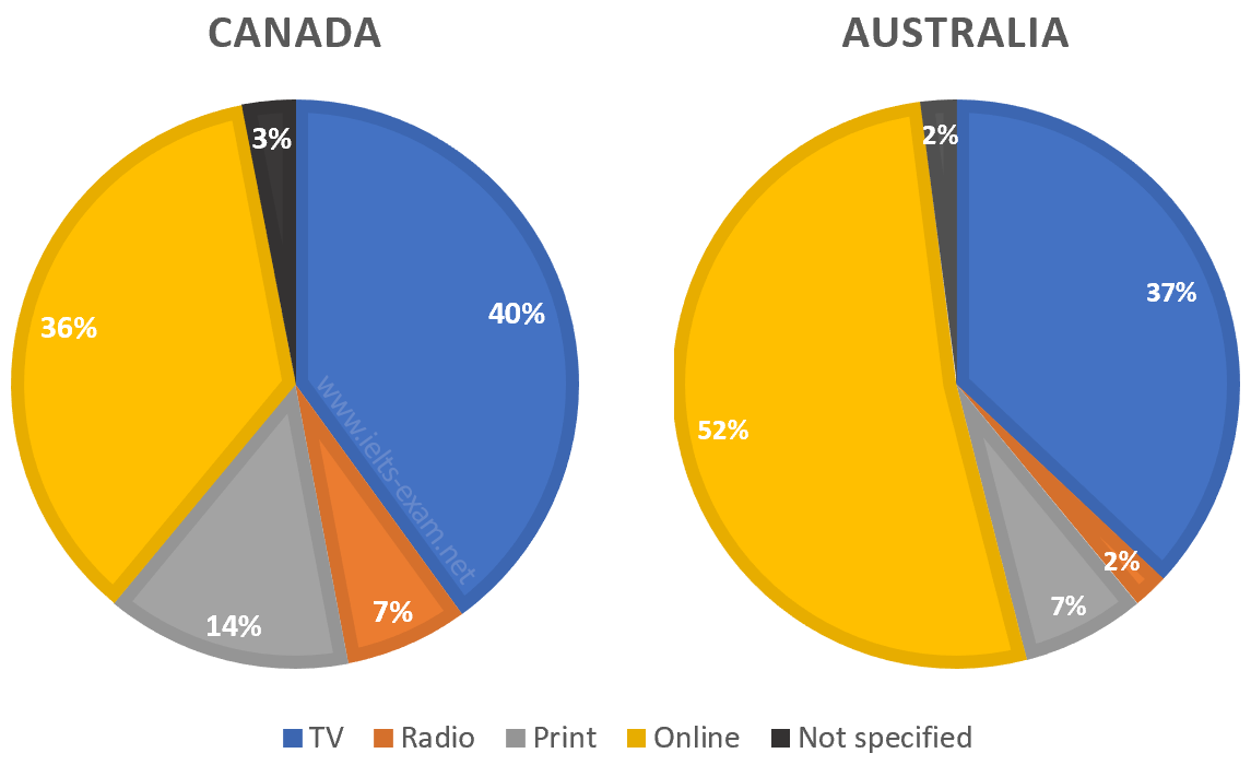
The pie charts compare ways of accessing the news in Canada and Australia.
Summarise the information by selecting and reporting the main features, and make comparisons where relevant.
Employment sectors of graduates from Brighton University, 2019
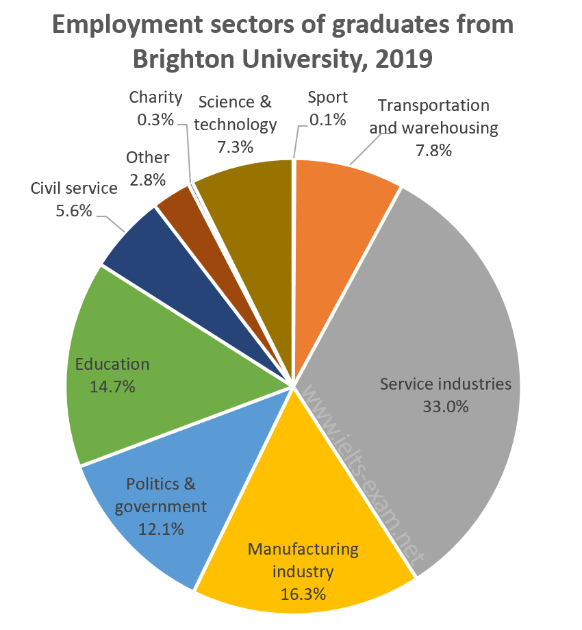
The chart below shows the proportions of graduates from Brighton University in 2019 entering different employment sectors.
The devices people use to watch television in Canada
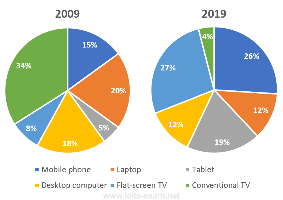
The pie charts below show the devices people in the 18 to 25 age group use to watch television in Canada in two different years.
World passenger car production, 2015
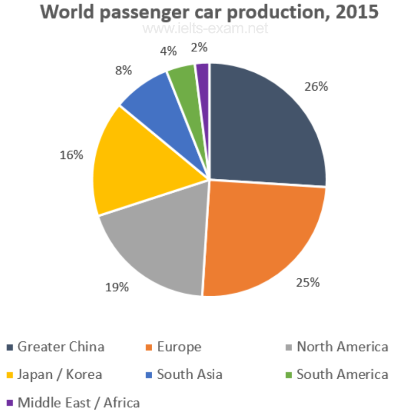
The graph shows data on the manufacture of passenger cars in 2015.
The post-school qualifications held by Canadians
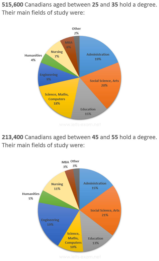
The graphs below show the post-school qualifications held by Canadians in the age groups 25 to 35 and 45 to 55.
Government expenditure in 2010 and 2015
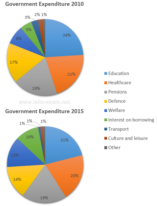
The charts below show local government expenditure in 2010 and 2015.
Most common advantages and disadvantages of Bowen Island
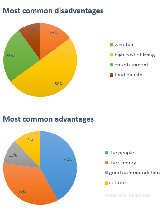
The pie charts below show the most common advantages and disadvantages of Bowen Island, according to a survey of visitors.
Number of journal articles read per week by all students, PhD students, and junior lecturers
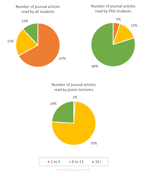
The pie charts below illustrate the number of journal articles read per week by all students, PhD students, and junior lecturers at an Australian university.
Reasons for cycling to work
The charts below show the reasons why people travel to work by bicycle or by car.
Causes of worldwide land degradation
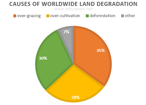
The pie chart below shows the main reasons why agricultural land becomes less productive. The table shows how these causes affected three regions of the world during the 1990s.
What makes people most happy?
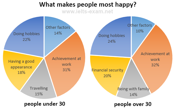
The charts below show the results of a survey about what people of different age groups say makes them most happy.
Average Household Expenditures by Major Category
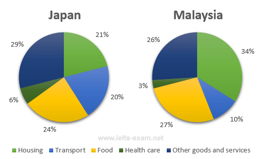
The pie charts below show the average household expenditures in Japan and Malaysia in the year 2010.
Employees and self-employed: by sex and occupation, 1992
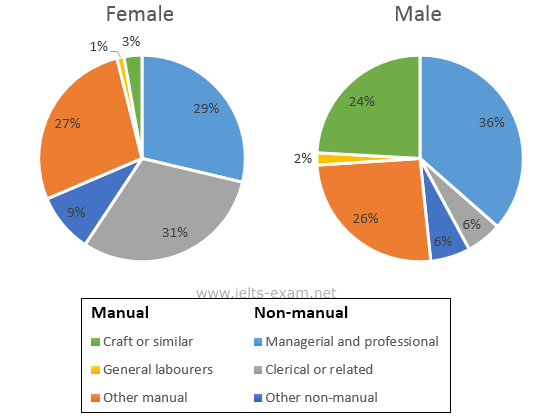
The two pie charts below show some employment patterns in Great Britain in 1992.
Online sales for retail sectors in Canada
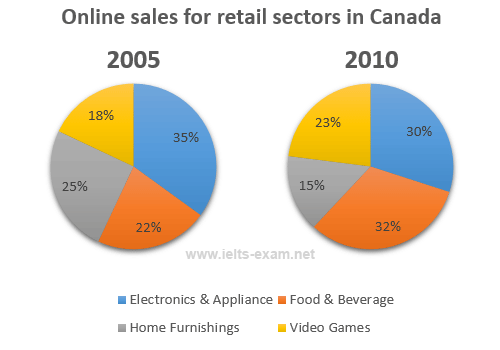
The two pie charts show the online shopping sales for retail sectors in Canada in 2005 and 2010.
Expenditure by local authorities in Someland
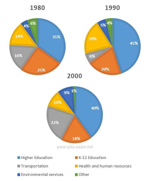
The three pie charts show the changes in annual spending by local authorities in Someland in 1980, 1990 and 2000.
Transport and car use in Edmonton
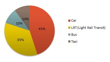
The diagrams give information on transport and car use in Edmonton.
Managing Finances
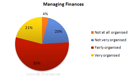
The diagrams show UK students' responses to the question of to what extent would they describe themselves as financially organised.
World population by region, 1900 and 2000
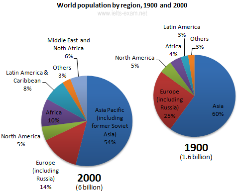
The pie charts give information about world population in 1900 and 2000.
Average Household Expenditure by Major Category
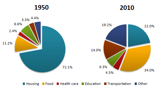
The pie charts show the average household expenditures in a country in 1950 and 2010.
Projected market share of the two companies in jeans

The pie chart shows the projected market share of the two companies in jeans at the end of next year.
Electricity generation by source in New Zealand and Germany in 1980 and 2010
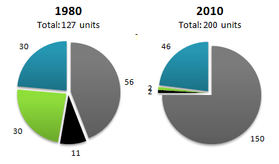
The pie charts show electricity generation by source in New Zealand and Germany in 1980 and 2010.
Related topics
- Writing task one: pie charts
- IELTS Writing Task 1: comparing pie charts
- Writing Introduction
- IELTS Writing strategies
- Next »
SHARE THIS PAGE
The reading, writing and listening practice tests on this website have been designed to resemble the format of the IELTS test as closely as possible. They are not, however, real IELTS tests; they are designed to practise exam technique to help students to face the IELTS test with confidence and to perform to the best of their ability.
While using this site, you agree to have read and accepted our terms of use, cookie and privacy policy.
Dear readers,
This is to inform you that we have moved to a new domain, https://www.ielts-writing.info/EXAM/ .
Our old domain, https://www.ielts-exam.net/ will remain active till the time we migrate all our content to the new domain.
We look forward to your continuing support.
- Skip to primary navigation
- Skip to main content
- Skip to primary sidebar
IELTS Training with Jonathan
Helping Busy People Succeed in IELTS.
How to answer IELTS Task 1 Pie Charts in 4 steps
By ielts-jonathan.com on 18 June 2022 0
IELTS Pie Charts for Task 1
If you a have just started learning about IELTS Task 1, the these articles articles are worth reading.
IELTS TASK 1 Describing changes and trends
IELTS TASK 1 Working correctly with numbers
IELTS TASK 1 Increase your band score with Adjectives/Adv erbs
IELTS TASK 1 Using Compare and Contrast language
What are Pie Charts?
I ELTS pie charts usually often have two main features that you need to notice
the comparison of two or more units or numbers in the same year, or charts that show changes or differences over a period of time
For this type of essay, it is standard to write a four paragraph essay, namely An Introduction, An Overview and one or two body paragraphs.
How to write an Introduction
How to write an Overview
How to write the main Bodies
Writing about Pie Charts
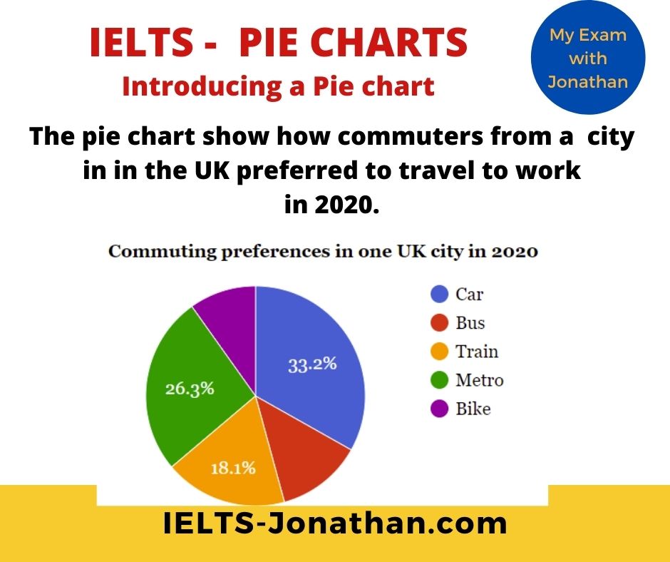
Pie charts are a common type of IELTS question.
This format of question is very visual and therefore seems easier to answer than other formats.
It is really important to be prepared for all types of IELTS questions but the preparation you need won’t take as long as you might think.
There are a few different types of pie chart.
The most common you will see will represent a different time period with units for comparison.
It’s often important to use specific vocabulary and grammar related to the task
numbers such as percentages and fractions, the past and present tense necessary to compare time periods language to describe amounts.
You also need linking words that show comparison and contrast.
These help tie your essay together.
Pie Chart Questions follow the same format as any IELTS Task 1:
Introduce the Chart
- Give an overview of the main point/s (necessary for Band 6 and above)
- And provide the detail
This post will explain:
- The types of pie chart question
- The tried and tested method for answering any chart question
- How to write the introduction
- How to write about the detail showing number, comparison and contrast.
- How to finish with a great overview
- The common mistakes IELTS students make
What is an IELTS Pie Chart Question?
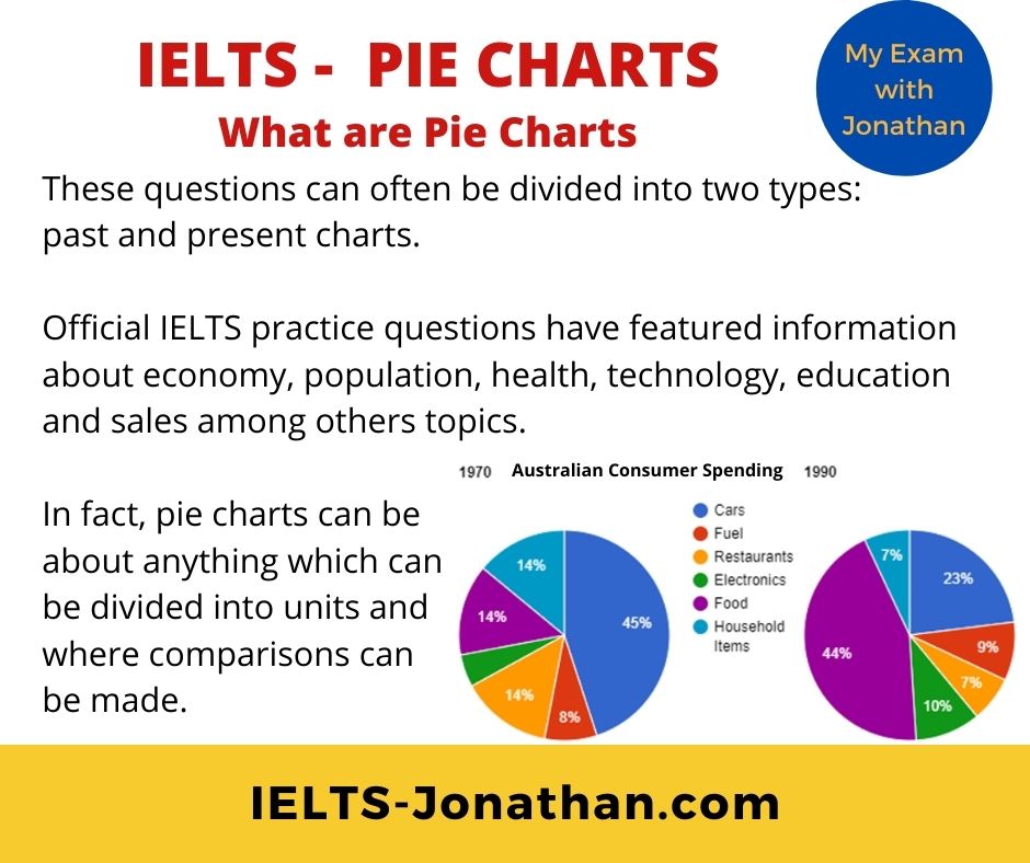
These questions can often be divided into two types: past and present charts.
Official IELTS practice questions have featured information about economy, population, health, technology, education and sales among others topics.
In fact, pie charts could be about anything which can be divided into units and where comparisons can be made
More good news is that the same skills and principles can be applied to any chart, whether in the past or present.
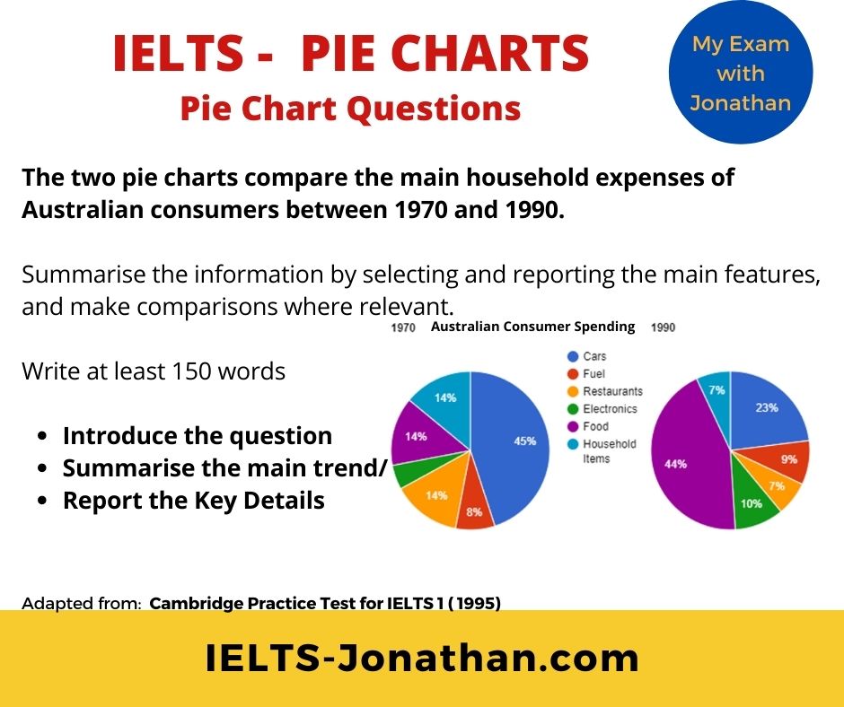
Let’s consider a typical question first.
A Good Teacher’s Guide to IELTS Planning.
To be effective in Task 1, it is vital to understand the task quickly and plan the answer.
You only have a short time, just 20 minutes including checking time.
These are the steps you can take:
Get an overall visual understanding of the chart.
- Paraphrase the question
- Consider an overview
- Divide the process into high and low units.
- Include time to proofread your writing

Gaining an overall understanding of the Pie Chart
A pie chart will have a number of features requiring vocabulary related to numbers, percentages or fractions
Start at the beginning, by noticing the obvious, large and small amounts and differences.
In the example above, these differences are fairly obvious. Noticeable features are the amount of money spent on food in 1970 and on cars in 1990.
However, pie charts are not always as clear as this, and you may need to look more carefully to notice changes.
It’s quite a challenge to write about something you have never seen, so it is important that you look at other sample pie charts to get a good understanding of how they might vary.
Don’t worry , it doesn’t need to be perfect, you only have 15 minutes and just need to notice the main features and report them in an accurate way.
TOP TIPS for understanding
- Identify the large or significant amounts and differences
- Is it a past situation/s?
- Count the number of significant amounts?
- If there is a legend, what information is provided on the first pie chart?
- If there is a legend, what information is provided on the second pie chart?
- What units are being measured? Fractions, numbers, percentages, time etc.
Answering these questions means you have started planning your essay
Good News – Remember the IELTS task is not there to trick you, and you won’t be given a complicated process to describe.
Your task is to report effectively and accurately.
Any pie chart question will follow the same format.
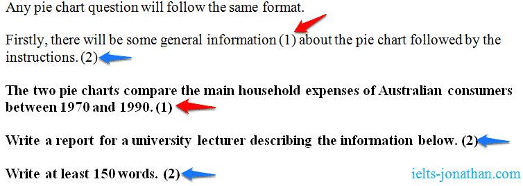
As with any Task 1, you can begin by paraphrasing sentence (1)
This is the rubric or instructions .
Learn how to paraphrase.
A good knowledge of paraphrasing will also help you in the Reading, Listening and Speaking part of the test.
Paraphrasing for IELTS means using different words and/or word order so the original meaning remains closely the same.
In order to remain the similar, different words need to be synonyms.
While man , male and person have a similar meaning and they are synonymous, man , male , person and girl are not all synonymous.
To show you how this works, look at my example using the question and rubric for this task.
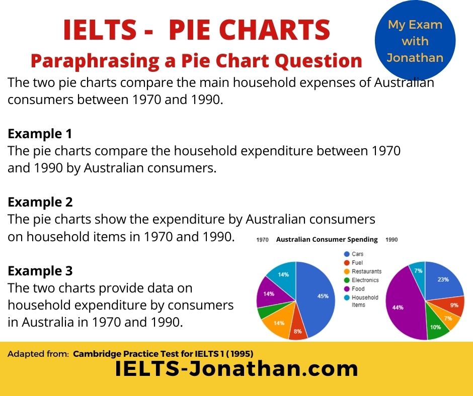
As you can see, all the information in the three sentences has been taken from the question, but it has not been copied.
If you copy directly, then those words are not used towards the word count and you will fail on Task Achievement .
You need to write the introduction in your own words.
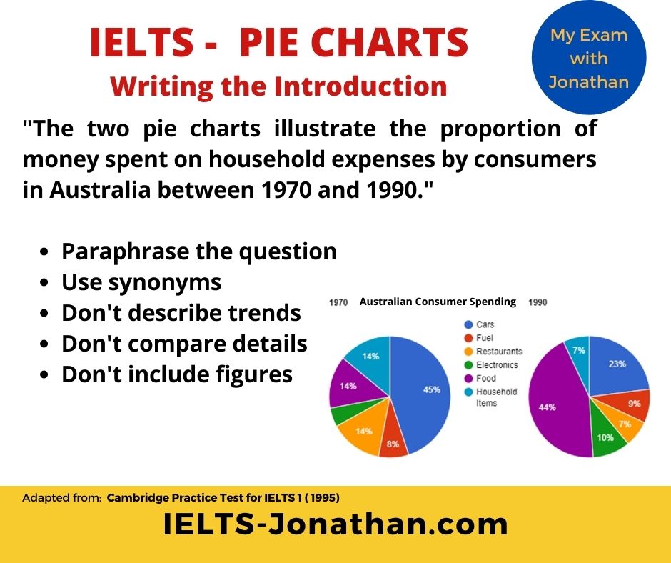
In any Academic Task 1 question you can rewrite (paraphrase) the questions and this will be the first paragraph.
That’s great! 🙂
We can move on and consider the next section, the Overview .
Overview of the Chart
The ‘ public band descriptors ’ state that to achieve a Band 6 or above for ‘ task response ’ the student must provide an overview in a Task 1.
So, even if your grammar and vocabulary is good, without one, you are unlikely to get an high score.
If you started planning at the beginning, then writing a good overview will be a lot easier near the end.
Remember, the questions I asked you to consider.
- Identify the significant amounts or differences.
- Is it a past situation or present?
- What information is provided on the legend?
- What units are being measured?
These should be sufficient to provide the 2 sentences needed to construct the basic overview.
An IELTS pie chart is different to a chart or table. There usually aren’t any trends to identify.
So, as there are no trends to comment on, you should mention, for example, the obvious differences .
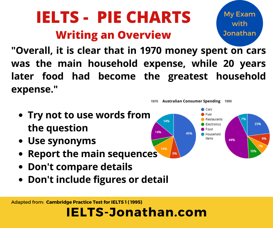
Great! 🙂 What next?
Providing the Detail
Now that you have completed paraphrasing the question and provided the overview, the next stage is to explain the IELTS pie chart in detail.
You can do this by:
- Stating the significant units.
- Stating the significant difference between the pie charts.
- Use suitable number, fractions or time units.
- Use prepositions to describe time.
Before you start, consider the most suitable language that reflects the sophistication of the task.
Suitable language
In order to describe a process, there are three key aspects of language to be considered.
These are vocabulary, language that describes numbers or amount and linking words.
Key Vocabulary for describing Pie Charts
1) Numbers and Amounts
These words can be useful when talking about comparing numbers and amounts.
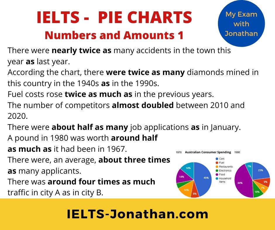
To make these expressions stronger, you can use many, much, far: many more than, much more than, far less than . To make these expressions weaker, you can use slightly or a little slightly more than, a little less than .
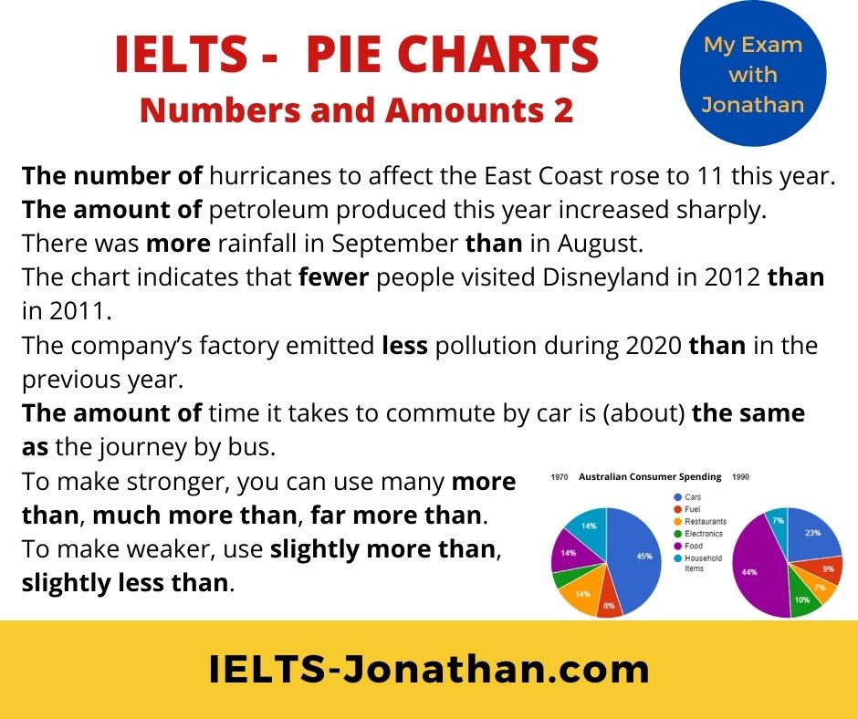
2 ) F ractions and Percentages
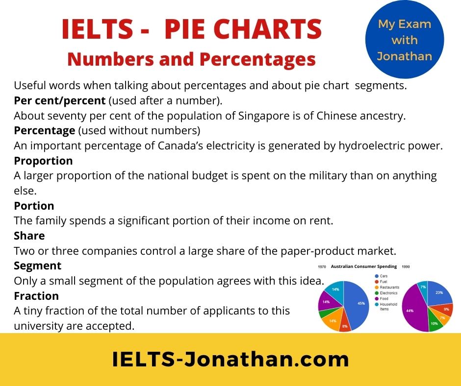
These words can be useful when talking about percentages and about segments of a pie chart.
3) Linking Words
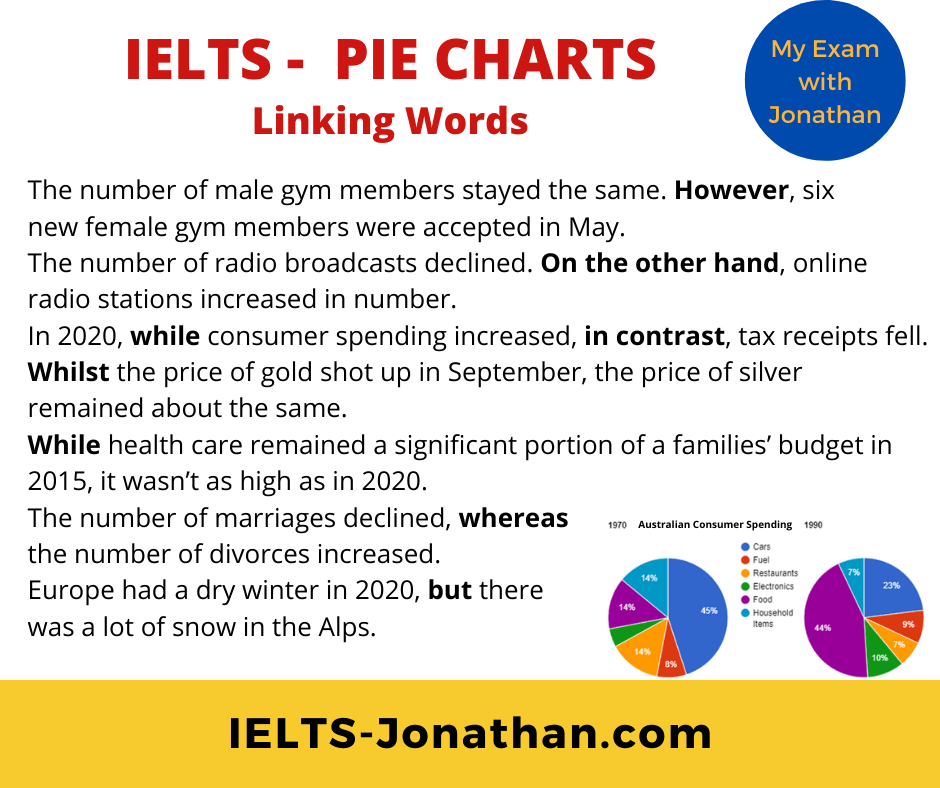
These words can be useful comparing and contrasting segments of a pie chart. They also add cohesion to your ideas and the writing in general.
For contrast
IELTS Writing Task 1 Structure
The Overview
The overview often comes just after the introduction and makes a general statement about the main differences between the Charts.
The overview is quite short, maybe about 2 or 3 sentences.
Remember, do not go into detail in the overview.
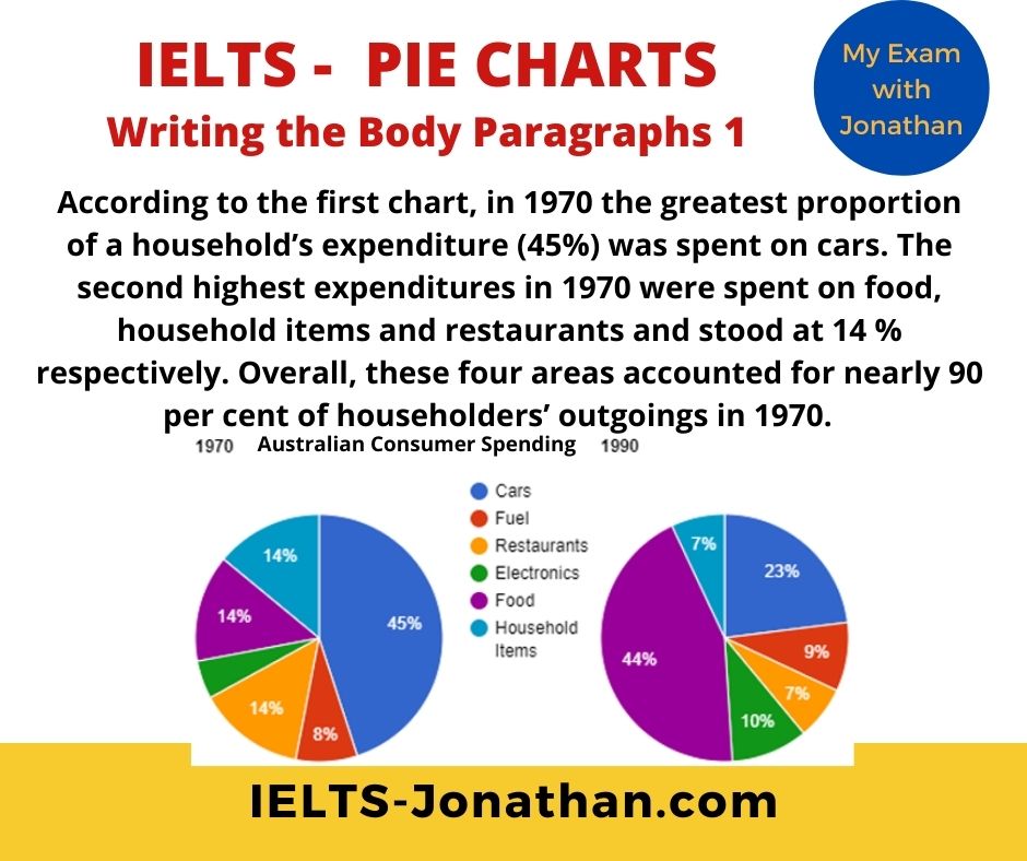
And now I’m adding the two Body Paragraphs using some of the language and vocabulary from above.
The Body Paragraphs
Varying your language
One final tip for a higher score is variation in language.
It’s a good idea to avoid repetition when using verbs.
The second highest expenditure . The household’s outgoings .
The same can apply to nouns too,
For example, the noun + verb money spent can become spending .
The money spent on household goods increased. Household spending increased.
Common Errors
A very basic error seen in Task 1 introduction is basic verb agreement.
Look at the two genuine examples below
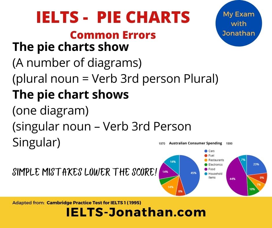
The pie chart show
The pie chart shows
In both examples it is unclear about the number of nouns discussed
Here is the correction:
Common Errors using the Past Simple / Present Perfect / Past Perfect
- Make sure you practise the past and present perfect, so you know exactly how to use it.
Singular or Plural
Notice these examples are incorrect.
The money spent on cars has dropped. (by 1990)
These are really common mistakes In Task 1 writing!
Here are the corrections:
By 1990, the money spent on cars had dropped. The money spent on cars had dropped by 1990.
Finally, check your Essay!
Ideally, you need to allow 3 to 4 minutes at the end of the test to check and improve your writing.
Some students don’t do this because they spend 20 minutes writing, but it is far better to write for about 15 minutes and allow 5 minutes to check and improve your writing.
From my experience the points you should check for are:
- Are there any obvious spelling or punctuation errors?
- Are the verbs the correct tense?
Additionally, you should consider these questions, but if you followed my planning advice you should be ok.
- Do the verbs agree with the subject?
- Does the description make sense? Does it follow the visual?
- Is there any repetition in vocabulary?
- Could this be improved with synonyms?
- Have I written over 150 words?
- Have I organised the text into at least 3 paragraphs?
- Have I noticed only the obvious features from the map?
- Have I included the prominent features in the overview?
- Have I NOT included my personal opinion?
Once you have done this, be proud of the final product! 🙂
Here’s my sample. What do you think?
Sample Answer Describing Pie Charts.
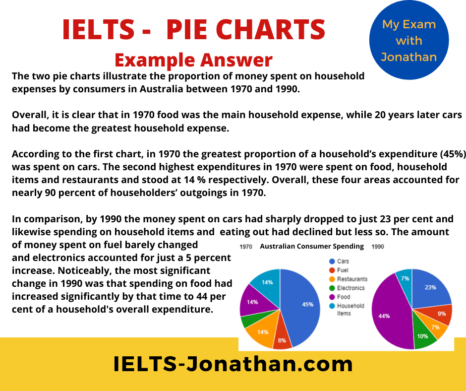
Australian consumers’ household expenses between 1970 and 1990.
The two pie charts illustrate the proportion of money spent on household expenses by consumers in Australia between 1970 and 1990.
Overall, it is clear that in 1970 money spent on cars was the main household expense, while 20 years later food had become the greatest household expense.
According to the first chart, in 1970 the greatest proportion of a household’s expenditure (45%) was spent on cars. The second highest expenditures in 1970 were spent on food, household items and restaurants and stood at 14 % respectively. Overall, these four areas accounted for nearly 90 percent of householders’ outgoings in 1970.
In comparison, by 1990 the money spent on cars had sharply dropped to just 23 per cent and likewise spending on household items and eating out had declined but less so. The amount of money spent on fuel barely changed and electronics accounted for just a 5 percent increase. Noticeably, the most significant change in 1990 was that spending on food had increased significantly by that time to 44 percent of a household’s overall expenditure.
(Word count 176)
I can correct and give valuable feedback to improve your IELTS writing using my correction service.
Finally, you can go over to my Facebook page and join other students who are working towards the test.
Join my IELTS WRITING TASK 1 group here, for free practice.
Leave a comment for a reply
I’m Jonathan
I’ve taught IELTS and University English in more than a dozen universities and schools around the world.
I’m a parent, traveller and passionate about language teaching and helping students achieve their dreams.
Whilst living in Austria or working in Asia, I run IELTS courses to help students get to where they want to be.
If you are serious about IELTS, connect with me to see how I can help you.

The Best Approach to Task 2 Writing
Paragraphing in Task 2 Writing
Strong Arguments for Task 2
Writing the Introduction
Writing a Line of Argument
Cohesion for Task 2 Writing
Writing – Benefits of a Foreign University Education
Share this:
- Click to share on Twitter (Opens in new window)
- Click to share on Facebook (Opens in new window)
- Click to share on Pinterest (Opens in new window)
- Click to share on WhatsApp (Opens in new window)
- Click to share on Telegram (Opens in new window)
- Click to share on Tumblr (Opens in new window)
- Click to share on LinkedIn (Opens in new window)
- Click to print (Opens in new window)
Reader Interactions
Was this helpful leave a comment :) cancel reply, let me help you get the ielts result you need.
JUST WRITING FEEDBACK

Speaking Feedback
IELTS TRAINING
IELTS FEEDBACK
YOUR PRIVACY
TERMS AND CONDITIONS
IELTS Writing Task 1: Pie Charts Guide
Do you have an idea what a pie chart is? Are you taking the IELTS test soon?
If your answer to the first question is ‘No’ and ‘Yes’ to the second question, then it is high time you learn what a pie chart is. It is because chances are, if you are taking the IELTS Academic Test, you will encounter one.
On the other hand, even if you already know what a pie chart is, reviewing its basic features and how it is a significant part of the IELTS Writing Test will aid you achiever your desired band score in the IELTS Writing Task 1.
This article will guide and help you prepare for the IELTS Writing Task 1 if the question is an IELTS pie chart. Please continue reading.
What is IELTS Writing Task 1?
What is a pie chart, what are the major features of the pie chart, how to analyze the question, how to structure your essay for pie chart ielts question, points to remember while writing the response, practice tips for evaluating pie charts, words and phrases to use in ielts academic writing task 1, sample pie charts responses with feedback, additional faqs on ielts writing task 1: pie charts guide.
The IELTS Writing Task 1 is the first part of the IELTS Writing Test .
It is different for the IELTS Academic and IELTS General Training modules.
- For the IELTS Academic Writing , you are given either a graph, chart, table, or diagram, and you need to interpret, describe, and explain the information given.
- On the other hand, the IELTS General Writing requires you to compose a letter in response to a given situation.
- Both tasks need you to have at least 150 words.
- You are advised to spend 20 minutes at most finishing this task because the IELTS Writing Task 2 has more weight.
An IELTS pie chart task is one of the tasks you might be given in the IELTS Academic Writing Task 1.
It is a form of a graph that uses a circular representation to display data. The graph’s parts are proportional to the percentage of the full number in each group. To put it simply, the size of a slice of the pie is proportional to the size of the group as a whole.
The full ‘pie’ represents 100% of the total pie, whereas the pie ‘slices’ represent parts of the whole.
Pie charts have unique characteristics that make them different from the other tasks in the IELTS Writing Academic Task 1. Before taking the test, make it a point that you familiarize yourself with these features to avoid confusion.
- Title : The title gives a quick summary of what is in your pie chart. This makes it easier for the readers to figure out what they are about to look at. It is not an issue if it is creative or simple as long as it explains the chart.
- Legend : The legend explains what each slice stands for. It aids the reader in understanding what they are looking at.
- Source : The source specifies where you obtained the data in your graph. It is critical to acknowledge those who gathered your data.
- Data : The information, or data, that your chart contains is the most significant component of it. Data is shown in pie charts as part of a 100-point scale (a percentage). Each slice represents a unique piece of information.
Part of the criteria for your writing in the IELTS Academic Writing Task 1 is Task Achievement. Were you able to accomplish what is asked of you? That is why to get your desired band score. It is a must that you analyze the question carefully.
- Examine the pie charts and make a plan of what you will write : This is probably the most important stage in the IELTS Writing Test because what you plan will dictate the flow of your writing. Keep in mind that you need to analyze the IELTS pie charts carefully. Study the given details before planning on what to write.
- Compare the main features to each other : The IELTS pie chart is meant to compare and contrast the given information. These comparisons will aid you in developing a strategy for the body of your IELTS Writing Task 1. Remember that you should not state your opinions and that you are only asked to examine, describe and explain the data given.
- Select the data for the overview statement : The next step is to consider what information should be included in the Overview statement. Remember that an ‘Overview Statement’ summarizes what you believe is the most important information to know about the pie chart.
- Write the overview paragraph : The last step is to write your response in the IELTS Academic Writing pie chart task. The first paragraph, the ‘overview paragraph,’ must be written first. Remember two tips when writing your response. First, you need to paraphrase the task, and second, have your overview statement followed by supporting and relevant details.
Paraphrasing the Question
Paraphrasing the question is essential in the IELTS Academic Writing pie chart task. It increases your chances of getting a high mark from the examiner as it demonstrates that you have a wide range of vocabulary.
You should rephrase this by utilizing your own grammar and vocabulary as possible. You also need to get a little more specific about the kind of information in the pie chart.
The way you structure your writing in the IELTS Academic Writing pie chart task will dictate your fate in this part of the test. That is why, in the next section of this article, we have listed the steps that you should follow when writing your 150-word (or more) output.
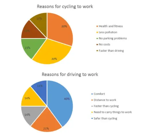
Step 1 — Analyze the question
Every IELTS Academic Writing Task 1 question has the same format. Here’s another version of our practice question, this time with the words that will appear in all of the questions highlighted.
The graph below depicts the reasons why people choose to commute to work by bicycle or car.
Select and summarize the most important data elements and draw comparisons where appropriate.
All questions in the IELTS Academic Writing pie chart task consist of:
- 1 st sentence – A brief description of the task
- 2 nd sentence – The instructions
- 3 rd sentence – The graphic (graph, chart, table, diagram)
The second sentence of the IELTS Academic Writing pie chart task instructs you what to do. You should do the following:
- Choose the main features.
- Write about the main features.
- Compare and contrast the main features.
Step 2 — Identify the Main Features
In the IELTS Academic Writing pie chart tasks, the graphic should be simple to understand. Each question is designed to assess your language skills rather than your numerical skills.
Percentages or proportions are always shown in pie charts. Apart from that, they are similar to bar charts and line graphs in that they’re a visual representation of data.
Here are some good questions to ponder.
- What unit of measurements are used?
- What does the title and label say?
- What is the most notable trend of the graphic?
- What are the similarities and differences?
Step 3 — Write the Introduction
Simply paraphrase the question in the introduction. Express similar sentences differently. This can be accomplished by employing synonyms and altering the phrase structure.
Step 4 — Write an Overview
The primary elements shown in the pie charts should be reported in the second paragraph, with just broad information provided. The essay’s detail comes later. You should also make any obvious comparisons you notice.
Step 5 — Write the First-detail Paragraph
More specific information regarding the data in the image should be included in paragraphs 3 and 4 of your IELTS Academic Writing pie chart essay.
In paragraph 3, you should support your first essential characteristic with proof. Remember to make comparisons when appropriate.
Step 6 — Write the Second-detail Paragraph
You repeat the process for your second significant characteristic in the fourth and final paragraph. If you need to add a third primary feature to complete the essay nicely, do so.
Because the question does not specify a time range, you can use either the present simple tense or the past simple tense. The present simple tense was used. Remember to be consistent with your tenses throughout your essay, regardless of which one you chose.
Sample — Complete IELTS Academic Writing Pie Chart Essay:
To obtain a high mark in the IELTS Academic Writing pie chart task, you should bear in mind the following:
- Be consistent with the verb tenses : This means that if the pie chart image is in the present, your explanation should also be in the present tense. If your chart reflects the past, the explanation must be in the past tense.
- Meet the minimum number of words required : Write at least 150 words. Otherwise, it can be rejected. To avoid being rejected, make sure your answer is at least 155-190 words long while writing the explanation.
- Have a clear comparison of the data : Comparing two graphs is frequently easier than creating an explanation for a single graph. Because of this, you need to pay close attention to every aspect to develop excellent ideas to write about the chart.
- Do not deviate from the given topic : The answer you write must correspond to the chart exactly. When composing the explanation, you must exercise considerable caution. So, before you start writing on the chart, have a good look at it.
- Make it easier to read : When writing an IELTS Academic Writing pie chart task, organize material logically to make it easier to follow and read. Rather than writing about each chart independently, the most natural thing to do with an IELTS pie chart is to compare categories across charts, concentrating on similarities and contrasts.
Accomplishing an IELTS Academic Writing pie chart task is not as easy as it seems.
It entails a lot of preparation, and that is why you are advised to consider the following when you practice for the IELTS Academic Writing pie chart task.
- Know what a pie chart is :
Pie charts are extremely useful when comparing a specified category (a slice of the pie) to the whole (the entire pie). The area of pie chart slices is a better representation of the relative size. Inflations and deflations, numbers per category, or direct correlations between categories in which one set of statistics depends on another should not be shown using pie charts. Using a line graph is a better format to utilize in this scenario.
- Have annotations :
Outside of minor fractions like 1/2 (50 percent), 1/3 (33 percent), and 1/4 (25 percent), it is actually quite difficult to deduce exact proportions from pie charts (25 percent). Furthermore, if the slice values are designed to represent amounts rather than proportions, pie charts usually lack the tick markings that allow direct value calculation based on slice sizes. Annotations are a regular feature of pie charts because of these reasons.
- Think about the order of the slices :
A solid slice order can make it easier for a reader to understand what is being said in the pie chart. When there are categories with relatively comparable values, a usual ordering goes from the largest slice to the smallest slice, which is highly useful. If the category levels have a natural ordering, plotting slices is usually preferable.
- Keep the amount of pie pieces to a minimum :
It can be tough to understand pie charts with many slices. It is difficult to identify the smallest slices, and it can also be difficult to select enough colors to distinguish all of the slices. Recommendations vary, but you should consider utilizing a different chart type if you have more than five categories. Another possibility is to combine little pieces into a single ‘others’ slice, which would be colored in a neutral gray.
- Do not use distorting effects:
To read a pie chart correctly, slices of the areas, arc lengths, and angles must all relate to an appropriate depiction of the data. While it is good to prevent 3-d effects in any plot, it is especially critical with pie charts. Squeezing or expanding the circle, or adding too much depth, can easily alter the size of each slice in relation to the total.
Vocabulary accounts for 25% of your marks in the IELTS Writing Test.
To earn a good score, you must produce accurate and strong descriptions and analyses for the provided graph(s) or diagram. It is simple to keep repeating phrases and numbers in this minimum 150-word essay.
However, this is not an excellent way to get a decent grade. You must utilize a variety of terminology that describes and emphasizes the changes, similarities, and contrasts in the data.
Here are some of the words and phrases that will help you accomplish the IELTS Academic Writing pie chart task.
Adjectives :
- significant
- considerable
- fluctuation
- dramatically
- significantly
- considerably
General Trend:
- It is clear…
- In general…
- It is obvious…
- At the onset…
- It is clear that…
- As can be seen…
- As it is observed…
- As a general trend…
- As it is presented…
- At first glance…
- Generally speaking…
- It can be clearly seen that…
- As an overall trend/ As overall trend…
- A glance at the graph(s) reveals that…
- According to…
- It is clear that…
- According to the…
- It is possible that…
- It is worth noting…
- It is obvious that…
- It is stated directly that…
- Categorically speaking…
- As shown in the image…
- Returning to the specifics…
- As can be observed in the…
- It is without a doubt/clear that…
- It can plainly be seen that…
- Now, returning to the details…
- It is worth mentioning that…
- It appears to be the case that…
- It is evident from the statistics…
- As you can see from the diagram…
- Based on the facts, it appears that…
- The figure is depicted in the graph…
Summarizing:
- Overall, the picture is clear…
- The majority/minority, in general…
- To summarize, the most significant difference is…
- To summarize, the most notable tendency is…
Predictions:
- is shown to…
- is expected to…
- is forecast to…
- is predicted to…
- is projected to…
Approximations:
- Just around
- Approximately
- More or less
- A little more than
- A little less than
- 33% – nearly a third
- 4% – a tiny fraction
- 50% – exactly a half
- 48% – around a half
- 52% – just over a half
- 48% – just under a half
- 23% – almost a quarter
- 27% – roughly one quarter
- 75% – nearly three quarters
- 78% – approximately three quarters
Proportions:
- 12% – a small minority
- 80% – a large proportion
- 68% – a significant majority
- 4% – an insignificant minority
To get an idea of how the questions in the IELTS Academic Writing pie chart task are posed, you are advised to study some sample responses. It will also help you structure your essay. Here are some of them:
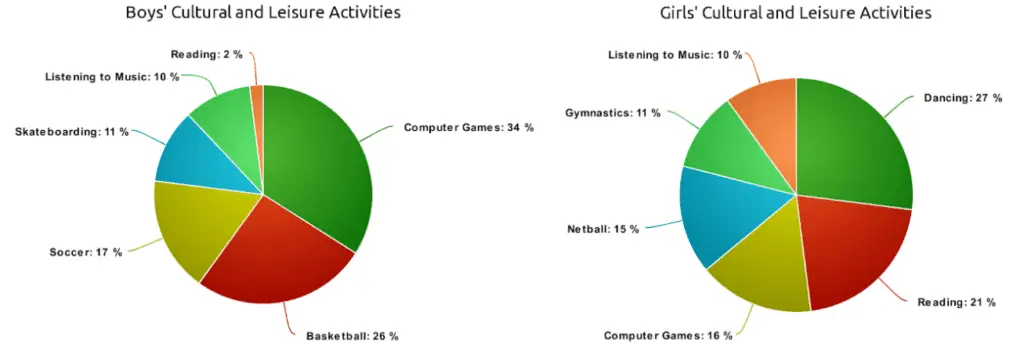
How Do You Write an Answer IELTS Pie Chart Question?
To write an IELTS Academic Writing pie chart task, you need to analyze the question first. Then, identify its main features.
Next, you have to write the introduction, overview, and summary. Please review our suggestions discussed above to ace this question type.
How Do You Write a Summary for the IELTS Academic Writing Pie Chart Task?
The summary is the last part of the IELTS Academic Writing pie chart task.
Therefore, before you can write one, you should first analyze the data and identify its main features. From there, you can write your summary.
Do not make it too long. It should be a short and brief conclusion on what you have written.
How Long Should I Spend in the IELTS Academic Writing Pie Chart Task?
You are strongly advised to spend no more than 20 minutes on the IELTS Academic Writing pie chart task because the second task carries more weight.
However, that is not to say that you should neglect this part of the test. The first task also accounts for your overall marks in the IELTS Writing Test, so you should give your best performance in both tasks.
Subscribe for English language proficiency tips

English Proficiency is not owned by or in any way affiliated with the institutions that handle the official Duolingo English Test, TOEIC®, TOEFL iBT®, IELTS, TOEFL ITP®, Cambridge C2, C1 Advanced, or any other English language proficiency exams listed or discussed on our website. We receive an affiliate commission for any purchases you may make on links to third party affiliate websites.

Tips for IELTS Success
IELTS Pie Chart: Writing Task 1 Pie Chart Tips
IELTS pie chart is question types in IELTS writing module. In order to write an answer, it is helpful for you to have a good understand about IELTS writing task 1 chart tips. Follow these tips to get high band in writing task 1.
The following 12 tips lead you in the best way to write an answer report for pie chart.
Understand and identify key information after reading the question
Read the instructions first. Then, it’s turn to move on to the question statement. Understand the question statement, and recognize key information from pie chart. There are different portions in the pie chart; understand each fluctuation. By doing this, you will get to know that what to do and how to do while describing an IELTS pie chart for getting good bands.
Summary of IELTS Pie Chart
IELTS is a language test in which pie chart is also one the question types. You have to explain the features of pie chart. To accomplish good bands in the question type of pie chart, you are required to follow the tips of pie chart that are provided in the blog. These 12 tips for IELTS pie chart are helpful in terms to present your level of best in the answer report of IELTS pie chart. Therefore, follow these tips and crack the nut of IELTS writing.
Arrange the data properly
When you analyze the question statement and pie chart, it is time to pick up the main points and make the best plan to write for describing an IELTS chart question type. Always keep in mind the instructions of chart while planning an answer report for IELTS pie chart.
Follow a recommended structure
The structure to write an answer in the question type of it consists of three components:
- Introduction
- Detailed body paragraphs
Your answer must follow the above format to get good scores in IELTS writing task 1 pie chart. The mentioned structure is not only for pie chart, but it is recommended for all-question types of IELTS academic writing task 1 .
Pen it a better introduction
The introduction is the first step of answer report in order to describe pie chart. You have to write 1 – 2 sentences in the paragraph of introduction. First thing to write an introduction is that what the question is about and the second thing is about time period.
Paraphrase the question statement in the introduction. Change the sentence structure and use synonyms in place of exact words in introduction paragraph.
Sketch out information in the overview paragraph by applying a précis technique
It is the second step of the answer in IELTS pie chart. In the overview paragraph, you need to sum up the key features of the pie chart. You do not have to write all points; just need to mention main features. You have to mention biggest and smallest portions of the pie chart, and if there is any stable portion, provide in the overview.
Describe detailed discussion in main body paragraphs
I recommend to write two main body paragraphs and split the information of the pie chart in two segments and write these segments in those two body paragraphs following a sequence. By following this procedure, you will get good scores in IELTS academic writing task 1 pie chart.
Use appropriate vocabulary
As IELTS pie chart is in writing module in which it is analyzed that how you understand and present ideas in the written format. In the writing module, it is important to get strong knowledge of vocabulary. If you have wide range of vocabulary, you can present well about the key features and comparisons of pie chart. Therefore, practice your level best to write an effective answer report for it.
Specifically, the most of the usage of vocabulary relates to present the percentages and proportions in the case of pie chart. Therefore, use different words to describe the percentages or fractions in the answer report of it.
Avoid adding irrelevant or extra information
You are not allowed to write a different information in the answer. You have to write to the point and do not write irrelevant or any other point which is not included in the pie chart.
Use tense according to the question
You are required to write the answer report in a correct tense. Write your answer in the same tense in which question is presented.
Manage your time
You have 20 minutes to solve the pie chart question, it is same time duration for the all of the question types of IELTS academic writing task 1. If you have good practice of pie charts, you can easily manage your time. Otherwise, it will be difficult for you to manage time.
Practice a lot
By practicing the pie charts in your preparation time, you will get more familiarization about the pie charts. By doing this, you will get to know the strategies and difficulties that are faced in the practice. Therefore, practice pie charts and try to solve the question in 15 minutes in order to manage the time in the test.
Do not add personal opinion
One of the other points to remember in terms of pie chart tips is that you are not permitted to write your personal opinion in the answer report while describing an IELTS pie chart . As the pie chart is a fact-based question in which you just have to explain the terms that are mentioned in the pie chart.
In a nutshell of Writing Task 1 Pie Chart Tips
Pie chart is a question type in which you are required to explain the features of the pie chart. Therefore, IELTS writing task 1 pie chart tips help a lot to explain pie chart as well as for getting good bands in IELTS writing task 1.
Similar Posts

IELTS Writing Task 1 Question Types
The writing test of IELTS is divided into 2 tasks- task 1 and task 2. As far as task 1 is concerned, Task 1 academic…

Tips for IELTS Writing Task 1
IELTS (International English Language Testing System) is used as an English language proficiency test to go abroad where English is primary language. There are four…

IELTS Writing Task 2: Question Types
In this article, you will learn about: (IELTS Writing Task 2: Question Types) IELTS Writing task 2 overview Most of the people think that IELTS…

How to Describe a Map in IELTS Writing Task 1
IELTS writing task 1 map question type is one of the common question types in IELTS writing task 1. Therefore, it is essential to know…
How to Describe a Bar Graph in IELTS Writing Task 1
IELTS bar graph is a common question type in the test of IELTS writing. Therefore, it is important for you to learn the method how…
IELTS Writing Task 1 Line Graph Vocabulary
Vocabulary plays an important role in the module of IELTS writing as well as for line graph. In terms of getting good bands in IELTS…

- Undergraduate Admissions
- Graduate Admissions
- Education Loan
- Forex & Air-Ticketing
- International Accommodation
- TOEFL Discount Code
- Pursuing an MBA in the United States [Ebook]
- Master’s Degree In New Zealand [Ebook]
- Biomedical Engineering
- Data science
- Masters in Computer Science
- Engineering Management in US & Canada
- Masters in Business Analytics
- MS in Computer Engineering
- Business Management in Europe Ebook
- Studying Business Management in Australia
- Comprehensive Guide to STEM Masters in Germany
- STEM Master’s in Australia
- STEM Master’s in UK
- STEM Masters in Ireland | Study in Ireland (Ebook)
- Test Preparation Resources
- Vocabulary App
- Why Galvanize
- Press Release
IELTS Pie Charts
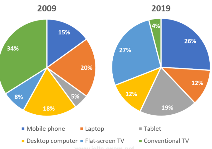
Sample Answer
The pie charts illustrate the percentage of water resources in Japan in the years 2000, 2010, and 2020, while the table shows the annual water consumption in the country in those years.
At a glance, specific changes can be easily detected. Seawater, the largest water resource in Japan, remained constant across the two decades until 2020 when we can see a decrease in the amount by 4%. There has been a steady decline in the amount of freshwater from rivers, lakes, and marshes. The water from glaciers, on the other hand, seems to have increased since 2000, after a slight dip in 2010. Groundwater has also increased from its initial value, though it fell again from 9% in 2010 to 7% in 2020.
With regard to the table, the annual water consumption has been increasing steadily since 2000, with 2020 seeing the highest amount of 93 gallons. Regardless of the cause, this is a concerning statistic, considering that the amount of freshwater resources available in the country has not increased significantly.
Sample Question 2
The pie charts below show the online shopping sales for retail sectors in New Zealand in 2003 and 2013.
Summarise the information by selecting and reporting the main features, and make comparisons where relevant.
Write at least 150 words.
The two pie charts compare the percentages of online sales across four different retail sectors in New Zealand in the years 2003 and 2013. For three of these sectors, it is evident that over this time frame, there was a significant change in their proportion of online transactions.
At 36%, we can see that the travel sector accounted for the majority of online sales in 2003, but this percentage dropped to 29% by 2013. Across the same ten-year period, we can see that film/music transactions went from just 21% to 33%, making it the retail sector with the highest overall share of sales on the online market. In 2003, the clothing industry boasted an impressive 24% of total online sales in New Zealand. However, by 2013, the figure fell considerably to 16%.
Interestingly, online sales of books eventually overtook sales of clothes, although books still represented only 22% of the market. Books are the retail sector with the least change in the percentage of sales.
IELTS Pie chart Sample Question 3
The charts below show the yearly budget of two publishing companies—BK and Nook.
Summarise the information by analyzing and reporting the main features, making comparisons where relevant.
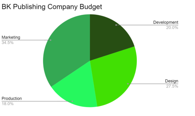
The given pie charts portray the yearly budget of two publishing companies—BK Publishing Company and Nook Publishing Company. The budget for both companies is allocated to four sectors, namely Development, Design, Production, and Marketing.
In both companies, marketing seems to have the largest budget, with BK allotting 34.5% to the sector and Nook assigning 30%. This speaks for the weight of marketing in the industry. With respect to Development, the two companies differ by a slight percentage, with BK dedicating 20% and Nook 24%. But BK clearly values its Design sector as it has the second-highest budget in the company, with 27.5% for its tasks. Nook, however, has only set aside 21% for its Design projects. On the other hand, the budget of Nook’s Production sector is significantly higher than BK’s, with the former allocating 25% and the latter only 18%.
Overall, while there are quite a few differences in the budget dedicated to each sector in both companies, there aren’t any drastic divergences, showing that each of the four sectors plays an invaluable role in both places.
IELTS PIe chart Question Type : Assessment
Practice question 1.
The pie charts below show the percentage of pop music enthusiasts according to age in 2018 and 2021.
Summarise the data by selecting and reporting the main features, and making comparisons where relevant.
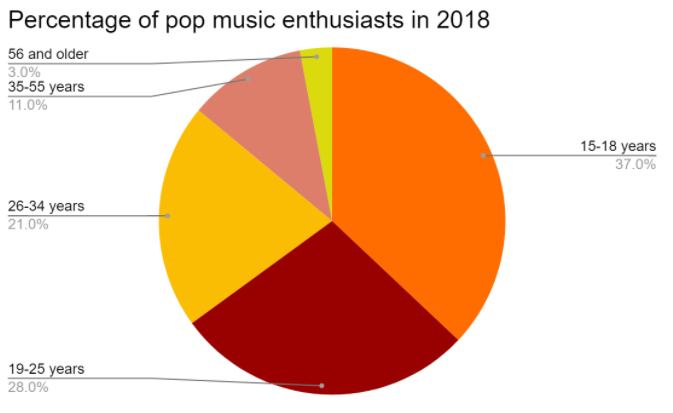
Practice Question 2
The pie chart shows the career preferences of the 2010-batch students from St. Albert School. The table shows the percentage of 2010-batch students from St. Albert School employed in various sectors in 2018.
Practice Question 3
The pie charts represent data from land surveys conducted in India in the years 2000 and 2020.
Summarise the data by selecting and reporting the main features, making comparisons where relevant.
Another Pie Chart Questions and Answers
The pie charts below show the devices people in the 18 to 25 age group used to watch television in Canada in two different years.
Summarize the data by selecting and reporting the essential elements, as well as making appropriate comparisons.

The two graphs show which devices young adults in Canada used to watch television in 2009 and how this changed in 2019. One of the most significant shifts is the shift from traditional televisions to flat-screens, with the former declining from 34% to 4% and the latter jumping from 8% to 27% during the same time period. The latter surpassed the former as the most widely used TV viewing device in 2019.
Another general tendency is that, compared to 2009, young folks in 2019 preferred watching tv on smaller, handheld devices. In particular, the usage of mobile phones for watching television almost doubled, going from 15 to 26%, with tablet use increasing nearly fourfold to 19 percent from 5%. This tendency is in alignment with the change in the number of 18 to 25-year-olds who watch TV on laptops. The use of both desktop and laptop computers decreased significantly, each category losing nearly one-third of its users.
Overall, the two pie charts indicate that TV viewing preferences in Canada have shifted away from older gadgets and toward more recent equivalents over the period from 2009 to 2019.
Another Pie Chart Question
The graph shows data on the manufacture of passenger cars in 2015.
IELTS Pie Chart FAQs :
How many words do we need to write for an ielts pie chart essay.
You must write at least 150 words, preferably more. The recommended word count is 160 to 180 words.
What are the essential elements of a Pie Chart Essay?
The essential elements of a Pie Chart Essay are an introduction, overview, and conclusion.
Where should the essential aspects of the pie chart be highlighted?
The essential elements of the pie chart should be covered in the overview and described in detail in the body of your essay.
Conclusion :
The Pie Chart Essay is one of the most common question types in IELTS Academic Writing Task 1. You must write a response explaining the given pie chart.
You must be capable of preparing a report of at least 150 words in 20 minutes. To get a band 8 or higher, you must thoroughly investigate the question and identify crucial features that can be written down.
We hope you found this article on IELTS Pie Charts informative. Stay tuned for more!
Related Blogs
- IELTS Band Scores
- IELTS Speaking Topics
- IELTS Writing Tips
- IELTS Reading Tips

Recommended For You

IELTS Exam Dates 2024 India: How to Select or Change Test Date

How to Answer Pie Chart Essay in IELTS Writing Task 1 Academics
- IELTS Writing Academics Task 1
Pie chart is one of the major questions in IELTS academic writing task 1.
Under this, you are expected to write your answer as a response to the pie chart presented. Here, you are required to describe the information given in 150 words in 20minutes. To score well in the pie chart essay questions, you need to study the question well.
Solving the pie chart essay questions is all about finding the right keywords in the questions and framing your answer based on them.
To help you with the Pie chart essay preparation, we will walk you through a complete overview of how to answer the Pie chart questions in IELTS Writing Task 1 Academics through this step-by-step guide.
Most of the IELTS aspirants share questions like-
What is a pie chart and how to answer a pie chart essay in the IELTS Writing task 1 Academics?
How to describe a pie chart sample?
Let’s begin by first thing first!
What is a Pie chart essay?
In the academic task 1 writing module, you are asked to write an essay based on visual information or data. This visual information can be presented in the form of a pie chart.
A pie chart is a circular statistical graphic, which is divided into slices to illustrate percentage or numerical proportion. In a pie chart, the arc length of each slice is proportional to the quantity it represents.
While writing a pie chart essay, you have to mention the most significant information. You need to write a short descriptive report in 150 words based on the visual information. You can frame your answer by describing the largest share in the pie chart and contrasting it with the smallest one.
What are the different parts of a Pie chart?
The different parts of a pie chart are-
- Part 1- It is a short explanation of the pie chart
- Part 2- Directs you what to do with the given information
- Part 3- it is the graphic information
Format for describing IELTS Pie Chart Writing Task 1
While writing a pie chart essay, you need to walk by a specific format which is-
- Introduction: Paraphrase the question
- Overview: In the overview, you can describe the trend or write a general overview of the main groupings
- Body paragraph 1: write about the specific logical details of the first grouping
- Body paragraph 2: Write about the specific logical details of the second grouping
You can follow either type of structure for your essay.
Focus on the following topic to organize your findings:
- Major trends
- Major groups
- Group information
- Other similar ideas
Marking Criteria of the IELTS Writing test
There are 4 parameters that you need to fulfill for scoring the desired band score:
- Task Achievement
- Coherence and Cohesion
- Lexical resource and vocabulary
- Grammar Range and Accuracy
Each criterion has a 25% weightage.
How to plan IELTS Writing Task 1-Academics? 1. Analyze the question Read the question; understand the context, instructions, facts, figures, and the axis information for answering the question.
2. Identify the main features Always pick 2-3 trends for forming the answer to your question.
3. Brainstorm the ideas and the vocabulary After identifying the main features, focus on framing and organizing the ideas to answer your question. Stress upon using the right vocabulary that befits the context of the pie chart essay question.
For writing the introduction, you can paraphrase the question and write the overall summary of the text as an overview.
Detailed paragraph : You can decide to elaborate on the main features from point 2 for explaining your point.
Sample question and Answer Here is a sample question and answer for a better understanding of the pie chart essay:
Here the answer reveals the main features of the questions, comparisons , and the overall estimation of the data.
Common Mistakes which you need to avoid in Pie chart Essay writing Incomplete Analysis of the data It is important to go through the question properly to frame your answer. Writing an explanation of the data Don’t write hypothetical reasons for the change in the percentage or the figures. Write according to the data given. Not writing an overview Missing out on writing an overview can cost you a score. Therefore, never be in hurry to complete the question and submit, take time in writing the complete overview. Writing / mentioning each detail Avoid mentioning every detail in the question and focus on including the main trends in the answer. Exceeding the word limit It is a wise man‘s saying that “do what is asked to do”. Going in length won’t fetch you extra marks. Staying and answering the questions within the word limit is crucial to skip on losing marks. Illogical structure In the IELTS Pie Chart Essay writing, you need to follow a specific structure to answer your questions. Do not get diverted from your point and follow the right structure. Not planning before writing Planning forms the base for your answer which is why you need to plan the things before to avoid confusion and wasting of time.
So, in this way you can plan your pie chart essay answer and gain the desired score. Always remember to follow a specific pattern for answering your questions and keep a tab over the tense and vocab to b used in the essay.
Unlock IELTS with Richa aims at providing a detailed explanation of how to attempt pie chart essay questions in IELTS writing task 1 academics and the common mistakes to avoid while answering the questions. For more interesting videos, you can subscribe to Unlock Ielts with Richa on YouTube.
Get Free Ebook
Enroll for Free Last Day Strategies
Related Posts

Last Day Strategies : IELTS Writing (Academics)

How to answer table chart essay in IELTS writing task 1 Academics

IELTS writing task 1 Academics: Understanding coherence and cohesion marking criteria

Understanding Task Achievement Marking criteria in IELTS writing task 1 Academics

How to answer line graph essay in IELTS writing task 1 Academics
Recent posts.

UnlockIelts- Designed for Your Success

Unlock your inner potential – How ‘Unlockielts’ makes it happen for you.

'Crushing The Curve': A Study Plan For Spectacular Results In Unlickielts Courses

'UnlockIELTS' Partner Program - Helping Others Meet Their English Language Goals!

Top 10 Myths About Preparing for the ILETS Exam Debunked

'Unlock' Your Score Today - Access Latest Tools and Techniques for Aceing IELTS Exam!
Frequently asked questions, 1) how to describe a pie chart sample, 2) how you can describe the percentages on a pie chart, 3) how to start an essay writing in the ielts, 4) how to write a description of the pie chart question, 5) how to prepare for the ielts from zero, of , how would you rate this course overall, write a public review.
- Richa Raj
- A Beginner’s Guide to IELTS
- Common Grammar Mistakes [for IELTS Writing Candidates]
Writing Correction Service
- Free IELTS Resources
- Practice Speaking Test
Select Page
Electricity Pie Chart [Sample IELTS Essay]
Posted by David S. Wills | Oct 10, 2022 | Model Essays | 0
In IELTS writing task 1, you might be asked to describe a pie chart. In this article, I’m going to show you my sample answer to a pie chart about sources of electricity. We’ll look at how to analyse the charts, pick the right language, and structure a good answer.
Analysing an Electricity Pie Chart
Here is the pie chart that we will look at today:
The pie charts below show the sources of energy used to generate electricity in the United States in 2021. Summarise the information by selecting and reporting the main features, and make comparisons where relevant.
As you can see, it is about electricity and specifically the sources of electricity. There are two pie charts, which is pretty normal, although sometimes you see three or four, and often you are given a pie chart and a table.
Above, the key thing to notice is that the chart on the left shows all the sources of energy and the one on the right breaks down the renewables section into further detail.
A common mistake here would be to think that wind power, for example, provided 47% of electricity. In fact, it is 47% of renewable energy, which is quite different.
When you have to describe pie charts, the most important thing is to know how to talk about percentages and proportions. Thus, you should be comfortable with numbers and fractions.
It is essential to avoid repetition and to not litter your essay with numbers, so you can vary your reporting of the data by using fractions. For example, 19% is “almost a fifth” and 47% is “just under half.”
You can read all about the necessary language for pie charts here .
For these specific pie charts, you don’t really need any specialist language, but you ought to be comfortable talking about electricity and energy. You should be familiar with terms like:
- energy sources / sources of energy
- generate / generation
- produce / production
- renewable energy
Beyond that, you don’t need much more language because you aren’t supposed to include extra information or opinions.
When it comes to IELTS writing task 1, you really should keep your structure simple. Just write an introduction that includes an overview, then one or two paragraphs that contain detail. Don’t try to do anything fancy.
Also, remember that you have been asked to “select and report the main features, and make comparisons where relevant.” That means you shouldn’t just list vast amounts of detail. You should pick only the important stuff, then present it carefully, with comparisons made if needed. Avoid including any pointless detail .
My structure will look like this:
You can learn all about IELTS writing task 1 structures here .
Sample Band 9 Answer
The two pie charts give information about electricity production in the United States in 2021. The first shows the various energy sources that were used to produce electricity and the second gives more specific detail about the renewable sources. Overall, it can be seen that natural gas was by far the main source of electricity production and that, of the renewable sources, wind was the most important.
Looking at the total electricity production, natural gas was the main source of energy used, contributing more than a third of the total, with coal, renewables, and nuclear each adding another fifth. Together, these made up 99% of all the electricity in the U.S., with the remaining one percent listed as having come from other sources.
In terms of renewable energy, almost half of this was wind power. In fact, that contributed nearly twice as much as the next biggest contributor, hydropower, which provided a little more than a quarter of all renewable energy. Solar was next, while biomass and geothermal energy contributed relatively little.
This is a successful essay because it concisely presents the main ideas and does not simply list numbers. In fact, you can see that the only two numbers I have written are “2021” and “99%.” The rest is made up of words.
I have grouped my data sensibly and avoided the trap of giving every little detail. My language was accurate and I did not need any specialist vocabulary to convey my ideas.
About The Author
David S. Wills
David S. Wills is the author of Scientologist! William S. Burroughs and the 'Weird Cult' and the founder/editor of Beatdom literary journal. He lives and works in rural Cambodia and loves to travel. He has worked as an IELTS tutor since 2010, has completed both TEFL and CELTA courses, and has a certificate from Cambridge for Teaching Writing. David has worked in many different countries, and for several years designed a writing course for the University of Worcester. In 2018, he wrote the popular IELTS handbook, Grammar for IELTS Writing and he has since written two other books about IELTS. His other IELTS website is called IELTS Teaching.
Related Posts
Cambridge IELTS 16 Sample Answer [Driverless Vehicles]
October 11, 2021
Sample Essay on Rising Crime Rates
November 21, 2022
- Taxing Fast Food: Model IELTS Essay
February 26, 2024
The Effects of Media Influence [IELTS Sample Essay]
January 14, 2020
Leave a reply Cancel reply
Your email address will not be published. Required fields are marked *
This site uses Akismet to reduce spam. Learn how your comment data is processed .
Download my IELTS Books
Recent Posts
- How to Improve your IELTS Writing Score
- Past Simple vs Past Perfect
- Complex Sentences
- How to Score Band 9 [Video Lesson]
Recent Comments
- David S. Wills on How to Describe Tables for IELTS Writing Task 1
- anonymous on How to Describe Tables for IELTS Writing Task 1
- David S. Wills on Writing Correction Service
- James Oluwasegun on Writing Correction Service
- Daisey Lachut on IELTS Discussion Essays [Discuss Both Views/Sides]
- Lesson Plans
- Model Essays
- TED Video Lessons
- Weekly Roundup

IMAGES
VIDEO
COMMENTS
Using this 5 steps process to plan and write IELTS pie chart essays will help you to achieve high marks in Task 1: 1) Analyse the question. 2) Identify the main features. 3) Write an introduction. 4) Write an overview. 5) Write the details paragraphs. In this lesson, we're going to work thorough each step as we answer a practice question and ...
How to compare two pie charts in IELTS writing task 1. This sample answer illustrates the method of organising the report as well as useful language and sentence structures to get a band score 9. IELTS Pie Charts. The pie charts below show the comparison of different kinds of energy production of France in two years.
IELTS Academic Writing Task 1. Sample 1. You should spend about 20 minutes on this task. The pie graphs below show the result of a survey of children's activities. The first graph shows the cultural and leisure activities that boys participate in, whereas the second graph shows the activities in which the girls participate.
The Essay Structure for Pie Charts IELTS Questions. IELTS Academic Writing task 1 uses the same structure for all tasks regardless if it is a pie chart, line graph, table, bar graph, or a mix of multiple charts. The structure is as follows: ... IELTS Tutor will help you achieve your target score with 1500+ IELTS practice questions. Try IELTS ...
Task 1 Sample. You should spend about 20 minutes on this task. The pie chart shows the amount of money that a children's charity located in the USA spent and received in one year, 2016. Summarise the information by selecting and reporting the main features and make comparisons where relevant. Write at least 150 words.
You should spend about 20 minutes on this task. The pie charts show the electricity generated in Germany and France from all sources and renewables in the year 2009. Summarise the information by selecting and reporting the main features and make comparisons where relevant. Write at least 150 words. IELTS Sample Pie Chart - Electricity Generation.
IELTS pie chart answering strategy: 1. Introduction. The first paragraph you write is an introduction. The introduction is 1 or 2 sentences, where you introduce your chart. In the introduction you have to paraphrase the information from your question and mention 2 important things: what your graph shows. for what period of time.
This IELTS Academic Writing Task 1 question type might make you a little hungry. That's because we're going over pie charts today! To help give you an idea of what to expect and how to write a response, let's look at this pie chart practice question with a model band 9 essay.. To see why this essay is band 9, see our Band 9 essay with scorer commentary, and check out the official IELTS ...
This IELTS pie chart lesson provides you with tips and advice on how to describe an IELTS Pie Chart in order to get a Band 7, 8 or 9. ... View a sample pie chart for the IELTS test on electricity generation, with a model answer. ... IELTS Essay: English as a Global Language. Apr 03, 24 03:49 PM.
Take a look at the IELTS Writing Task 1 Academic essay example below >>. *This pie chart question and answer were provided by a student. IELTS Achieve did not design this question*. The chart below shows how much money is spent in the budget on different sectors by the UAE government in 2000. Summarize the information by selecting and reporting ...
This test looks at producing a response to a pie chart IELTS essay on the topic on the Origins of the English Language. A further advantage is students can gain a good understanding of organisation, sentence structure and language choices suitable for IELTS academic writing as well as an enhanced awareness of topic ideas.
This test looks at producing a response to a pie chart IELTS essay on the topic on the accommodation preferences of holiday makers. A further advantage is students can gain a good understanding of organisation, sentence structure and language choices suitable for IELTS academic writing as well as an enhanced awareness of topic ideas.
IELTS writing task 1 pie chart sample essays. Cookie Duration Description; cookielawinfo-checkbox-analytics: 11 months: This cookie is set by GDPR Cookie Consent plugin.
Introduction. You must paraphrase the information given at the top of the charts "The graph shows the main sources of energy for the USA in 1980 and 1990". You cannot copy this, you must use your own language. Tips. the graph = the pie chart. shows = illustrates. main sources of energy = energy production from different sources.
IELTS Writing strategies. Next ». In Academic Task 1 of the Writing module, you are expected to write a short descriptive report based on visual information or data. This visual information may be presented as pie charts. Pie charts are circular charts divided into sectors or 'pie slices', usually illustrating percentages.
Responding to an IELTS task in the test can be a challenge. The 'public band descriptors' say to achieve a Band 6 or above for 'task response' the student must provide an overview in a Task 1. Without one, you are less likely to get a high score. If you started planning at the beginning then writing a good overview will be a lot easier near the end.
Try doing a Google image search for 'pie charts' and you'll find plenty of charts that you could practise describing. Here's one I found: To write an essay, you need to do 3 things: Introduce the chart by saying what it shows. Summarise the information by describing the main/general points. Describe the charts in detail, comparing the figures (2 paragraphs).
An IELTS pie chart task is one of the tasks you might be given in the IELTS Academic Writing Task 1. It is a form of a graph that uses a circular representation to display data. The graph's parts are proportional to the percentage of the full number in each group. To put it simply, the size of a slice of the pie is proportional to the size of ...
Use appropriate vocabulary. Avoid adding irrelevant or extra information. Use tense according to the question. Manage your time. Practice a lot. Do not add personal opinion. In a nutshell of Writing Task 1 Pie Chart Tips. The following 12 tips lead you in the best way to write an answer report for pie chart.
Now, let's implement these tips to solve the IELTS Pie Chart Essay sample questions given in the following section. Pie Charts Sample Questions & Answers. You should spend about 20 minutes on this task. The charts below show the percentage of available water resources in Japan in 2000, 2010, and 2020. The table shows the percentage of annual ...
Watch on. Pie chart is one of the major questions in IELTS academic writing task 1. Under this, you are expected to write your answer as a response to the pie chart presented. Here, you are required to describe the information given in 150 words in 20minutes. To score well in the pie chart essay questions, you need to study the question well.
This is an IELTS writing task 1 sample answer essay on the topic of a pie chart showing what a bookseller sells from the real IELTS exam. Find my full IELTS Ebooks here. Dave. IELTS Essay Task 1: Bookseller Pie Charts. The pie charts detail sales by a bookseller between 1972 and 2012 according to genre. Looking from an overall perspective, it ...
These are pie charts and graphs that I've collected over the years from real past IELTS exams and other practice materials. Check out my Patreon EBooks here! If you want to stay up to date with all the latest task 1 questions, you can find those here. Here are the IELTS pie charts and graphs! Dave. IELTS Task 1: Pie Charts and Graphs
Sample Band 9 Answer. The two pie charts give information about electricity production in the United States in 2021. The first shows the various energy sources that were used to produce electricity and the second gives more specific detail about the renewable sources. Overall, it can be seen that natural gas was by far the main source of ...